

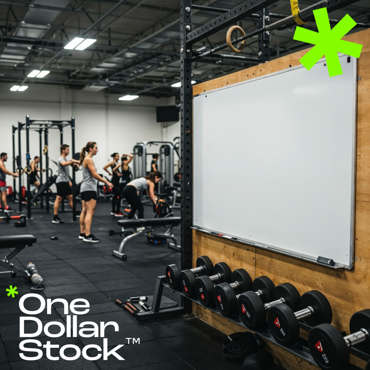
Top Visual Mistakes Small Gyms Make on Social Media (And How to Fix Them)
Top Visual Mistakes Small Gyms Make on Social Media (And How to Fix Them) If your gym's Instagram looks like it was put together in five minutes between classes, you are not alone. Most independent gyms and boutique fitness studios struggle with the same problem: the training is excellent, but the social media presence looks cheap, inconsistent, or completely forgettable. And in a market where potential members scroll past dozens of fitness brands every day, looking generic is the same as being invisible. This article breaks down the most common visual mistakes small gyms make on social media, and shows exactly how better fitness imagery and consistent branding can turn a low-performing profile into one that actually attracts premium members. Mistake 1: Using Low-Quality Gym Photos That Kill Your Brand Credibility Blurry action shots taken on an old phone, harsh fluorescent lighting, cluttered backgrounds with equipment piled in the corner. These are the images that make a gym look like a budget operation even when the actual facility is solid. The problem is not the gym itself. It is the visual representation of it. Premium members, the ones who will pay for personal training packages, annual memberships, and specialty classes, make snap judgments based on what they see online. A dark, grainy photo of someone doing a squat does not communicate quality. It communicates that nobody cared enough to do it right. Investing in professional-grade modern gym interior photography is one of the fastest ways to reposition how your brand is perceived before a single word is read. Mistake 2: Inconsistent Visual Style Across Every Post One post is bright and airy. The next is dark and moody. The one after that uses a completely different font and color palette. This kind of visual inconsistency is one of the most damaging things a small gym can do on social media, because it signals that there is no brand identity behind the business. Consistency is what makes a profile feel like a brand rather than a random collection of posts. That means committing to a color palette, a tone, a style of photography, and sticking to it. Applying a consistent Lightroom preset to every image is one of the simplest ways to achieve this. A set like Strong Color Grading Presets can unify the look of your entire feed in minutes, giving every photo the same punchy, high-contrast finish that reads as intentional and professional. Mistake 3: Only Posting Equipment and Empty Spaces A photo of a barbell rack is not a reason to join a gym. People join gyms because of how they imagine themselves feeling inside them. The most effective fitness social media content puts people at the center: real training moments, raw effort, and the kind of energy that makes someone think they want to feel that way too. Small gyms often default to equipment shots because they feel safe and easy. But they rarely convert. What converts is showing the experience in motion. An athlete pushing hard through a sprint, a member mid-rep with full focus, a coach cueing someone through a tough set. That is the content that stops the scroll. Mistake 4: Ignoring the Visual Language of Your Target Member A gym targeting 35-to-50-year-old professionals who want structured strength training should not be posting the same kind of content as a CrossFit box targeting competitive athletes in their twenties. The visual language, the color palette, the type of movement shown, the mood of the photography, all of it needs to match the lifestyle and aspirations of the specific person you are trying to reach. A boutique studio that offers yoga, pilates, or mindful movement needs imagery that feels calm, intentional, and premium, not aggressive or high-intensity. Generic fitness imagery that could belong to any gym in any city does not speak to anyone in particular. Niche-specific visuals create an immediate sense of recognition. When the right person sees your content and thinks that looks like me, you have done your job. Mistake 5: Promotional Posts That Look Like Flyers from 2009 Membership offers, class schedules, and seasonal promotions are necessary content for any gym. But the way most small gyms design these posts is a problem. Bright yellow backgrounds, clip art icons, five different fonts, and a wall of text crammed into a square image. These posts look like they were made in a word processor and they perform accordingly. Promotional content for a fitness brand should feel as premium as the brand itself. Clean layouts, strong typography, high-quality background imagery, and a consistent color system make the difference between a post that gets ignored and one that gets saved and shared. The visual energy of a focused athlete cycling intensely on a bright orange bike used as a background immediately raises the perceived value of whatever offer you are running. Mistake 6: Never Showing the People Behind the Gym Independent gyms have one major advantage over big-box chains: personality. The coaches, the community, the culture. But most small gyms never show any of it on social media. Every post is a workout tip or a stock-looking image with no human connection. Showing real people, whether that is your coaching staff, your members with their permission, or behind-the-scenes moments from class, builds the kind of trust that no promotional post can manufacture. Pair that authentic content with polished supporting visuals from a professional fitness image library and you get the best of both worlds: real and refined. How to Fix Your Gym's Social Media Visuals Without a Big Budget The good news is that fixing these mistakes does not require hiring a full-time photographer or a creative agency. It requires three things: a consistent visual style, a library of high-quality fitness images you can actually use, and a basic understanding of what your target member responds to. A well-curated stock library built specifically for fitness and wellness content gives you the raw material to post consistently, look professional, and stay on brand without scrambling for content every week. Pair that with a set of Lightroom presets to keep your color grading consistent, and you have a repeatable visual system that scales with your gym as it grows. The gyms that win on social media are not always the ones with the best equipment or the most square footage. They are the ones that look like they belong in the premium tier, even before a potential member walks through the door. Build a Gym Brand That Looks as Good as Your Training Social media is the first impression most potential members will ever have of your gym. If that impression is inconsistent, low-quality, or visually forgettable, you are losing members before they ever contact you. The fix is not complicated, but it does require intention. Start by auditing your last 30 posts. Count how many use consistent colors, how many feature people in action, and how many look like they belong to the same brand. Then close the gaps with better source material, a defined visual style, and fitness photography that actually reflects the quality of what you offer. Your social media should be the best advertisement your gym has. Right now, for most small gyms, it is the biggest missed opportunity.

Editable PSD Mockups for Modern Brands: Why OneDollarStock's New Mockups Are Changing the Creative Workflow
Editable PSD Mockups for Modern Brands: How to Present Your Work Like a Pro If you have ever spent hours trying to make a product shot look realistic, a packaging design look shelf-ready, or a social media concept look polished enough to show a client, you already know the problem. Great ideas deserve great presentation. And editable PSD mockups are one of the fastest ways to get there. OneDollarStock has just expanded its creative asset library with a new collection of editable PSD mockups built specifically for modern brands, agencies, and independent creators. These are not generic filler files. They are practical, professionally designed smart-object templates that let you drop in your design and export a finished visual in minutes. This article breaks down what makes editable PSD mockups worth using, how to use them in Photoshop even if you are not an advanced designer, and why this new category fits perfectly into what OneDollarStock has always been about: affordable, creator-first tools that actually work. What Are Editable PSD Mockups and Why Do They Still Matter? A PSD mockup is a layered Photoshop file that places your design inside a realistic scene. Think a coffee cup with your logo on it, a tote bag showing your print, a phone screen displaying your app UI, or a packaging box with your label applied. The scene is already built. You just replace the placeholder with your artwork. The reason PSD mockups remain the industry standard is control. Unlike static image generators or browser-based tools, a PSD file gives you full access to every layer. You can adjust shadows, change backgrounds, tweak lighting, and export at any resolution you need. That flexibility matters when you are working across multiple formats or delivering assets to a client who has specific requirements. For brands, agencies, and freelancers, editable PSD mockups are not a shortcut. They are a workflow upgrade. Best Uses for Editable PSD Mockups in Brand and Marketing Work The range of applications is wider than most people expect. Here are the most common and highest-value use cases: Product packaging presentations: Show a client how their label looks on a bottle, box, or pouch before anything goes to print. Social media content: Create scroll-stopping visuals for Instagram, Pinterest, or LinkedIn without a full photo shoot. Brand identity proposals: Present logos, color systems, and typography in context rather than on a white background. E-commerce product images: Give your online store a polished, lifestyle-adjacent look without hiring a photographer. Campaign mockups: Show how a design will look on a billboard, a tote bag, a t-shirt, or a business card before committing to production. Portfolio work: Make your design projects look finished and real, even when the client never moved forward with production. Each of these scenarios has one thing in common: the visual needs to look credible fast. PSD mockups make that possible without a studio, a photographer, or a production budget. How to Use Editable PSD Mockups in Photoshop: A Simple Step-by-Step Tutorial You do not need to be an advanced Photoshop user to get great results from a smart-object PSD mockup. The process is straightforward once you understand the structure of the file. Step 1: Open the PSD File Download your mockup from OneDollarStock and open it in Adobe Photoshop. You will see a layered file with clearly labeled groups. Most mockups include a dedicated smart object layer, often labeled something like "Your Design Here" or "Place Artwork." Step 2: Locate the Smart Object Layer In the Layers panel, find the smart object layer. It is identified by a small icon in the corner of the layer thumbnail that looks like a folded page. Smart objects are the key feature that makes mockups work. They allow your design to be placed inside the scene with perspective, shadows, and lighting already applied. Step 3: Double-Click to Open the Smart Object Double-click the smart object thumbnail. A new document will open. This is your canvas. It shows the exact dimensions and shape your design needs to fill. Delete the placeholder content and paste or place your own artwork here. Step 4: Replace the Placeholder with Your Design Paste your logo, illustration, pattern, or design into the smart object document. Scale and position it to fit the canvas. Keep it within the boundaries for the cleanest result. If your design has a transparent background, make sure the smart object background is set accordingly. Step 5: Save and Return to the Mockup Save the smart object document using Ctrl+S (Windows) or Cmd+S (Mac). Do not use Save As. When you save, Photoshop automatically updates the main mockup file with your design applied inside the scene. You will see the result immediately. Step 6: Adjust and Export Back in the main PSD file, review the result. You can turn layers on or off to change the background, adjust shadows, or switch color variants if the mockup includes them. When you are happy with the result, go to File, then Export, then Export As, and choose your preferred format. JPEG works for most web uses. PNG is better when you need transparency. The entire process typically takes under five minutes once you are familiar with the file structure. What Makes OneDollarStock PSD Mockups Different There is no shortage of mockup files on the internet. What separates a useful mockup from a frustrating one comes down to a few things: file quality, layer organization, smart object accuracy, and whether the scene actually looks realistic at export. OneDollarStock mockups are built with working creators in mind. The files are clean, the layers are labeled, and the smart objects are set up to work without needing to restructure the file before you can use it. The scenes are chosen for relevance to real brand and marketing work, not just for visual novelty. And because OneDollarStock operates on a pay-once model, you are not dealing with subscription tiers, download limits, or licensing confusion. You buy the asset, you own the right to use it. That clarity matters when you are working on client projects or building a commercial brand. Common Mistakes to Avoid When Using PSD Mockups Even with a well-built mockup file, a few common errors can undermine the final result. Here is what to watch for: Placing a low-resolution design: If your artwork is 72 DPI and the mockup is built for 300 DPI output, the result will look blurry. Always work with high-resolution source files. Ignoring the smart object canvas size: Your design should fill the smart object canvas proportionally. Stretching or squashing it will distort the final result. Saving over the original file: Always keep a copy of the original PSD. Work on a duplicate so you can reuse the mockup with different designs later. Skipping the shadow and highlight layers: Many mockups include optional overlay layers that add depth and realism. Turning these off can make the result look flat. Exporting at the wrong size: Match your export dimensions to the platform or use case. A social media post, a client PDF, and a print file all have different requirements. Editable PSD Mockups for Specific Brand Scenarios Different brand contexts call for different mockup types. Here is a quick breakdown of which mockup categories tend to deliver the most value for specific creative goals: For Product-Based Brands and E-Commerce Packaging mockups, label mockups, and product surface mockups are the most useful. They let you show how a physical product will look before it exists, which is essential for pre-launch campaigns, crowdfunding visuals, and investor decks. For Agencies and Brand Designers Stationery mockups, brand identity scene mockups, and device mockups are the go-to formats. They make brand proposals look finished and help clients visualize the system rather than just the individual elements. For Social Media Creators and Content Teams Phone screen mockups, tablet mockups, and lifestyle flat-lay mockups are the most practical. They let you show digital content in context, which performs significantly better on visual platforms than raw screenshots or white-background exports. For Apparel and Merchandise Brands T-shirt mockups, hoodie mockups, tote bag mockups, and cap mockups are essential for any brand selling or sampling printed goods. They eliminate the need for physical samples in early-stage product development and marketing. Why Affordable PSD Mockups Matter for Independent Creators and Small Brands Professional mockup photography is expensive. A single styled product shoot can cost hundreds or thousands of dollars depending on the studio, photographer, and props involved. For independent creators, small brands, and early-stage businesses, that cost is often not realistic. Editable PSD mockups close that gap. They give smaller operations access to the same quality of visual presentation that larger brands use, without the production overhead. When the mockups are also affordable to license, the barrier drops even further. This is exactly the space OneDollarStock was built to serve. The platform exists to give creators and brands access to professional creative assets at a price point that makes sense for real working budgets, not enterprise licensing departments. How PSD Mockups Fit Into a Modern Creative Workflow The best creative workflows are built around speed and flexibility. You need to move from concept to presentation quickly, iterate based on feedback, and deliver polished results without rebuilding everything from scratch each time. Editable PSD mockups fit naturally into that kind of workflow. You build your design in Illustrator or Photoshop, drop it into the mockup, export, and share. If the client wants a color change or a different background, you make the adjustment in minutes rather than hours. If you need to show the same design across five different product types, you use five mockups and export five files in a single session. That kind of efficiency compounds over time. The more mockups you have in your library, the faster you can respond to briefs, pitch ideas, and deliver work that looks finished from the first round. What to Look for in a High-Quality PSD Mockup File Not all mockup files are created equal. Before downloading or purchasing a PSD mockup, it is worth checking a few things: Smart object support: The file should use smart objects, not just flat layers. Smart objects are what make the design placement accurate and realistic. Layer organization: Well-labeled layers save time and reduce confusion. Look for files where the structure is clear from the moment you open it. Resolution: A good mockup file should be at least 3000 pixels on the longest side and built at 300 DPI for print-ready output. Realistic lighting: The best mockups use photography-based or carefully rendered lighting that makes your design look like it belongs in the scene. Clear licensing: Know what you can and cannot do with the file. Commercial use, client work, and resale rights are all different things. Editable PSD Mockups: The Next Step in OneDollarStock's Creative Asset Library OneDollarStock started with stock photography and has grown into a broader creative marketplace that includes Lightroom presets, overlays, textures, and now editable PSD mockups. Each addition to the library follows the same logic: give creators something they will actually use, at a price that does not require a business case to justify. The mockup collection is a natural extension of that mission. It fills a real gap in the workflow of anyone who creates visual content for brands, whether that is a solo designer, a small agency, a content team, or a brand owner doing their own creative work. The goal has never been to build the biggest stock library. It has been to build the most useful one for the people who actually do creative work every day. Conclusion: Editable PSD Mockups Are a Workflow Investment Worth Making Editable PSD mockups are not a trend. They are a practical tool that has been part of professional creative workflows for years, and they remain one of the fastest ways to produce polished, realistic visuals without a production budget. With OneDollarStock's new mockup collection, you get files that are built to work, priced to make sense, and designed for the kind of real creative work that brands, agencies, and independent creators do every day. Whether you are presenting a packaging concept, building a brand proposal, or creating content for social media, the right editable PSD mockup saves time and raises the quality of everything you put in front of a client or audience. Browse the full collection of editable PSD mockups at OneDollarStock and find the files that fit your next project.

Content Marketing for Independent Pharmacies and Wellness Stores
Content Marketing for Independent Pharmacies and Wellness Stores Independent pharmacies and wellness stores are sitting on one of the most underused advantages in retail: genuine, face-to-face trust with their customers. People come in with real questions about supplements, seasonal immunity, skin care routines, and self-care habits. They leave with a recommendation they actually follow. The problem is that most of this expertise never makes it online. The store's Instagram shows a promotional flyer for a discount on vitamins. The Facebook page has not been updated since February. Meanwhile, the customer who just bought magnesium glycinate from you is watching a wellness influencer explain the same thing on TikTok. Content marketing for independent pharmacies is not about competing with big chains on ad spend. It is about making your real expertise visible, consistent, and findable before the customer even walks through the door. Why Educational Content Builds More Trust Than Promotional Flyers A flyer announcing 20% off omega-3 capsules tells a customer you have a sale. A short post explaining the difference between EPA and DHA, which one matters more for cardiovascular support, and what to look for on the label tells a customer you know what you are talking about. That second piece of content does not just sell a product. It earns a relationship. Independent pharmacies and wellness stores that publish consistent educational content, whether on Instagram, a blog, or a simple email newsletter, are building a reputation that a chain pharmacy with a loyalty card program cannot replicate. The pharmacist who explains things clearly online is the pharmacist people recommend to their neighbors. Educational content is not a marketing tactic. It is the digital version of the conversation that already happens at your counter every day. Seasonal Health Campaigns That Match What Customers Are Already Searching For Wellness retail has a natural content calendar built into it. Cold and flu season, allergy season, back-to-school immunity prep, winter vitamin D awareness, summer sun care, and New Year supplement resets are all moments when customers are actively searching for guidance. An independent pharmacy that publishes a short, useful post about immune support supplements in late September, before the first cold wave hits, is positioned exactly where a high-intent customer is looking. Seasonal content for wellness stores does not need to be elaborate. A single well-written post about elderberry versus zinc for cold prevention, paired with a clean, professional visual, will outperform a generic promotional graphic every time. The key is publishing before the season peaks, not during it. Visual Branding for Wellness Stores: Why Aesthetics Are Part of the Trust Signal Customers make subconscious judgments about credibility based on how a brand looks. A wellness store with a clean, consistent visual identity, soft natural tones, professional product photography, and a coherent color palette, signals quality before a single word is read. This matters especially for independent stores competing against well-funded national brands. You do not need a full-time designer or a photography studio to achieve this. High-quality stock photography built specifically for wellness and health content gives independent retailers the same visual standard as brands spending ten times more on creative production. Using professional imagery across your social posts, email headers, and in-store POS materials creates a cohesive brand experience that makes customers feel they are in good hands, which is exactly the feeling that drives repeat visits and word-of-mouth referrals. Self-Care Content That Speaks to the Modern Wellness Customer The wellness customer of 2025 is not just buying products. They are building a routine, an identity, and a set of daily rituals that make them feel in control of their health. Content that speaks to this, posts about morning supplement stacks, evening wind-down routines, skin care layering, or stress management habits, resonates far more deeply than product-focused promotions. For an independent pharmacy or wellness store, this kind of content is a natural extension of what your staff already knows. A short post about how to build a consistent self-care routine using products you already stock is not just useful content. It is a soft, non-pushy way to introduce customers to products they did not know they needed. Pair this content with imagery that reflects the calm, intentional aesthetic your target customer aspires to, and the connection between your brand and their lifestyle becomes intuitive. In-Store POS Materials and Digital Content: Making the Two Work Together One of the most overlooked opportunities for independent pharmacies is the connection between in-store materials and digital content. A shelf talker explaining the benefits of a probiotic strain, a counter card with a QR code linking to a short educational post, or a printed seasonal guide available at the register, all of these extend the content experience into the physical space. When the in-store materials share the same visual language as the store's social media and email content, the brand feels coherent and intentional rather than assembled from different sources. This consistency is what separates a professional independent retailer from a store that feels like it is still figuring out its identity. Wellness and health stock photos that work equally well in print and digital formats are a practical starting point for building this kind of unified visual system across every customer touchpoint. How to Build a Simple Content Routine That an Independent Store Can Actually Maintain The biggest obstacle to content marketing for independent pharmacies is not ideas. It is consistency. A store that publishes three posts a week for two weeks and then goes quiet for a month does more damage to its credibility than a store that publishes once a week without fail. The goal is a sustainable rhythm, not a burst of activity. A practical starting point is one educational post per week tied to a seasonal or product theme, one lifestyle or self-care post per week using professional imagery, and one promotional post per month that is visually consistent with everything else. This three-to-one ratio of value content to promotional content is the standard that builds audiences who actually pay attention. The content does not need to be long. A single well-chosen image, three sentences of useful information, and a clear connection to something you stock is enough to build a presence that compounds over time. Lightroom presets for health and wellness content can help maintain a consistent color tone across all posts without requiring editing expertise for every image. The Independent Pharmacy Content Advantage That Chains Cannot Buy National pharmacy chains have bigger budgets, wider distribution, and more brand recognition. What they do not have is the pharmacist who remembers that a customer's daughter has a tree nut allergy, or the wellness buyer who spent three months researching the best magnesium form for sleep before adding it to the shelf. That depth of knowledge and that quality of relationship is the content advantage that no chain can replicate at scale. The independent pharmacies and wellness stores that are growing their customer base right now are the ones making that expertise visible online, consistently, with a visual identity that matches the quality of their recommendations. Content marketing is not an add-on for independent wellness retail. It is the most direct path from being a well-kept local secret to becoming the store that customers drive past three competitors to reach. Start with one piece of useful content this week, pair it with a professional visual from the OneDollarStock wellness collection, and publish it where your customers are already spending time.

How Butcher Shops Can Modernize Their Image Without Losing Tradition
How Butcher Shops Can Modernize Their Image Without Losing Tradition The craft is still there. The knowledge of cuts, the relationships with local farms, the pride in a perfectly trimmed ribeye. What has changed is where customers discover you, how they decide to trust you, and what makes them choose your counter over the supermarket two blocks away. For local butcher shops, the gap between a thriving business and a struggling one is increasingly a visual and communication gap, not a quality gap. The meat is great. The brand does not show it. This article is for independent butchers, specialty meat shops, and the marketers behind them. If your Instagram looks like it was last updated in 2019, your website hero image is a stock photo of a generic deli counter, and your seasonal promotions are a printed flyer taped to the window, this is for you. Here is how to modernize your butcher shop brand without abandoning the craft and tradition that make you worth choosing. Why Visual Branding Is Now the Primary Competitive Advantage for Local Butcher Shops Independent butchers have always competed on quality and relationships. Those advantages still matter, but they are invisible online. A customer searching for "best butcher near me" or scrolling through local food accounts on Instagram makes a judgment call based entirely on what they see before they ever walk through your door. If your visual presence communicates "old-fashioned corner shop" when you mean "premium craft butchery," you are losing customers to brands that look the part, even if they cannot match your product. Modern butcher shop branding does not mean abandoning your identity. It means translating your actual quality into a visual language that works on a phone screen. Dark wood textures, close-up shots of marbled cuts, the hands of a skilled butcher at work, the steam rising from a grill at a summer event. These are the images that build trust and desire simultaneously, and they are the foundation of a visual identity that can carry your shop from a local institution to a genuinely sought-after brand. Food Photography for Butcher Shops: What Actually Sells Premium Cuts Most butcher shop photography makes the same mistake: it shows the product, not the desire. A flat lay of raw chicken thighs on a white background tells a customer nothing about why they should pay more for yours. What sells premium cuts is context, texture, and craft. The marbling visible in a thick ribeye held up to natural light. The confident grip of a gloved hand presenting a prime cut. The char marks on a rack of ribs fresh off the grill. These images do not just show meat. They communicate expertise, care, and the promise of a better meal. For butcher shops building out their content library, the priority should be variety across three visual categories. First, craft and product shots: close-ups of cuts, hands at work, the counter in action. Second, outcome imagery: the finished grill, the holiday table, the meal that justifies the price. Third, atmosphere and identity: the shop itself, the team, the sourcing story. Together, these three layers build a brand that feels real, premium, and worth seeking out. How to Build a Seasonal Content Calendar for a Butcher Shop or Meat Brand Butcher shops have a natural content calendar built into the year, and most of them are not using it. Summer is BBQ season: grill content, outdoor gathering imagery, sausage and rib promotions. Fall is the transition to slow-cooked cuts, braises, and comfort food. The holiday window from late November through December is the single highest-revenue opportunity of the year for most specialty meat shops, driven by roasts, hams, and premium gifting. January brings the resolution crowd looking for high-protein, clean-eating options. Each of these windows requires a different visual tone and a different content strategy. Summer BBQ content should feel energetic, social, and outdoor-focused. Holiday content needs to feel warm, abundant, and celebratory. The mistake most butcher shops make is using the same visual style year-round, or worse, posting nothing at all during the windows when their customers are most actively searching and planning. BBQ Season Campaigns: Visual Content That Drives Foot Traffic and Online Orders The summer BBQ window is the most commercially important content period for most butcher shops outside of the holidays. Customers are actively planning cookouts, searching for quality cuts, and more willing to spend on premium products when the occasion justifies it. Your content during this window should not just show meat on a grill. It should show the experience: the gathering, the smoke, the moment when the ribs come off the grate and everyone leans in. For social media, this means leading with outcome imagery and following up with product and sourcing content. A reel that opens with a close-up of ribs hitting a hot grill, cuts to the finished rack with a perfect crust, and ends with a simple call to action for pre-ordering your summer BBQ pack will outperform a static product photo every time. The grilled BBQ ribs stock photography in the OneDollarStock library gives you exactly this kind of high-impact visual without a full production shoot. Holiday Meat Campaigns: How to Market Premium Roasts, Hams, and Festive Cuts The holiday season is where a well-branded butcher shop can genuinely separate itself from supermarket competition. Customers buying a Christmas roast or a glazed ham for a family gathering are not looking for the cheapest option. They are looking for confidence: the assurance that this centerpiece will be worth it. Your marketing during this window needs to sell that confidence, and it does so almost entirely through imagery. Holiday butcher shop content should lead with the table, not the counter. Show the finished roast surrounded by sides, the glazed ham at the center of a festive spread, the moment the carving knife goes in. This is the outcome your customer is buying, and it is the image that justifies a premium price point. Pair this with clear pre-order messaging, sourcing details, and a simple pickup or delivery offer, and you have a holiday campaign that converts. For shops that want to extend the holiday campaign across email, social, and their website simultaneously, having a consistent visual library is essential. The festive holiday meal with glazed ham imagery from OneDollarStock is the kind of warm, commercially polished visual that works across every channel without looking like a generic supermarket ad. Color Grading and Presets for Butcher Shop Social Media Content Consistency of visual tone is what separates a brand from a collection of random posts. For butcher shops, the right color grade communicates warmth, richness, and craft. Think deep amber tones, slightly lifted shadows, rich reds in the meat, and a warm overall temperature that makes food look genuinely appetizing rather than clinical. This is not just an aesthetic choice. It is a brand signal that tells your audience, at a glance, that your content belongs to a premium, intentional brand. Achieving this consistency does not require a professional colorist on every shoot. Applying a consistent preset to your food and product photography is the fastest way to unify your visual identity across Instagram, your website, and your printed materials. The Moody Urban Food Presets from OneDollarStock are built specifically for this kind of rich, editorial food aesthetic, and they work across both Lightroom and mobile editing workflows. Premium Cut Photography That Builds Trust and Justifies Higher Prices One of the most underused tools in butcher shop marketing is the close-up product shot done right. Not a flat lay on a cutting board with bad lighting. A properly lit, tightly framed image of a prime cut that shows the marbling, the color, the texture. This kind of image does two things simultaneously: it communicates quality to the customer and it signals that your shop takes its product seriously enough to present it with care. For shops that cannot afford a regular food photographer, a curated library of prime cut butcher stock photos fills the gap between your own shoots and keeps your content calendar moving. Used alongside your own behind-the-counter content, these images give you the visual range to cover product pages, email headers, social posts, and seasonal promotions without repeating yourself. The Bottom Line: Craft Deserves a Brand That Matches It The best butcher shops in any city are not struggling because their product is not good enough. They are struggling because their brand does not communicate what their product actually is. A premium ribeye presented on a styrofoam tray with a printed label looks like a supermarket product. The same cut photographed with care, presented with the right visual language, and marketed through a consistent seasonal content strategy looks like something worth driving across town for. Modernizing your butcher shop brand does not mean abandoning tradition. It means giving your craft the visual identity it deserves. Start with your imagery. Build a seasonal content calendar. Apply a consistent visual tone. And make sure every touchpoint, from your Instagram grid to your holiday campaign landing page, communicates the same thing: this is a shop that takes quality seriously, and the product is worth it.

The Smartest Social Media Strategy for Small Garden Centers
The Smartest Social Media Strategy for Small Garden Centers Most small garden centers have the same problem on social media: they post when they remember, they photograph whatever is closest to the register, and they wonder why their follower count stays flat while their spring inventory sells out before anyone online even knew it arrived. Social media for a garden center is not about posting more. It is about posting smarter, with a seasonal rhythm, a consistent visual style, and content that actually helps your customers make decisions. The right strategy, paired with strong garden stock photos and nature presets, can turn your Instagram or Facebook page into a genuine sales channel rather than an afterthought. Why Seasonal Content Is the Core of Any Garden Center Social Media Strategy A garden center's entire business model is built around seasonality, and your social media content should reflect that with the same precision you apply to your buying calendar. The mistake most small garden centers make is treating social media as reactive rather than planned. By the time the tulip bulbs are in and looking beautiful, you have already missed two weeks of pre-season content that could have driven customers to your door on opening day. The most effective garden center social media strategies work four to six weeks ahead of the season, teasing what is coming, educating customers on timing and planting windows, and building anticipation before the inventory even arrives. That kind of forward-looking content does not require a big production budget. It requires a plan and a consistent visual style that makes every post feel like it belongs to the same brand. Before-and-After Garden Posts: The Highest-Engagement Format for Garden Centers If there is one content format that consistently outperforms everything else for garden centers on social media, it is the before-and-after. A bare patch of soil transformed into a thriving perennial border. A neglected front yard turned into a cottage garden. A plain concrete patio surrounded by container plantings that make it feel like a private courtyard. These posts work because they answer the question every customer is silently asking: what could my space look like? They also demonstrate expertise in a way that a product photo never can. You do not need a professional photographer to pull this off. You need a consistent editing style so the before and after images feel like they belong together, and you need to shoot both in similar light conditions. A good set of garden-specific Lightroom presets applied consistently across both images makes a significant difference in how polished the final post looks. How to Use Gardening Tips and Educational Content to Drive Foot Traffic The garden centers that build the most loyal social media followings are the ones that teach, not just sell. A post explaining the difference between determinate and indeterminate tomatoes, a short video on how to deadhead roses correctly, a graphic showing which perennials thrive in full shade: this kind of content positions your team as the local experts and gives customers a reason to follow you year-round, not just during peak season. It also drives foot traffic in a very direct way. When a customer reads your post about dividing hostas in early fall and realizes they have a clump that needs splitting, they are going to come to you for advice and supplies. Educational content is not a soft brand play. For a garden center, it is a direct sales tool. Garden Center Instagram Aesthetics: How to Make Your Feed Look Cohesive A garden center has a natural visual advantage over most small businesses: the product is inherently beautiful. The challenge is making sure that beauty translates consistently across your social media feed rather than looking like a random collection of phone snapshots taken in different lighting conditions. The fix is simpler than most garden center owners expect. Shoot in consistent light, ideally early morning or late afternoon when natural light is soft and warm. Apply the same editing preset to every image so the colors, contrast, and tone feel unified. And vary your subjects deliberately: close-up flower details, wide shots of display areas, lifestyle images of people enjoying finished gardens, and product-focused shots of new arrivals. That mix keeps the feed visually interesting while maintaining a consistent brand feel. The Gardens Presets from OneDollarStock are built specifically for this kind of outdoor plant and garden photography, with tones that make greens look rich and flowers look vivid without looking oversaturated. Using Stock Garden Photography to Fill Your Content Calendar Between Seasons Late winter is the hardest time of year for a garden center's social media. The inventory is sparse, the outdoor displays are bare, and there is not much to photograph. But your customers are already dreaming about spring, browsing seed catalogs, and planning their gardens. This is exactly when consistent, high-quality content matters most, and exactly when most garden centers go quiet. Filling that gap with carefully chosen garden and nature stock photography keeps your feed active and your brand visible during the off-season without requiring a photo shoot in February. The key is choosing images that match your brand's visual style and feel specific rather than generic: a close-up of pink camellia blooms, a dewy morning garden scene, a beautifully lit flower detail that makes a follower stop scrolling and think about spring. Botanical Presets and Nature Editing Styles That Work for Garden Center Content Not all Lightroom presets work well for garden and plant photography. Presets designed for portraits or urban photography tend to flatten greens, shift flower colors in unflattering directions, and add contrast that makes outdoor scenes look harsh rather than inviting. For garden center content, you want presets that preserve the natural vibrancy of plant colors, add warmth without going orange, and handle the wide tonal range of an outdoor scene without blowing out highlights or crushing shadows. The Botanical Presets from OneDollarStock are designed with exactly this kind of plant-forward photography in mind, making them a practical tool for any garden center owner who wants their photos to look consistently polished without spending hours editing each image individually. DIY Garden Content and Inspiration Posts That Convert Browsers Into Buyers DIY and inspiration content is one of the most shareable formats on social media for garden centers, and one of the most underused. A post showing three ways to style a container planting for a shaded porch, a simple guide to building a raised bed from reclaimed wood, or a mood board of a cottage garden color palette for the coming season: these posts get saved, shared, and returned to. They also create a very natural path to purchase. A customer who saves your container planting inspiration post is going to come to your center to buy the plants, the soil, and the pot. The content did the selling before they ever walked through the door. Pairing this kind of inspiration content with strong, editorial-quality imagery, whether from your own shoots or from a curated stock library, makes the posts more likely to be saved and shared, which extends your reach without any additional ad spend. Build a Visual Asset Library for Your Garden Center Marketing The garden centers that show up consistently on social media are not the ones with the biggest teams. They are the ones with a system. That means a defined visual style, a small library of on-brand stock images for content gaps, a preset pack that unifies all their photography, and a content calendar that maps to the growing season rather than reacting to it. Building that library does not require a large investment. OneDollarStock's pay-once, use-forever model means you can acquire a set of garden presets, a collection of botanical and outdoor stock photos, and a handful of lifestyle images for a fraction of what a single professional photo shoot would cost. Browse the full nature and garden asset library to find photography, presets, and visual content that fits your garden center's brand and seasonal content needs. Final Thoughts: A Social Media Strategy That Actually Grows Your Garden Center Social media works for small garden centers when it is treated as a seasonal business tool rather than a random posting habit. That means planning content ahead of the growing calendar, mixing educational posts with inspiration and product content, maintaining a consistent visual style across every platform, and filling content gaps with high-quality imagery that keeps your brand visible even when the outdoor displays are bare. The garden center owners who do this well are not spending more time on social media than their competitors. They are spending it more intentionally, with better visuals, a clearer strategy, and a content library that makes every post easier to produce. Start with one preset pack, one curated collection of garden stock photos, and one content calendar mapped to your next season. The results will follow.

How Bridal Boutiques Can Look Luxury Online Before the First Appointment
How Bridal Boutiques Can Look Luxury Online Before the First Appointment A bride does not walk into your boutique and then decide whether to trust you. She decides that weeks earlier, scrolling through your Instagram at midnight, clicking through your website between meetings, and comparing your visual presence against every other bridal boutique in her area. By the time she books an appointment, the sale is already half made or half lost. For independent bridal boutiques, the challenge is not the product. The gowns are beautiful. The challenge is making sure the online experience communicates the same level of luxury, care, and editorial quality that a bride will feel the moment she steps through the door. The right bridal stock photos, wedding presets, and editorial visual assets make that possible without the cost of a full creative production. Why Luxury Bridal Boutique Branding Starts Online, Not In-Store The bridal market is one of the most emotionally driven purchasing environments in retail. Brides are not just buying a dress. They are buying a feeling, a vision of themselves, and a promise of how their wedding day will look and feel. That emotional transaction begins the moment a potential client encounters your brand online. If your website imagery looks inconsistent, your Instagram grid feels unpolished, or your promotional graphics look like they were made in a hurry, you are communicating something about your boutique before a single word is read. Luxury bridal boutique branding is not about having the most expensive gowns. It is about making every visual touchpoint feel intentional, curated, and worthy of the occasion. Build a Bridal Visual Identity That Communicates Premium Before the First Click A strong visual identity for a bridal boutique comes down to three things: a consistent color palette, a defined editorial mood, and imagery that feels cohesive across every platform. Most independent boutiques make the mistake of mixing warm golden-hour wedding photos with bright white studio shots and flat product images, all on the same Instagram grid. The result looks scattered rather than curated. Choose a visual direction and commit to it. Soft, natural light with muted tones and a romantic editorial feel works well for boutiques positioning themselves as intimate and personal. Clean whites, architectural interiors, and minimal styling communicate a more modern luxury positioning. Either direction works. Inconsistency does not. Use Editorial Wedding Stock Photos to Elevate Your Website and Lookbook Not every boutique has the budget for a quarterly editorial shoot, and not every shoot produces enough variety to fill a full website, a lookbook, and six months of social content. This is where a curated library of high-quality wedding and bridal stock photography becomes a practical business tool. The key is selectivity. Avoid generic stock images that look like they belong on a greeting card. Look instead for editorial-quality images that feel specific: a close-up of luxurious lace and velvet fabric, a romantic ceremony moment with a beautifully composed bouquet, a boutique interior that communicates the atmosphere you want brides to associate with your brand. These images do not replace your own photography. They extend it, fill the gaps, and keep your visual presence consistent between shoots. Lightroom Presets for Wedding Photography: Create a Signature Bridal Aesthetic One of the fastest ways to make a bridal boutique's online presence look more cohesive and premium is to apply a consistent editing style across all photography. Whether you are editing your own boutique interior shots, styling photos from trunk shows, or processing images from styled shoots, a well-chosen Lightroom preset pack can unify everything under a single visual signature. For boutiques with a romantic, moody positioning, a set of dedicated wedding presets adds depth, warmth, and a cinematic quality that elevates even a simple smartphone photo. The Moody Autumn Wedding Presets from OneDollarStock are built specifically for this kind of editorial bridal aesthetic, with rich tones and a soft atmospheric quality that reads as luxury rather than filtered. Bridal Boutique Instagram Strategy: What High-End Boutiques Post and Why The most effective bridal boutique Instagram accounts share one thing in common: they do not just post dresses. They post a world. That means mixing gown detail shots with boutique interior imagery, ceremony moments, bridal party content, and the kind of soft lifestyle photography that makes a bride imagine herself inside that world. The ratio matters too. A grid that is 100 percent product shots feels like a catalog. A grid that mixes editorial imagery, behind-the-scenes moments, and aspirational lifestyle content feels like a brand. For boutiques that do not have enough of their own content to maintain that mix, supplementing with carefully chosen wedding lifestyle stock photos is a practical and cost-effective way to keep the feed active and visually consistent between appointments and shoots. How to Make Your Bridal Boutique Website Feel Luxury Without a Full Redesign A website redesign is expensive and time-consuming. But a visual refresh, swapping out weak hero images, updating gallery photos, and adding editorial-quality imagery to key landing pages, can dramatically change how a boutique is perceived online without touching the underlying design. The homepage hero image is the single most important visual on your website. It sets the tone for everything that follows. If that image looks dated, poorly lit, or generic, it undermines every other element on the page. Replacing it with a strong, editorial boutique interior shot or a beautifully composed bridal detail image can shift the perceived positioning of your boutique immediately. The same principle applies to your appointment booking page, your about section, and any lookbook or gallery pages you maintain. Seasonal Bridal Campaigns and Trunk Show Promotions That Look the Part Trunk shows, designer visits, sample sales, and seasonal collection launches are some of the highest-value marketing moments a bridal boutique has each year. They are also the moments where the visual quality of your promotional content matters most. A poorly designed Instagram story or a low-quality email header for a trunk show announcement signals to potential clients that the event itself may not be worth their time. Investing in strong visual assets for these campaigns, whether that means editorial photography, a consistent preset applied to all promotional images, or a curated set of lifestyle visuals that match the collection's mood, pays back in appointment bookings and walk-in traffic. The visual quality of the promotion is part of the product experience before the event even begins. Build a Bridal Content Library That Works Across Every Platform The most efficient bridal boutiques treat their visual assets as a library rather than a one-time production. That means building a small, curated collection of on-brand images, presets, and editorial visuals that can be reused, remixed, and repurposed across Instagram, Pinterest, email campaigns, website updates, and printed lookbooks. A single strong editorial image can become an Instagram post, a Pinterest pin, a website banner, and an email header. A single preset pack can unify six months of photography across every platform. OneDollarStock's pay-once, use-forever licensing model makes this kind of asset library genuinely practical for independent boutiques that need professional-quality visuals without ongoing subscription costs. Browse the full wedding and bridal asset library to find editorial stock photos, wedding presets, and lifestyle imagery that fits your boutique's visual direction. The Luxury Bridal Boutique Online Presence: Final Thoughts Brides are making decisions about your boutique before they ever speak to you. The visual quality of your online presence is not a secondary concern or a nice-to-have. It is the first impression, the trust signal, and the emotional invitation that either brings a bride through your door or sends her to a competitor. Independent bridal boutiques do not need a chain's marketing budget to compete visually. They need a clear aesthetic direction, a consistent editing style, and a curated library of editorial-quality images that communicate luxury, care, and attention to detail at every touchpoint. Start with one strong hero image, one preset pack that matches your brand mood, and one collection of on-brand wedding lifestyle photos. Build from there, and your online presence will start doing the work of selling the dream before the first appointment is ever booked.

How Surf Schools and Water Sports Brands Can Sell the Lifestyle, Not Just Lessons
How Surf Schools and Water Sports Brands Can Sell the Lifestyle, Not Just Lessons People do not book a surf lesson because they want to stand on a board. They book it because they want to feel something: freedom, adrenaline, belonging, the kind of morning that makes the rest of the week worth it. The surf schools and kitesurfing brands that understand this are not selling a service. They are selling an identity. And the ones that communicate that identity clearly, consistently, and visually are the ones filling their calendars every summer while everyone else competes on price. This article is for surf school owners, kitesurfing instructors, water sports operators, and the marketers behind them. If your website, Instagram, or campaign still leads with "beginner-friendly lessons from $X per hour," you are leaving serious revenue on the table. Here is how to shift from selling a service to selling a world people want to belong to. Why Lifestyle Marketing Outperforms Lesson-Based Advertising for Water Sports Brands Hourly pricing and feature lists are commodities. Every surf school on the same stretch of coast offers roughly the same thing: boards, wetsuits, instructors, and a beach. What you cannot commoditize is the feeling. Lifestyle marketing works because it targets desire, not logic. A potential customer scrolling Instagram at 9pm on a Tuesday is not comparing lesson packages. They are dreaming. Your job is to be the brand that shows up in that dream. The most effective water sports brands build content around three emotional pillars: freedom (open water, no walls, no schedule), community (the crew, the shared stoke, the post-session ritual), and transformation (the person who could not paddle out versus the person who just caught their first green wave). When your visuals and copy consistently hit those three notes, you stop being a vendor and start being a destination. The Visual Language of Surf and Kitesurfing Brands That Actually Convert Your visual identity is your first pitch. Before anyone reads your pricing page or watches your intro video, they have already decided whether your brand feels like their kind of place. For surf schools and water sports operators, that decision happens in under three seconds based almost entirely on imagery. The visual language that converts for this niche is specific. Golden hour light on moving water. Wet hair and wide smiles after a session. The silhouette of a board against a fading sky. A kite pulling taut against a clean blue horizon. These are not generic beach photos. They are emotionally coded images that signal a specific lifestyle to a specific audience. Generic stock photography of people posing on sand does not do this job. You need images that feel like they were shot on location, in the moment, by someone who actually surfs. For reels and short-form video, color grading matters as much as the footage itself. A warm, slightly desaturated grade with lifted shadows reads as "authentic surf documentary." A flat, overexposed look reads as "phone footage from 2017." Using the right Outdoor LUTs on your video content can shift the entire emotional register of a reel without changing a single frame of footage. Building a Surf School Content Strategy Around Energy, Freedom, and Community A content strategy for a surf school or kitesurfing brand should not be built around your lesson schedule. It should be built around the emotional arc of your customer: the anticipation before their first session, the struggle and breakthrough during it, and the identity shift that happens after. Map your content to that arc and you will always have something worth posting. Practically, this means mixing three types of content. First, aspirational visuals: wide shots of perfect waves, aerial kite footage, golden hour beach scenes that make people stop scrolling. Second, social proof with texture: not just five-star reviews, but real moments from real sessions, candid group shots, the look on someone's face when they stand up for the first time. Third, educational content that reinforces authority without being dry: tips on reading waves, gear breakdowns, destination guides for surf travel. For the aspirational layer, you do not need to shoot everything yourself. A well-curated library of surf stock photo packs gives you consistent, high-quality imagery to fill the gaps between your own shoots, keep your feed active during off-season, and build out landing pages and campaign assets without a full production budget. How to Use Visuals to Sell Surf Travel Packages and Premium Experiences If your surf school offers multi-day retreats, surf travel packages, or premium coaching intensives, the visual bar is even higher. You are no longer competing with the school down the beach. You are competing with every other travel experience your customer could book with the same budget: yoga retreats, ski weekends, city breaks. The imagery has to communicate premium value immediately. For this tier of marketing, the details matter. The quality of light in your hero images. The composition of your accommodation shots. The way your instructors are framed in action. Everything should feel editorial, not promotional. Think surf magazine, not flyer. For photo editing, Holiday Postcard Presets can give your travel and destination imagery a warm, polished finish that reads as aspirational without looking over-processed. Seasonal Campaign Visuals for Surf Schools: What to Post and When Water sports businesses are inherently seasonal, and your content calendar should reflect that rhythm rather than fight it. The pre-season window (typically March through May in the Northern Hemisphere) is your highest-leverage marketing period. This is when your target audience is planning their summer, searching for experiences, and most receptive to aspirational content. Hit them with your strongest lifestyle imagery during this window and you will book out faster than any discount campaign could achieve. During peak season, shift toward community and social proof content. Real sessions, real students, real moments. Post-season is the time for recap content, early-bird offers for next year, and destination-focused pieces that keep your brand visible during the quiet months. Each phase requires a different visual tone, and having a ready library of surf and water sports imagery means you can execute that calendar without scrambling for content at every transition. Stock Photos for Surf and Water Sports Brands: What to Look For and What to Avoid Not all surf stock photography is created equal. The images that work for lifestyle marketing are specific: dynamic action shots with real motion blur, candid group moments with genuine emotion, environmental shots that establish place and atmosphere. What does not work: stiff posed shots, overly saturated "tropical paradise" cliches, or images that look like they were shot in a studio with a fake wave machine. When sourcing imagery for your website, campaigns, or social content, prioritize photos that show real conditions, real people, and real energy. The surf lifestyle photo packs at OneDollarStock are built around exactly this kind of authentic, commercially usable imagery, available with a one-time license and no subscription required. The Bottom Line: Sell the Feeling, Then the Lesson The surf schools and water sports brands that grow year over year are not the ones with the lowest prices or the most certifications. They are the ones that make people feel something before they ever book. They show up in the right feeds with the right images at the right moment in the planning cycle. They communicate a world, not a service. And they do it consistently, across every touchpoint, from Instagram to landing page to confirmation email. If your current marketing is still leading with lesson packages and hourly rates, the fix is not a new pricing strategy. It is a new visual and content strategy built around the energy, freedom, and community that your brand actually delivers. Start with the imagery. Get the visual language right. The bookings follow.

Best Visual Branding Tips for Independent Cafes and Coffee Shops
Best Visual Branding Tips for Independent Cafes and Coffee Shops If you run an independent cafe or coffee shop, you already know the product is not the problem. The espresso is dialed in, the pastries are fresh, and the regulars keep coming back. What holds most small coffee shops back from growing their audience, attracting new customers, and competing with bigger chains is not the coffee. It is the visual brand. The good news is that you do not need a costly rebrand or a full-time designer to fix it. With the right stock photos, Lightroom presets, and ready-to-use creative assets, an independent cafe can look polished, premium, and genuinely Instagram-worthy in a matter of hours. Why Visual Branding Matters More Than Ever for Independent Coffee Shops Customers decide whether to visit a cafe based on what they see online before they ever walk through the door. Your Google Business photos, your Instagram grid, your seasonal drink promotions, and even your digital menu all communicate something about your brand. If those visuals look inconsistent, low-quality, or generic, potential customers will scroll past and choose the place that looks more put-together. For independent coffee shops competing against well-funded chains with in-house creative teams, visual consistency is one of the most powerful and affordable advantages available. Start With a Consistent Color Palette and Cafe Aesthetic Before you post another photo or update your menu board, define your visual identity. Most successful independent cafes anchor their brand around two or three core colors and a consistent mood. Think warm neutrals and terracotta for a cozy neighborhood feel, or clean whites and muted greens for a minimalist specialty coffee vibe. Once you have that palette, every photo you post, every story you share, and every promotional graphic you create should feel like it belongs to the same world. This is where high-quality stock photography becomes a practical tool rather than a shortcut. Choosing images that already match your color story saves hours of editing and keeps your feed looking intentional. Use Professional Cafe Stock Photos to Fill Content Gaps Not every cafe has the budget for a monthly photo shoot, and not every owner has time to style and shoot content between the morning rush and closing. This is exactly where a well-curated library of cafe and coffee lifestyle stock photos pays for itself. The key is choosing images that feel specific and editorial rather than generic and staged. A photo of a barista carefully pouring steamed milk into a fresh latte, shot in warm ambient light, tells a story. A flat, overlit stock photo of a coffee cup on a white background does not. When you browse the OneDollarStock photo library, look for images that match the actual mood of your space, not just the subject matter. Lightroom Presets for Coffee Shop Photography: Edit Faster, Look More Premium Even the best smartphone photo looks flat without a consistent edit. Lightroom presets are one of the fastest ways to give your cafe photography a signature look without spending hours in post-production. For coffee shops, the most effective presets tend to lean warm and moody, with lifted shadows, rich browns, and a slight fade that makes drinks and interiors look inviting rather than clinical. If your cafe has a darker, more atmospheric interior, a set of dark interior presets can make your space look intentional and editorial rather than just dimly lit. The Moody Urban Food Presets from OneDollarStock are a strong starting point for cafes that want a consistent, high-end look across food and drink photography. How to Make Your Seasonal Drink Promotions Look More Professional Seasonal menus are one of the highest-engagement content opportunities a coffee shop has all year. A pumpkin spice latte launch in September, a lavender cold brew for summer, or a holiday spiced mocha in December can drive real foot traffic if the visual promotion looks good enough to share. The mistake most independent cafes make is creating these promotions at the last minute with whatever photos they have on hand. A better approach is to build a small library of seasonal cafe imagery and lifestyle shots in advance, then pair them with a consistent editing style so every seasonal campaign feels like a deliberate brand moment rather than a rushed post. Pairing strong imagery with the Dark Interior Presets can give autumn and winter drink promotions a rich, atmospheric quality that performs well on Instagram and in email campaigns. Barista and Behind-the-Counter Content That Builds Brand Trust Customers connect with people, not just products. Behind-the-counter content, showing your baristas at work, the care that goes into each drink, and the craft behind your espresso program, builds the kind of brand trust that no amount of logo design can replicate. If you do not have enough of your own behind-the-scenes photography, supplementing with high-quality barista stock photos that match your cafe's aesthetic is a practical and cost-effective solution. The goal is to make your content feel human and specific, not polished to the point of feeling corporate. Make Your Coffee Shop Instagram-Worthy Without Redesigning Your Space You do not need to renovate your cafe to make it more photogenic. Small, deliberate changes to how you style your counter, your window seating, or your seasonal display can make a significant difference in how your space photographs. Natural light is your best asset. A clean, uncluttered surface with one or two well-chosen props, a ceramic cup, a small plant, a handwritten card, will photograph better than a busy counter full of equipment. When you combine thoughtful in-house styling with a consistent editing preset and a curated selection of lifestyle stock photos to fill your content calendar, your Instagram grid starts to look like a brand rather than a random collection of phone snapshots. Build a Repeatable Visual System for Your Cafe Marketing The cafes that consistently look great online are not necessarily the ones with the biggest budgets. They are the ones with a system. That means a defined color palette, a go-to editing preset, a small library of on-brand stock photos for content gaps, and a simple template for promotional graphics. Once that system is in place, creating content for a new seasonal drink, a weekend event, or a loyalty program promotion takes minutes instead of hours. For independent coffee shop owners who are already managing everything from ordering to staffing, that kind of efficiency is not a luxury. It is a competitive advantage. Visual Branding Assets for Coffee Shops: Where to Start If you are starting from scratch or refreshing your cafe's visual identity, the most practical first step is to build a small, curated asset library. That means a set of Lightroom presets that match your cafe's mood, a collection of high-quality coffee and cafe lifestyle stock photos that align with your color palette, and a handful of versatile lifestyle images you can use across Instagram, your website, and email. OneDollarStock offers a pay-once, use-forever model with no subscription required, which makes it a genuinely practical option for independent cafe owners who need professional-quality assets without ongoing costs. Browse the full creative asset library to find coffee shop photography, food and drink presets, and lifestyle images that fit your brand. Final Thoughts: Premium Coffee Shop Branding Is Within Reach Independent cafes have something the big chains can never fully replicate: personality, community, and a genuine story. The goal of visual branding is not to make your cafe look like a chain. It is to make sure that personality comes through clearly and consistently everywhere a potential customer encounters your brand, from your Instagram grid to your seasonal menu launch to the photo on your Google listing. With the right stock photos, a consistent editing style, and a small library of on-brand creative assets, you can close the visual gap between your cafe and the competition without a costly rebrand or a full-time creative team. Start with one preset pack, one curated photo collection, and one consistent color story. The rest follows from there.

How Yoga Studios Can Attract the Right Clients, Not Just More Clients
How Yoga Studios Can Attract the Right Clients, Not Just More Clients Most yoga studios do not have a visibility problem. They have a clarity problem. The class schedule is posted, the Instagram is active, the intro offer is live, and still the room fills with people who drop off after two weeks. The issue is rarely the product. It is almost always the positioning. When a studio tries to speak to everyone, it ends up resonating with no one, and the clients who would have stayed for years never feel like they found their place. This article is for studio owners and wellness brand managers who want to stop chasing volume and start building a community of clients who actually belong there. That shift starts with how you define your audience, how you communicate your identity, and how every visual touchpoint, from your website to your seasonal campaign, reflects a consistent and intentional world. Define Your Ideal Yoga Client Before You Market to Anyone The most effective yoga studio marketing starts with a decision, not a campaign. Before you write a single caption or design a single flyer, you need to answer one question honestly: who is this studio actually for? Not in a demographic sense, but in a psychographic one. Are you building a space for burned-out professionals who need stillness? For active women in their 30s who want a physical challenge alongside their mindfulness practice? For people recovering from injury who need a therapeutic, slow-paced environment? Each of those audiences has different search behavior, different visual expectations, and different reasons to stay. A studio that positions itself around nervous system regulation and deep rest will attract a completely different client than one that leads with power flow and athletic progression, even if both offer the same class types. The positioning is the product, at least from the outside. Once you have named your ideal client clearly, every marketing decision becomes easier. You know which platforms to prioritize, which language to use, which visuals feel right, and which offers will convert. Vague positioning produces vague results. Specific positioning builds loyalty. Yoga Studio Branding That Communicates Calm, Not Just Classes Wellness clients are not buying a workout. They are buying a feeling, a lifestyle signal, and a sense of belonging to something that reflects their values. That means your brand identity needs to do more than list your schedule and your pricing. It needs to communicate an atmosphere before anyone walks through the door. Visual consistency is one of the most underused tools in yoga studio marketing. Studios that invest in a coherent visual language, consistent color palettes, intentional photography, and a recognizable aesthetic across all channels, build trust faster and retain clients longer. When someone sees your Instagram post, your email header, and your website hero image and they all feel like the same world, that coherence signals professionalism and intentionality. It tells the client that the experience inside the studio will match the promise outside it. For studios that do not have the budget for regular professional photo shoots, a well-curated library of wellness stock photography can fill the gap without sacrificing quality. The key is choosing images that feel specific and editorial rather than generic and staged. A photo of a woman in a sunlit room with plants reads very differently than a clipart-style yoga pose on a white background. The former builds a world. The latter just fills space. Wellness Lifestyle Positioning: Selling a Way of Life, Not a Drop-In Class Studios that grow sustainably are not selling individual classes. They are selling a lifestyle identity that their clients want to be part of. This is the difference between a transactional business and a community-driven one. When your marketing consistently reflects a coherent way of life, whether that is slow mornings, intentional movement, seasonal rhythms, or urban calm, clients begin to see your studio as part of their identity, not just their weekly schedule. This kind of positioning shows up in the language you use, the stories you tell, and the visuals you choose. A retreat announcement that features a woman relaxing in a wooden sauna with a forest view during a wellness retreat communicates something very specific about the experience you are offering. It is not just a weekend away. It is a particular kind of restoration, in a particular kind of environment, for a particular kind of person. That specificity is what makes someone feel seen and want to book. Seasonal Yoga Campaigns That Attract High-Retention Clients One of the most reliable ways to attract the right clients, rather than just more clients, is to build your marketing calendar around seasonal themes that resonate with your target audience's emotional state. People's relationship with their body and their wellness practice shifts throughout the year. January brings resolution energy. Spring brings renewal. Late summer brings a desire to slow down before the year accelerates again. Autumn is a natural moment for introspection and grounding. Studios that align their campaigns with these rhythms speak directly to where their ideal client already is emotionally. A September campaign built around the theme of returning to stillness, supported by warm, earthy visuals and language about grounding and transition, will resonate far more deeply with a mindfulness-oriented audience than a generic back-to-class promotion. The message meets the moment. For studios building seasonal content, visual consistency across the campaign matters as much as the copy. Using a cohesive set of images with a unified color grade, such as warm earth tones or soft neutrals, ties the campaign together visually and makes it feel intentional rather than assembled. Earth Tones Presets are a practical tool for studios editing their own photography, allowing a small team to maintain a consistent, premium look across every piece of content without a dedicated creative director. How to Use Visual Storytelling to Build a Yoga Community Online The studios that build the strongest online communities are not the ones posting the most. They are the ones posting with the most intention. Every image, caption, and story should reinforce the same core identity: who this space is for, what it feels like to be there, and why it matters. Visual storytelling for yoga studios works best when it moves between three registers. The first is aspirational, showing the experience at its most beautiful and evocative, a group yoga class in a modern desert retreat, a quiet morning practice in a light-filled room. The second is relatable, showing the real, human side of the practice, the effort, the community, the small moments of progress. The third is educational, offering genuine value through tips, sequences, or insights that position the studio as a trusted guide. When studios do not have access to original photography for every post, a curated library of high-quality wellness stock images can maintain the visual standard without requiring a shoot for every campaign. The important thing is to choose images that feel specific to your world, not generic to the category. A woman practicing yoga at home in gentle morning light tells a story about a particular kind of client and a particular kind of practice. That specificity is what makes the content feel real rather than promotional. Stop Competing on Price and Start Competing on Identity The most common mistake yoga studios make when growth slows is dropping their prices. A lower intro offer might bring in more first-timers, but it rarely brings in the right ones. Price-sensitive clients are the hardest to retain and the least likely to become community members. The studios that thrive long-term are the ones that make their identity so clear and so compelling that the right clients feel they have no real alternative. That kind of positioning is built over time through consistent communication, intentional visuals, and a brand voice that never wavers. It is reinforced every time someone lands on your website, opens your email, or sees your content in their feed. When all of those touchpoints feel coherent and specific, the right client recognizes themselves in what you are offering. That recognition is worth far more than a discounted first month. The Right Clients Are Already Looking for You Yoga studio growth does not require a bigger audience. It requires a clearer signal. The clients who will stay for years, refer their friends, and become the core of your community are already searching for what you offer. The question is whether your brand is specific enough, consistent enough, and visually compelling enough for them to recognize you when they find you. Start with your positioning. Name your ideal client precisely. Build a visual identity that communicates your world before anyone reads a single word. Align your seasonal campaigns with the emotional rhythms of your audience. And make sure every image you use, whether original or sourced from a premium wellness stock library, reflects the specific atmosphere you are building. That is how you stop filling seats and start building a studio that people genuinely belong to.

7 Content Ideas for Small Tattoo Studios That Want Better Clients
7 Content Ideas for Small Tattoo Studios That Want Better Clients The tattoo studios that stay fully booked months in advance are not running flash sales or posting filler content to hit a daily quota. They are building a visual identity so specific and so consistent that the right clients find them, recognize themselves in the work, and book without negotiating on price. If your studio is ready to stop competing on cost and start attracting clients who respect your craft, these seven content ideas are where that shift begins. 1. Portfolio Presentation That Filters Out the Wrong Clients Your portfolio is not just a gallery. It is a filter. Every image you post either attracts the kind of client you want to work with or invites someone who will ask you to copy a Pinterest design at a discount. The studios that consistently book high-quality projects show only the work they want more of, shot under consistent lighting, with a color grade that ties the feed together. If your best work is blackwork and fine line, your feed should look like a blackwork and fine line studio, not a general showcase of everything you have ever done. Specificity signals expertise, and expertise commands a premium. 2. Mood-Driven Feed Aesthetics That Communicate Your Studio's Identity A tattoo studio feed that looks like it was shot in three different decades with three different phones tells potential clients nothing about who you are. The studios with the most loyal, design-conscious followings treat their Instagram grid like an editorial publication. Every post, whether it is a healed piece, a work-in-progress shot, or a studio atmosphere photo, shares the same tonal range, the same contrast level, and the same emotional register. Applying a consistent color grade across all your content is one of the lowest-effort, highest-impact changes you can make. The Dark Cinematic Studio Presets from OneDollarStock are built exactly for this kind of moody, high-contrast editorial look that works well for tattoo content. 3. Educational Content That Positions You as the Expert in Your Niche Clients who understand the craft make better clients. A short post explaining why certain placements age better than others, what makes a design work at a small scale, or how to care for a fresh piece in the first two weeks does two things at once: it filters out clients who are not serious, and it builds trust with the ones who are. Educational content also performs well in search and saves, which means it keeps working long after you post it. You do not need to give away trade secrets. You need to demonstrate that you think about your work at a level most studios do not. 4. Behind-the-Scenes Content That Sells the Experience, Not Just the Result The finished tattoo is the product. The experience of getting it is the brand. Studios that document the process, the consultation, the stencil placement, the first pass of the needle, the quiet focus of a long session, are selling something a price comparison cannot touch. Behind-the-scenes content humanizes the artist, makes the process feel intentional rather than transactional, and gives potential clients a preview of what it actually feels like to sit in your chair. That preview is what converts a follower who has been watching you for six months into a booking inquiry. Pair this content with dark, textured visual assets to reinforce the atmosphere. Scratched Steel Textures work well as background layers for studio graphics and promotional posts that need a raw, industrial edge. 5. Healed Tattoo Content That Builds Long-Term Credibility Fresh tattoo photos look impressive. Healed tattoo photos prove you can actually tattoo. The difference matters enormously to clients who have been burned before by work that looked sharp on day one and faded into a blur within a year. Posting healed results, especially on challenging placements like hands, elbows, and ribs, signals technical confidence that most studios never bother to demonstrate. Ask returning clients to come back for a healed photo session. Shoot it properly. Post it with context. This single content habit separates studios that are building a reputation from studios that are just filling a feed. 6. Collaboration and Guest Artist Content That Expands Your Reach Without Diluting Your Brand Hosting a guest artist is one of the most effective ways to introduce your studio to a new audience that already has a high tolerance for quality tattoo work. The content opportunity is significant: the announcement, the artist's portfolio preview, the session itself, and the finished work all generate posts that reach two audiences at once. The key is choosing collaborators whose aesthetic is adjacent to yours, not identical and not incompatible. A guest artist whose work complements your studio's visual identity reinforces your positioning. One whose work clashes with it sends a confusing signal to the clients you have spent months attracting. Use the same color grading and visual treatment on collaboration content as you do on everything else. The Cinematic Portrait Presets are a strong choice for keeping guest artist portraits visually consistent with your existing feed. 7. Promotional Content That Feels Premium, Not Desperate Flash day announcements, booking open posts, and gift voucher promotions are necessary. How they look determines whether they reinforce your brand or undermine it. A promotional graphic that looks like a Canva template from 2019 tells clients your studio is not serious about its visual identity, even if the work itself is exceptional. The studios that charge more and fill their books faster treat every promotional post with the same visual discipline as their portfolio content. Dark editorial stock photography, consistent typography, and a color palette that matches your feed are not luxuries. They are the difference between a promotion that gets saved and shared and one that gets scrolled past. The Dark Fashion Editorial Presets give promotional content the same high-contrast, intentional look as your best portfolio shots, without requiring a separate shoot for every announcement. The Real Difference Between Studios That Attract Better Clients and Studios That Chase Any Client Better clients do not appear because you lowered your prices or posted more often. They appear because your content makes them feel like your studio was built for someone exactly like them. That feeling is the result of deliberate, consistent visual identity work: a feed that looks like it belongs to one artist with one point of view, educational content that demonstrates expertise, and promotional material that looks as considered as the tattoos themselves. Every piece of content you publish is either building that reputation or diluting it. The studios that understand this are the ones with waitlists, with clients who travel for appointments, and with a brand that grows without paid advertising. Start with one of these seven content ideas, apply it consistently, and the quality of your inquiries will follow.

How Florists Can Make Their Brand Look Premium Without a Big Budget
How Florists Can Make Their Brand Look Premium Without a Big Budget If you run a small flower shop, you already know that the product sells itself in person. The moment a customer walks in and sees a well-arranged dahlia bouquet or smells fresh lavender, the sale is halfway done. The problem is getting them through the door, or to your website, or to follow you on Instagram, before they ever experience that. That first impression is entirely visual, and it is made in under three seconds. For most independent florists, that window is being lost to competitors with bigger marketing budgets and more polished feeds. The good news is that premium brand perception is not about budget. It is about consistency, color, and the right imagery. This guide breaks down exactly how a small florist can build a high-end visual identity without an agency, a photographer on retainer, or a design team. Why Visual Branding Matters More for Florists Than Almost Any Other Business Flowers are a visual product sold in a visual medium. Instagram, Pinterest, Google Business photos, and your website header are all doing the same job: convincing a potential customer that your arrangements are worth the price. A blurry phone photo of a bouquet on a cluttered counter communicates something very specific about your brand, and it is not "premium." Conversely, a clean, well-lit macro shot of a pink dahlia petal communicates craft, care, and attention to detail, even if the arrangement itself costs the same. The visual gap between a florist that looks established and one that looks amateur is rarely about the flowers. It is almost always about the photography and the consistency of the brand palette across every touchpoint. How to Build a Consistent Color Palette for Your Flower Shop Brand Color consistency is the single fastest way to make a small brand look intentional and professional. Pick two to three core colors that reflect your shop's personality, whether that is soft blush and sage for a romantic wedding florist, or deep burgundy and forest green for a moody, editorial aesthetic. Apply those colors to your Instagram grid backgrounds, your website banners, your packaging tissue paper, and your promotional graphics. When every visual element shares the same palette, the brand starts to feel cohesive even if the individual assets are simple. You do not need a designer to do this. You need discipline and a reference image you can pull colors from. A detailed purple-toned floral images can serve as your palette anchor, giving you exact hex codes to match across Canva, your website theme, and your printed materials. Using Professional Floral Stock Photos to Elevate Your Instagram and Website Not every post needs to be an original photo you took yourself. Professional florists and lifestyle brands have used licensed stock photography for years to fill content gaps, maintain visual quality between shoots, and create seasonal campaigns without a photographer on call. For a small flower shop, having access to a library of high-quality floral images can be the difference between a sparse, inconsistent Instagram grid and one that looks like it belongs to a boutique studio. The key is choosing images that match your brand palette and feel, not just any flower photo. Browse nature stock photos for seasonal campaigns, for example, to find images that work perfectly for a spring campaign post, a website seasonal banner, or a Valentine's Day email header, without requiring a photoshoot. Seasonal Campaigns That Make a Small Florist Look Like a Big Brand The florist calendar is built around seasons and occasions: Valentine's Day, Mother's Day, spring weddings, summer garden parties, autumn arrangements, and Christmas wreaths. Each of these is a content and sales opportunity, but only if you show up with visuals that match the moment. A premium-looking seasonal campaign does not require a full photoshoot. It requires three things: a strong hero image that fits the season, a consistent color treatment applied across your posts and stories, and copy that speaks directly to the buyer's intent. For wedding season specifically, pink floral stock photos can anchor an entire campaign across Instagram, your website, and printed flyers. The image does the heavy lifting. Your job is to keep the palette and messaging consistent around it. How Lightroom Presets Help Florists Create a Consistent Photo Aesthetic One of the fastest ways to make your own flower photos look more professional is to apply a consistent editing style across every image you post. Lightroom presets let you do this in one click. Instead of spending twenty minutes adjusting each photo, you apply a preset that matches your brand's warmth, saturation, and tone, and every image instantly feels like it belongs to the same visual world. For florists, the right preset can make a phone photo of a bouquet look editorial. Warm, slightly desaturated tones work well for romantic and rustic aesthetics. Cooler, high-contrast edits suit modern and minimalist shops. Analog film presets are particularly effective for florists going for a timeless, slightly faded look that photographs well on both Instagram and print materials. What a Premium Florist Instagram Feed Actually Looks Like A premium Instagram feed for a florist is not about posting every day. It is about posting with intention. Each image should feel like it belongs next to the one before it. That means consistent editing, consistent framing (close-up macro shots mix well with wider arrangement shots), and a color story that runs through the grid. Avoid mixing warm-toned photos with cool-toned ones in the same row. Avoid posting low-light phone photos next to bright studio shots. The contrast breaks the visual rhythm and signals inconsistency to the viewer. Use your stock images to fill gaps between original content, and use your presets to unify the editing across both. A florist with 800 followers and a visually coherent feed will convert more profile visitors into customers than one with 8,000 followers and a chaotic grid. Perceived quality drives purchasing decisions in this category more than almost any other metric. The Cheapest Investment a Small Florist Can Make in Their Brand If you had to pick one thing to invest in first, it would be a small library of high-quality floral stock images and a set of Lightroom presets that match your brand palette. Together, these two assets give you the raw material to build every campaign, every seasonal post, every website banner, and every promotional graphic for the next twelve months, without a photographer, without a designer, and without an agency retainer. The cost is a fraction of a single photoshoot. The output is a brand that looks like it has been professionally managed from day one. For independent florists competing against larger chains and well-funded boutiques, that visual credibility is not a luxury. It is the baseline for being taken seriously in a market where the first impression is always visual and almost always made on a screen.

Why Artisan Bakeries Sell More Than Bread
Why Artisan Bakeries Sell More Than Bread Walk past an artisan bakery at 7 a.m. and you already know what it sells before you see a single product. The smell of sourdough, the steam rising from a fresh batch of croissants, the handwritten chalkboard in the window. Customers are not buying a loaf. They are buying a ritual, a sensory experience, and a reason to leave the house in the morning. For food brands, bakery marketers, and content creators working in this space, understanding that distinction is the difference between content that converts and content that gets scrolled past. Artisan Bakery Marketing Starts with the Sensory Story The most effective bakery marketing does not lead with price or product specs. It leads with atmosphere. A golden croissant on a clean white surface communicates freshness, craft, and premium quality in a single frame. That is why visual content is the primary sales tool for any artisan bakery, whether it operates a single neighborhood shop or a growing DTC pastry brand. The right image does not just show the product. It makes the viewer feel the warmth of the oven and the crunch of the first bite. The Daily Habit Loop: Why Bakery Customers Come Back Every Morning Repeat business is the backbone of every successful artisan bakery. Unlike most retail categories, a well-run bakery can count on the same customers showing up five days a week. That loyalty is not built on discounts. It is built on consistency, familiarity, and the small pleasure of a reliable morning ritual. Sourdough on Tuesday. A seasonal pastry on Friday. A flat white and a croissant before the commute. Bakery content that reflects this rhythm, real people, real mornings, real warmth, performs significantly better than polished product shots alone. Seasonal Bakes and Limited Offers Drive Urgency Without Discounting One of the most underused levers in artisan bakery marketing is seasonality. A pumpkin spice danish in October, a cardamom bun for the holidays, a strawberry tart when local fruit comes into season. These are not just menu items. They are content opportunities that create urgency, drive social sharing, and give loyal customers a reason to come in on a day they might have skipped. The visual language for seasonal bakes should feel warm, slightly imperfect, and handcrafted. Overly clinical photography kills the mood. Stock imagery that captures steam, texture, and natural light is far more effective for this category. Bakery Content for Social Media: What Actually Performs Instagram, Pinterest, and TikTok have made food content one of the highest-engagement categories online, but bakery brands specifically benefit from a very particular visual style. Warm tones, natural light, close-up texture shots, and lifestyle context outperform flat lays and studio setups in almost every case. For small bakeries without a dedicated photographer, a well-chosen stock photo of a couple sharing coffee in a sunlit cafe can do more for brand perception than a rushed in-house shoot. The goal is content that looks like it was shot in your bakery, not in a generic studio. Color grading also plays a significant role. A warm, golden-toned edit makes bread look more appetizing, croissants look more buttery, and the whole feed feel more cohesive. The Golden Hour Breakfast Presets are specifically designed for this use case, giving food and bakery content creators a consistent warm edit that works across product shots, lifestyle images, and morning-themed social posts. Freshness as a Brand Promise: How to Communicate It Visually Freshness is the single most important brand promise an artisan bakery can make, and it is almost impossible to communicate with words alone. Phrases like "baked fresh daily" are so common they have lost meaning. What actually communicates freshness is visual: steam rising from a just-cut loaf, flour dusted on a wooden surface, a croissant with visible laminated layers still warm from the oven. For bakery brands building content libraries, a clean shot of fresh golden croissants on a light surface provides exactly this kind of visual shorthand without requiring a full production shoot. Why Artisan Bakery Branding Needs a Consistent Visual Identity A bakery that posts inconsistently, mixes warm and cold tones, or alternates between lifestyle and clinical product shots will struggle to build a recognizable brand online, even if the actual product is exceptional. Visual consistency is not a luxury for small food businesses. It is a baseline requirement for building trust and recognition in a crowded market. This means choosing a color palette, a tone of voice, and a photographic style and sticking to them across every touchpoint: Instagram, Google Business, the website, and printed menus. A set of breakfast and food presets is one of the fastest ways to achieve that consistency without hiring a full-time editor. The Real Product Is the Experience, Not the Loaf Artisan bakeries that grow beyond their neighborhood do so because they understand what they are actually selling. It is not sourdough. It is the smell of it at 8 a.m. It is the ritual of picking up the same order every Tuesday. It is the feeling of buying something made by hand, with real ingredients, by someone who cares. That story is what drives word of mouth, repeat visits, and the kind of brand loyalty that no discount campaign can manufacture. The job of bakery marketing, and bakery content, is to make that story visible. Every image, every caption, every preset choice is either reinforcing that story or diluting it. For marketers, content creators, and bakery brands looking to build that visual story without a full production budget, the OneDollarStock library offers a practical starting point: commercially licensed bakery and food stock photos, warm-toned presets, and lifestyle imagery that fits the artisan aesthetic without the artisan price tag.

How Barbershops Build a Brand People Want to Be Seen In
How independent barbershops build lifestyle brands through visual identity, interior atmosphere, social media content, and customer experience that turns first-time clients into loyal regulars.
From Invisible to Memorable: How Visual Repetition Builds Brand Recognition
How the mere exposure effect and visual consistency work together to make your brand unforgettable. A data-backed look at why repetition is the most underrated tool in brand building.
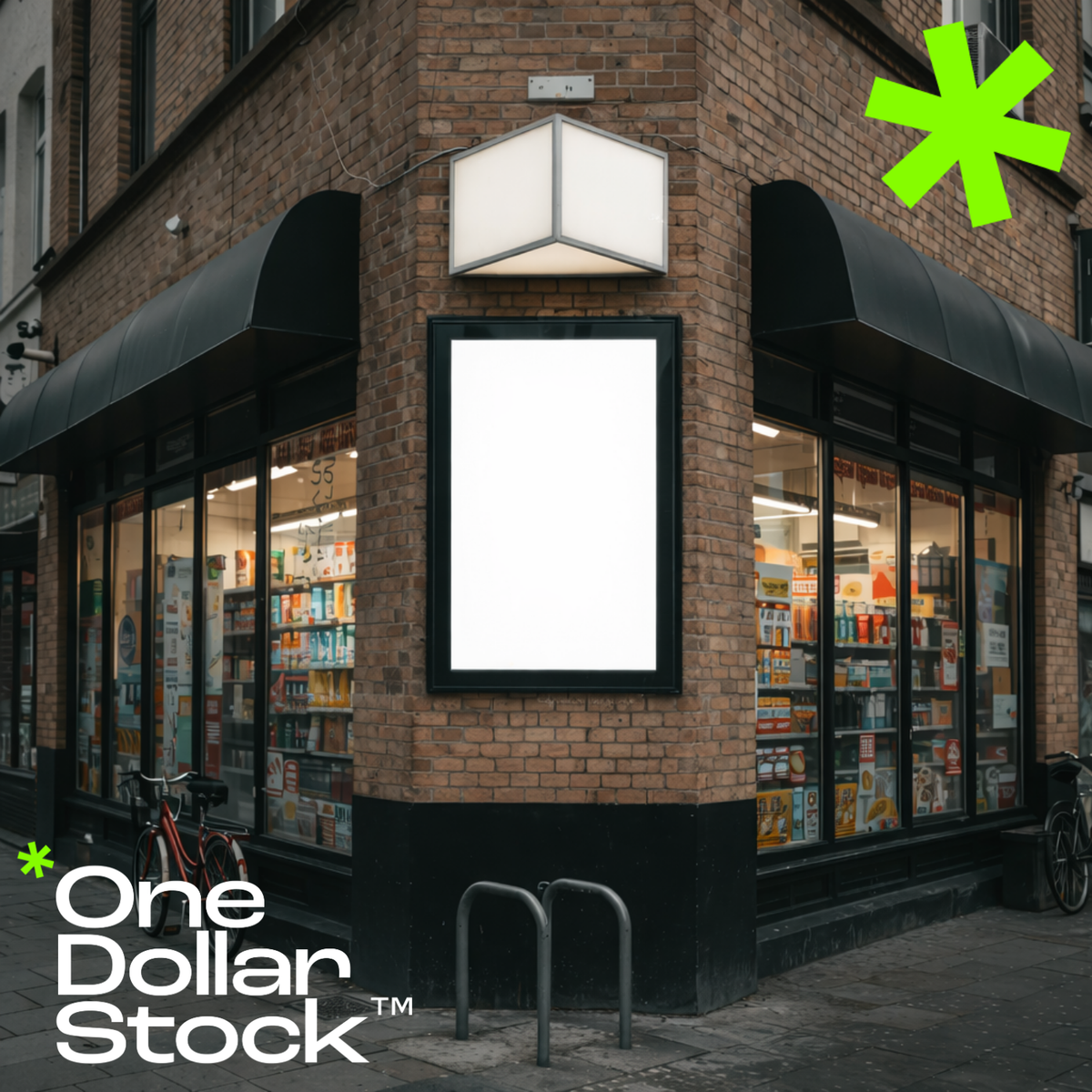
How to Run a Corner Shop and Survive: Family Stores vs. Corporate Giants
A practical guide for independent corner shop owners on how to survive and thrive when supermarket chains move into the neighborhood - covering local brand identity, stock strategy, customer experience, and digital presence.

The Anti-Photoshoot Playbook: When Stock Visuals Beat a Custom Shoot
A practical guide to building a flexible visual identity without expensive photoshoots. Learn when stock photography is the smarter, more scalable choice for your brand.

