


How to Use Lightroom Presets Without Making Photos Look Overedited
Lightroom presets can make photo editing faster, but they can also make images look heavy, artificial, or strangely similar if they are applied without adjustment. The difference usually comes down to workflow. A preset should be a starting point for editing, not the final decision. The best use of Lightroom presets is not to force every photo into one fixed look. It is to build a consistent direction faster: color mood, contrast, warmth, shadow depth, skin tone behavior, grain, clarity, and overall atmosphere. After that, the photo still needs human judgment. This guide explains how to use Lightroom presets without making photos look overedited. It is written for photographers, creators, designers, founders, social media teams, and ecommerce brands that want consistent images without losing natural detail. What Lightroom presets actually do A Lightroom preset is a saved group of editing settings. Depending on how it was built, it can adjust exposure, contrast, highlights, shadows, white balance, tone curve, color mix, color grading, sharpening, grain, vignette, calibration, and other editing controls. That sounds powerful, but it also explains why presets need care. A preset created for a soft indoor portrait may not work on a sunny travel photo. A preset designed for warm lifestyle photography may damage food color. A cinematic preset may look strong on one image and muddy on another. Professional editing is rarely about applying one look at full strength. It is about finding the right direction, then adapting that direction to the image in front of you. If you want ready-made editing foundations, you can browse Lightroom and Photoshop presets built for faster color grading and repeatable photo workflows. The preset is not the edit The biggest mistake is treating a preset as a finished edit. A preset can give the image a style, but it cannot fully understand the lighting, subject, skin tone, product color, background, or final use case. A good preset gives you a controlled starting point. After applying it, you still need to check exposure, white balance, contrast, color accuracy, highlights, shadows, and local details. This is where the image starts to look intentional instead of filtered. Working rule: use presets to create direction, then edit the photo back toward believability. If the viewer notices the preset before the subject, the edit is probably too strong. A simple preset workflow that keeps photos natural The safest way to use presets is to separate style from correction. First you choose the visual direction. Then you repair the technical issues. Then you adjust the strength of the look. This gives you consistency without flattening every image into the same treatment. Step 01 Prepare the photo Check exposure, crop, white balance, and obvious distractions before judging the preset. → Step 02 Apply the preset Choose a look that matches the lighting, subject, brand mood, and final use case. → Step 03 Reduce the damage Fix clipped highlights, blocked shadows, strange skin tones, and oversaturated colors. → Step 04 Export with purpose Adjust sharpness, crop, color, and file size for web, social media, store pages, or print. Start with exposure before judging the preset Many people apply a preset to a poorly exposed image and then blame the preset. In reality, presets respond differently depending on the starting photo. If the image is underexposed, the preset may make shadows muddy. If the image is too bright, it may destroy highlight detail. If white balance is wrong, the preset may exaggerate the color problem. Before choosing a preset, make a basic correction. Bring the exposure close to natural. Recover highlights if they are too strong. Open shadows if the image is too heavy. Correct obvious color temperature issues. Then apply the preset and judge the result. This does not mean you need a perfect manual edit first. It means the photo should be technically stable enough for the preset to behave predictably. Choose presets by lighting, not only by style Preset names can be misleading. A preset called “cinematic”, “moody”, “clean”, “warm”, or “editorial” may sound right, but the real question is whether it fits the lighting conditions of your photo. Soft indoor light, harsh sunlight, golden hour, cloudy weather, flash photography, studio portraits, food photos, and ecommerce product shots all react differently to the same preset. A good editing workflow starts by matching the preset to the light before matching it to the mood. Presets usually work better when The lighting is similar to the preset sample images. The photo has enough exposure detail to adjust. The color palette already supports the intended mood. The subject does not require strict color accuracy. Presets usually fail when The image is very underexposed or overexposed. Skin tones become orange, gray, red, or green. Product colors need to stay commercially accurate. The preset adds too much contrast, clarity, or saturation. How to reduce the overedited look The overedited look usually comes from too much contrast, too much saturation, crushed shadows, strong clarity, heavy grain, aggressive sharpening, unnatural skin tones, or a tone curve that forces every image into the same mood. If a preset looks too strong, do not remove it immediately. First reduce the most aggressive settings. Often, a few small corrections are enough to keep the style while making the image feel more natural. Contrast Saturation Clarity Grain Small edits matter Most preset problems do not require a full reset. Lowering contrast, reducing orange saturation, lifting shadows, or softening clarity can make the same preset look more professional. Pull back saturation Oversaturation is one of the fastest ways to make a preset look cheap. Pay close attention to reds, oranges, yellows, and greens. These colors often become too intense after a preset is applied, especially in skin, food, plants, clothing, and product photography. Protect skin tones Skin tones reveal bad editing quickly. If a preset makes skin look orange, gray, pink, green, or waxy, adjust the color mix and white balance. In portraits and lifestyle images, natural skin is more important than forcing the entire image into one trendy palette. Recover highlights and shadows Many presets add contrast by pushing highlights and shadows apart. This can look dramatic, but it can also remove detail. If white areas lose texture or dark areas become blocked, recover highlights and lift shadows until the image feels usable again. Use grain carefully Grain can make digital images feel more organic, but too much grain can damage product detail, skin texture, and clean brand visuals. Use it with intention. For ecommerce, beauty, food, and product photos, subtle grain usually works better than heavy film simulation. How to use presets for different types of photos A preset workflow should change depending on the image category. The same settings that improve a lifestyle portrait may damage a product image. The same warm look that works for travel content may make food look stale or skin look unnatural. Photo type Preset goal Main thing to check after applying Portraits and lifestyle Consistent mood, soft contrast, flattering color, natural skin. Skin tone, eye detail, shadow softness, orange and red saturation. Food photography Freshness, appetite appeal, clean contrast, accurate warmth. Yellow, orange, red, and green color balance. Food should still look real. Product photos Clean polish, controlled shadows, accurate brand and product color. Color accuracy, white balance, texture, material detail, clipping. Travel and landscapes Atmosphere, depth, sky control, natural color direction. Sky saturation, green tones, haze, highlight recovery, horizon contrast. Social media content Fast consistency across many images in a campaign or content series. Whether the preset still works when images are viewed together in a grid. Presets for brand consistency Presets are useful for brands because they help different images feel connected. A founder, ecommerce team, agency, or social media manager may work with photos from different shoots, sources, locations, and lighting conditions. A preset can bring those images closer together visually. The key is not to make every photo identical. A good brand editing system allows variety while keeping a recognizable tone. For example, a brand might use warm highlights, soft shadows, low saturation, and subtle grain across its visuals. The images can still differ, but the overall feeling stays consistent. This is where curated presets are more useful than random filters. They can support a repeatable editing language across campaigns, product launches, newsletters, thumbnails, blog images, and social media posts. When presets are not enough Presets are strong for photo style, but they do not solve every visual problem. Some images need retouching, local adjustments, masking, object cleanup, background correction, or manual color work. In those cases, the preset should come after the image is technically repaired or before a more detailed finishing pass. If you work across photo and video, you may also need a separate color workflow. Presets are usually associated with photo editing, while LUTs for video color grading are often used to create consistent looks in video projects. The logic is similar: apply the look, then adjust it to the footage or image instead of trusting it blindly. You can also combine presets with subtle visual effects when the project needs a more designed result. For example, photo overlays can add light leaks, atmosphere, texture, dust, or mood, but they should be used after the core edit is already working. A practical preset routine for better results Before editing a full batch, test your preset on three to five different images from the same shoot or project. Choose one bright image, one darker image, one close-up, one wider frame, and one image with important color detail. This small test will show whether the preset is flexible enough. After that, create your own adjusted version. Lower aggressive settings, correct color problems, save the edited version as a custom preset, and use that as your real working base. This is often better than applying the original preset at full strength to every image. Start with one photo and correct exposure before applying the preset. Apply the preset and check whether the mood fits the image. Fix skin tones, product colors, shadows, highlights, and saturation. Test the same adjusted look on several images from the same project. Save a custom version for that shoot, campaign, or brand style. Export according to the final use: website, store, social media, ad, or print. How to know when the edit is finished A finished preset edit should feel consistent, but not forced. The image should still have believable light, natural detail, readable color, and a clear subject. If the edit calls attention to itself before the photo does, it probably needs to be pulled back. One useful test is to step away from the image for a few minutes, then view it next to the unedited version and two or three other images from the same project. If the preset improves the image and still feels connected to the rest of the set, it is probably doing its job. The best preset workflow is not about speed alone. It is about repeatable control. Presets save time when they help you reach a strong direction faster, but the final quality still comes from knowing what to adjust after the preset is applied. A better way to think about presets Lightroom presets are most useful when they act like editing systems, not shortcuts. They help you start with a clear visual direction, keep a consistent mood across images, and speed up repetitive decisions. But they still need correction, restraint, and context. Use presets to get close faster. Then use your eye to make the image work. That balance is what keeps photos from looking overedited, generic, or filtered.

Dark Phone Wallpapers: Why They Work Better on OLED Screens
Dark phone wallpapers are popular for a simple reason: they make modern screens feel calmer, cleaner, and easier to use. On iPhone and Android, a dark background can reduce visual noise, support dark mode, make icons stand out, and create a more polished lock screen without making the phone feel overloaded. They are especially effective on OLED screens, where deep blacks, charcoal gradients, low-light photography, and muted abstract backgrounds can look rich without pushing too much brightness into the interface. But a good dark wallpaper is not just a black image. It still needs detail, contrast, composition, and enough structure to feel intentional. This guide explains why dark phone wallpapers work so well, how they behave on OLED screens, which styles are easiest to use daily, and how to choose a background that stays readable behind icons, widgets, notifications, and lock screen elements. Why dark phone wallpapers work so well A phone screen is not an empty frame. It is an interface. Every wallpaper has to sit behind app icons, widgets, folders, notification cards, the clock, search bars, and status indicators. Dark phone wallpapers often work better because they let those interface elements stay visually dominant. Bright wallpapers can look impressive in a preview, but they can also compete with app labels and widgets. A high-contrast beach photo, white interior, colorful street scene, or very bright landscape may make the screen feel busy after a few hours. Dark wallpapers usually create a quieter base. This is why dark backgrounds are common in productivity setups, premium app screenshots, dark mode interfaces, and minimalist home screens. They give the screen a clean foundation without making the phone look empty. Simple rule: a dark wallpaper should make your screen easier to read, not just darker. If icons, widgets, and lock screen text become harder to see, the image is not working. Why dark wallpapers are a natural fit for OLED screens OLED displays handle black and very dark areas differently from traditional backlit screens. Instead of lighting the whole screen from behind, each pixel can be controlled individually. This is one reason why deep blacks can look especially clean on many modern phones with OLED displays. For wallpapers, this creates a specific visual advantage. Dark backgrounds can feel deeper, smoother, and less aggressive than bright full-screen images. A black, graphite, navy, deep green, or dark brown wallpaper can blend naturally with dark mode and make the interface feel more unified. That does not mean every OLED wallpaper should be pure black. In many cases, subtle detail works better. A very dark gradient, a soft fabric texture, a low-light landscape, a shadowed architectural detail, or an abstract black-and-gray composition can look more refined than a flat black background. Dark wallpaper styles that work best on phones The best dark phone wallpaper depends on how you use your screen. A lock screen can handle a stronger image because there are fewer icons. A home screen usually needs more restraint because app icons and widgets sit on top of the background all day. Dark gradients Soft black, graphite, navy, green, or purple gradients are easy to use because they create depth without adding too much visual noise. Low-light photos Night streets, moody interiors, dark landscapes, shadows, and soft lighting can make the lock screen feel cinematic and personal. Abstract textures Dark glass, liquid shapes, grain, stone, fabric, metal, and blurred forms can add atmosphere while keeping the screen readable. Black wallpapers Black phone wallpapers are the simplest option. They are clean, minimal, and highly compatible with dark mode. A pure black background can make icons and widgets feel sharp, especially if you use a simple app layout. The downside is that pure black can sometimes feel too empty. If you want a more premium result, choose black wallpapers with very subtle texture, shadow, grain, reflection, or gradient. The difference is small, but it can make the screen feel designed rather than blank. Dark abstract wallpapers Dark abstract wallpapers are one of the safest choices for daily use. They do not depend on a specific subject, so they usually crop well across different screen sizes. They can also create a strong visual mood without interfering with icons. Soft abstract forms, dark color fields, smoky gradients, macro textures, glass effects, and blurred light can all work well. If you want more visual variation, explore abstract visuals and look for images with low visual noise and enough empty space. Dark nature wallpapers Dark nature wallpapers create a calmer screen without looking too technical. Forest shadows, mountains at dusk, dark water, mist, night skies, stones, leaves, and quiet landscapes can make the phone feel more grounded. They work best when the scene is not too detailed. A dark forest with too many branches can become visually messy behind icons. A simple horizon, soft fog, low-light water, or dark botanical close-up is usually easier to use. Dark luxury and editorial wallpapers Dark editorial wallpapers can make the phone feel more premium. These can include black marble, leather texture, architecture, studio lighting, minimal product-style compositions, shadowed interiors, or old money-inspired visual details. This style works well for people who want their phone to feel polished rather than decorative. The key is restraint. One strong texture, one refined object, or one controlled light source is usually enough. How to choose a dark wallpaper for your lock screen The lock screen is the best place for a more expressive dark wallpaper. There are fewer app icons, so the image can have a stronger focal point. Still, the clock, date, notifications, and widgets need space. When choosing a dark lock screen wallpaper, look at the top third of the image first. If the clock sits over a busy face, object, text, bright reflection, or detailed pattern, the composition may not work. A clean upper area usually performs better. Strong lock screen options include dark landscapes with open sky, shadowed architecture, low-light portraits without busy backgrounds, abstract gradients, black marble, night roads, cinematic interiors, and minimal dark textures. How to choose a dark wallpaper for your home screen The home screen is more demanding than the lock screen because it has more interface elements. App icons, folders, widgets, and labels need a calm background. A dark home screen wallpaper should support readability first and mood second. The safest choices are dark gradients, soft textures, low-contrast abstract images, blurred backgrounds, and simple dark surfaces. If the wallpaper has a subject, keep it away from the most crowded icon areas. If your home screen has many widgets, avoid detailed images. Widgets already add blocks, text, numbers, weather data, calendars, and controls. A busy wallpaper behind them makes the entire screen harder to scan. Screen setup Best dark wallpaper type Why it works Minimal home screen Black gradient, charcoal texture, dark abstract image Supports icons without making the screen feel empty or harsh. Widget-heavy layout Low-contrast background with large quiet areas Keeps widgets readable and avoids visual clutter behind cards. Dark mode interface Deep black, graphite, navy, dark green, or muted brown Creates consistency between wallpaper, apps, settings, and system UI. Expressive lock screen Low-light landscape, dark editorial photo, cinematic background Adds personality while leaving space for the clock and notifications. Color choices that make dark wallpapers easier to use Dark does not always mean black. Many of the best dark phone wallpapers use controlled color rather than total darkness. Deep navy, forest green, graphite gray, dark brown, burgundy, purple-black, and muted blue can all feel premium while still supporting readability. The most important factor is contrast. If the wallpaper has bright highlights directly behind white app labels, the labels may disappear. If the wallpaper is dark but visually noisy, icons may still become hard to read. A useful dark wallpaper needs contrast in the right places, not everywhere. For everyday use, choose darker backgrounds with soft transitions. Hard patterns, bright edges, high-detail photos, and sharp reflections are better for lock screens than home screens. Common mistakes with dark phone wallpapers Dark wallpapers are easy to get wrong because they look good in a clean preview. The real test happens when your phone interface appears over the image. A wallpaper can be dark and still be distracting. Using an image that is too flat A plain black wallpaper is clean, but it can feel empty. If that is the goal, it works. If you want something more polished, choose a dark image with subtle grain, shadow, gradient, or texture. Choosing too much contrast Bright neon details, sharp light streaks, and strong reflections can look impressive, but they often fight app icons and widgets. Keep strong highlights away from the busiest areas of your screen. Ignoring the crop Dark images can lose their subject quickly when cropped. If the main detail is near the edge, your phone may cut it off. Vertical compositions are usually safer for mobile backgrounds. Using text-based wallpapers Text on wallpapers often clashes with the phone interface. It can sit behind the clock, become partly hidden by icons, or compete with notifications. If you want a clean daily setup, avoid wallpapers with large words or slogans. Quick checklist for dark phone wallpapers The wallpaper stays readable behind app icons and widgets. The top area leaves enough room for the lock screen clock. The image has subtle depth, not just random darkness. Bright details do not sit behind important interface elements. The image crops well on a vertical phone screen. The color palette works with dark mode and your app icons. How to match dark wallpapers with iPhone and Android iPhone and Android handle wallpapers differently, but the practical rules are similar. You need a strong vertical crop, good readability, and enough calm space for interface elements. Dark wallpapers for iPhone On iPhone, the lock screen clock and widgets make the upper part of the image especially important. If you want a dark wallpaper for iPhone, choose images with a quieter top area and stronger visual detail toward the middle or lower part of the frame. Dark gradients, low-light landscapes, abstract images, and clean editorial photos often work well. If you use multiple focus modes, consider using different dark wallpapers for different contexts: one calm background for work, one more expressive image for personal use, and one very minimal option for night mode. Dark wallpapers for Android Android users often have more control over launchers, icon packs, widgets, and grid layouts. This makes dark wallpapers especially flexible. A dark background can support custom icon themes, monochrome layouts, and widget-heavy screens without making the interface look crowded. If you use a custom launcher, match the wallpaper to your icon style. Minimal icons work well with soft black gradients. Colorful icons need a quieter background. Large widgets need negative space and low contrast behind the widget area. How to build a consistent dark screen style A dark wallpaper works best when it feels connected to the rest of your phone setup. That does not mean everything has to be black. It means the wallpaper, icons, widgets, and app layout should feel like one visual system. 1 Pick a base tone Start with black, graphite, navy, dark green, brown, or purple-black as the dominant background tone. 2 Control contrast Keep bright details away from app labels, widgets, and clock areas so the interface remains easy to read. 3 Match your icons Use a wallpaper that supports your icon style instead of competing with it for attention. 4 Test daily use Keep the wallpaper for a full day and check whether it still feels calm, readable, and visually useful. If you are comparing wallpaper quality, size, and cropping before choosing a dark background, the guide to 4K phone wallpaper size and resolution explains the technical side in more detail. Where to find better dark phone wallpapers Good dark wallpapers are not only about mood. They need clean composition, strong resolution, subtle detail, and enough negative space for everyday use. Random downloads often look fine in preview but become messy once they sit behind icons and widgets. On OneDollarStock, you can browse 4K phone wallpapers for mobile screens and use them as lock screens, home screen backgrounds, design references, moodboard material, or visual assets for creative projects. The best dark wallpaper is often one that does more than look dark: it creates a screen that feels easier to use. Conclusions Dark phone wallpapers work because they respect the way people actually use their phones. They reduce visual noise, support dark mode, improve readability, and make OLED screens feel deeper and more refined. The strongest dark wallpapers are not always the blackest ones. They are the ones with the right balance of darkness, detail, contrast, and composition. Choose a background that works with your screen, not against it, and your phone will feel cleaner every time you unlock it.
4K Phone Wallpapers: Size, Resolution and Style Guide for iPhone and Android
A practical guide to choosing 4K phone wallpapers for iPhone and Android, including resolution, cropping, readability, OLED screens, style and visual composition.
7 Pet Store Content Ideas Using Stock Images for Social Media and Ads
Pet store content works best when it feels useful before it feels promotional. People do not follow a pet shop only to see discounts. They follow it for product tips, seasonal reminders, cute pet moments, care advice, trust signals, and ideas that make life with animals feel easier. That is why stock images can be useful for pet stores, especially when the visual plan is more specific than “post a dog photo.” A good image can support a dog food campaign, a cat-care carousel, a grooming reminder, a seasonal sale, a local community post, or a paid ad for pet accessories. This article shows seven pet store content ideas using stock images from OneDollarStock. Each example is chosen for a different marketing role, so the final mix can help a pet shop build trust, educate customers, promote products, and create more consistent social media content. Why pet stores need more than cute animal photos Cute animal photos are useful, but they are not a full content strategy. A pet store needs different types of visuals for different jobs. Some images should create warmth. Some should explain a product. Some should support seasonal campaigns. Some should make the brand feel professional and safe. The strongest pet store content usually combines emotion with practical context. A dog running outdoors can support active lifestyle products. A cozy cat image can work for indoor care. A seasonal pet photo can support holiday bundles. A human-and-pet image can make the shop feel more trustworthy and local. If you are building a larger content library, start with broad animal images, then add lifestyle photos, seasonal pet visuals, human interaction scenes, and product-friendly backgrounds that can be reused across posts, ads, newsletters, and store banners. Practical rule: choose pet store images by marketing purpose first, not by cuteness alone. A good content mix should help customers feel something, understand something, and take the next step. A 7-image content mix for pet stores A balanced pet store content plan should include more than one visual mood. The goal is not to use all seven images in one campaign. The goal is to create a repeatable library of content angles that can support different offers, seasons, and customer questions. Use this simple visual mix: 1 Friendly brand emotion 2 Active dog lifestyle 3 Human trust and advice 4 Cozy cat care 5 Close-up educational detail 6 Seasonal cat campaign 7 Holiday gift promotion 1 Friendly dog image for warm brand posts Best for: brand warmth, spring campaigns, cheerful pet content A happy dog holding colorful flowers is the kind of image that makes a pet store feel friendly before any product is mentioned. It works well when the goal is to make the brand feel approachable, positive, and emotionally connected to everyday pet owners. This type of image is especially useful for light social posts, community messages, spring promotions, adoption-related content, pet celebration posts, and friendly “new arrivals” announcements. Use it for: Instagram and Facebook posts about pet happiness. Spring offers for dog treats, toys, shampoos, or accessories. Email headers with a warm, optimistic pet-store mood. View this dog image on OneDollarStock 2 Active dog lifestyle image for outdoor products Best for: dog walking, leashes, outdoor care, active pet owners Pet stores often need visuals that show the result of a product, not only the product itself. A person running with a dog communicates movement, companionship, routine, freedom, and outdoor activity. That makes it useful for dog accessories, active dog treats, harnesses, leashes, paw protection, and travel-friendly pet products. This kind of image is also strong for paid ads because it quickly tells a lifestyle story. The customer does not just see a product category. They see the life they want with their dog. Use it for: Dog walking accessory campaigns. Outdoor pet care blog posts or social carousels. Ads for active dogs, beach walks, travel, or weekend pet routines. View this dog lifestyle image on OneDollarStock 3 Human-and-pet image for trust-building content Best for: advice posts, local trust, customer education Pet store marketing should not only show animals. It should also show the relationship between people and pets. A human-and-pet image can make a post feel more conversational, which is useful for advice content, local shop messaging, service announcements, and educational posts. This visual works well when the pet store wants to sound helpful rather than sales-driven. It can support posts about choosing the right dog food, preparing for a new puppy, understanding pet behavior, or asking staff for product recommendations. Use it for: “Ask our team” advice posts. Customer service and consultation messages. Local pet store brand storytelling. View this dachshund lifestyle image on OneDollarStock 4 Cozy cat image for indoor care content Best for: cat comfort, bedding, indoor routines, gentle care Cat content often works best when it feels calm, safe, and slightly intimate. A black cat peeking out from a white blanket creates an instant feeling of comfort and curiosity. It is a good match for indoor cat care, bedding, litter, grooming, calming products, and cold-weather pet content. For pet stores, this image can also support educational content about creating a more comfortable home environment for cats. It feels less like an ad and more like a relatable pet moment. Use it for: Cat bedding, blankets, and comfort product promotions. Indoor cat care tips and cozy home routines. Soft social media posts for cat owners. View this cozy cat image on OneDollarStock 5 Close-up cat detail for educational posts Best for: grooming, paw care, sensitive pets, product education Not every pet store visual needs to show a full animal. Close-up images are valuable because they help create focused educational content. A detailed cat image can work for grooming tips, paw care, fur care, nail trimming, sensitive skin, comfort products, or posts that explain why certain pet products matter. This type of visual is useful for carousel posts because it leaves room for text overlays and practical advice. It can also work as a softer background for blog headers and newsletter sections. Use it for: Cat grooming education and care reminders. Carousel posts about paws, fur, whiskers, or comfort. Background visuals for product tips and newsletters. View this cat close-up image on OneDollarStock 6 Seasonal cat image for holiday campaigns Best for: Christmas posts, holiday safety tips, seasonal offers Seasonal content is important for pet stores because customers buy differently around holidays. A cat near a Christmas tree can support product promotions, gift guides, seasonal safety reminders, and cozy holiday messaging without needing a hard-sell approach. This image is useful because it gives the store a holiday mood while still keeping the pet as the emotional center. It can work for Christmas cat toys, festive collars, treats, cozy beds, scratchers, and educational posts about holiday safety for cats. Use it for: Holiday cat gift guides and seasonal promotions. Christmas tree safety tips for cat owners. Warm December social posts and email banners. View this Christmas cat image on OneDollarStock 7 Holiday dog image for gift-driven campaigns Best for: gift guides, festive bundles, paid holiday ads Gift-focused pet store campaigns need images that show the emotional reason behind the purchase. A dog wearing a red bow tie during a gift exchange makes the campaign feel warm, festive, and family-oriented. It can support holiday bundles without showing specific products directly. This kind of image is especially useful for paid social because it communicates the campaign angle quickly. It says “pets are part of the celebration” before the user reads the caption. Use it for: Christmas gift bundles for dog owners. Paid ads for toys, treats, collars, and pet accessories. Holiday newsletters, website banners, and seasonal landing sections. View this holiday dog image on OneDollarStock How to turn these images into a real pet store content plan The most practical way to use these images is to assign each one to a different content role. That helps the pet store avoid posting the same kind of cute animal content every week. A stronger plan mixes emotion, advice, product context, seasonal timing, and trust-building. For organic social media Use friendly dog and cozy cat images for regular posts, customer education, care reminders, and community content. These visuals are less aggressive and can make the pet store feel active without turning every post into an ad. For ads and promotions Use active lifestyle and holiday gift images when the post has a clearer commercial goal. They make the benefit easier to understand: more outdoor fun, better care, seasonal gifts, or a more comfortable life with pets. If you plan to use stock images for commercial pet store campaigns, check the license type before publishing. OneDollarStock explains its image usage options on the licenses page, including personal, commercial, creator commerce, and larger-scale use cases. What pet stores should avoid when choosing images The biggest mistake is choosing images only because they are cute. Cute helps, but marketing images also need a job. Before using any pet image, ask what the post is supposed to do: educate, sell, remind, entertain, build trust, or support a seasonal offer. Pet stores should also avoid visuals that feel too generic for the message. A random puppy image may get attention, but it may not help sell cat litter, explain grooming, promote a leash, or introduce a holiday gift guide. The closer the image is to the content angle, the stronger the post becomes. Do not use outdoor dog visuals for indoor cat-care topics. Do not use busy images when the post needs text overlay. Do not use seasonal visuals outside the right campaign window. Do not choose images that feel emotionally disconnected from the product. Do not use only animal close-ups if the brand also needs trust and lifestyle context. The useful takeaway for pet store marketing A pet store does not need hundreds of random visuals to create better content. It needs a small, strategic image mix: warm brand images, lifestyle scenes, trust-building human moments, cozy cat visuals, educational close-ups, and seasonal campaign photos. That kind of visual system makes content easier to plan and easier for customers to understand. One image can support a product post. Another can support a care tip. Another can carry a seasonal campaign. Together, they give the pet store a more professional and consistent presence across social media, ads, email, and website content. Build a better pet store content library Start with a clear purpose for each visual. Choose images that support real content ideas, not just generic pet aesthetics. Then connect every post to a useful message: care, comfort, outdoor activity, product education, seasonal gifting, or local trust. For more options, browse animal stock images and people lifestyle images on OneDollarStock to build a larger pet store content library for social media, ads, newsletters, and local marketing campaigns.
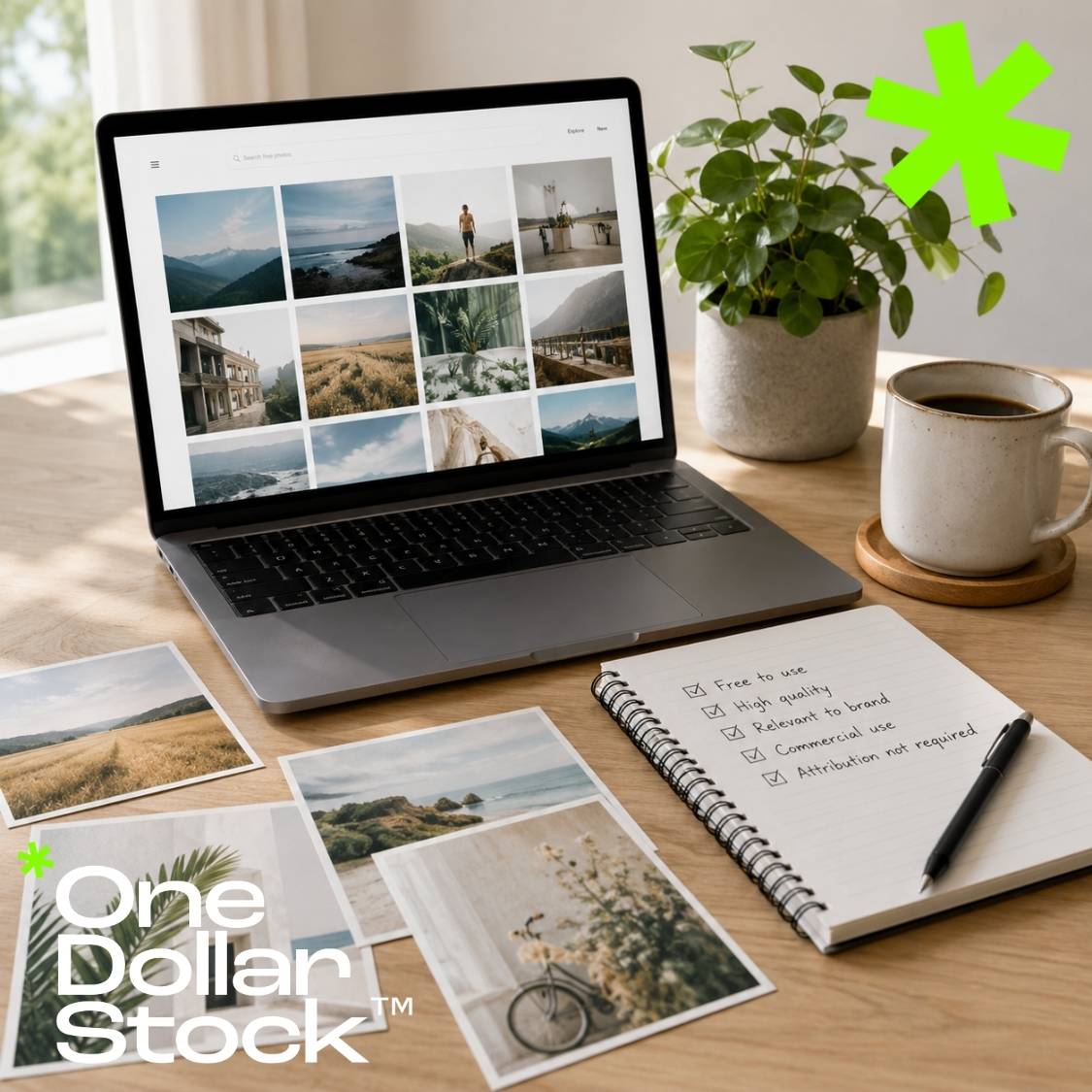
Free Stock Photos for Commercial Use: What to Check Before You Download
Free stock photos can be useful, especially when you are building a quick landing page, testing an idea, creating social media posts, preparing a presentation, or working with a small budget. The problem is that “free” does not always mean simple, safe, or suitable for commercial use. If you want to use free stock photos for a business website, ad campaign, client project, ecommerce store, newsletter, product mockup, or social media content, you need to check more than image quality. You also need to understand licensing, model rights, brand safety, file quality, originality, and whether the image can actually support the project you are building. This guide explains what to check before you download free stock photos for commercial use, when free images are enough, when paid assets are safer, and how to avoid the most common mistakes that make visual content look generic or risky. In this article: What commercial use means Free stock photo checklist Common risks with free stock photos When free images are enough When paid assets are better How to choose better commercial visuals What commercial use means Commercial use usually means using an image in a context connected to business, promotion, sales, advertising, monetization, client work, or brand communication. This can include a website hero image, paid social ad, product page, email campaign, pitch deck, digital download, printed flyer, YouTube thumbnail, or post for a company profile. The important point is that commercial use is broader than direct resale. You do not need to sell the image itself for your usage to be commercial. If the image supports a business goal, promotes a product, attracts customers, builds brand identity, or appears in client work, you should treat it as commercial usage and check the license carefully. A free stock photo can be free to download and still have limits. Always check whether the license allows commercial use, whether attribution is required, whether people or private property appear in the image, and whether the image can be used in advertising, templates, products, or client projects. Free stock photo checklist before you download Before using a free stock photo in a commercial project, go through a simple checklist. This protects your brand, saves time later, and helps you choose visuals that look intentional rather than randomly downloaded. What to check Why it matters What to look for Commercial use permission The image may be free but not suitable for every business context. A clear license that allows business, marketing, website, social media, or client use. Attribution rules Some free images require credit, which may not fit ads, landing pages, or product visuals. Check whether attribution is optional, required, or restricted by placement. People and likeness rights A person appearing in an image may involve model release or publicity rights. Look for clear usage information when people are recognizable. Logos and trademarks Visible brands can create legal or brand-safety issues. Avoid images with visible logos, labels, trademarked packaging, or branded products. Private property Buildings, interiors, artworks, vehicles, and designed objects may have usage restrictions. Use extra caution with famous landmarks, museums, galleries, hotels, and private interiors. Image quality Low-resolution or compressed images can make a brand look cheap. Choose high-resolution files with clean detail, natural color, and enough cropping flexibility. Visual originality Overused free images can appear across many unrelated websites. Search for images that feel specific, modern, and less obviously stock-like. Common risks with free stock photos 1. The image is legally free, but not risk-free Free licenses are often generous, but they do not automatically solve every commercial-use problem. An image may be offered for free by the platform, but that does not always mean every person, object, location, artwork, trademark, or property inside the image is cleared for every possible use. This matters most in advertising, paid campaigns, ecommerce, product packaging, client work, and anything that creates a direct connection between the image and a brand. If a recognizable person appears to endorse a product, or if a private property becomes part of a commercial campaign, the risk profile changes. 2. The image has been used everywhere One of the biggest practical problems with free stock photos is repetition. The same image can appear on dozens or hundreds of websites, blog posts, ads, presentations, and social profiles. Even if the license is fine, the visual may make your brand feel generic. This is especially damaging for startups, agencies, ecommerce brands, coaches, SaaS products, and creative businesses. If your hero image looks like something users have already seen on five other websites, the page can lose credibility before the copy has a chance to work. 3. The style does not match the brand Free stock libraries often push users toward whatever is easiest to find. The image may be technically good, but it may not match the brand’s tone, audience, colors, product category, or level of professionalism. For example, a financial services website needs a very different visual tone from a lifestyle brand, a children’s product, a design studio, or a fitness app. If the image style is wrong, the page can feel disconnected even if the photo itself is attractive. 4. The photo is hard to adapt A strong commercial image should be flexible. You may need to crop it for a website hero, social post, email banner, ad creative, thumbnail, presentation slide, or product mockup. Many free images look good in their original ratio but fall apart when cropped. Look for images with negative space, clean backgrounds, strong subject separation, and enough resolution to support multiple formats. If an image only works in one exact crop, it may slow down your workflow. 5. The visual lowers perceived value Commercial visuals influence how people judge a product, service, or brand. A weak image can make a premium offer feel cheaper. A generic image can make a serious company feel less credible. A low-quality image can make a polished page feel unfinished. This does not mean every brand needs expensive photography. It means every image should support the message. Good stock assets save time because they look intentional from the start. When free stock photos are enough Free stock photos can work well when the visual is not the main driver of conversion, the project is low-risk, or you are still testing an idea. They are useful for drafts, internal presentations, early mockups, moodboards, simple blog posts, and quick social content. Free images are also useful when you need generic visual support rather than a distinctive brand asset. For example, a simple background texture, abstract image, nature photo, or placeholder visual can be enough for an early version of a page. Good use cases for free stock photos Early landing page drafts Internal moodboards and concept boards Blog posts with low commercial risk Simple social media posts Presentation backgrounds Non-branded design experiments Testing visual direction before buying premium assets If you are looking for accessible assets to start with, browse the free collection on OneDollarStock. It includes free creative assets that can help you test styles, build quick concepts, and explore different visual directions before scaling a campaign or brand system. Start with free creative assets Explore free images, graphics, and visual resources on OneDollarStock. Use them to test ideas, build moodboards, create quick concepts, and start projects without adding visual cost at the beginning. Browse free assets → View licenses → When paid assets are better Paid assets are usually a better choice when the image is part of a real business outcome. If the visual appears on a paid ad, homepage, pricing page, ecommerce product page, lead magnet, client website, commercial presentation, print material, or template you deliver to someone else, the image should be chosen more carefully. Paid assets are not only about resolution. They are about confidence, consistency, better curation, clearer commercial use cases, and a more professional result. For many teams, paying for a stronger asset is cheaper than wasting hours trying to make a weak free image work. Paid assets make more sense when: The visual appears in a paid campaign The image is used for a client project The asset supports a product, offer, or landing page The brand needs a more premium look You need visual consistency across many materials You want to avoid overused images You need assets beyond simple photos, such as mockups, presets, LUTs, textures, overlays, or templates For brand, marketing, ecommerce, and creator workflows, the best option is often not a single photo. It is a full creative asset system: images, graphics, mockups, textures, presets, LUTs, overlays, and templates that work together across campaigns. OneDollarStock is built around that broader workflow. Instead of only downloading one image, you can build a more complete visual system for websites, ads, social media, product pages, presentations, and creative projects. How to choose better commercial visuals Choose images with a clear job Before downloading any image, decide what the image needs to do. Is it supposed to build trust, explain a product, create emotion, support a blog post, make an ad more clickable, or make a landing page feel more premium? A visual without a job is decoration. A visual with a clear job becomes part of the message. Look for useful negative space Negative space is one of the most useful traits in commercial visuals. It gives you room for headlines, buttons, product mockups, overlays, and mobile cropping. Images with clean space are easier to adapt across ads, banners, slides, thumbnails, and web sections. Avoid obvious stock-photo behavior Overly staged smiles, unrealistic office scenes, generic handshakes, fake-looking teamwork, and exaggerated expressions can make a brand look less credible. Modern commercial visuals usually work better when they feel natural, specific, editorial, or product-focused. Check whether the image fits your audience A good commercial image should feel relevant to the person you want to reach. A founder, designer, ecommerce manager, parent, fitness customer, creative director, or SaaS buyer will respond to different visual cues. The more closely the image matches the audience and use case, the better it performs. Think beyond the first placement If you are choosing an image for a serious project, ask whether it can be reused across related materials. Can it support the landing page, social posts, email header, presentation, and ad creative? A versatile image saves time because it can become part of a small visual system. Free vs paid stock photos: practical comparison Free and paid stock photos are not enemies. They solve different problems. Free images are good for speed, testing, and low-risk projects. Paid assets are better when visuals need to support brand quality, commercial outcomes, client work, or long-term campaigns. Use case Free stock photos Paid creative assets Early idea testing Good choice for drafts and quick concepts. Useful when you already know the direction. Client work Requires careful license review and quality control. Usually safer and more professional. Paid advertising Possible, but risky if the image is generic or overused. Better for campaigns where creative quality affects conversion. Website hero sections Can work if the image is high quality and brand-aligned. Often better for first impressions and premium positioning. Brand consistency Harder to maintain across many materials. Easier when assets come from curated collections or bundles. Speed Fast to start, but can take time to find something distinctive. Faster when you need usable, polished assets immediately. Final rule: free is fine when the risk is low Free stock photos are useful when the stakes are low, the license is clear, the image is high quality, and the visual does not need to carry a major business outcome. They are a practical starting point for testing ideas and creating early-stage content. For commercial projects that need to look polished, trustworthy, and distinctive, it is worth being more selective. The right asset can improve a landing page, make a social ad feel stronger, help a client presentation look more professional, or give a brand a clearer visual identity. The smartest workflow is simple: use free assets when they are enough, move to paid assets when visual quality, commercial confidence, or brand consistency matters, and always check the license before using any image in a business context. Build better projects with clearer visual assets Explore free and premium creative assets on OneDollarStock, including images, graphics, mockups, textures, overlays, presets, LUTs, bundles, and website templates for commercial creative work. Browse free assets → Explore collections → View plans →

LUTs vs Presets: What’s the Difference?
Creative asset bundles are one of the fastest ways to build better visual projects without starting from zero every time. Instead of searching for one image, one texture, one mockup, one overlay, one preset, or one background separately, a bundle gives you a ready-made collection of assets that already belong to the same creative direction. For designers, marketers, founders, ecommerce teams, agencies, and content creators, this can save hours of repetitive work. A good creative asset bundle helps you move from idea to execution faster, especially when you need visuals for websites, social media posts, ad campaigns, product pages, pitch decks, client presentations, thumbnails, digital products, or brand concepts. The real value of a bundle is not only the number of files inside. The value is speed, consistency, flexibility, and the ability to build a complete visual system from one source. A strong creative bundle should feel like a useful toolkit, not a random folder of files. The best bundles give you assets that can work together across multiple formats, channels, and campaign needs. What is a creative asset bundle? A creative asset bundle is a collection of digital files grouped around a specific use case, style, product type, theme, or workflow. It can include images, graphics, mockups, textures, overlays, LUTs, presets, templates, backgrounds, patterns, and other ready-to-use files for visual projects. Some bundles are narrow and specific, such as a pack of product mockups for ecommerce packaging. Others are broader, such as a large visual bundle with images, textures, overlays, and design assets for social media or branding. The best choice depends on what you need to create. A bundle is especially useful when you need visual consistency. Instead of combining unrelated files from many different sources, you can work from a curated set of assets that share a similar mood, quality level, color direction, or creative purpose. Why creative asset bundles save time The biggest hidden cost in creative work is not always the price of the asset. It is the time spent searching, comparing, downloading, testing, rejecting, resizing, adapting, and trying to make unrelated visuals work together. Bundles reduce that friction. They give you a larger creative starting point, which means you can test more directions, build more variations, and complete projects faster without interrupting the workflow every few minutes to look for another file. 1 Less searching, more building Instead of opening multiple marketplaces and searching for every visual separately, you start with a ready collection. This is useful when you need to produce many assets quickly, such as ad variations, social posts, landing page visuals, or product presentation materials. 2 More consistent visual direction A bundle can help your project feel more coherent. When images, textures, mockups, overlays, and templates share a similar style, the final result looks more intentional and less patched together. 3 Faster creative testing Bundles are useful when you want to compare styles quickly. You can test several backgrounds, mockups, textures, or image directions before deciding which look fits the campaign, product, or brand. 4 Better value per project When one bundle can support a website, social posts, ads, email graphics, thumbnails, product pages, and presentations, the cost per final creative output becomes much lower. What can be included in a creative asset bundle? Creative bundles can be built around different asset types. Some are focused on photography, others on mockups for product and brand presentation, design elements, editing tools, or website templates. The strongest bundles are usually organized around a practical outcome: build a campaign, present a product, create a brand look, edit a photo set, design a landing page, or produce content faster. Asset type What it helps with Common use cases Images Visual storytelling, website sections, campaigns, editorial content, and social posts. Landing pages, blog covers, ads, moodboards, presentations, thumbnails. Graphics Decorative visuals, digital compositions, backgrounds, and creative layouts. Post designs, banners, digital products, brand visuals, campaign graphics. Mockups Showing designs in realistic product, branding, packaging, apparel, or device contexts. Portfolios, client presentations, ecommerce previews, branding concepts. Textures Adding depth, material detail, atmosphere, and tactile visual quality. Posters, packaging, backgrounds, web sections, editorial layouts. Overlays Adding light leaks, film effects, dust, grain, shadows, frames, or atmospheric details. Photo edits, social visuals, music covers, thumbnails, campaign images. LUTs and presets Creating a consistent color style across videos and photos. Reels, YouTube videos, product clips, photo sets, social media feeds. Website templates Speeding up web design and layout production. Landing pages, portfolios, startup pages, product pages, service websites. Bundles vs single assets: which one is better? Single assets are useful when you know exactly what you need. A single image, mockup, texture, or preset can solve a specific problem quickly. But bundles are usually better when you are building a full project, testing multiple directions, or creating content across many channels. Single assets are best when the need is precise Use a single asset when you need one clear file: one hero image, one product mockup, one background texture, one social media visual, or one preset style. This keeps the workflow simple and direct. Use bundles when the project has many outputs. If you need a landing page, ads, social posts, thumbnails, email graphics, and presentation visuals, a bundle gives you more material to build a connected system. The choice is not only about price. It is about workflow. If you are creating one visual, a single asset may be enough. If you are creating a campaign or brand system, a bundle usually gives you more creative freedom. Who should use creative asset bundles? Creative asset bundles are useful for anyone who regularly produces visual work. They are especially valuable when time, consistency, and output volume matter. Designers Use bundles to speed up layouts, test visual directions, build client concepts, create presentations, and prepare portfolio-ready mockups. Marketing teams Use bundles to create campaign variations, ad visuals, social content, email graphics, landing page sections, and promotional materials faster. Founders Use bundles when building early-stage websites, pitch decks, product pages, launch materials, and brand assets without hiring a full creative team. Agencies Use bundles to produce more concepts, move faster in client work, and keep campaign materials visually aligned across multiple deliverables. Ecommerce teams Use bundles for product presentations, mockups, seasonal campaigns, social media ads, email visuals, and storefront graphics. Creators Use bundles to create thumbnails, reels, posts, covers, digital products, editing styles, and branded visual content more efficiently. How to choose a good creative asset bundle Not every bundle is worth downloading. A large file count does not automatically mean better value. A good bundle should be usable, organized, visually consistent, and relevant to the kind of work you actually produce. Before choosing a bundle, look at the asset quality, file types, licensing, variety, preview images, and how many real projects the bundle can support. The best bundles are practical enough for immediate use but flexible enough to support different creative directions. A practical bundle checklist Check the use case. Is the bundle for branding, social media, websites, product presentation, photo editing, video editing, or general creative work? Review the file types. Make sure the files match your tools and workflow, such as JPG, PNG, PSD, XMP, CUBE, HTML, or template files. Look for visual consistency. The assets should feel like they can belong to the same project or campaign. Check commercial usability. If you plan to use the assets in business or client work, make sure the license supports your intended use. Think beyond one project. A strong bundle should be useful across multiple formats, not only one isolated design. Best use cases for creative asset bundles Bundles work best when you need more than one finished visual. They are ideal for projects where the same visual style needs to appear across several placements. Website launches A website launch rarely needs only one image. It may need hero visuals, section backgrounds, product previews, blog graphics, icons, mockups, social sharing images, and presentation visuals. A bundle can help keep those assets aligned. Social media campaigns Social campaigns need volume. A bundle can support multiple post variations, stories, reels covers, carousels, promotional graphics, and seasonal content without forcing the team to search from scratch every time. Brand presentations Pitch decks, client presentations, and brand proposals benefit from visual consistency. A bundle can help create a polished presentation with connected imagery, mockups, textures, and backgrounds. Ecommerce product launches Ecommerce teams often need product images, lifestyle visuals, banners, ads, packaging mockups, and storefront graphics. Bundles can speed up the launch process and make the visual system feel more complete. Creator workflows Creators need repeatable visual systems for thumbnails, reels, posts, covers, templates, and product previews. Bundles make it easier to publish consistently without redesigning every asset from zero. How creative bundles support brand consistency Brand consistency does not mean every visual should look identical. It means that the images, graphics, colors, textures, editing styles, and layouts should feel connected. This is where bundles become useful. A curated bundle can give your project a shared visual language. For example, a brand campaign might use warm lifestyle images, high-quality texture assets, clean mockups, and subtle overlays. A tech startup might use minimal backgrounds, product mockups, clean website templates, and a restrained visual palette. A creator might combine presets, overlays, and cover images to keep content recognizable across platforms. The more places your brand appears, the more useful this becomes. Websites, ads, emails, social posts, thumbnails, pitch decks, and product pages should not feel like they were made by six unrelated teams. Where OneDollarStock fits into this workflow OneDollarStock is built for creators, founders, marketers, agencies, designers, and ecommerce teams that need practical visual assets for real projects. Instead of only working with single stock images, you can build a broader creative workflow using images, graphics, mockups, textures, overlays, LUTs, presets, bundles, and website templates. That makes bundles especially useful. They help you build campaigns, visual systems, product presentations, web sections, social media content, and client materials faster. You can start with creative asset bundles, then expand into related categories such as mockups, textures, LUTs, and presets when the project needs more specific assets. Useful OneDollarStock collections for bundle-based workflows Start with the asset category that matches your current project, then combine related assets when you need a larger visual system. Browse creative asset bundles Browse mockups for product and brand presentation Browse textures for backgrounds and design depth Browse LUTs for video color grading Browse presets for photo editing Final takeaway: bundles are not just cheaper files, they are faster workflows Creative asset bundles are useful because they reduce friction. They help you search less, test faster, create more variations, and keep your visual work more consistent across different formats. Single assets are still useful when you need one specific file. But when you are building a campaign, a brand system, a launch, a social content set, a product presentation, or a complete website, bundles usually give you a stronger starting point. The best bundle is not the one with the biggest number of files. It is the one that helps you finish better creative work faster.
Best Phone Wallpaper Ideas for iPhone and Android in 2026
Choosing a phone wallpaper looks simple until you realize how often you see it. Your lock screen, home screen, notifications, widgets, icons, and everyday phone habits all sit on top of one visual background. The best phone wallpaper is not just pretty. It is readable, personal, well-composed, and matched to how you use your device. This guide covers the best phone wallpaper ideas for iPhone and Android in 2026, from minimalist dark backgrounds and nature scenes to aesthetic photography, old money visuals, abstract graphics, product-style compositions, and wallpapers designed for better focus. In this article: What makes a good phone wallpaper? Best phone wallpaper ideas for 2026 iPhone vs Android wallpaper tips Wallpaper styles by use case Common phone wallpaper mistakes Where to find high-quality phone wallpapers What makes a good phone wallpaper? A good phone wallpaper does three things at the same time: it looks good, keeps your screen readable, and feels right after repeated daily use. The image may be beautiful on its own, but if it makes app icons hard to see, clashes with widgets, or feels visually noisy after a few days, it is not a strong wallpaper. The best phone wallpapers usually have a clear focal point, enough negative space for icons, good contrast, and a vertical composition that works naturally on modern smartphone screens. They should also match the way you use your phone. A wallpaper for a work phone may need to be calmer and cleaner. A personal phone can be more expressive, colorful, cinematic, or seasonal. Wallpaper factor Why it matters Best choice Readability Icons, widgets, time, notifications, and app labels need to stay visible. Clean backgrounds, soft gradients, dark tones, or simple compositions. Composition Important parts of the image should not sit behind the clock or app grid. Vertical images with empty space near the top and center. Contrast Too much detail can make the screen feel chaotic. Balanced contrast with one dominant visual direction. Mood You see your wallpaper dozens of times a day, so the feeling matters. Calm, focused, energizing, elegant, playful, or seasonal visuals. Image quality Low-resolution images can look soft, stretched, or pixelated on modern screens. High-resolution 4K+ images that crop well into vertical formats. Best phone wallpaper ideas for 2026 1. Minimalist dark wallpapers Minimalist dark wallpapers are one of the safest choices for both iPhone and Android. They keep icons readable, work well with dark mode, and make the screen feel cleaner. A dark wallpaper does not have to be plain black. It can use charcoal textures, soft shadows, low-light photography, deep gradients, or subtle abstract patterns. This style works especially well for people who use many widgets, keep a busy home screen, or want their phone to feel more organized. Look for images with quiet contrast, simple shapes, and enough empty space around the center of the screen. 2. Nature photography wallpapers Nature phone wallpapers are popular because they bring a softer visual rhythm to a device that is otherwise full of notifications, apps, and tasks. Forests, mountains, flowers, coastlines, clouds, plants, and close-up natural textures can make your screen feel calmer without looking boring. The strongest nature wallpapers are not always wide landscapes. For phones, close-up compositions often work better: leaves with water drops, soft botanical details, misty forest paths, blurred flowers, or vertical mountain scenes with clean sky space at the top. 3. Abstract phone backgrounds Abstract wallpapers are ideal when you want visual personality without using a literal photo. Gradients, liquid shapes, glass effects, soft geometry, blurred color fields, paper textures, and modern graphic forms can create a strong aesthetic while staying flexible behind icons. For a polished look, choose abstract backgrounds with one main color family. Too many saturated colors can make the screen feel busy. A restrained abstract wallpaper can feel premium, creative, and modern without distracting from the interface. 4. Old money aesthetic wallpapers Old money aesthetic wallpapers work well when you want your phone to feel elegant rather than loud. This style often uses classic interiors, tennis courts, sailing details, vintage cars, quiet luxury textures, tailored fashion, architecture, books, leather, marble, cream tones, navy, forest green, and warm neutral palettes. For the best result, avoid images that look too staged or overly glossy. The old money style works because it feels restrained. Choose wallpapers with natural light, classic materials, and a calm editorial composition. 5. Product-style wallpapers Product-style phone wallpapers use clean objects, packaging, perfume bottles, tech items, beauty products, coffee cups, ceramics, stationery, or everyday design objects as the main visual element. This can make your screen feel curated and modern, especially if you like editorial product photography. The best product wallpapers have a clear subject and a simple background. They work well for creators, designers, marketers, ecommerce founders, and anyone who likes a polished studio look. 6. Travel and landscape wallpapers Travel wallpapers are good for people who want their phone to feel open, aspirational, and cinematic. Beaches, cliffs, lakes, mountains, city streets, desert roads, hotels, pools, and aerial landscapes can all work well as phone backgrounds. For iPhone and Android screens, choose travel images with depth. A road leading into the distance, a vertical coastline, a mountain peak under open sky, or a quiet hotel balcony can create a strong lock screen without overwhelming the interface. 7. Macro photography wallpapers Macro wallpapers turn small details into abstract visual worlds. Water droplets, flower petals, fruit textures, leaves, skin-like surfaces, minerals, ice, fabric, and close-up natural patterns can look excellent on high-resolution phone screens. Macro images are especially useful because they often contain detail without a complicated story. They give your phone texture, color, and depth while still working as a background. 8. Soft gradient wallpapers Soft gradients are one of the best wallpaper ideas for people who care about readability. They give the screen atmosphere without adding visual clutter. A gradient can feel calm, futuristic, warm, cold, playful, luxurious, or minimal depending on the colors. Choose darker gradients if you use your phone mostly at night or in dark mode. Choose lighter gradients if you prefer a bright, clean, airy screen. For the most versatile result, use gradients with subtle transitions rather than harsh color changes. 9. Black and white wallpapers Black and white phone wallpapers are timeless because they remove color conflict. They work especially well with colorful app icons, widget stacks, and custom home screen layouts. Monochrome portraits, architecture, shadows, street photography, fabric, smoke, stone, and abstract shapes can all create a strong visual identity. The key is contrast. A flat gray image can feel dull, while a carefully balanced black and white wallpaper can look sharp, editorial, and premium. 10. Seasonal wallpapers Seasonal wallpapers are useful if you like variety but do not want to redesign your entire phone every week. You can rotate your wallpaper four times a year: fresh florals and morning light for spring, beach and golden hour visuals for summer, warm leaves and deep browns for autumn, and frost, snow, dark green, or candlelit scenes for winter. This gives your phone a refreshed feeling without constant decision fatigue. It also works well for creators and social media managers who like their device to match the season visually. 11. Personal brand wallpapers If you use your phone for work, content creation, client calls, or screen sharing, your wallpaper becomes part of your visual identity. A personal brand wallpaper does not need to show your logo. It can simply match your color palette, your industry, or the feeling you want to project. Designers may prefer abstract forms or clean studio shots. Founders may prefer minimal dark backgrounds or structured photography. Wellness creators may choose calm nature images. Fashion creators may prefer editorial textures, fabric details, or old money visuals. 12. Focus wallpapers A focus wallpaper is designed to help your phone feel less distracting. It usually has limited color, minimal detail, and strong empty space. The goal is not to impress anyone. The goal is to make the phone easier to use and less visually demanding. This is a strong choice if your phone is connected to work, productivity, studying, or business communication. A clean focus wallpaper can make your device feel calmer and more intentional. Find high-resolution phone wallpapers for your style Explore 4K+ phone wallpapers made for modern screens, clean layouts, lock screens, home screens, aesthetic edits, and personal visual style. Choose from minimal, nature, abstract, dark mode, colorful, and editorial-inspired backgrounds on OneDollarStock. Browse phone wallpapers → Read the wallpaper guide → iPhone vs Android wallpaper tips The same image can behave differently on iPhone and Android because each system handles lock screens, widgets, depth effects, icon layouts, and cropping in its own way. A good wallpaper should survive cropping, zooming, and overlay elements without losing its main visual impact. For iPhone wallpapers Choose images with clean space near the top for the clock and lock screen widgets. Vertical portraits, soft gradients, nature scenes, and centered subjects can work well. If you use widgets, avoid wallpapers with heavy detail behind the widget area. For Android wallpapers Android users often have more flexibility with launchers, icon packs, and home screen layouts. This makes abstract images, dark backgrounds, and themed color palettes especially useful. Choose wallpapers that support your icon style rather than fighting it. Wallpaper styles by use case The best wallpaper style depends on what you want your phone to feel like. Some people want calm. Some want energy. Some want luxury. Some want a clean work setup. Use the table below to match your wallpaper choice to your actual use case. If you want... Choose this wallpaper style Search for visuals like... A calmer phone Nature, soft gradients, minimal dark backgrounds forest path, botanical close-up, mist, soft green, dark gradient A premium look Old money, black and white, architecture, editorial textures marble, classic interiors, tennis court, leather, monochrome architecture A creative screen Abstract graphics, macro photography, color fields liquid gradient, glass texture, flower macro, geometric forms A work-friendly setup Minimalist, low-contrast, clean composition charcoal background, neutral texture, simple shadow, soft gray A travel mood Landscapes, beaches, city streets, hotels, mountains coastline, alpine lake, desert road, city night, resort balcony Common phone wallpaper mistakes Using images with too much detail Highly detailed images can look impressive in a gallery, but they often fail as wallpapers. If every part of the background competes for attention, app icons become harder to read. Choose images with one clear visual direction. Ignoring the lock screen clock Many wallpapers look great until the time, date, and notifications appear on top of them. Before saving a wallpaper permanently, preview it on the lock screen and check whether the main subject is covered. Choosing low-resolution images A low-resolution wallpaper can look blurred, stretched, or compressed on modern phone displays. Use high-resolution images that can be cropped vertically without losing quality. Using the same wallpaper for every mode Your lock screen and home screen have different jobs. The lock screen can be more expressive because it has fewer icons. The home screen should usually be cleaner because it sits behind apps and widgets. How to choose your next phone wallpaper Start with the feeling you want from your phone. Do you want it to feel calmer, cleaner, more premium, more creative, more personal, or more productive? Then choose a wallpaper category that supports that feeling. Next, check practical details. Is the subject in the right place? Are icons readable? Does the image work with dark mode or light mode? Does it look good after cropping? Does it still feel good after a few hours, not just in the first moment? The best phone wallpaper is the one you do not get tired of quickly. It should improve the surface you see most often without making your screen harder to use. Where to find high-quality phone wallpapers You can find phone wallpapers almost anywhere, but not every image works well on a modern screen. A good wallpaper should be high-resolution, visually clean, easy to crop, and strong enough to look intentional on both lock screens and home screens. OneDollarStock offers high-resolution phone wallpapers and screen-ready visuals across styles such as minimal, nature, abstract, dark mode, editorial, product-inspired, travel, and aesthetic photography. These images can also be useful for social posts, moodboards, design references, brand visuals, and creative projects beyond your phone screen. Upgrade your screen with better visuals Browse high-resolution phone wallpapers, nature backgrounds, abstract visuals, dark mode images, aesthetic photography, and creative screen-ready assets on OneDollarStock. Explore phone wallpapers → Browse nature images → Browse abstract visuals →

How to Build a Complete Brand Launch Kit with Stock Photos, Presets, LUTs, Textures and Website Templates
How to Build a Complete Brand Launch Kit Using Creative Assets from OneDollarStock A brand launch kit is the single most important creative investment you can make before going to market. It is not a logo file and a color palette. A real brand launch kit is a complete visual asset system: stock photos, a color grading style for photos and video, background textures, design overlays, and a website template that ties everything together. Without it, your launch looks fragmented. With it, a solo founder or a two-person startup can produce content that looks like it came from a funded creative team. This guide shows you exactly how to build a complete brand launch kit using commercial creative assets from OneDollarStock, a marketplace offering stock photos, Lightroom presets, color LUTs, textures, and Framer website templates under a pay-once commercial license. Every asset category covered here maps directly to a real production need at launch. What Should a Brand Launch Kit Include? Most founders underestimate how many visual asset types a brand launch actually requires. A complete brand launch kit covers every surface where your brand will appear in the first 90 days after launch. Hero stock photography: Images for your homepage, social profiles, email headers, and paid ads. Lightroom presets: A consistent color grade applied to every still photo your brand publishes. Color LUTs: The video equivalent of presets, applied in Premiere Pro, DaVinci Resolve, or Final Cut Pro to keep your reels, ads, and brand videos visually consistent with your photography. Textures and overlays: Background layers and design accents used in social media graphics, email headers, and landing page sections. A website template: A professionally designed, customizable web presence you can launch in hours, not weeks. Brand guidelines document: A simple internal reference that tells your team which assets to use, where, and how. OneDollarStock covers all five asset categories in one place. Browse the full Lightroom presets collection, the LUTs collection, the textures collection, and the Framer templates collection to start building your kit. Step 1: Define Your Visual Identity Before You Download Anything Before selecting any asset, answer three questions: What emotion should your brand trigger? What color temperature fits your positioning? Who is your primary visual audience? A wellness brand targeting women in their 30s needs warm, natural tones and clean editorial photography. A SaaS startup targeting B2B buyers needs sharp, modern visuals with a cool or neutral palette. A streetwear label needs gritty textures and high-contrast color grading. A personal brand built around coaching or consulting needs approachable, confident portraiture. Your answers determine which stock photos, presets, LUTs, and textures you select. Skipping this step is the single most common reason brand launch kits end up looking inconsistent three weeks after launch. Step 2: Build Your Stock Photo Library for Brand Launch Stock photography is the backbone of any brand launch kit. It sets the human tone of your brand and gives you immediate content for your homepage, social profiles, email headers, and ad creatives. The key is selecting images that share a consistent light direction, color temperature, and compositional style so they feel like they belong to the same visual world. For brands built around people, lifestyle, or beauty, editorial portrait photography works best. For product-focused brands, you need clean, styled imagery that puts the product in context without competing with it. The Elegant Woman in Black Blouse with Earrings Portrait Stock Photo is a strong example of editorial-grade imagery that works across beauty, fashion, lifestyle, and premium product brands. The neutral background, sharp focus, and confident subject make it versatile enough for homepage heroes, Instagram grids, and email headers without modification. For brands with a warmer, more approachable tone, the Joyful Young Woman Smiling Outdoors with Nature Background delivers natural light and authentic energy that performs well in wellness, coaching, and consumer lifestyle categories. What to Look for in Brand Launch Photography Consistent light direction and color temperature across all selected images Neutral or brand-aligned backgrounds that do not compete with overlays or text Subjects and compositions that leave room for copy placement Commercial licensing that explicitly covers social media, paid ads, and web use Step 3: Lock In Your Color Grade with Lightroom Presets for Branding Color grading is what separates a random collection of images from a recognizable brand aesthetic. A single Lightroom preset applied consistently across all your still photography creates the visual signature that makes your brand instantly identifiable in a feed, an inbox, or a search result. Presets work in Lightroom Classic, Lightroom CC, and Lightroom Mobile. They are applied in seconds and can be batch-processed across an entire photo library, which means you can grade 50 brand images in the same time it takes to edit one manually. The Earth Tones Presets (15 XMP files) are built for brands that want a warm, grounded, organic aesthetic. They work especially well for wellness, food, beauty, and lifestyle brands where natural warmth signals authenticity and trust. Fifteen variations give you enough range to match different lighting conditions without breaking your visual consistency. If your brand leans toward a cleaner, editorial warmth without retro grain, the Vintage Warm No Grain Presets (15 XMP files) give you a polished, timeless look that works across portrait, product, and lifestyle photography. This is a strong choice for personal brands, coaches, and service businesses that want to look premium without looking cold. Step 4: Add LUTs for Brand Video Consistency If your brand produces any video content at all, including Instagram Reels, YouTube videos, TikToks, or paid video ads, you need a LUT. A LUT (Look Up Table) is the video equivalent of a Lightroom preset. It applies a color grade to your footage in Premiere Pro, DaVinci Resolve, or Final Cut Pro in a single click. Without a LUT, your video content will never match your photo content. That mismatch is one of the most common reasons brand feeds look inconsistent even when the photography is strong. For a complete brand launch kit, your preset and your LUT should share the same color temperature and tonal direction. The Dark Portraits LUT pack (20 LUTs) is ideal for premium, high-contrast brands in fashion, beauty, and luxury. Twenty variations give you enough range to find the exact tone that fits your visual direction without locking you into a single look across every video format. For brands with a more vibrant, urban, or street-culture identity, the Cinematic Colorful Streets LUT pack (6 LUTs) delivers punchy, saturated tones that make content pop on mobile screens and social feeds. This pack works particularly well for consumer brands, streetwear labels, and lifestyle products targeting younger audiences. Step 5: Use Textures to Make Your Brand Visuals Feel Premium Textures are one of the most underused tools in brand design. They add tactile depth to flat digital assets, making backgrounds, overlays, and design elements feel more intentional and premium. In a brand launch kit, textures are used as background layers in social media templates, as overlay elements on hero images, and as design accents in email headers and landing page sections. The right texture reinforces your brand's material world. A luxury brand uses gold or marble. A craft brand uses wood or raw paper. A tech brand uses brushed metal or concrete. Choosing the wrong texture, or using too many, is one of the fastest ways to make a brand look inconsistent. The Subtly Textured Gold Textures (20 JPG files) are a strong choice for luxury, beauty, and premium consumer brands. The subtle metallic quality adds richness without overwhelming the design, making them ideal for email headers, product announcement graphics, and social story backgrounds. For brands with a raw, artisan, or craft identity, the Burned Wood Textures (16 JPG files) bring an organic, handcrafted quality to digital design. They work particularly well for food, spirits, outdoor, and maker brands that want to signal authenticity through their visual materials. Step 6: Launch Your Website with a Framer Website Template Your website is the single most important brand touchpoint at launch. It is where every ad, every social post, and every email ultimately sends traffic. A poorly designed or generic website undermines every other asset in your launch kit, regardless of how strong your photography and color grading are. Framer website templates give you a professionally designed, fully customizable web presence that you can launch in hours rather than weeks. They are built for speed, visual quality, and conversion, which is exactly what a brand launch requires. Replace the placeholder images with your brand photography, apply your color palette, and you have a launch-ready website that looks like it cost ten times more to build. The Ignitex Digital Agency Framer Template is built for agencies, studios, and service brands that need a sharp, modern web presence with strong visual hierarchy. The layout is designed to showcase work, communicate positioning, and convert visitors into leads from the first scroll. For SaaS products, tech startups, and digital-first brands, the Elixhub SaaS and Startup Framer Template provides a clean, conversion-focused structure with sections for features, pricing, testimonials, and CTAs. It is the kind of website launch kit that makes a pre-launch page look like a funded product from day one. Common Mistakes When Building a Brand Launch Kit Most brand launch kits fail not because of bad assets, but because of poor selection and inconsistent application. These are the most common mistakes to avoid. Mixing color temperatures: Combining warm-toned photos with cool-toned presets creates visual dissonance that makes your brand look unpolished, even if each individual asset is high quality. Choosing too many textures: One or two textures used consistently is a brand system. Five different textures used randomly is visual noise. Skipping video color grading: If your brand produces any video content, launching without a LUT means your video and photo content will never visually match. Using a website template without replacing placeholder images: A Framer template is a starting point, not a finished product. Populate it with your actual brand photography before launch. Treating the launch kit as a one-time project: Your visual system should evolve with your brand. Build it with assets that are flexible enough to grow across new campaigns and channels. Skipping the brand guidelines document: Without a simple internal reference, team members and freelancers will make inconsistent choices that erode your visual identity over time. How to Organize Your Brand Launch Kit for a Team If you are working with a team, a freelancer, or an agency, your brand launch kit needs to be organized and documented so that anyone can use it correctly without asking you for guidance every time. Create a shared folder with clearly labeled subfolders: Photography, Presets, LUTs, Textures, Templates, and Brand Guidelines. Inside the Brand Guidelines document, specify which preset to use for still photography, which LUT to use for video, which textures are approved for which use cases, and which Framer template sections are locked versus editable. This structure turns a collection of assets into a repeatable production system. That is the real goal of a brand launch kit: not just to look good at launch, but to make it easy to produce consistent content for the next 12 months without starting from scratch every time. Build Your Complete Brand Launch Kit with Affordable Creative Assets A brand launch kit built on commercial-grade creative assets is one of the highest-leverage investments a founder or marketer can make before going to market. It compresses weeks of creative production into a single, organized system that your entire team can execute from, consistently, across every channel. OneDollarStock provides stock photos, Lightroom presets, color LUTs, textures, and Framer website templates under a pay-once commercial license. You build the kit once and use every asset indefinitely across campaigns, channels, and markets. No subscriptions. No per-use fees. No licensing surprises. Start with your hero photography, lock in your color grade with a matching preset and LUT, add one or two textures that reinforce your brand tone, and deploy your web presence with a Framer template built for your category. That is a complete, affordable brand launch kit, and it is ready to produce content from day one. Browse the full range of Framer website templates and Lightroom presets at OneDollarStock to start assembling your visual identity kit today. Frequently Asked Questions About Brand Launch Kits What is a brand launch kit? A brand launch kit is a curated collection of visual assets that defines how your brand looks and feels across every touchpoint at launch. It typically includes stock photography, a color grading style for photos and video, background textures, design overlays, and a website template. The goal is to give your team a complete, consistent visual system they can use immediately without building assets from scratch. How much does it cost to build a brand launch kit? The cost varies widely depending on whether you use custom photography, hire a designer, or use ready-made commercial assets. Using a marketplace like OneDollarStock, you can assemble a complete brand launch kit, including stock photos, presets, LUTs, textures, and a Framer website template, for a fraction of what a custom creative production would cost. All assets are sold under a pay-once commercial license with no recurring fees. Do I need both Lightroom presets and LUTs for a brand launch kit? If your brand produces both photo and video content, yes. Lightroom presets apply your color grade to still photography. LUTs apply the same visual direction to video footage in tools like Premiere Pro, DaVinci Resolve, and Final Cut Pro. Using both ensures your photos and videos share the same aesthetic, which is essential for a consistent brand identity across social media, ads, and your website. What Framer template should I use for a brand launch? The right Framer template depends on your brand category. Agencies and service brands benefit from portfolio-style layouts with strong visual hierarchy. SaaS products and startups need conversion-focused structures with feature sections, pricing tables, and clear CTAs. Personal brands and coaches need clean, approachable layouts that put the person front and center. OneDollarStock offers Framer templates across all of these categories. Can I use OneDollarStock assets for commercial projects? Yes. All assets available on OneDollarStock are sold under a commercial license, which means you can use them in client work, paid advertising, social media, websites, and marketing materials. Always review the specific license terms for each asset before use to confirm the scope of permitted use cases.
Stock Images for Marketing: How to Choose High-Converting Visuals That Actually Drive Results
Stock Images for Marketing: How to Choose High-Converting Visuals That Actually Drive Results If you are searching for stock images for marketing, you are probably trying to solve one real problem: how to create content faster without sacrificing quality or conversions. Modern marketing moves fast. Ads, landing pages, social media, email campaigns. Everything needs visuals, and not just any visuals. You need high quality stock images that feel intentional, relevant, and aligned with your brand. This guide breaks down exactly how to choose, use, and optimize stock images for marketing so they actually perform. Why Stock Images for Marketing Still Matter in 2025 There is a common myth that stock photos do not work anymore. That only happens when people use bad ones. High quality stock images are still one of the fastest ways to produce consistent visual content across channels. For ecommerce brands, agencies, and marketers under pressure, speed matters. Faster campaign launches Consistent visual identity Lower production costs Scalable content creation The difference is not whether you use stock images. It is how you choose them. What Makes High Quality Stock Images for Marketing Campaigns Not all stock photos are equal. The gap between generic and high-performing visuals is huge. 1. Realistic, Not Overproduced Images should feel natural. Overly staged photos kill trust instantly, especially in ads. 2. Clear Use Case Good marketing visuals are not abstract. They show context. Workspaces, products, people using something. Young Woman with Glasses and Bright Smile — Professional Stock Photos → 3. Composition That Leaves Space You need room for headlines, UI elements, or product overlays. Busy images are harder to use. A good example is our modern laptop on wooden desk — clean, open, and ready for text overlay. 4. Modern Aesthetic Outdated visuals signal outdated brands. Lighting, colors, and styling must feel current. Best Stock Image Ideas for Marketing Campaigns If you are stuck on what to use, these categories consistently perform across industries. Workspace and Productivity Scenes Perfect for SaaS, agencies, and service businesses. Clean desks, laptops, real working environments. Browse our modern laptop workspace, organized desk with vintage books, or the minimal podcast studio setup — all ready to use in your next campaign. Product Lifestyle Images Show products in use. Not isolated, but in context. This increases perceived value. Our wellness and sauna lifestyle photos and urban lifestyle street scenes are strong examples of this done right. Authentic Urban Lifestyle — Candid Couples, Families & Street Scenes (27 Images) → Minimal Background Visuals Ideal for ads and landing pages. They allow easy text overlay and faster design. Try our pastel chalks with sketchbook or the ultra-clean white tape on table surface for a distraction-free base. Emotional Close-Ups Faces, hands, small interactions. These work well in social media and storytelling formats. How to Use Stock Images for Marketing Campaigns That Convert Choosing the image is only step one. How you use it determines performance. Match the Image to the Funnel Stage Top of funnel: attention-grabbing, emotional visuals Middle: product or service context Bottom: trust-building, clarity-focused images Design Around the Image Do not just drop an image into a layout. Build the layout around it. Align colors, spacing, and typography. Use Consistent Visual Direction Random styles kill brand recognition. Pick a visual direction and stick to it. Test Variations Even small changes in visuals can impact CTR and conversions. Always test multiple options. How to Choose the Best Stock Images for Your Brand The right image is not just about quality. It is about fit. Align With Your Audience Your visuals should reflect your customer, not just look good. Match Your Offer If you sell premium products, your images must feel premium. If you sell fast solutions, they should feel dynamic. Think in Systems Do not choose images one by one. Build a visual system that can scale across campaigns. Common Mistakes When Using Stock Photos in Marketing Using overly generic images Mixing inconsistent styles Choosing images without space for design Ignoring brand alignment Not testing variations These mistakes reduce performance more than most people realize. What to Avoid When Choosing Stock Images Some images will hurt your brand more than help it. Fake-looking corporate scenes Outdated technology or environments Overly edited or unrealistic colors Visuals that do not match your product If it feels generic, your audience will feel it too. Stock Images for Ecommerce vs Social Media vs Ads Ecommerce Focus on product clarity and lifestyle context. Food brands, for example, benefit from rich, detailed shots like our gourmet steak photography pack or fresh vegetables and fruits lifestyle set. Gourmet Steak Stock Photos — Juicy Grilled Cuts & Elegant Plating (17 Images) → Social Media Prioritize attention and emotion. Candid, human moments perform best. Our professional portrait stock photos and cozy lifestyle scenes are built for scroll-stopping content. Paid Ads Clarity wins. The message should be obvious within seconds. Pair a clean background image with a strong headline and you are halfway there. Each channel requires a slightly different visual strategy. How Affordable Stock Images Improve Marketing Speed Speed is one of the biggest competitive advantages today. Affordable stock images allow you to: Launch campaigns faster Test more variations Reduce production bottlenecks Scale content output This is especially important for small teams and growing brands. Conclusion: How to Use Stock Images for Marketing That Actually Work Stock images for marketing are not about filling space. They are about communicating faster and more effectively. If you choose high quality stock images that match your audience, align with your brand, and support your message, they become a powerful tool for growth. The brands that win are not the ones with the biggest budgets. They are the ones that move faster and make better creative decisions. Q&A: Stock Images for Marketing What are the best stock images for marketing? Images that feel real, match your audience, and support your message clearly. Avoid generic visuals. Are stock images good for ads? Yes, if chosen correctly. High quality stock images can perform as well as custom content when aligned with the offer. Where can I use stock images in marketing? Landing pages, ads, social media, email campaigns, and websites. How do I make stock photos look unique? Use consistent editing, crop strategically, and design layouts around them. What makes a stock image convert better? Clarity, relevance, and emotional connection with the target audience. How many stock images should I test? At least 3 to 5 variations per campaign to find what performs best.

How to Use LUTs for Better Video Color Grading Without Slowing Down Your Edit
How to Use LUTs for Better Video Color Grading Without Slowing Down Your Edit If you spend more time color grading than actually editing, LUTs are the fix you have been looking for. A good LUT can transform flat, lifeless footage into something cinematic, consistent, and on-brand in a matter of seconds. For creators, marketers, and brand teams producing reels, ads, YouTube videos, and product content at scale, LUTs are not a shortcut. They are a workflow essential. This guide covers everything you need to know about video color grading with LUTs: what they are, how to apply them correctly, how to dial in the intensity, and how to avoid the mistakes that make footage look over-processed or inconsistent. What Are LUTs and Why Do They Matter for Video Color Grading LUT stands for Look-Up Table. In practical terms, it is a preset color transformation that maps the original color values in your footage to a new set of values. Think of it as a color filter with mathematical precision. Unlike a basic Instagram filter, a LUT is designed to work with professional video formats and can be applied across editing software including Premiere Pro, DaVinci Resolve, Final Cut Pro, and CapCut. For video editors working on tight deadlines, LUTs eliminate the need to build a color grade from scratch on every clip. For brands and marketers, they create visual consistency across every piece of content, whether it is a 15-second reel or a 10-minute YouTube video. Best LUTs for Video Editing: Cinematic, Moody, and Brand-Ready Styles Not all LUTs are created equal. The best LUTs for video editing are ones that complement your footage type, match your brand aesthetic, and hold up across different lighting conditions. Here are the styles that perform best for common content formats: Cinematic LUTs for YouTube videos, short films, and brand documentaries. These add depth, contrast, and a film-like quality that elevates production value instantly. The Cinema (20 LUTs) pack is a strong starting point for editors who want range and flexibility. Moody and dark LUTs for fashion, lifestyle, and editorial content. Deep shadows and desaturated tones work well for premium brands. The Dark Portraits (20 LUTs) pack covers this range with precision. Street and urban LUTs for social content, travel reels, and product ads shot outdoors. The Cinematic Streets (8 LUTs) pack delivers gritty, high-contrast looks that perform well on Instagram and TikTok. Warm and natural LUTs for food, interiors, and lifestyle brands. These keep skin tones accurate while adding warmth and richness to the overall image. Black and white LUTs for editorial, portrait, and artistic content. The BW Portraits Blue (2 LUTs) pack adds a cool, tonal quality that works well for fashion and personal branding. How to Apply LUTs in Premiere Pro, DaVinci Resolve, and Final Cut Pro Applying a LUT is straightforward once you know where to find the setting in your editing software. Here is a quick breakdown for the three most common platforms: Adobe Premiere Pro Go to the Lumetri Color panel, open the Basic Correction tab, and click the Input LUT dropdown. Select Browse and navigate to your downloaded .cube file. The LUT will apply immediately to the selected clip. From there, use the Intensity slider or the HSL Secondary controls to fine-tune the look. DaVinci Resolve In the Color page, right-click on a node and select LUTs. Browse to your .cube file and apply it. DaVinci gives you the most control for adjusting LUT intensity using node opacity or by adding a correction node after the LUT node. Final Cut Pro Go to the Effects Browser, find the Custom LUT effect under Color, and drag it onto your clip. In the inspector, click Choose Custom LUT and select your file. You can adjust the Mix slider to control how strongly the LUT affects the footage. How to Lower LUT Intensity for a More Natural, Polished Result One of the most common mistakes editors make is applying a LUT at full strength and calling it done. Most LUTs are designed to be used at 60 to 80 percent intensity, not 100 percent. At full strength, they can crush shadows, blow out highlights, or shift skin tones in ways that look unnatural on screen. Here is how to dial it in correctly: Apply the LUT at 100 percent first so you can see the full effect. Reduce the intensity or opacity to around 70 percent as a starting point. Check skin tones, shadow detail, and highlight recovery. Make small exposure and white balance corrections before applying the LUT, not after. Use a second adjustment layer or node to add any final contrast or saturation tweaks on top of the LUT. How to Use LUTs for Brand Consistency Across Reels, Ads, and YouTube Visual consistency is one of the most underrated advantages of using LUTs in a content workflow. When every video your brand publishes shares the same color treatment, it builds recognition. Viewers start to associate that look with your brand before they even see your logo. To build a consistent visual identity with LUTs, pick one or two LUTs that match your brand palette and stick with them across all content formats. Apply them as a base layer and adjust per clip rather than switching LUTs from video to video. If you shoot in log or flat profiles, apply a technical LUT first to restore a normal image, then layer your creative LUT on top. For brands producing product videos, the Film PRO View (2 LUTs) pack offers a clean, professional film look that works across indoor and outdoor product footage without overpowering the subject. Common LUT Mistakes That Make Footage Look Over-Processed Even experienced editors fall into these traps. Avoiding them will immediately improve the quality of your color grades: Applying a LUT to poorly exposed footage. LUTs cannot fix bad exposure. Always correct brightness and white balance before applying any LUT. Using the wrong LUT for the footage type. A LUT designed for log footage applied to a standard color profile will look washed out or broken. Match the LUT to your camera profile. Stacking multiple LUTs without adjustment. Layering two or three LUTs without reducing intensity creates an over-saturated, unnatural result. Use one LUT and adjust it. Ignoring skin tones. Always check how the LUT affects skin tones, especially in portrait or talking-head content. Use HSL or qualifier tools to protect skin if needed. Applying the same LUT to every project regardless of mood. A dark, moody LUT does not belong on a bright, cheerful product ad. Match the LUT to the emotional tone of the content. What to Look for When Buying LUTs for Video Color Grading Not every LUT pack is worth your money. Here is what separates a quality LUT from a generic one: Compatibility with .cube format for cross-platform use Multiple variations within a pack so you can choose the right intensity level Designed for a specific mood or use case, not a catch-all pack Works across different camera profiles and lighting conditions Comes from a source that understands real editing workflows At OneDollarStock, every LUT pack is built for practical use in real content workflows. You pay once and use the assets across every project, with no subscription and no licensing headaches. Browse the full LUT collection to find packs matched to your content style. LUTs for Reels and Short-Form Video: What Works on Social Short-form video on Instagram Reels, TikTok, and YouTube Shorts has its own color grading logic. Screens are small, playback is fast, and contrast and saturation need to punch harder to hold attention. LUTs that work well for long-form YouTube content can look flat or dull on mobile. For reels and short-form content, lean toward LUTs with stronger contrast, slightly elevated saturation, and clear tonal separation between highlights and shadows. The Cinematic Colorful Streets (6 LUTs) pack is a strong choice for urban and lifestyle reels that need to stand out in a fast-moving feed. Conclusion: Faster Color Grading Starts With the Right LUTs Video color grading does not have to be a time sink. With the right LUTs, a clear application process, and a consistent approach to intensity and correction, you can build a polished, on-brand look across every video you produce without rebuilding your grade from scratch each time. Whether you are editing product ads, YouTube content, brand reels, or client videos, LUTs give you a repeatable, professional starting point that saves time and raises the quality of your output. Find the LUT packs that match your style at OneDollarStock and start building a visual identity that is consistent, cinematic, and yours.

Why Framer Templates Are a Smarter Way to Build Fast, Modern Websites
Best Framer Templates to Build Fast, Modern Websites Without Starting From Scratch Framer templates are the fastest way to go from idea to live website without sacrificing design quality. If you are a founder, designer, agency, or marketer who needs a polished site up quickly, the right Framer template cuts your build time from days to hours and gives you a professional result from the very first frame. This guide covers everything you need to know: what Framer templates are, how they compare to Webflow and WordPress, which templates work best for SaaS, agencies, and portfolios, how to customize them properly, and where to find the best free and paid options available right now. If you have been staring at a blank Framer canvas wondering where to start, this is the article that gets you moving. What Are Framer Templates? Framer templates are pre-built website designs created inside Framer, the design-first web publishing platform. Each template includes a complete page layout, component library, typography system, color styles, and in many cases a CMS structure ready for real content. Unlike traditional website themes, Framer templates are built with motion, responsiveness, and modern UI patterns as defaults. They are not static mockups. They are fully functional, publishable websites that you open, edit, and launch. The key difference between a Framer template and a generic website theme is intentionality. Good Framer templates are designed for specific use cases: SaaS landing pages, digital agency sites, personal portfolios, nonprofit pages, restaurant menus, and more. That specificity is what makes them useful. Why Framer Templates Are Better Than Starting From Scratch Building a website from scratch in Framer gives you complete creative control. It also costs you time you probably do not have. A well-structured page built from zero by an experienced Framer designer takes anywhere from four to twelve hours depending on complexity. A template-based build of the same page typically takes one to three hours. For agencies billing by the hour, that difference is margin. For founders building their own site, it is the difference between launching this week and launching next month. There is also the blank-canvas problem. When you open a new Framer project with nothing on the artboard, every decision depends on every other decision. Layout, typography, spacing, navigation, color, component structure. That loop kills momentum before a single pixel is placed. A good Framer template breaks that loop immediately. You open a file that already has a visual hierarchy, a type scale, a spacing system, and a component library. Your job shifts from designing a system to editing one. That is a fundamentally faster and less stressful workflow, and it consistently produces better results for people who are not full-time Framer specialists. The argument for building from scratch only holds when your design requirements are so specific that no template comes close. For most projects, a good template gets you 80 percent of the way there in 20 percent of the time. Framer Templates vs Webflow and WordPress Themes This comparison comes up constantly, and the answer depends on what you actually need. Here is an honest breakdown. Framer Templates vs Webflow Templates Webflow is a powerful platform, but its templates tend to be heavier, more complex to customize, and built around a CMS-first architecture that adds friction for simple marketing sites. Framer templates are lighter, faster to edit, and built with a design-first mindset that makes visual customization more intuitive. Framer also has a significant advantage in animation and interaction design. If your site needs smooth scroll effects, hover states, or entrance animations, Framer handles these natively without custom code. Webflow requires interactions panels and often custom JavaScript to achieve the same results. For pure marketing sites, landing pages, and portfolio sites, Framer templates are faster to launch and easier to maintain. For complex e-commerce or heavily CMS-driven sites, Webflow may still have an edge. Framer Templates vs WordPress Themes WordPress themes carry decades of legacy decisions. Plugin dependencies, theme frameworks, PHP templates, and a block editor that still does not feel native to modern design workflows. For a founder or marketer who wants a fast, modern site, WordPress is often more overhead than it is worth. Framer templates require no plugins, no hosting configuration, no database management, and no security patching. You design in Framer, publish with one click, and Framer handles the infrastructure. For speed-focused teams, that simplicity is a genuine competitive advantage. The tradeoff is ecosystem depth. WordPress has thousands of plugins for e-commerce, membership, forms, and integrations. Framer is catching up, but it is not there yet. If your site is primarily a marketing or content site, Framer wins on speed and simplicity. If you need deep backend functionality, WordPress still has the broader ecosystem. Best Framer Templates for SaaS, Agencies, and Portfolios The best Framer templates are purpose-built for specific audiences. Here is a curated breakdown of the strongest options available at OneDollarStock, organized by use case. Best Framer Templates for Digital Agencies An agency site needs to communicate credibility, showcase work, and generate inquiries. The layout has to feel confident without being loud. Ignitex is built exactly for that use case. Ignitex leads with bold typography, a clean portfolio grid, and a services layout that converts visitors into inquiry leads without feeling cluttered. It is structured for agencies that want to look established from day one. Best Framer Templates for SaaS Products SaaS landing pages live or die by their above-the-fold clarity. Visitors decide in seconds whether your product is worth their attention. The layout has to communicate value immediately, handle feature breakdowns cleanly, and push toward a single CTA. Cloudkit is structured around conversion: a strong hero, feature breakdowns, pricing, and social proof, all in a layout that feels native to modern software products. It is one of the cleanest SaaS Framer templates available. For teams focused on driving sign-ups above everything else, Worklane is a conversion-focused SaaS template built around a single goal: getting visitors to click the CTA. Every section is designed to reduce friction and push toward action. If your product is AI-powered or automation-focused, BotFlow is designed specifically for SaaS product landing pages that need to handle feature-heavy content without losing visual clarity. Best Framer Templates for Personal Portfolios A portfolio site is your first impression with every new client or employer. It needs to put your work front and center without visual noise getting in the way. Showoff is a clean, minimal personal portfolio and resume template that does exactly that. Showoff is built for designers, developers, and creatives who want a professional online presence without spending a week building it. It is free, fully customizable, and ready to publish in an afternoon. Framer Templates for Other Industries The range of available Framer templates extends well beyond tech and creative industries. Here are a few more purpose-built options worth knowing about. Flexora is a therapy and wellness Framer template built for practitioners, coaches, and health professionals who need a calm, trustworthy online presence. It handles service listings, about pages, and appointment booking structures cleanly. Charityflow is built for nonprofits, charities, and NGOs. It leads with mission, handles donation CTAs naturally, and communicates impact without feeling corporate. Reado is a blog and magazine Framer template with a strong editorial layout and a CMS structure ready for ongoing content publishing. It is a solid choice for content-driven brands and independent publishers. Browse the complete Framer templates collection to explore every available option by industry and use case. Free vs Paid Framer Templates: Which Should You Choose? This is one of the most common questions from people new to Framer, and the honest answer is: free templates are often better than people expect, and paid templates are not always worth the premium. Free Framer templates from quality sources are built to the same design standards as paid ones. They exist because they serve as a showcase for the designer's or platform's quality. A free template that looks great and works well is a better advertisement than a paid template that nobody uses. That said, paid Framer templates often include more pages, more component variants, more CMS structure, and more detailed documentation. If your project needs a multi-page site with a blog, case studies, a pricing page, and a careers section, a paid template may save you more time than a free one. The practical approach: start with a free template to validate your layout direction and content structure. If you find yourself needing more pages or components than the free version offers, upgrade. If the free template covers your needs, ship it. You can browse all free Framer templates and paid Framer templates separately at OneDollarStock to compare what each tier offers before committing. One thing that sets OneDollarStock apart from other template marketplaces: every asset is priced with a pay-once, use-forever model. No subscriptions, no recurring fees, no licensing confusion. You buy it once and it is yours. How to Customize Framer Templates Properly The most common mistake people make with Framer templates is over-customizing too early. They change fonts, swap colors, and restructure sections before they understand how the template is built. The result is a broken layout that takes longer to fix than starting fresh would have. Here is the right sequence for customizing any Framer template without breaking what makes it work. Step 1: Read the Structure Before You Touch Anything Spend five to ten minutes clicking through every section and component before you change a single thing. Open the layers panel. Understand what is a component, what is a frame, and what is connected to what. This five-minute investment saves hours of debugging later. Step 2: Update Global Styles First Change your brand colors and fonts at the style level, not element by element. Framer's color styles and text styles let you update every instance of a color or font across the entire project in one edit. If you skip this step and start editing individual elements, you will spend the rest of the project chasing inconsistencies. Step 3: Replace Content Before Adjusting Layout Drop in your real copy and images before you start moving sections around. The layout will often need less adjustment than you expect once real content is in place. Placeholder text and demo images make layouts look wrong in ways that disappear the moment you add real content. Step 4: Test Mobile Before Finalizing Desktop Framer templates are responsive, but your content edits may break breakpoints. Check mobile and tablet views early in the process, not at the end. Fixing a broken mobile layout after you have finalized the desktop version is significantly more painful than catching it mid-process. Step 5: Remove Unused Sections Cleanly Do not hide sections you do not need by setting opacity to zero or toggling visibility off. Delete them properly. Hidden sections still affect page performance and can cause unexpected behavior in Framer's layout engine. Clean deletion keeps your project fast and predictable. Step 6: Fill in SEO Metadata Before Publishing Framer lets you set page titles, meta descriptions, and Open Graph images per page. Fill these in before you go live. A beautifully designed site with empty SEO fields is invisible to search engines and looks broken when shared on social media. Common Mistakes When Using Framer Templates Templates are only as good as how you use them. These are the mistakes that consistently produce mediocre results, even with a strong starting template. Launching with placeholder copy. Lorem ipsum on a live site signals that the site was not finished. Replace every line of placeholder text before publishing, including footer links, navigation labels, and form field placeholders. Keeping the template's demo images. Stock photos from a template demo are not your brand. Replace them with assets that reflect your actual product, service, or personality. Ignoring the CMS structure. Many Framer templates include CMS collections for blog posts, case studies, team members, or testimonials. Set these up properly instead of hardcoding content into static frames. The CMS structure is there to make your site easier to maintain long-term. Skipping SEO metadata. Page titles, descriptions, and Open Graph images matter. Fill them in for every page before you publish. Not optimizing images. Even well-built templates slow down if you upload uncompressed images. Compress every image before uploading. Framer does not automatically optimize images the way some platforms do. Editing components instead of instances. If you edit a component directly instead of detaching an instance, your change will apply everywhere that component is used. Understand the difference between editing a component and editing an instance before you start customizing. Skipping the documentation. Most quality Framer templates include setup documentation or a readme. Read it. It will tell you about CMS structure, font licenses, image replacement instructions, and known quirks specific to that template. What to Look for in a High-Quality Framer Template Not every template on the market is worth your time. Here is what separates a genuinely useful Framer template from one that will slow you down. Clean Component Structure Components should be reusable, clearly named, and logically organized in the layers panel. If the layer panel looks like a mess of unnamed frames and groups, the template will be painful to edit. A well-structured template has a layers panel that reads like documentation. Responsive Layouts That Actually Work Check the mobile and tablet breakpoints before you buy or download. Many templates look great on desktop and fall apart on smaller screens. A template that is not properly responsive is not a finished template. It is a desktop mockup with extra steps. Minimal Reliance on Custom Code Heavy custom code in a template creates dependencies that can break when Framer updates its platform. Prefer templates built with native Framer features wherever possible. Custom code has its place, but a template that requires ten custom code components to function is a maintenance liability. Realistic Demo Content Templates with thoughtful, realistic placeholder content are easier to customize because they show you how the layout handles real-world text lengths and image ratios. A template that uses three-word headlines and square placeholder images will look completely different once you add real content. Recent Updates Framer updates its platform frequently. A template that has not been updated in over a year may have compatibility issues with newer Framer features or layout engine changes. Check the last update date before committing to a template for a client project. Clear Licensing Terms Know what you are buying. Some templates allow unlimited personal and commercial use. Others restrict the number of projects or require attribution. At OneDollarStock, every template comes with transparent licensing: pay once, use forever, no recurring fees, no ambiguity. How Framer Templates Save Time and Increase Conversion The time savings from using a Framer template are obvious. The conversion benefits are less discussed but equally real. A well-designed Framer template is built by someone who has thought carefully about layout hierarchy, visual flow, and CTA placement. The decisions that drive conversion, where the eye goes first, how the page guides the reader toward action, what information appears above the fold, are already made. You are not guessing. You are editing a system that was designed to work. This matters especially for founders and marketers who are not professional designers. The instinct when building from scratch is often to add more: more sections, more features, more copy, more visual elements. Templates impose discipline. They show you what a focused, conversion-optimized layout actually looks like, and they make it harder to deviate from that structure in ways that hurt performance. There is also a speed-to-market argument. A site that launches in three days and converts at three percent is more valuable than a site that launches in three weeks and converts at four percent. The compounding value of being live, collecting data, and iterating is almost always greater than the marginal gain from a longer build cycle. If you are ready to move faster without compromising on quality, start with the Framer templates collection at OneDollarStock and find the template that fits your next project. Frequently Asked Questions About Framer Templates What are Framer templates? Framer templates are pre-built website designs created inside Framer, the design-first web publishing platform. They include complete page layouts, component libraries, typography systems, and color styles that you can customize and publish as a fully functional website. They are designed to give you a professional starting point so you can focus on content and branding rather than building a design system from scratch. Are Framer templates free? Many Framer templates are available for free, including high-quality options for SaaS, portfolios, agencies, and more. Free templates from reputable sources are built to the same design standards as paid ones. Paid templates typically offer more pages, more component variants, and more detailed CMS structures. At OneDollarStock, both free and paid templates are available with clear, transparent licensing. Are Framer templates good for SEO? Yes. Framer generates clean, semantic HTML and supports custom page titles, meta descriptions, Open Graph images, and canonical URLs per page. Sites built on Framer templates can rank well in search engines when SEO metadata is properly filled in and content is optimized. Framer also produces fast-loading pages, which is a positive ranking signal. How fast can you build a website with Framer templates? A simple one-page site using a Framer template can be customized and published in two to four hours. A multi-page site with a blog, case studies, and a pricing page typically takes one to three days depending on how much content needs to be created. This is significantly faster than building from scratch, which can take one to three weeks for the same scope. What is the difference between Framer and Webflow templates? Framer templates are generally lighter, faster to customize, and built with a design-first approach that makes visual editing more intuitive. Framer handles animations and interactions natively without custom code, which gives it an advantage for motion-heavy sites. Webflow templates tend to be more CMS-heavy and better suited for complex content architectures. For marketing sites and landing pages, Framer templates are typically the faster and simpler choice. Can beginners use Framer templates? Yes. Framer templates are one of the best entry points for beginners because they remove the hardest part of building a site: making design decisions from scratch. You open a finished design, replace the content with your own, and publish. Framer's editing interface is visual and intuitive, and most quality templates include documentation to help you get started. Are Framer templates customizable? Fully. Framer templates are editable at every level: colors, fonts, layout, content, animations, and component structure. You can make minor edits like swapping copy and images, or deep edits like restructuring sections and adding new components. The degree of customization is limited only by your familiarity with Framer's design tools. Where can I download Framer templates? You can download Framer templates from OneDollarStock, which offers a curated collection of free and paid templates across industries including SaaS, agencies, portfolios, nonprofits, and more. Every template at OneDollarStock comes with a pay-once, use-forever license and no subscription required. Browse the full collection at onedollarstock.com/collections/framer-templates. Are free Framer templates worth it? Yes, when they come from quality sources. Free Framer templates from reputable designers and platforms are built to professional standards and are fully functional. They are an excellent starting point for validating a layout direction, testing content structure, or launching a site on a tight budget. The best free templates are indistinguishable from paid ones in terms of design quality. Do Framer templates work for SaaS startups? Absolutely. Some of the best Framer templates are purpose-built for SaaS products, with layouts optimized for hero sections, feature breakdowns, pricing tables, and sign-up CTAs. Templates like Cloudkit, Worklane, and BotFlow are designed specifically for SaaS landing pages and have been used by early-stage startups to launch polished marketing sites quickly. How do Framer templates improve conversion rates? Quality Framer templates are built by designers who have thought carefully about layout hierarchy, visual flow, and CTA placement. The structural decisions that drive conversion are already made. You are editing a system designed to guide visitors toward action, not guessing at what layout works. This is especially valuable for founders and marketers who are not professional designers but need a site that performs. What should I look for before choosing a Framer template? Look for clean component structure, responsive layouts that work on mobile, minimal reliance on custom code, realistic demo content, recent updates, and clear licensing terms. A template that checks all of these boxes will be faster to customize, easier to maintain, and more reliable in production. Avoid templates with messy layer panels, broken mobile layouts, or unclear licensing. The Smarter Way to Build Modern Websites Starts With the Right Template Framer templates are not a shortcut. They are the professional approach to building fast, modern websites without wasting time on decisions that have already been made well by someone else. The best designers, agencies, and founders use templates because they understand that speed and quality are not opposites. The right Framer template gives you a production-ready design system, a clear content structure, and a layout built to convert. Your job is to bring the content, the brand, and the vision. The template handles the rest. OneDollarStock is built for exactly this kind of workflow. A curated library of modern creative assets, including Framer templates, stock photos, presets, LUTs, and mockups, all available with a pay-once, use-forever license. No subscriptions. No licensing confusion. No generic filler. Browse the full Framer templates collection and find the template that gets your next project live faster than you thought possible.

Beginner's Guide to Creative Bundles: What They Include and How to Use Them Efficiently
Beginner's Guide to Creative Bundles: What They Include and How to Use Them Efficiently If you have ever downloaded a creative bundle and felt immediately overwhelmed by the number of files inside, you are not alone. Creative bundles are one of the most cost-effective ways to stock up on professional visual assets, but only if you know what you are getting and how to put it all to work. This guide breaks down exactly what creative bundles include, how to organize them, and how to use them efficiently across real projects without wasting time or losing visual consistency. What Are Creative Bundles and Why Do They Matter for Brands and Creators? A creative bundle is a curated collection of digital assets packaged together and sold or offered as a single download. Instead of purchasing individual files one by one, you get a set of complementary resources that are designed to work together or cover a range of use cases within a specific visual style or theme. For marketers, content creators, and small brand teams, bundles solve a real problem: building a consistent visual library takes time and money. A well-chosen bundle gives you a ready-made toolkit that covers multiple formats, moods, and applications in one go. The value is not just in the price. It is in the coherence. Assets within a bundle are typically matched in tone, color palette, and style, which makes it far easier to maintain brand consistency across campaigns, social posts, and marketing materials. What Creative Bundles Typically Include The contents of a creative bundle vary depending on the provider and the intended use case, but most professional bundles for brands and creators include some combination of the following asset types. Stock Photography High-resolution lifestyle or product images that can be used across websites, social media, email campaigns, and print materials. Quality stock photography in a bundle is often themed around a specific aesthetic, season, or industry niche, making it easier to maintain a consistent look. Lightroom Presets and LUTs Presets for Adobe Lightroom and LUTs (Look Up Tables) for video editing allow you to apply a consistent color grade across your entire content library with a single click. Bundles that include presets alongside matching stock photos are especially useful because the preset is often calibrated to complement the included imagery. Overlays and Textures Overlay files add visual depth, grain, light leaks, or atmospheric effects to photos and videos. Textures can be used as backgrounds, layered elements, or design accents. These are particularly useful for social media content, branded visuals, and editorial layouts. Templates and Design Assets Some bundles include editable templates for platforms like Canva, Adobe Photoshop, or Illustrator. These might cover social media post formats, story templates, media kits, or presentation slides. Having templates that match your stock imagery and presets dramatically speeds up content production. Mockups Product mockups let you display your designs, prints, or digital products in realistic settings without a photoshoot. Bundles that include mockups alongside lifestyle photography give you a complete toolkit for product launches and e-commerce listings. How to Choose the Right Creative Bundle for Your Project Not every bundle is the right fit for every project. Before downloading or purchasing, ask yourself three questions: Does the visual style match my brand? Does the bundle cover the formats I actually need? And will I realistically use more than half of what is included? If the answer to any of those is no, keep looking. A bundle that is 80 percent relevant to your workflow is far more valuable than one that looks impressive but only gives you two or three usable files. Match the aesthetic first. Color temperature, mood, and subject matter should align with your existing brand visuals or the campaign you are building. Check the file formats. Make sure the included files are compatible with the tools you use. PSD files are useless if you only work in Canva. Look at the license. Confirm that the bundle license covers your intended use, whether that is commercial, editorial, or client work. Prioritize coherence over quantity. A bundle with 20 tightly matched assets will serve you better than one with 200 loosely related files. How to Organize Creative Bundle Assets So You Can Actually Find Them One of the most common mistakes beginners make with creative bundles is downloading everything into a single folder and never touching it again. A disorganized asset library kills productivity and defeats the purpose of having a bundle in the first place. Set up a simple folder structure the moment you download a new bundle. A reliable system looks like this: /Bundles/[Bundle Name]/Photos /Bundles/[Bundle Name]/Presets /Bundles/[Bundle Name]/Overlays /Bundles/[Bundle Name]/Templates /Bundles/[Bundle Name]/Mockups If you work across multiple brands or clients, add a top-level folder for each brand before the bundle name. This keeps assets separated and prevents cross-contamination between projects. Tag or rename files with descriptive keywords where possible. Instead of leaving a file named DSC_0042.jpg, rename it to something like lifestyle-coffee-morning-neutral.jpg. This takes a few extra minutes upfront but saves significant time when you are searching for a specific image under deadline pressure. How to Use Creative Bundle Assets Efficiently Across Multiple Formats The real power of a creative bundle comes from using its assets across multiple touchpoints without losing consistency. A single bundle can realistically power an entire campaign if you approach it strategically. Start With a Core Visual Pick one or two hero images from the bundle that best represent the campaign or project. These become your anchor visuals. Everything else, including overlays, presets, and templates, should be applied in a way that complements these core images. Apply Presets Globally Before Customizing If the bundle includes Lightroom presets, apply the same preset to all photos you plan to use before making any individual adjustments. This creates a unified color story across your content, even if the photos were shot in different conditions or sourced from different parts of the bundle. Repurpose Assets Across Channels A single stock photo can be used as a website hero image, cropped for an Instagram post, overlaid with text for a story, and embedded in an email header. Overlays and textures can be layered on top of the same base image to create visual variety without breaking consistency. Templates can be swapped with different photos from the same bundle to produce a full content series. Build a Reusable Asset Kit After working with a bundle for the first time, identify the five to ten files you used most. Move those into a separate folder labeled something like /Active Kit/[Campaign Name]. This becomes your go-to set for that project or brand, and it eliminates the need to dig through the full bundle every time you need a file. Common Mistakes to Avoid When Using Creative Bundles Even experienced creators fall into predictable traps when working with bundles. Knowing what to avoid saves time and keeps your output looking professional. Using too many assets from the same bundle at once. Variety within a bundle is a feature, not an invitation to use everything simultaneously. Overloading a single piece of content with multiple overlays, textures, and presets creates visual noise. Ignoring the license terms. Always read the license before using assets in client work, paid advertising, or resale contexts. Most commercial licenses are straightforward, but assumptions can be costly. Skipping the organization step. Downloading and immediately using files without organizing them leads to a chaotic library that becomes unusable within weeks. Choosing bundles based on price alone. A cheap bundle with mismatched or low-quality assets is not a deal. It is a liability. Prioritize quality and coherence over volume. Applying presets without adjusting for your specific images. Presets are starting points, not final edits. Always fine-tune exposure, white balance, and contrast after applying a preset to ensure the result looks intentional rather than filtered. Why Buying a Bundle Is Smarter Than Collecting Files One by One Sourcing individual assets from multiple providers creates a fragmented library. You end up with photos from one source, presets from another, and templates from a third, and none of them quite match. The result is a visual identity that feels inconsistent, even if each individual asset is high quality. Bundles solve this by design. The assets are curated to work together, which means less time spent trying to make things match and more time spent actually creating. For small teams and solo creators working under tight deadlines, that coherence is worth more than the sum of the individual files. At OneDollarStock, creative bundles are built around specific aesthetics and use cases, giving brands and creators a ready-made visual toolkit that holds together across every format and channel. Whether you are building a campaign from scratch or refreshing an existing brand, starting with a well-matched bundle is one of the most efficient decisions you can make. How to Get the Most Out of Your Creative Bundle Long-Term A good creative bundle is not a one-time-use resource. The assets inside can serve you across multiple campaigns, seasons, and projects if you manage them well. Revisit your bundle library regularly and look for assets you have not used yet. A photo that did not fit one campaign might be exactly right for the next one. Keep a simple log of which assets you have used, where, and when. This prevents accidental repetition across client deliverables and helps you identify which bundles are delivering the most value for your workflow. When a bundle starts to feel visually dated or no longer matches your brand direction, retire it from your active kit but keep it archived. Visual trends shift, and assets that feel overused today may feel fresh again in a different context later. Start Using Creative Bundles the Right Way Creative bundles are one of the smartest investments a brand, marketer, or content creator can make, but only when used with intention. Understanding what is inside, organizing assets from the start, and applying them consistently across formats is what separates creators who get real value from their bundles from those who download and forget. If you are ready to build a visual library that actually works for your brand, explore the creative asset collections at OneDollarStock and find a bundle that matches your aesthetic, your workflow, and your goals.

How to Create a Website in 1 Hour Using OneDollarStock
How to Create a Website in 1 Hour Using OneDollarStock If you want to create a website in 1 hour using OneDollarStock, the good news is that it is completely realistic when you use the right creative assets in the right order. Most people waste time on design decisions, visual consistency, and hunting for files. The faster way is to build a clear workflow first, then use ready-to-go assets that help you move from blank page to polished site without getting stuck. This guide shows exactly how to create a website in 1 hour using OneDollarStock step by step. It is built for founders, marketers, creators, freelancers, agencies, and small businesses that need a site live fast. Instead of treating website creation like a giant design project, this article breaks it into focused stages you can actually complete. You will learn how to use website templates, stock images, mockups, textures, overlays, presets, and LUTs together so your final site looks sharper, feels more intentional, and takes a fraction of the time to build. Why Creating a Website in 1 Hour Is Possible With the Right Asset Workflow The main reason websites take too long is not coding. It is indecision. People lose hours picking fonts, searching for visuals, replacing bad images, redesigning sections, and trying to force random assets into one coherent look. When you create a website in 1 hour using OneDollarStock, you skip most of that chaos. You start with a strong visual system and use pre-made assets that already solve the hard parts. Instead of creating everything from scratch, you assemble a website with better speed and fewer weak points. This matters for businesses that need to launch quickly. A founder validating an idea, a freelancer building a portfolio, a restaurant updating its online presence, or an agency shipping a landing page for a client does not need more friction. They need a fast, repeatable process. Templates reduce layout time Images improve quality instantly Mockups make offers look more real Textures and overlays add brand depth Presets and LUTs create visual consistency That combination is what makes a one-hour website build possible. What You Need Before You Create a Website in 1 Hour Using OneDollarStock Before you open your website builder, get your inputs ready. This is where a lot of speed is won. If you go in without structure, the hour disappears fast. Prepare Your Website Goal Pick one goal only. Do not try to make the website do everything: collect leads, sell a product, show a portfolio, present a service, or launch a brand landing page. A focused site is easier to build and converts better. Prepare Your Core Copy You do not need perfect copy. You need enough to fill the key sections: a headline, a short subheadline, three core benefits, one call to action, and one trust element such as a testimonial, result, or guarantee. If you already have these ready, you save huge time during the build. Prepare Your Asset Direction Choose one visual direction before you begin. Clean and minimal, bold and energetic, premium and editorial, warm and human, or modern and tech-focused. This helps you choose the right OneDollarStock products faster and keeps the website from looking random. Step 1: Start With a Website Template to Save the Most Time If you want to create a website in 1 hour using OneDollarStock, starting from a blank page is the worst move. The fastest path is to begin with a ready-made Framer website template that already solves structure, hierarchy, spacing, and layout flow. A strong template gives you a homepage framework immediately. Instead of asking what goes where, you only need to replace content and visuals. That cuts decision fatigue fast. Salifact: Automation SaaS Website Framer Template → Founders launching an MVP, marketers building campaign pages, creators making personal websites, and agencies handling fast-turnaround client work all benefit from templates because they reduce the slowest part of web design: the beginning. The first rule of building fast is simple. Borrow structure. Customize meaning. A good website template should already give you a strong hero section, clear content blocks, call to action sections, responsive spacing, and a layout style that fits your niche. If your goal is speed, do not over-customize the structure. Focus on replacing assets and tightening the message. Step 2: Use Stock Images to Make the Website Look Professional Fast Once your layout is in place, the next biggest upgrade comes from visuals. Stock images are one of the fastest ways to make a website feel complete, credible, and usable. This is where OneDollarStock becomes especially useful because you can quickly build a site with visuals that look intentional instead of filler. When people say a website looks polished, they are often reacting to image quality, image fit, and visual consistency more than anything else. Use stock images that reflect your audience and use case. If the website is for a cafe, do not use sterile corporate laptop scenes. Relevance matters more than volume. Choose images that are visually aligned. Similar lighting, similar color mood, and similar composition will make the entire site feel more designed. Pick images with usable negative space, especially if you want to place headlines or interface elements on top. Strong website images should explain the offer visually, create emotional tone, add credibility, or support scannability. If an image does none of those, it is probably decoration, not a useful asset. Step 3: Use Mockups to Present Products, Offers, or Downloads Better One of the easiest ways to make a website look more valuable is to show your offer inside a mockup. Mockups help users understand what they are buying, what they are signing up for, or what they will receive. That makes them especially useful for digital products, service packages, presentations, courses, templates, and app concepts. Browse the full editable mockups collection to find the right format for your offer. Man Holding a Phone Mockup (editable, layered PSD file) → Mockups add context. Context increases trust. They make digital products feel tangible, improve hero sections, help product blocks look more complete, and can replace weaker screenshots. If you are building a site for an ebook, online service, creative pack, branding offer, or digital toolkit, mockups can carry a lot of visual weight. The hero section is a strong place to use a mockup because it creates a fast first impression. For service businesses, you can also use mockups to frame deliverables such as audit documents, strategy decks, social media plans, or onboarding materials. The man holding a tablet mockup works especially well for app presentations and digital service pages. Step 4: Use Presets and LUTs to Create a Consistent Visual Identity If you want your website to look cohesive in one hour, consistency matters more than perfection. This is where Lightroom presets and LUTs help. Instead of editing every image from scratch or accepting visual mismatch, you use presets for photos and LUTs for video stills or moving visuals to create a more unified style. This is especially useful when your site includes multiple images from different shoots, different creators, or different sources. Water Tones Presets (13 XMP files) → Presets let you batch-edit images so they share similar brightness, contrast, tone, warmth, mood, and color balance. Even small visual consistency makes a site feel more premium. If your brand direction is soft and editorial, a preset can reduce harshness and make your visuals feel aligned. If your brand is bold and modern, a different preset can increase contrast and punch. LUTs are useful when your website includes video banners, social proof clips, product reels, founder videos, or embedded campaign content. If those visuals all feel different, the site starts to look stitched together. LUTs help bring visual harmony to video elements. When users move across a site and the visual language feels stable, the whole brand feels more deliberate. Step 5: Use Overlays and Textures to Add Depth Without Slowing the Site Down A lot of fast websites look flat. They have structure, but no atmosphere. This is where overlays and website textures can make a big difference. Used carefully, they add visual depth, character, and uniqueness without forcing a full redesign. Subtly Textured Gold Textures (20 JPG files) → Textures work well in section backgrounds, banners, cards, separators, and brand moments. A subtle paper texture, grain texture, fabric texture, or organic surface can make a page feel warmer and less sterile. This works especially well for creative brands, editorial businesses, hospitality, beauty, food, fashion, and premium service sites. For natural, organic brand aesthetics, the spalted maple wood textures are a strong choice for section backgrounds and card elements. Overlays can be useful for hero images, call-to-action visuals, campaign pages, and promotional blocks. They add mood, movement, and emphasis. The important thing is moderation. If the overlay fights readability, remove it. Good depth supports clarity. Bad depth competes with it. Step 6: Build the Core Website Sections in the Right Order If you only have one hour, section order matters. Do not jump around randomly. Build the website from highest impact to lowest impact. Hero section Main offer or features section Social proof or trust section About or brand section Call to action section Footer This order works because it prioritizes what users actually need first. Most websites do not fail because the footer is weak. They fail because the message is unclear, the visuals are generic, and the first screen does not make the offer obvious. Your hero should answer three things quickly: what is this, who is it for, and what should I do next. Add one strong headline, one supporting line, one button, and one key visual. That visual can be a stock image, a mockup, or a styled product frame using overlays or textures. For the features section, keep it tight. Use three to four core benefits, not ten. Pair each feature with a relevant visual if possible. For the trust section, include testimonials, logos, before-and-after visuals, case snippets, star ratings, or outcomes. Even if the website is simple, trust elements help it feel finished. Step 7: Keep the Website Simple Enough to Finish in One Hour The fastest websites are not the ones with the most sections. They are the ones where every section has a job. If you are serious about creating a website in 1 hour using OneDollarStock, you need to avoid feature creep. Cut too many pages, fancy animations everywhere, overwritten copy, too many colors, too many image styles, and sections that repeat the same message. Keep the first version lean. A website that is live and clear beats a half-finished masterpiece every time. Usually one strong landing page or homepage is enough. If you move fast, you might also finish a contact page or simple product page. But the smartest approach is to launch one strong page first, then expand later. Speed comes from narrowing the scope. Best OneDollarStock Products to Use When You Create a Website Fast If your goal is building quickly, some product types have a bigger impact than others. Here is the smartest priority order for a one-hour website build. Framer Templates save the most time because they solve structure first. Images create immediate polish and relevance. Editable Mockups increase product clarity and perceived value. Textures add atmosphere and brand depth. Overlays enhance visuals when used lightly. Presets help unify photo content across the site. LUTs help unify video and motion-based content if your site uses them. This order helps because it focuses first on structure, then on image quality, then on visual refinement. Common Mistakes When You Try to Create a Website in 1 Hour Fast builds go wrong when people confuse speed with randomness. The goal is not to rush badly. The goal is to make fast decisions that still support a good result. Using too many asset styles is the most common trap. If your images feel editorial, your mockups feel corporate, your textures feel grungy, and your overlays feel futuristic, the site becomes visually confused. Use fewer styles and repeat them well. Writing too much copy also slows the build and often weakens the design. And choosing visuals before the message is backwards. Pick the main offer first, then choose assets that make the offer clearer. Do not try to reinvent the template either. Most of the time, your fastest win is replacing content inside a good structure, not redesigning every block. What to Avoid if You Want a Website That Looks Fast but Not Cheap There is a difference between efficient and unfinished. A website can be built quickly and still feel premium if you avoid a few common traps: low-resolution visuals, mixed color temperatures, an overcrowded hero section, generic filler photos, effects used just because they are available, and launching without checking spacing or mobile layout. Take five minutes at the end to review spacing, button clarity, and image consistency. That final check can make a fast site feel much more intentional. How to Create a Website in 1 Hour Using OneDollarStock: A Realistic 60-Minute Workflow Here is a practical one-hour build system you can actually follow. Minute 0 to 10: Pick the closest-fit template from the Framer Templates collection. Replace logo, colors, and main headline. Do not overthink it. Minute 10 to 20: Swap in stock images for the hero, about, and supporting sections. Keep them consistent. Minute 20 to 30: Place mockups from the editable mockups collection where users need more clarity around what they get. Minute 30 to 40: Shorten headlines, simplify benefit blocks, and make the main button clear. Minute 40 to 50: Add textures or overlays only where they improve the page. Keep it subtle. Minute 50 to 60: Check spacing, readability, button hierarchy, and overall consistency. Remove anything that feels extra. This timeline works because it forces focus. It is easier to create a website in 1 hour when each part of the build has a job and a time limit. Why This Workflow Works for Founders, Marketers, and Small Teams Most small teams do not have the luxury of waiting weeks for a polished website. They need fast launch systems. That is exactly why asset-based workflows are so practical. Instead of making every visual decision from zero, you use a library of strong parts and assemble a better result faster. Founders can test ideas faster. Marketers can launch campaigns faster. Creators can present themselves faster. Agencies can reduce delivery time without lowering quality. That is the real value of using OneDollarStock for web creation. The asset library approach is not about cutting corners. It is about removing unnecessary friction from the process. Conclusion: The Fastest Way to Create a Website in 1 Hour Using OneDollarStock If you want to create a website in 1 hour using OneDollarStock, the smartest move is to stop thinking of website creation as one huge task. Break it into a fast asset workflow. Start with a Framer template, add strong stock images, use mockups where clarity matters, unify visuals with presets or LUTs, and add textures or overlays only where they improve the page. This approach works because it matches how real businesses operate. You do not always need a custom design process from scratch. Sometimes you need a website that is clear, attractive, on-brand, and ready today. With the right asset system, that is not just possible. It is repeatable. The faster you can build without making the site look rushed, the more useful your workflow becomes. That is exactly where OneDollarStock fits in. Q&A: How to Create a Website in 1 Hour Using OneDollarStock Can I really create a website in 1 hour using OneDollarStock?Yes, if you start with a template, keep the scope small, and use ready-made assets in a clear order. A one-page website or landing page is the most realistic format for a one-hour build. What OneDollarStock products are most useful for website creation?Templates, stock images, and mockups have the biggest immediate impact. Textures, overlays, presets, and LUTs help refine the site and improve visual consistency. Should I use presets and LUTs for a website?Yes, especially if your site includes multiple images or videos from different sources. Presets help unify photos, while LUTs help unify video content and visual tone. What kind of website can I build in one hour?You can realistically build a homepage, landing page, simple portfolio, service site, or product page. The key is limiting the number of sections and pages. Do mockups help website conversion?They can. Mockups help users understand what they are getting, especially for digital products, service deliverables, downloadable files, and visual offers. How many visuals should I use on a fast website?Use only what supports the page. One strong hero visual, a few supporting images, and one or two clear product presentation visuals are often enough. What is the biggest mistake when building a website fast?The biggest mistake is adding too much. Too many sections, too many styles, and too many effects make the site slower to build and weaker to use. Who is this workflow best for?It is best for founders, creators, marketers, freelancers, small businesses, and agencies that need a polished website live quickly without a heavy production process.

How to Use Lightroom Presets to Edit Faster and Create a Consistent Brand Look
How to Use Lightroom Presets to Edit Faster and Create a Consistent Brand Look If you spend more time editing photos than actually shooting or creating content, Lightroom presets are the fix you have been looking for. A single preset can cut your editing time from 20 minutes per photo down to under two, while keeping every image in your feed, campaign, or portfolio looking like it belongs together. This guide is written for photographers, social media managers, brand teams, and content creators who want a faster editing workflow and a more recognizable visual identity. Whether you are building a personal brand on Instagram, producing product photography for an e-commerce store, or managing visual content for clients, presets are one of the highest-leverage tools in your workflow. What Are Lightroom Presets and Why Do They Matter for Brand Consistency? A Lightroom preset is a saved collection of editing settings, including exposure, contrast, color grading, tone curves, and more, that can be applied to any photo in a single click. Instead of manually adjusting 20 sliders every time you open a new image, you apply a preset and make minor tweaks from there. For brands and creators, the real value is not just speed. It is visual consistency. When every photo you publish shares the same color temperature, shadow depth, and tonal range, your content becomes instantly recognizable. That recognition builds trust, and trust drives engagement and conversions. Presets are available as XMP files (for Lightroom Classic and Camera Raw) or DNG files (for Lightroom Mobile). Most professional preset packs today ship as XMP, which gives you the most flexibility across desktop and mobile workflows. How to Apply Lightroom Presets Step by Step Step 1: Import Your Preset Files In Lightroom Classic, go to the Develop module, right-click anywhere in the Presets panel on the left, and select "Import Presets." Navigate to your XMP files and click Import. Your presets will appear in the panel immediately. Step 2: Open Your Photo and Apply the Preset With your photo open in the Develop module, click any preset in the panel to apply it instantly. You will see a live preview when you hover over preset names, which makes it easy to compare looks before committing. Step 3: Fine-Tune for the Specific Photo No preset works identically on every image. After applying, check these four settings and adjust as needed: Exposure: Brighten or darken to match the original lighting conditions White Balance: Shift temperature slightly if the preset feels too warm or too cool for your scene Highlights and Shadows: Recover blown highlights or lift crushed shadows without losing the preset's color character Vibrance vs. Saturation: Use Vibrance for subtle color boosts; avoid pushing Saturation above +15 or skin tones will suffer Step 4: Sync Across a Batch of Photos Once you have dialed in the look on one photo, select all similar images in the filmstrip, click "Sync Settings," and choose which adjustments to copy across. This is where presets become a true time-saver for shoots with consistent lighting. Best Lightroom Presets for Brands and Content Creators Choosing the right preset pack depends on your brand's visual language. Here are five distinct styles from the OneDollarStock Presets collection that cover the most common brand aesthetics: Golden Morning Presets (10 XMP Files) A warm, golden-hour look built for lifestyle brands, food photographers, and wellness creators. These presets add soft warmth and lifted shadows that work especially well on natural light portraits and outdoor product shots. Get the Golden Morning Presets. Mono Cold Presets (10 XMP Files) A desaturated, cool-toned look that suits editorial fashion, architecture, and premium product photography. If your brand leans minimal, modern, or luxury, this pack delivers a clean and controlled aesthetic. Get the Mono Cold Presets. Water Tones Presets (13 XMP Files) Blue, teal, and aqua tones that work beautifully for travel, surf, outdoor, and coastal brands. With 13 variations, this pack gives you enough range to cover different lighting conditions while keeping a cohesive palette. Get the Water Tones Presets. Sepia Soft Presets (10 XMP Files) A warm, film-inspired sepia tone that adds depth and nostalgia without going full vintage. Great for heritage brands, artisan products, and creators who want a timeless, handcrafted feel in their visual content. Sporty Presets (15 XMP Files) High contrast, punchy, and energetic. These presets are built for fitness brands, sports photography, and activewear campaigns where you need images that feel dynamic and bold. With 15 files, you have plenty of options for both indoor and outdoor athletic content. How to Build a Consistent Brand Look Using Presets Applying a preset is the first step. Building a consistent brand look requires a bit more intention. Here is a simple framework that works for both solo creators and marketing teams: Choose one primary preset pack that matches your brand's color palette and mood. Avoid mixing packs from different aesthetic families. Create a base edit template by applying your preset to a neutral, well-exposed photo and saving the result as a new preset. This becomes your brand baseline. Document your adjustments. Keep a simple note of the typical tweaks you make after applying the preset, such as "always pull highlights to -20" or "add +10 to shadows." This makes it easy to delegate editing to a team member or VA. Batch edit by shoot, not by photo. Group photos from the same shoot and sync settings after applying the preset to the best-exposed image in the set. Review at the grid level. Before exporting, zoom out to the grid view in Lightroom and check that all images feel cohesive. Outliers are easy to spot at a glance. Common Lightroom Preset Mistakes to Avoid Even experienced editors make these errors when working with presets. Avoiding them will save you time and keep your output looking professional. Applying Presets Without Checking White Balance First Presets are calibrated for a specific color temperature range. If your raw file has a wildly off white balance, the preset will look wrong. Always correct white balance before applying a preset, or at least check it immediately after. Using the Same Preset Strength on Every Photo A preset that looks perfect on a bright outdoor shot will often look flat or muddy on a dark indoor image. Learn to use the Amount slider (in Lightroom Classic) to reduce preset intensity on challenging exposures rather than fighting individual sliders. Mixing Too Many Preset Styles Across One Feed or Campaign Using three different preset packs across one Instagram grid or campaign deck destroys visual cohesion. Pick one pack per project or brand identity and stick with it. Variety within a pack is fine. Variety across packs is not. Overediting After the Preset Presets do the heavy lifting. If you find yourself pushing sliders far beyond the preset's starting point, the preset is probably wrong for that image. Try a different preset from the same pack rather than forcing a bad fit. Ignoring Skin Tones Heavy color grading presets can shift skin tones in unflattering directions. Always check portraits after applying a preset and use the HSL panel to correct hue and saturation in the orange and red channels if needed. How to Adapt One Preset Pack Across Different Content Types A good preset pack should work across multiple content formats without requiring a completely different look for each one. Here is how to adapt a single pack across common use cases: Product photography: Reduce saturation slightly and lift shadows to keep product colors accurate and details visible Lifestyle and portrait: Apply the preset at full strength, then fine-tune skin tones in the HSL panel Flat lay and studio shots: Adjust white balance toward cooler tones if the preset adds too much warmth to white backgrounds Outdoor and travel: Use the preset as-is on well-exposed shots; reduce exposure by 0.3 to 0.5 on bright sky-heavy images Video stills and thumbnails: Export at full resolution and apply the same preset for visual consistency between your photo and video content Why Preset-Based Workflows Save Real Time at Scale For a solo creator posting three times a week, a preset workflow might save two to three hours per month. For a brand team producing 50 to 100 images per campaign, that number jumps to a full day or more of editing time recovered per project. The compounding effect is even more significant. When your editing process is systematized, you can onboard new team members faster, maintain quality across contributors, and spend more time on strategy and content creation rather than post-production. XMP preset files are also non-destructive and infinitely reusable. You buy them once and use them across every project, every client, and every platform indefinitely. Conclusion: Lightroom Presets Are the Fastest Way to Build a Recognizable Visual Brand Lightroom presets are not just an editing shortcut. They are a brand consistency tool, a workflow system, and a quality control mechanism rolled into one. For photographers, content creators, and marketing teams who produce visual content at any meaningful volume, a well-chosen preset pack is one of the best investments you can make in your production workflow. The key is choosing presets that genuinely match your brand's visual language, learning to adapt them across different lighting conditions, and building a repeatable system around them. Once that system is in place, consistency stops being something you have to think about and starts being something that just happens. Browse the full Lightroom preset collection at OneDollarStock to find the pack that fits your brand's look. Every pack ships as XMP files, works in Lightroom Classic and Camera Raw, and is available for a one-time purchase with no subscription required.
How Local Wine Shops Can Build a Premium Brand Without Looking Intimidating
Wine Shop Branding: How Local Wine Shops Can Look Premium Without Scaring Anyone Away Wine shop branding has a reputation problem. Too many independent wine retailers lean so hard into the premium aesthetic that they accidentally make their best potential customers feel like they do not belong. The result is a store that looks beautiful on Instagram and feels cold in person, one that attracts enthusiasts and loses everyone else. The good news is that approachable and premium are not opposites. The local wine shops that are growing right now have figured out how to look elevated without feeling exclusive, how to signal expertise without triggering anxiety, and how to build a visual identity that makes a first-time buyer feel as welcome as a seasoned collector. This guide covers the most effective wine shop branding strategies for independent retailers who want to attract a wider audience without diluting what makes them special. Why Most Wine Shop Branding Fails to Convert Casual Buyers The average person walking past a wine shop is not a sommelier. They are someone who wants a good bottle for a dinner party, a gift for a colleague, or something interesting to try on a Friday night. They have a budget, a vague preference, and a low tolerance for feeling judged. When a wine shop's branding communicates only expertise, it filters out exactly this customer. Dense tasting notes on shelf cards, staff who lead with region and vintage before asking what the customer actually likes, a visual identity so dark and serious that it feels like a museum. These are all signals that say this place is not for you to the customer who would happily spend $30 to $60 per bottle if they felt comfortable doing it. The Signals That Make Wine Shops Feel Intimidating Shelf cards written for experts, not curious beginners A visual identity that prioritizes prestige over warmth Staff who assume knowledge rather than invite questions Social media content that talks about wine rather than talking to people who drink it No clear entry point for someone who does not know where to start Fixing these signals does not mean dumbing down the brand. It means designing the experience so that expertise feels like a resource rather than a barrier. How to Build a Wine Shop Brand That Feels Premium and Approachable The most effective wine shop branding sits at the intersection of warmth and credibility. It communicates that the people behind the store know what they are talking about, and that they genuinely want to share that knowledge with anyone who walks in, regardless of what they already know. This balance shows up in every touchpoint: the visual identity, the in-store experience, the social media content, and the way staff are trained to open conversations. Getting it right is not complicated, but it requires intention at every level. Visual Identity: Warm, Not Cold Premium does not have to mean dark, minimal, and serious. Some of the most effective wine shop visual identities use warm tones, natural textures, and inviting photography to signal quality without formality. Think candlelight and linen rather than black marble and serif fonts. Choose a color palette with warmth: deep burgundy, terracotta, warm cream, aged gold Use photography that shows wine being enjoyed, not just displayed Avoid stock imagery that looks like a luxury hotel brochure Incorporate natural materials in store design: wood, stone, woven textures Make sure your logo and typography feel approachable, not intimidating In-Store Experience: Expertise as Hospitality The physical store is the most powerful branding tool a local wine shop has. Every detail communicates something about who the store is for and how it wants customers to feel. Write shelf cards in plain language with a clear recommendation hook: Great with pasta, easy to drink, crowd-pleaser at $18 Create a clearly labeled Start Here section for customers who are new to wine Train staff to open with questions, not credentials: What are you drinking it with? beats Are you familiar with this appellation? Offer free tastings on a regular schedule so customers can explore without committing Display food pairing suggestions visually, not just in text Wine Shop Social Media Ideas That Build Community Without Losing Credibility Social media is where most local wine shops either win or lose the approachability battle. The stores that grow their following are not the ones posting the most technical content. They are the ones that make wine feel like a conversation rather than a lecture. Content Ideas for Local Wine Shop Social Media What to drink this weekend posts with a single bottle recommendation and a one-sentence reason why Food pairing guides that connect specific bottles to meals people are actually cooking Behind-the-scenes content showing how the team selects new arrivals Ask us anything story sessions where followers submit wine questions Seasonal picks tied to real moments: summer grilling, holiday gifting, Valentine's dinner Staff picks with personality: a short quote from the team member who loves it and why The visual quality of this content matters as much as the words. Warm, moody photography with consistent color grading signals that the brand is intentional and worth following. Food and drinks stock photography with a lifestyle feel can fill the gaps in a content calendar without making the feed look generic or corporate. Wine and Food Pairing Content: The Best Marketing Tool Most Wine Shops Ignore Pairing content is the single most effective marketing format for a local wine shop that wants to attract beginners without alienating enthusiasts. It is practical, shareable, and it positions the store as a helpful resource rather than a gatekeeper. A post that says this Grenache is a 92-point wine from a biodynamic producer in the southern Rhone speaks to a narrow audience. A post that says this is the bottle to open when you are making lamb chops on a Sunday speaks to almost everyone. How to Build a Pairing Content Strategy for a Local Wine Shop Create a monthly pairing guide tied to seasonal ingredients and occasions Build a simple visual template for pairing posts so the format is instantly recognizable Tie pairing recommendations to specific bottles you have in stock, not generic varietals Publish pairing content before the weekend, not after, when purchase intent is highest Repurpose pairing guides as printed shelf cards, email content, and story highlights Pairing content also gives the store a natural reason to post consistently without running out of ideas. There are 52 weekends in a year and a different meal on every table. That is a content calendar that writes itself. Seasonal Wine Shop Marketing Ideas That Drive Foot Traffic Year-Round Most local wine shops activate heavily around the holidays and go quiet for the rest of the year. This is a missed opportunity. Wine is a year-round purchase, and the shops that build seasonal campaigns around non-obvious moments are the ones that stay top of mind between December and the next major holiday. February: Valentine's Day wine and chocolate pairing kits, pre-curated for easy gifting April: Spring rose arrivals with a first rose of the season campaign May: Mother's Day gift sets with a focus on sparkling and white wines July: Summer grilling pairings featuring easy-drinking reds and chilled whites September: Harvest season content celebrating new vintage arrivals November: Thanksgiving pairing guide with specific bottle recommendations for every dish Each of these moments gives the store a reason to post, email, and display something new. The visual identity of each campaign should feel consistent with the overall brand while adapting the mood to the season. Common Wine Shop Branding Mistakes (And How to Fix Them) Mistake 1: Treating Every Customer Like an Expert Most of your customers are not wine experts. They are curious, willing to spend, and easily put off by jargon. Lead with approachability and let expertise emerge through the conversation, not the signage. Mistake 2: A Visual Identity That Prioritizes Prestige Over Warmth Dark, minimal, and serious is not the only way to look premium. Warmth, texture, and lifestyle imagery can communicate quality just as effectively while making a much wider audience feel welcome. The visual language of your brand should invite people in, not filter them out. Mistake 3: Inconsistent Social Media Presence Posting three times in one week and then going silent for a month does more damage to credibility than posting once a week without fail. Consistency signals that the brand is alive, intentional, and worth following. A simple content calendar with two to three posts per week is more effective than sporadic bursts of activity. Mistake 4: Ignoring the Gift-Buying Customer A significant share of wine purchases are gifts. The customer buying a bottle for a dinner party host, a birthday, or a thank-you does not need to know the wine deeply. They need to feel confident that what they are buying is good. Pre-curated gift sets, clear price-point signage, and staff who can make a recommendation in thirty seconds are all ways to capture this customer before they default to a grocery store. What Premium Wine Shop Branding Actually Looks Like in Practice The best local wine shops do not choose between premium and approachable. They build a brand that makes both feel like the same thing. The store looks beautiful. The staff are knowledgeable. The content is consistent and warm. And every customer, from the first-time buyer to the serious collector, leaves feeling like the store was designed with them in mind. That kind of brand is built through consistent decisions over time: the photography you choose, the words on your shelf cards, the way your staff opens a conversation, and the content you publish every week. None of it is complicated. All of it is intentional. For the visual side of that consistency, old money lifestyle photography that captures warmth, elegance, and understated quality can anchor a wine shop's aesthetic across social media, email, and print without requiring a custom photoshoot for every campaign. And for stores that want to maintain a consistent color grade across all their content, Lightroom presets built for moody, warm tones can unify the look of every image in minutes. Start Building Your Wine Shop Brand With One Decision at a Time Wine shop branding does not require a rebrand, a new logo, or a full creative agency. It requires a clear point of view about who the store is for and a consistent commitment to communicating that across every touchpoint. Start with the shelf cards. Rewrite three of them in plain language this week. Then look at your last ten social media posts and ask whether a first-time wine buyer would feel welcome or confused. Then look at your window display and ask whether it invites curiosity or signals exclusivity. The local wine shops that build lasting customer loyalty are the ones that make expertise feel like a gift rather than a gatekeeping mechanism. That is the brand worth building. And it starts with one small, intentional decision at a time.
How Independent Toy Stores Can Win With Nostalgia and Discovery
How Independent Toy Stores Can Win With Nostalgia and Discovery Walk into a well-run independent toy store and you feel something that no big-box retailer has ever managed to bottle. There is a warmth to it, a sense that someone curated this place with real intention. The shelves are not just stocked. They are arranged to spark curiosity, trigger a memory, and make a parent stop mid-aisle and say, "I had one of these." That feeling is not an accident. It is a competitive strategy, and for independent toy retailers, it is the most powerful one available. This article is for the owners and operators of small, independent toy shops who want to stop competing on price and start competing on experience, emotion, and local identity. The big chains will always win on volume. But they will never win on magic. Why Nostalgia Is the Most Underused Sales Tool in Independent Toy Retail Nostalgia is not just a feeling. It is a purchase trigger. When a parent picks up a wooden pull-along duck or a tin wind-up robot and feels a flash of their own childhood, the decision to buy is almost already made. They are not buying a toy. They are buying a memory, a moment to share, and a story to tell. Independent toy stores are uniquely positioned to stock and present these items in a way that activates that response, because they have the freedom to curate without a corporate planogram telling them what goes where. The key is intentional merchandising. Grouping classic toys by era, by material, or by the emotion they evoke, rather than by age range or price point, creates a browsing experience that feels like discovery rather than shopping. A corner dedicated to wooden toys from European makers, a shelf of tin toys with a mid-century aesthetic, a display of classic board games in their original box art. These are not just product arrangements. They are conversation starters, and in a small retail environment, conversation is the beginning of every sale. Wooden Toys, Open-Ended Play, and the Parents Who Seek Them Out There is a growing segment of parents who are actively looking for an alternative to plastic, battery-powered, screen-adjacent toys. They want open-ended play. They want toys that grow with the child, that do not have a single correct way to use them, and that will still be on the shelf in fifteen years. Wooden blocks, stacking toys, peg dolls, and simple construction sets are not niche products. They are a category with serious commercial momentum, and independent toy stores are far better positioned to own that category than any chain. Stocking and presenting playroom toys and creative props with context, explaining the developmental benefit, the material quality, the maker's story, turns a product into a recommendation. And a recommendation from a knowledgeable independent retailer carries a weight that a product listing on a major marketplace simply cannot match. The Gift-Giving Moment: How Independent Toy Stores Can Own Birthday Shopping Birthday gifts are the highest-intent purchase moment in toy retail, and independent stores consistently underperform in capturing them. The reason is almost always the same: the store does not make the gift-giving experience feel special enough to justify the extra effort of not ordering online. The fix is not a loyalty card. It is theater. Gift wrapping that looks like it came from a boutique. A curated "birthday box" of three to five items selected by age and interest that a parent can grab without agonizing over choices. A small card with a handwritten note option. These small touches transform a transaction into an experience, and experiences are what parents talk about to other parents. Word-of-mouth in a local community is worth more than any paid ad campaign for a store with a two-mile radius of loyal customers. Visual Merchandising for Toy Stores: Making the Store Itself the Marketing Most independent toy stores are sitting on a visual marketing asset they never fully use: the store itself. A beautifully arranged window display, a themed seasonal corner, a play table where kids can actually touch and test products. These are not just nice-to-haves. They are the reason someone stops walking, takes a photo, and posts it to their neighborhood group with the caption "you have to check this place out." Seasonal visual merchandising is especially powerful for toy stores because the emotional stakes are already high. A spring window display built around imaginative outdoor play, a back-to-school corner focused on creative kits and art supplies, a rainy-day section stocked with puzzles and building sets. These are not just product arrangements. They are editorial statements about what the store believes play should look like. And that point of view is what turns a first-time visitor into a regular. Content Marketing for Independent Toy Shops: What to Post and Why It Works Independent toy store owners often say they do not have time for social media. What they mean is they do not have time to create content from scratch every week. The solution is not to post more. It is to post smarter, using content that is already happening in the store. A short video of a child's face the moment they discover a toy they did not know existed. A photo of a new arrival displayed next to the vintage version of the same toy. A post about the story behind a small-batch wooden toy maker whose products you carry. A behind-the-scenes look at how you set up a new display. None of this requires a content team or a production budget. It requires a phone, a good eye, and the understanding that authenticity is the content strategy that independent retailers are best positioned to execute. For the moments when original photography is not available, creative kids editorial and imagination stock photos that capture genuine play and childhood curiosity can fill the gaps in a content calendar without making the feed look generic. The key is choosing images that feel emotionally specific rather than broadly commercial. How Nostalgia-Driven Toy Stores Build Local Brand Identity The independent toy stores that survive and grow are not the ones that try to stock everything. They are the ones that stand for something. A store known for its curated selection of open-ended wooden toys builds a reputation with a specific type of parent. A store that specializes in science kits and creative building sets becomes the go-to destination for grandparents who want to give something meaningful. A store with a strong nostalgic identity, one that celebrates the toys of the 1960s through the 1990s alongside modern classics, becomes a destination rather than a convenience stop. That identity needs to extend beyond the physical store. The store's Instagram, its window displays, its email newsletter, and even its paper bags should all communicate the same thing: this is a place that cares about play, about childhood, and about the kind of toys that get passed down rather than thrown away. Emotional childhood moment photography that captures the wonder and focus of a child deep in play can anchor that aesthetic across digital and print materials without requiring a custom photoshoot for every campaign. Seasonal Campaigns That Independent Toy Retailers Can Run Without a Big Budget The holiday season is the obvious peak for toy retail, but independent stores that only activate around major gift-giving holidays are leaving significant revenue on the table. Birthdays happen every month. Back-to-school is an opportunity to position educational toys and creative kits as an alternative to the usual stationery haul. Teacher appreciation week, summer boredom busters, and rainy-day activity kits are all content and campaign hooks that a small store can own locally before any national brand thinks to try. A simple seasonal campaign for an independent toy store does not need a paid media budget. It needs a clear theme, a small selection of curated products, a visual identity that matches the season, and a reason for customers to come in or share the post. A "Best Gifts for 5-Year-Olds" guide published in January, a "Rainy Day Activity Box" promotion in March, or a "Summer Creativity Kit" in June are all campaigns that a one-person operation can execute with a phone, a printer, and a consistent visual style. The Discovery Experience: Why Browsing Still Wins in Independent Toy Retail Online toy retail is optimized for search. You know what you want, you type it in, you buy it. Independent toy retail is optimized for discovery. You walk in looking for a birthday gift for a seven-year-old and you leave with three things you did not know existed, one of which is for yourself. That discovery experience is the single most powerful differentiator an independent toy store has, and it cannot be replicated by an algorithm. Protecting and enhancing that discovery experience should be the central design principle of every independent toy store. It means keeping the layout slightly unpredictable so that regular customers always find something new. It means training staff to ask the right questions and make unexpected recommendations. It means stocking at least a few items that customers genuinely cannot find anywhere else locally. And it means making the store look and feel like a place worth exploring, not just a place to complete a transaction. Independent Toy Stores That Win Are the Ones That Feel Like a Place The independent toy stores that are growing right now are not winning because they have better prices or a wider selection. They are winning because they have built something that feels irreplaceable. A personality. A point of view. A reason to come back that has nothing to do with convenience and everything to do with how the store makes people feel. Nostalgia, discovery, gift-giving emotion, and local identity are not soft marketing concepts. They are the hard competitive advantages that a small toy retailer can build and defend in ways that no national chain ever will. The stores that lean into these advantages, that merchandise with intention, communicate with warmth, and show up visually for every seasonal moment, are the ones that will still be open in ten years. And they will be the ones that parents drive past three other toy stores to reach.

