


How to Create Social Media Ads Using Stock Images
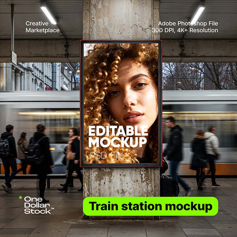
Creating social media ads with stock images is not about placing a random image behind a headline. A good ad needs a clear goal, a visual hook, readable copy, the right format, enough space for branding, and a layout that still works on a small mobile screen. Stock images can make that process much faster because you do not need a full photoshoot for every campaign. But the image has to do a specific job. It should stop the scroll, support the offer, create the right emotion, and leave enough room for a short message. This guide shows how to create social media ads using stock images, step by step. The workflow works for Meta ads, Instagram ads, LinkedIn ads, Pinterest graphics, campaign banners, story ads, carousel ads, and simple promotional visuals for small brands, ecommerce stores, agencies, creators, and founders. Start with the campaign goal, not the image The first step is to define what the ad is supposed to do. Many weak social media ads start with a nice image and then try to force a message into it. A stronger workflow starts with the campaign goal and chooses the image after that. An awareness ad needs a different image than a discount ad. A lead generation ad needs a different structure than a product launch. A local service ad needs a different level of trust than a bold founder-style campaign. The image, headline, and call to action should all support the same goal. Practical rule: every social media ad should answer one question before you design anything: what should the viewer understand or do after seeing this creative? Build the ad around one message A social media ad usually has only a few seconds to make sense. That means one visual idea, one main message, and one action. If the ad tries to explain too much, the viewer will keep scrolling. Before opening a design tool, write the message in one sentence. For example: “Get 40% off commercial design assets,” “Launch your landing page faster,” “Book your first consultation,” or “Upgrade your product visuals before the next campaign.” If the sentence is not clear, the design will not fix it. safe zone Campaign Hook Make the benefit visible fast. Use the image to create emotion, then let the headline explain the offer in one short idea. CTA area A simple ad structure Think of the ad as three layers. The image creates the first reaction. The headline explains the promise. The call to action tells the viewer what to do next. The best stock image is not always the most beautiful one. It is the one that gives the ad enough emotion, contrast, space, and context to make the message easy to understand. Step-by-step workflow for creating the ad The workflow below keeps the process practical. It helps you move from campaign idea to finished creative without overdesigning the ad or relying on a generic image that does not support the offer. Define the offer Write the exact thing you are promoting: a product, service, discount, bundle, free trial, newsletter, event, lead magnet, launch, or seasonal campaign. The offer decides the emotional direction of the image. Choose the ad format Decide whether the ad will be square, vertical, horizontal, story format, carousel, or a simple feed image. Format matters because it changes the crop, text placement, and amount of visual space available. Pick an image with a clear visual role Use the image as a hook. People-centered images can create trust, product-style images can show value, lifestyle images can show desire, and abstract images can create a clean background for stronger copy. Add one short headline The headline should explain the benefit quickly. Avoid long copy on the image. A good ad headline usually works as a short promise, direct offer, pain point, or result. Design for mobile readability Most social ads are viewed on phones. Keep the headline large, avoid weak contrast, leave safe space near the edges, and check whether the creative is still readable at small size. Export several variations Do not rely on one creative. Make several versions with different images, headlines, crops, and CTA treatments. Small changes can make a large difference in ad performance. Choose the right format for the platform The same stock image can work differently depending on the format. A wide image may be strong for a website banner but weak for a story ad. A close-up image may work well in a square feed post but feel too tight in a vertical crop. Before editing the image, decide where the ad will run. This prevents last-minute cropping problems and keeps the design from feeling squeezed. 1:1 Square feed ads Good for simple offers, product messages, brand awareness, and posts that need to work across several platforms with minimal layout changes. 4:5 Tall feed ads Useful when you want more vertical screen space without going full story format. Strong for Meta and Instagram feed placements. 9:16 Story ads Best for full-screen mobile creatives. Use images with strong vertical composition and keep key text away from interface areas. Use the stock image as the hook The image should create the first reason to stop. For some ads, that means a person looking natural and relatable. For others, it means a bold product scene, a strong background, a premium texture, a food image, a workspace, a travel mood, or a clean abstract visual. If the ad needs human trust, start with people images that feel natural and relevant to the offer. If the ad promotes an app, template, ebook, course, or digital product, use mockups for brand presentation to make the offer more tangible. A stock image should not be decoration. It should make the offer easier to understand. If the viewer could remove the image and the ad would mean the same thing, the visual is probably too generic. Write copy that fits the image Good social ad copy is usually shorter than people expect. The image does the emotional work. The headline explains the offer. The caption or ad text can add context. Trying to put everything inside the image usually makes the creative harder to read. Headline Use one short promise or direct offer. Example: “Launch cleaner ads faster” or “Upgrade your campaign visuals.” Support line Add one extra detail only if it improves clarity. Example: “Ready-to-use images, mockups and creative assets.” CTA Use a clear action. Example: “Browse assets,” “Start designing,” “Get the bundle,” or “Download the visuals.” Design the ad for speed, not decoration Social media ads are not posters. People see them quickly, often while walking, waiting, scrolling, or switching between apps. The design should make the idea obvious fast. Use strong contrast between text and image. Place copy where the image has enough empty space. Avoid covering faces, products, hands, important objects, or emotional details. If the image is too busy, add a soft gradient or use a cleaner crop. For campaign sets, it can help to use creative asset bundles so the images feel visually related. This is useful when a brand needs multiple ads for the same offer, season, product launch, or paid campaign. Create variations before judging the ad One ad creative is rarely enough. A better workflow is to create several variations from the same campaign idea. This gives you more material to test and helps you avoid making design decisions based only on personal taste. Five useful ad variations Use the same offer, then change one main element at a time. This makes it easier to understand what actually improves the creative. A Lifestyle image with benefit-focused headline. B Product mockup with direct offer. C Close-up crop with short pain point. D Abstract background with bold typography. E Seasonal image with time-sensitive CTA. Check the license before publishing Before using any stock image in a paid ad, campaign banner, email, landing page, or social media creative, check the license. This is especially important when the ad is commercial, when the creative will run at scale, or when the image becomes part of a product, template, merchandise, or client campaign. On OneDollarStock, usage depends on the license type and intended use case. Review the license page before publishing commercial campaigns, especially if the ad will be used for client work, ecommerce, paid media, or larger brand distribution. Run a quick quality check before export The last step is to check the ad as a viewer would see it, not as a designer editing it at full size. Zoom out. Preview it on a phone. Check whether the message is still clear in a feed. If the creative needs five seconds of explanation, simplify it. Pre-export checklist The ad has one clear goal. The image supports the offer. The headline is readable on mobile. The CTA is short and specific. The image is not too busy behind the text. The crop works in the chosen format. The brand colors are visible but not excessive. The file size is suitable for the platform. The license matches the commercial use case. There are at least three creative variations. A practical workflow for your next ad campaign To create stronger social media ads with stock images, start with the campaign goal, choose the format, select an image with a clear role, write one short message, design for mobile readability, and export several variations. That process is more reliable than choosing a nice image and hoping the ad works. The best stock image for an ad is not simply the most attractive image. It is the image that helps the viewer understand the offer faster. When the visual hook, headline, layout, CTA, and license all support the same campaign goal, the ad has a much better chance of working in a real feed.
What Is Framer? A Beginner’s Guide to Building Websites With Templates
Framer is a website builder for people who want to design and publish modern websites without starting from a blank codebase. It is especially popular with designers, founders, marketers, startups, agencies, and creators who need a polished website quickly but still want control over layout, motion, content, and visual direction. The easiest way to understand Framer is this: it feels closer to a visual design tool than a traditional website admin panel. You work on a canvas, arrange sections, edit text, adjust responsive layouts, connect CMS content, set SEO metadata, and publish the site from the same environment. For beginners, the fastest way to start is usually with a template. A good Framer template already gives you page structure, spacing, typography, sections, responsive behavior, and visual hierarchy. Your job is to replace the content, adapt the brand, check the mobile version, set the SEO details, and publish. What is Framer? Framer is a no-code website builder and design platform used to create websites, landing pages, portfolios, startup pages, product sites, marketing pages, and content-driven web projects. Instead of writing every layout in code, you build visually and publish the finished page as a live website. It is not only a static design tool. Framer includes website-specific features such as hosting, responsive breakpoints, CMS collections, SEO settings, page publishing, forms, components, animations, and collaboration. That makes it useful for people who want to move from idea to live website without separating design, development, and publishing into three different processes. Plain-English definition: Framer is a visual website-building platform that lets you design, customize, and publish professional websites without building the entire front end manually in code. A short history of Framer Framer was founded by Koen Bok and Jorn van Dijk in 2014. In its earlier years, it was known mainly as a prototyping tool for designers who wanted to create interactive, high-fidelity product experiences. Over time, the product shifted toward a broader goal: helping teams design and publish real websites, not only prototypes. That history matters because it explains Framer’s personality. It still feels design-first. The platform is built around visual control, motion, layout precision, and fast iteration. But it has evolved into a practical website platform for businesses, creators, and teams that need live web pages, not just mockups. 2014 Framer begins as a design and prototyping tool The early product focused on helping designers create interactive prototypes and explore more advanced product experiences. Later The platform moves closer to website creation Framer gradually expanded beyond prototyping into visual website building, publishing, CMS workflows, performance, and SEO. Now Framer is used as a full website platform Teams can design pages, manage content, collaborate, optimize for search, and launch sites from one visual workflow. How Framer works Framer works by combining a visual design canvas with web publishing features. You create pages and sections visually, but the final result is a real website that can be published, indexed, shared, and updated. For a beginner, the workflow feels simple: choose a starting point, edit the design, replace the content, check responsiveness, configure SEO, and publish. For more advanced teams, Framer can also support CMS-driven pages, reusable components, localization, analytics, A/B testing, and more complex site structures. Visual canvas You build the website visually by placing sections, text, images, buttons, navigation, forms, and layout elements on a canvas. This makes Framer feel familiar to designers who are used to visual tools. Responsive layout You adjust how the page behaves on desktop, tablet, and mobile. This is important because a beautiful desktop design can still fail if the mobile version is not checked carefully. CMS and content Framer can use CMS collections for repeated content such as blog posts, case studies, resources, directories, updates, or landing page variations. Publishing and SEO Framer includes publishing, hosting, page settings, metadata, URLs, social previews, sitemap support, and other website essentials that matter after the design is finished. What are Framer templates? Framer templates are pre-built website projects that you can open, duplicate, customize, and publish. They can include complete pages, reusable sections, components, typography styles, color systems, CMS structures, navigation, and responsive layouts. This is why templates are useful for beginners. Instead of figuring out every section from scratch, you start with a working website structure. You can then replace the copy, images, colors, logo, links, sections, and SEO settings until the template becomes your own website. You may hear people say they “install” a Framer template. In practice, the workflow is closer to opening, duplicating, or remixing a ready-made project into your Framer workspace. Once it is in your account, you edit it like a normal Framer site. Template mindset A Framer template is not just decoration. It is a pre-built website system: layout, hierarchy, spacing, sections, responsive behavior, and visual direction. Choose a template that matches the type of website you need. Open or duplicate the template into your Framer workspace. Replace the placeholder copy with real messaging. Swap images, mockups, icons, and brand assets. Adjust colors, typography, spacing, and sections. Check desktop and mobile layouts before publishing. How to use a Framer template step by step The right template can save days of structural work. The wrong template can create more work than starting clean. Before choosing one, look at the purpose of the website. A SaaS landing page, personal portfolio, agency site, restaurant page, newsletter landing page, and product launch site all need different content structures. If you are looking for ready-made starting points, browse the Framer templates collection on OneDollarStock. Choose the template by website goal first, not only by visual style. 1 Choose the website type Start with the goal: landing page, portfolio, agency website, SaaS page, startup site, product page, local business website, or personal brand. 2 Open the template in Framer Use the template as a working project. Keep the structure that helps the page flow, then remove sections that do not support your message. 3 Replace the copy first Before changing every color and image, add your real headline, subheadline, offer, benefits, proof, pricing, contact details, and calls to action. 4 Update the visual system Replace stock visuals, product screenshots, mockups, background images, icons, and color accents so the template fits your brand. 5 Check mobile behavior Review spacing, text size, button visibility, navigation, image crops, and section order on smaller screens before publishing. 6 Set SEO and publish Add a clear page title, meta description, URL slug, Open Graph image, headings, alt text, and index settings before launching the site. What to change first after opening a template Many beginners start by changing colors, animations, and decorative details. That is usually the wrong order. A website succeeds or fails because of message clarity, offer structure, visual hierarchy, trust, and mobile usability. Decoration comes later. Start by replacing the core content. If the headline, offer, benefits, CTA, proof, and images are still generic, the website will feel generic even if the design is beautiful. Template customization checklist Replace the homepage headline. Rewrite the subheadline. Update all button labels. Remove sections you do not need. Add real product or service images. Check every mobile breakpoint. Update navigation links. Set page titles and meta descriptions. Add alt text to key images. Replace placeholder testimonials. Check contact forms and links. Preview the social sharing image. When Framer is a good choice Framer is a strong choice when the website needs to look polished, launch quickly, and stay easy to update. It is especially useful when the team cares about design quality but does not want a long development cycle for every landing page or marketing update. It works well for startup websites, SaaS landing pages, portfolios, agency websites, creator pages, event pages, product announcements, waitlists, lead generation pages, and marketing sites that need fast iteration. Good fit Landing pages and startup websites. Portfolio and personal brand sites. Agency, studio, and service websites. Product launches and waitlists. Marketing pages that need frequent updates. Sites where design quality matters a lot. May need another setup Complex ecommerce with advanced inventory logic. Large custom web apps with user dashboards. Deep backend workflows and custom databases. Advanced membership platforms. Projects requiring highly specific server-side logic. Websites where the main product is a complex application. How Framer compares to building from scratch Building from scratch gives maximum technical control, but it also takes more time, planning, development resources, QA, and maintenance. Framer is built for a different type of project: websites where speed, visual quality, and iteration matter more than building every piece manually. A custom-coded site may be the better option for a complex application. A Framer site may be the better option for a brand website, launch page, content site, portfolio, or campaign page that needs to go live quickly and still look professional. The practical question is not “Is Framer better than code?” The better question is: “What kind of website are we building, and how much custom logic does it really need?” How Framer templates help beginners move faster Beginners often struggle with the same problem: they know they need a website, but they do not know what the structure should be. A template solves that by giving them a working page architecture. The sections are already there. The rhythm is already there. The spacing and hierarchy are already planned. That does not mean the template should stay untouched. A good template is a starting system. It should be edited, trimmed, rewritten, and visually adjusted. The goal is not to hide the fact that you used a template. The goal is to use the template as a professional foundation, then make the content specific enough that the website feels real. If you already understand the basics and want a more tactical build process, read the existing guide on how to create a website in 1 hour using OneDollarStock. It focuses more on assembling a fast website workflow with templates and creative assets. Common mistakes beginners make in Framer Framer makes it easier to build a website, but it does not automatically make the website good. The most common mistakes are not technical. They are usually content, hierarchy, and decision-making problems. Choosing a template only because it looks impressive A dramatic template may look great in preview but fail for your actual content. Choose a template that fits the website’s purpose, not just your first reaction to the design. Keeping too many sections Templates often include more sections than you need. Remove anything that does not support the message. A shorter, clearer website is usually stronger than a long page filled with weak content. Ignoring mobile layout A website can look excellent on desktop and still feel broken on mobile. Check spacing, image crops, sticky elements, navigation, buttons, and text sizes before publishing. Publishing without SEO basics Before launching, set the page title, meta description, URL handle, headings, alt text, social preview image, and index settings. These details are easy to skip but important for search and sharing. How OneDollarStock fits into a Framer workflow A Framer template gives you the website structure. OneDollarStock can support the visual layer around it: templates, images, mockups, textures, presets, LUTs, and other creative assets that help the site feel finished faster. This is useful because many template-based sites fail at the same stage. The layout is good, but the visuals stay generic. Replacing placeholder assets with stronger images, product mockups, textures, and brand-specific visuals can make the site feel more credible immediately. If you are comparing template options, the existing guide to Framer templates for fast, modern websites goes deeper into how templates save time, how to choose better ones, and what to check before using them for a real project. The practical takeaway for beginners Framer is best understood as a design-first website platform. It helps you move from visual idea to live website without forcing every beginner through a full development workflow. That makes it useful for founders, creators, designers, marketers, and small teams that need a professional web presence quickly. Templates make that process even easier. They give you structure before you have a perfect plan. Start with the right template, replace the content with real messaging, adjust the visual system, check mobile layouts, set SEO details, and publish only when the site feels specific to your project. The result should not feel like a template. It should feel like a focused website built from a strong foundation.

How to Use Lightroom Presets Without Making Photos Look Overedited
Lightroom presets can make photo editing faster, but they can also make images look heavy, artificial, or strangely similar if they are applied without adjustment. The difference usually comes down to workflow. A preset should be a starting point for editing, not the final decision. The best use of Lightroom presets is not to force every photo into one fixed look. It is to build a consistent direction faster: color mood, contrast, warmth, shadow depth, skin tone behavior, grain, clarity, and overall atmosphere. After that, the photo still needs human judgment. This guide explains how to use Lightroom presets without making photos look overedited. It is written for photographers, creators, designers, founders, social media teams, and ecommerce brands that want consistent images without losing natural detail. What Lightroom presets actually do A Lightroom preset is a saved group of editing settings. Depending on how it was built, it can adjust exposure, contrast, highlights, shadows, white balance, tone curve, color mix, color grading, sharpening, grain, vignette, calibration, and other editing controls. That sounds powerful, but it also explains why presets need care. A preset created for a soft indoor portrait may not work on a sunny travel photo. A preset designed for warm lifestyle photography may damage food color. A cinematic preset may look strong on one image and muddy on another. Professional editing is rarely about applying one look at full strength. It is about finding the right direction, then adapting that direction to the image in front of you. If you want ready-made editing foundations, you can browse Lightroom and Photoshop presets built for faster color grading and repeatable photo workflows. The preset is not the edit The biggest mistake is treating a preset as a finished edit. A preset can give the image a style, but it cannot fully understand the lighting, subject, skin tone, product color, background, or final use case. A good preset gives you a controlled starting point. After applying it, you still need to check exposure, white balance, contrast, color accuracy, highlights, shadows, and local details. This is where the image starts to look intentional instead of filtered. Working rule: use presets to create direction, then edit the photo back toward believability. If the viewer notices the preset before the subject, the edit is probably too strong. A simple preset workflow that keeps photos natural The safest way to use presets is to separate style from correction. First you choose the visual direction. Then you repair the technical issues. Then you adjust the strength of the look. This gives you consistency without flattening every image into the same treatment. Step 01 Prepare the photo Check exposure, crop, white balance, and obvious distractions before judging the preset. → Step 02 Apply the preset Choose a look that matches the lighting, subject, brand mood, and final use case. → Step 03 Reduce the damage Fix clipped highlights, blocked shadows, strange skin tones, and oversaturated colors. → Step 04 Export with purpose Adjust sharpness, crop, color, and file size for web, social media, store pages, or print. Start with exposure before judging the preset Many people apply a preset to a poorly exposed image and then blame the preset. In reality, presets respond differently depending on the starting photo. If the image is underexposed, the preset may make shadows muddy. If the image is too bright, it may destroy highlight detail. If white balance is wrong, the preset may exaggerate the color problem. Before choosing a preset, make a basic correction. Bring the exposure close to natural. Recover highlights if they are too strong. Open shadows if the image is too heavy. Correct obvious color temperature issues. Then apply the preset and judge the result. This does not mean you need a perfect manual edit first. It means the photo should be technically stable enough for the preset to behave predictably. Choose presets by lighting, not only by style Preset names can be misleading. A preset called “cinematic”, “moody”, “clean”, “warm”, or “editorial” may sound right, but the real question is whether it fits the lighting conditions of your photo. Soft indoor light, harsh sunlight, golden hour, cloudy weather, flash photography, studio portraits, food photos, and ecommerce product shots all react differently to the same preset. A good editing workflow starts by matching the preset to the light before matching it to the mood. Presets usually work better when The lighting is similar to the preset sample images. The photo has enough exposure detail to adjust. The color palette already supports the intended mood. The subject does not require strict color accuracy. Presets usually fail when The image is very underexposed or overexposed. Skin tones become orange, gray, red, or green. Product colors need to stay commercially accurate. The preset adds too much contrast, clarity, or saturation. How to reduce the overedited look The overedited look usually comes from too much contrast, too much saturation, crushed shadows, strong clarity, heavy grain, aggressive sharpening, unnatural skin tones, or a tone curve that forces every image into the same mood. If a preset looks too strong, do not remove it immediately. First reduce the most aggressive settings. Often, a few small corrections are enough to keep the style while making the image feel more natural. Contrast Saturation Clarity Grain Small edits matter Most preset problems do not require a full reset. Lowering contrast, reducing orange saturation, lifting shadows, or softening clarity can make the same preset look more professional. Pull back saturation Oversaturation is one of the fastest ways to make a preset look cheap. Pay close attention to reds, oranges, yellows, and greens. These colors often become too intense after a preset is applied, especially in skin, food, plants, clothing, and product photography. Protect skin tones Skin tones reveal bad editing quickly. If a preset makes skin look orange, gray, pink, green, or waxy, adjust the color mix and white balance. In portraits and lifestyle images, natural skin is more important than forcing the entire image into one trendy palette. Recover highlights and shadows Many presets add contrast by pushing highlights and shadows apart. This can look dramatic, but it can also remove detail. If white areas lose texture or dark areas become blocked, recover highlights and lift shadows until the image feels usable again. Use grain carefully Grain can make digital images feel more organic, but too much grain can damage product detail, skin texture, and clean brand visuals. Use it with intention. For ecommerce, beauty, food, and product photos, subtle grain usually works better than heavy film simulation. How to use presets for different types of photos A preset workflow should change depending on the image category. The same settings that improve a lifestyle portrait may damage a product image. The same warm look that works for travel content may make food look stale or skin look unnatural. Photo type Preset goal Main thing to check after applying Portraits and lifestyle Consistent mood, soft contrast, flattering color, natural skin. Skin tone, eye detail, shadow softness, orange and red saturation. Food photography Freshness, appetite appeal, clean contrast, accurate warmth. Yellow, orange, red, and green color balance. Food should still look real. Product photos Clean polish, controlled shadows, accurate brand and product color. Color accuracy, white balance, texture, material detail, clipping. Travel and landscapes Atmosphere, depth, sky control, natural color direction. Sky saturation, green tones, haze, highlight recovery, horizon contrast. Social media content Fast consistency across many images in a campaign or content series. Whether the preset still works when images are viewed together in a grid. Presets for brand consistency Presets are useful for brands because they help different images feel connected. A founder, ecommerce team, agency, or social media manager may work with photos from different shoots, sources, locations, and lighting conditions. A preset can bring those images closer together visually. The key is not to make every photo identical. A good brand editing system allows variety while keeping a recognizable tone. For example, a brand might use warm highlights, soft shadows, low saturation, and subtle grain across its visuals. The images can still differ, but the overall feeling stays consistent. This is where curated presets are more useful than random filters. They can support a repeatable editing language across campaigns, product launches, newsletters, thumbnails, blog images, and social media posts. When presets are not enough Presets are strong for photo style, but they do not solve every visual problem. Some images need retouching, local adjustments, masking, object cleanup, background correction, or manual color work. In those cases, the preset should come after the image is technically repaired or before a more detailed finishing pass. If you work across photo and video, you may also need a separate color workflow. Presets are usually associated with photo editing, while LUTs for video color grading are often used to create consistent looks in video projects. The logic is similar: apply the look, then adjust it to the footage or image instead of trusting it blindly. You can also combine presets with subtle visual effects when the project needs a more designed result. For example, photo overlays can add light leaks, atmosphere, texture, dust, or mood, but they should be used after the core edit is already working. A practical preset routine for better results Before editing a full batch, test your preset on three to five different images from the same shoot or project. Choose one bright image, one darker image, one close-up, one wider frame, and one image with important color detail. This small test will show whether the preset is flexible enough. After that, create your own adjusted version. Lower aggressive settings, correct color problems, save the edited version as a custom preset, and use that as your real working base. This is often better than applying the original preset at full strength to every image. Start with one photo and correct exposure before applying the preset. Apply the preset and check whether the mood fits the image. Fix skin tones, product colors, shadows, highlights, and saturation. Test the same adjusted look on several images from the same project. Save a custom version for that shoot, campaign, or brand style. Export according to the final use: website, store, social media, ad, or print. How to know when the edit is finished A finished preset edit should feel consistent, but not forced. The image should still have believable light, natural detail, readable color, and a clear subject. If the edit calls attention to itself before the photo does, it probably needs to be pulled back. One useful test is to step away from the image for a few minutes, then view it next to the unedited version and two or three other images from the same project. If the preset improves the image and still feels connected to the rest of the set, it is probably doing its job. The best preset workflow is not about speed alone. It is about repeatable control. Presets save time when they help you reach a strong direction faster, but the final quality still comes from knowing what to adjust after the preset is applied. A better way to think about presets Lightroom presets are most useful when they act like editing systems, not shortcuts. They help you start with a clear visual direction, keep a consistent mood across images, and speed up repetitive decisions. But they still need correction, restraint, and context. Use presets to get close faster. Then use your eye to make the image work. That balance is what keeps photos from looking overedited, generic, or filtered.

Dark Phone Wallpapers: Why They Work Better on OLED Screens
Dark phone wallpapers are popular for a simple reason: they make modern screens feel calmer, cleaner, and easier to use. On iPhone and Android, a dark background can reduce visual noise, support dark mode, make icons stand out, and create a more polished lock screen without making the phone feel overloaded. They are especially effective on OLED screens, where deep blacks, charcoal gradients, low-light photography, and muted abstract backgrounds can look rich without pushing too much brightness into the interface. But a good dark wallpaper is not just a black image. It still needs detail, contrast, composition, and enough structure to feel intentional. This guide explains why dark phone wallpapers work so well, how they behave on OLED screens, which styles are easiest to use daily, and how to choose a background that stays readable behind icons, widgets, notifications, and lock screen elements. Why dark phone wallpapers work so well A phone screen is not an empty frame. It is an interface. Every wallpaper has to sit behind app icons, widgets, folders, notification cards, the clock, search bars, and status indicators. Dark phone wallpapers often work better because they let those interface elements stay visually dominant. Bright wallpapers can look impressive in a preview, but they can also compete with app labels and widgets. A high-contrast beach photo, white interior, colorful street scene, or very bright landscape may make the screen feel busy after a few hours. Dark wallpapers usually create a quieter base. This is why dark backgrounds are common in productivity setups, premium app screenshots, dark mode interfaces, and minimalist home screens. They give the screen a clean foundation without making the phone look empty. Simple rule: a dark wallpaper should make your screen easier to read, not just darker. If icons, widgets, and lock screen text become harder to see, the image is not working. Why dark wallpapers are a natural fit for OLED screens OLED displays handle black and very dark areas differently from traditional backlit screens. Instead of lighting the whole screen from behind, each pixel can be controlled individually. This is one reason why deep blacks can look especially clean on many modern phones with OLED displays. For wallpapers, this creates a specific visual advantage. Dark backgrounds can feel deeper, smoother, and less aggressive than bright full-screen images. A black, graphite, navy, deep green, or dark brown wallpaper can blend naturally with dark mode and make the interface feel more unified. That does not mean every OLED wallpaper should be pure black. In many cases, subtle detail works better. A very dark gradient, a soft fabric texture, a low-light landscape, a shadowed architectural detail, or an abstract black-and-gray composition can look more refined than a flat black background. Dark wallpaper styles that work best on phones The best dark phone wallpaper depends on how you use your screen. A lock screen can handle a stronger image because there are fewer icons. A home screen usually needs more restraint because app icons and widgets sit on top of the background all day. Dark gradients Soft black, graphite, navy, green, or purple gradients are easy to use because they create depth without adding too much visual noise. Low-light photos Night streets, moody interiors, dark landscapes, shadows, and soft lighting can make the lock screen feel cinematic and personal. Abstract textures Dark glass, liquid shapes, grain, stone, fabric, metal, and blurred forms can add atmosphere while keeping the screen readable. Black wallpapers Black phone wallpapers are the simplest option. They are clean, minimal, and highly compatible with dark mode. A pure black background can make icons and widgets feel sharp, especially if you use a simple app layout. The downside is that pure black can sometimes feel too empty. If you want a more premium result, choose black wallpapers with very subtle texture, shadow, grain, reflection, or gradient. The difference is small, but it can make the screen feel designed rather than blank. Dark abstract wallpapers Dark abstract wallpapers are one of the safest choices for daily use. They do not depend on a specific subject, so they usually crop well across different screen sizes. They can also create a strong visual mood without interfering with icons. Soft abstract forms, dark color fields, smoky gradients, macro textures, glass effects, and blurred light can all work well. If you want more visual variation, explore abstract visuals and look for images with low visual noise and enough empty space. Dark nature wallpapers Dark nature wallpapers create a calmer screen without looking too technical. Forest shadows, mountains at dusk, dark water, mist, night skies, stones, leaves, and quiet landscapes can make the phone feel more grounded. They work best when the scene is not too detailed. A dark forest with too many branches can become visually messy behind icons. A simple horizon, soft fog, low-light water, or dark botanical close-up is usually easier to use. Dark luxury and editorial wallpapers Dark editorial wallpapers can make the phone feel more premium. These can include black marble, leather texture, architecture, studio lighting, minimal product-style compositions, shadowed interiors, or old money-inspired visual details. This style works well for people who want their phone to feel polished rather than decorative. The key is restraint. One strong texture, one refined object, or one controlled light source is usually enough. How to choose a dark wallpaper for your lock screen The lock screen is the best place for a more expressive dark wallpaper. There are fewer app icons, so the image can have a stronger focal point. Still, the clock, date, notifications, and widgets need space. When choosing a dark lock screen wallpaper, look at the top third of the image first. If the clock sits over a busy face, object, text, bright reflection, or detailed pattern, the composition may not work. A clean upper area usually performs better. Strong lock screen options include dark landscapes with open sky, shadowed architecture, low-light portraits without busy backgrounds, abstract gradients, black marble, night roads, cinematic interiors, and minimal dark textures. How to choose a dark wallpaper for your home screen The home screen is more demanding than the lock screen because it has more interface elements. App icons, folders, widgets, and labels need a calm background. A dark home screen wallpaper should support readability first and mood second. The safest choices are dark gradients, soft textures, low-contrast abstract images, blurred backgrounds, and simple dark surfaces. If the wallpaper has a subject, keep it away from the most crowded icon areas. If your home screen has many widgets, avoid detailed images. Widgets already add blocks, text, numbers, weather data, calendars, and controls. A busy wallpaper behind them makes the entire screen harder to scan. Screen setup Best dark wallpaper type Why it works Minimal home screen Black gradient, charcoal texture, dark abstract image Supports icons without making the screen feel empty or harsh. Widget-heavy layout Low-contrast background with large quiet areas Keeps widgets readable and avoids visual clutter behind cards. Dark mode interface Deep black, graphite, navy, dark green, or muted brown Creates consistency between wallpaper, apps, settings, and system UI. Expressive lock screen Low-light landscape, dark editorial photo, cinematic background Adds personality while leaving space for the clock and notifications. Color choices that make dark wallpapers easier to use Dark does not always mean black. Many of the best dark phone wallpapers use controlled color rather than total darkness. Deep navy, forest green, graphite gray, dark brown, burgundy, purple-black, and muted blue can all feel premium while still supporting readability. The most important factor is contrast. If the wallpaper has bright highlights directly behind white app labels, the labels may disappear. If the wallpaper is dark but visually noisy, icons may still become hard to read. A useful dark wallpaper needs contrast in the right places, not everywhere. For everyday use, choose darker backgrounds with soft transitions. Hard patterns, bright edges, high-detail photos, and sharp reflections are better for lock screens than home screens. Common mistakes with dark phone wallpapers Dark wallpapers are easy to get wrong because they look good in a clean preview. The real test happens when your phone interface appears over the image. A wallpaper can be dark and still be distracting. Using an image that is too flat A plain black wallpaper is clean, but it can feel empty. If that is the goal, it works. If you want something more polished, choose a dark image with subtle grain, shadow, gradient, or texture. Choosing too much contrast Bright neon details, sharp light streaks, and strong reflections can look impressive, but they often fight app icons and widgets. Keep strong highlights away from the busiest areas of your screen. Ignoring the crop Dark images can lose their subject quickly when cropped. If the main detail is near the edge, your phone may cut it off. Vertical compositions are usually safer for mobile backgrounds. Using text-based wallpapers Text on wallpapers often clashes with the phone interface. It can sit behind the clock, become partly hidden by icons, or compete with notifications. If you want a clean daily setup, avoid wallpapers with large words or slogans. Quick checklist for dark phone wallpapers The wallpaper stays readable behind app icons and widgets. The top area leaves enough room for the lock screen clock. The image has subtle depth, not just random darkness. Bright details do not sit behind important interface elements. The image crops well on a vertical phone screen. The color palette works with dark mode and your app icons. How to match dark wallpapers with iPhone and Android iPhone and Android handle wallpapers differently, but the practical rules are similar. You need a strong vertical crop, good readability, and enough calm space for interface elements. Dark wallpapers for iPhone On iPhone, the lock screen clock and widgets make the upper part of the image especially important. If you want a dark wallpaper for iPhone, choose images with a quieter top area and stronger visual detail toward the middle or lower part of the frame. Dark gradients, low-light landscapes, abstract images, and clean editorial photos often work well. If you use multiple focus modes, consider using different dark wallpapers for different contexts: one calm background for work, one more expressive image for personal use, and one very minimal option for night mode. Dark wallpapers for Android Android users often have more control over launchers, icon packs, widgets, and grid layouts. This makes dark wallpapers especially flexible. A dark background can support custom icon themes, monochrome layouts, and widget-heavy screens without making the interface look crowded. If you use a custom launcher, match the wallpaper to your icon style. Minimal icons work well with soft black gradients. Colorful icons need a quieter background. Large widgets need negative space and low contrast behind the widget area. How to build a consistent dark screen style A dark wallpaper works best when it feels connected to the rest of your phone setup. That does not mean everything has to be black. It means the wallpaper, icons, widgets, and app layout should feel like one visual system. 1 Pick a base tone Start with black, graphite, navy, dark green, brown, or purple-black as the dominant background tone. 2 Control contrast Keep bright details away from app labels, widgets, and clock areas so the interface remains easy to read. 3 Match your icons Use a wallpaper that supports your icon style instead of competing with it for attention. 4 Test daily use Keep the wallpaper for a full day and check whether it still feels calm, readable, and visually useful. If you are comparing wallpaper quality, size, and cropping before choosing a dark background, the guide to 4K phone wallpaper size and resolution explains the technical side in more detail. Where to find better dark phone wallpapers Good dark wallpapers are not only about mood. They need clean composition, strong resolution, subtle detail, and enough negative space for everyday use. Random downloads often look fine in preview but become messy once they sit behind icons and widgets. On OneDollarStock, you can browse 4K phone wallpapers for mobile screens and use them as lock screens, home screen backgrounds, design references, moodboard material, or visual assets for creative projects. The best dark wallpaper is often one that does more than look dark: it creates a screen that feels easier to use. Conclusions Dark phone wallpapers work because they respect the way people actually use their phones. They reduce visual noise, support dark mode, improve readability, and make OLED screens feel deeper and more refined. The strongest dark wallpapers are not always the blackest ones. They are the ones with the right balance of darkness, detail, contrast, and composition. Choose a background that works with your screen, not against it, and your phone will feel cleaner every time you unlock it.

4K Phone Wallpapers: Size, Resolution and Style Guide for iPhone and Android
A practical guide to choosing 4K phone wallpapers for iPhone and Android, including resolution, cropping, readability, OLED screens, style and visual composition.
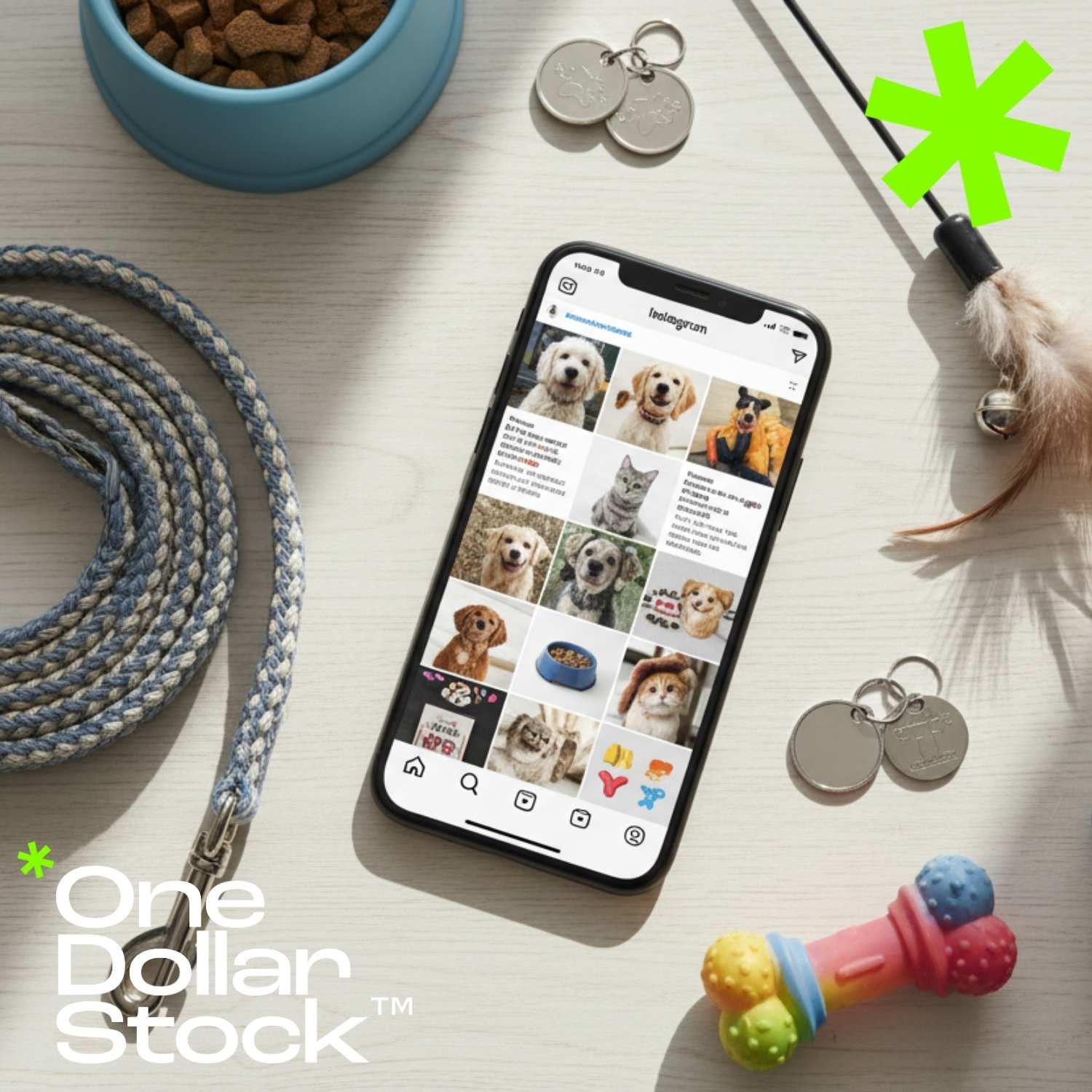
7 Pet Store Content Ideas Using Stock Images for Social Media and Ads
Pet store content works best when it feels useful before it feels promotional. People do not follow a pet shop only to see discounts. They follow it for product tips, seasonal reminders, cute pet moments, care advice, trust signals, and ideas that make life with animals feel easier. That is why stock images can be useful for pet stores, especially when the visual plan is more specific than “post a dog photo.” A good image can support a dog food campaign, a cat-care carousel, a grooming reminder, a seasonal sale, a local community post, or a paid ad for pet accessories. This article shows seven pet store content ideas using stock images from OneDollarStock. Each example is chosen for a different marketing role, so the final mix can help a pet shop build trust, educate customers, promote products, and create more consistent social media content. Why pet stores need more than cute animal photos Cute animal photos are useful, but they are not a full content strategy. A pet store needs different types of visuals for different jobs. Some images should create warmth. Some should explain a product. Some should support seasonal campaigns. Some should make the brand feel professional and safe. The strongest pet store content usually combines emotion with practical context. A dog running outdoors can support active lifestyle products. A cozy cat image can work for indoor care. A seasonal pet photo can support holiday bundles. A human-and-pet image can make the shop feel more trustworthy and local. If you are building a larger content library, start with broad animal images, then add lifestyle photos, seasonal pet visuals, human interaction scenes, and product-friendly backgrounds that can be reused across posts, ads, newsletters, and store banners. Practical rule: choose pet store images by marketing purpose first, not by cuteness alone. A good content mix should help customers feel something, understand something, and take the next step. A 7-image content mix for pet stores A balanced pet store content plan should include more than one visual mood. The goal is not to use all seven images in one campaign. The goal is to create a repeatable library of content angles that can support different offers, seasons, and customer questions. Use this simple visual mix: 1 Friendly brand emotion 2 Active dog lifestyle 3 Human trust and advice 4 Cozy cat care 5 Close-up educational detail 6 Seasonal cat campaign 7 Holiday gift promotion 1 Friendly dog image for warm brand posts Best for: brand warmth, spring campaigns, cheerful pet content A happy dog holding colorful flowers is the kind of image that makes a pet store feel friendly before any product is mentioned. It works well when the goal is to make the brand feel approachable, positive, and emotionally connected to everyday pet owners. This type of image is especially useful for light social posts, community messages, spring promotions, adoption-related content, pet celebration posts, and friendly “new arrivals” announcements. Use it for: Instagram and Facebook posts about pet happiness. Spring offers for dog treats, toys, shampoos, or accessories. Email headers with a warm, optimistic pet-store mood. View this dog image on OneDollarStock 2 Active dog lifestyle image for outdoor products Best for: dog walking, leashes, outdoor care, active pet owners Pet stores often need visuals that show the result of a product, not only the product itself. A person running with a dog communicates movement, companionship, routine, freedom, and outdoor activity. That makes it useful for dog accessories, active dog treats, harnesses, leashes, paw protection, and travel-friendly pet products. This kind of image is also strong for paid ads because it quickly tells a lifestyle story. The customer does not just see a product category. They see the life they want with their dog. Use it for: Dog walking accessory campaigns. Outdoor pet care blog posts or social carousels. Ads for active dogs, beach walks, travel, or weekend pet routines. View this dog lifestyle image on OneDollarStock 3 Human-and-pet image for trust-building content Best for: advice posts, local trust, customer education Pet store marketing should not only show animals. It should also show the relationship between people and pets. A human-and-pet image can make a post feel more conversational, which is useful for advice content, local shop messaging, service announcements, and educational posts. This visual works well when the pet store wants to sound helpful rather than sales-driven. It can support posts about choosing the right dog food, preparing for a new puppy, understanding pet behavior, or asking staff for product recommendations. Use it for: “Ask our team” advice posts. Customer service and consultation messages. Local pet store brand storytelling. View this dachshund lifestyle image on OneDollarStock 4 Cozy cat image for indoor care content Best for: cat comfort, bedding, indoor routines, gentle care Cat content often works best when it feels calm, safe, and slightly intimate. A black cat peeking out from a white blanket creates an instant feeling of comfort and curiosity. It is a good match for indoor cat care, bedding, litter, grooming, calming products, and cold-weather pet content. For pet stores, this image can also support educational content about creating a more comfortable home environment for cats. It feels less like an ad and more like a relatable pet moment. Use it for: Cat bedding, blankets, and comfort product promotions. Indoor cat care tips and cozy home routines. Soft social media posts for cat owners. View this cozy cat image on OneDollarStock 5 Close-up cat detail for educational posts Best for: grooming, paw care, sensitive pets, product education Not every pet store visual needs to show a full animal. Close-up images are valuable because they help create focused educational content. A detailed cat image can work for grooming tips, paw care, fur care, nail trimming, sensitive skin, comfort products, or posts that explain why certain pet products matter. This type of visual is useful for carousel posts because it leaves room for text overlays and practical advice. It can also work as a softer background for blog headers and newsletter sections. Use it for: Cat grooming education and care reminders. Carousel posts about paws, fur, whiskers, or comfort. Background visuals for product tips and newsletters. View this cat close-up image on OneDollarStock 6 Seasonal cat image for holiday campaigns Best for: Christmas posts, holiday safety tips, seasonal offers Seasonal content is important for pet stores because customers buy differently around holidays. A cat near a Christmas tree can support product promotions, gift guides, seasonal safety reminders, and cozy holiday messaging without needing a hard-sell approach. This image is useful because it gives the store a holiday mood while still keeping the pet as the emotional center. It can work for Christmas cat toys, festive collars, treats, cozy beds, scratchers, and educational posts about holiday safety for cats. Use it for: Holiday cat gift guides and seasonal promotions. Christmas tree safety tips for cat owners. Warm December social posts and email banners. View this Christmas cat image on OneDollarStock 7 Holiday dog image for gift-driven campaigns Best for: gift guides, festive bundles, paid holiday ads Gift-focused pet store campaigns need images that show the emotional reason behind the purchase. A dog wearing a red bow tie during a gift exchange makes the campaign feel warm, festive, and family-oriented. It can support holiday bundles without showing specific products directly. This kind of image is especially useful for paid social because it communicates the campaign angle quickly. It says “pets are part of the celebration” before the user reads the caption. Use it for: Christmas gift bundles for dog owners. Paid ads for toys, treats, collars, and pet accessories. Holiday newsletters, website banners, and seasonal landing sections. View this holiday dog image on OneDollarStock How to turn these images into a real pet store content plan The most practical way to use these images is to assign each one to a different content role. That helps the pet store avoid posting the same kind of cute animal content every week. A stronger plan mixes emotion, advice, product context, seasonal timing, and trust-building. For organic social media Use friendly dog and cozy cat images for regular posts, customer education, care reminders, and community content. These visuals are less aggressive and can make the pet store feel active without turning every post into an ad. For ads and promotions Use active lifestyle and holiday gift images when the post has a clearer commercial goal. They make the benefit easier to understand: more outdoor fun, better care, seasonal gifts, or a more comfortable life with pets. If you plan to use stock images for commercial pet store campaigns, check the license type before publishing. OneDollarStock explains its image usage options on the licenses page, including personal, commercial, creator commerce, and larger-scale use cases. What pet stores should avoid when choosing images The biggest mistake is choosing images only because they are cute. Cute helps, but marketing images also need a job. Before using any pet image, ask what the post is supposed to do: educate, sell, remind, entertain, build trust, or support a seasonal offer. Pet stores should also avoid visuals that feel too generic for the message. A random puppy image may get attention, but it may not help sell cat litter, explain grooming, promote a leash, or introduce a holiday gift guide. The closer the image is to the content angle, the stronger the post becomes. Do not use outdoor dog visuals for indoor cat-care topics. Do not use busy images when the post needs text overlay. Do not use seasonal visuals outside the right campaign window. Do not choose images that feel emotionally disconnected from the product. Do not use only animal close-ups if the brand also needs trust and lifestyle context. The useful takeaway for pet store marketing A pet store does not need hundreds of random visuals to create better content. It needs a small, strategic image mix: warm brand images, lifestyle scenes, trust-building human moments, cozy cat visuals, educational close-ups, and seasonal campaign photos. That kind of visual system makes content easier to plan and easier for customers to understand. One image can support a product post. Another can support a care tip. Another can carry a seasonal campaign. Together, they give the pet store a more professional and consistent presence across social media, ads, email, and website content. Build a better pet store content library Start with a clear purpose for each visual. Choose images that support real content ideas, not just generic pet aesthetics. Then connect every post to a useful message: care, comfort, outdoor activity, product education, seasonal gifting, or local trust. For more options, browse animal stock images and people lifestyle images on OneDollarStock to build a larger pet store content library for social media, ads, newsletters, and local marketing campaigns.

Creative marketplace with trusted visuals reaching 1.4M+ users monthly
Avg. from last 6 months.
4.9/5 ★★★★★
Average rating from our customers
Very nice alternative if you need modern assets and don't want to overpay every time you test an idea, especially with unlimited access to mockups. That part alone makes a lot of sense for my workflow.
Very nice alternative if you need modern assets and don't want to overpay every time you test an idea, especially with unlimited access to mockups. That part alone makes a lot of sense for my workflow.
1M+ Products
& Assets
We already have 1+ million products in our store
Lifetime Access.
Unlimited
Downloads!
We did something no major stock platform offers. Ownership over rental.
A team focused on solo-creatives and founders
We're focused on supporting founders, designers, creatives and solo entrepreneurs. Meet our team:
Partners