


Digital Friction & Pixelated Grain: Why Imperfection Beats AI Smoothness in Modern Design
Discover why digital friction, Y2K aesthetics, film grain and visual artifacts are replacing AI smoothness in modern graphic design and branding.

Psychology of Shapes in Graphic Design: How Geometry Influences Brand Perception
Discover how shape psychology influences brand perception and learn how circles, squares and triangles can support trust, positioning and visual identity.
Dark Mode Marketing: How to Design Ads for Dark Mode Users
Learn how to design Dark Mode ads with better contrast, typography, imagery and adaptive assets for more comfortable and effective digital campaigns.
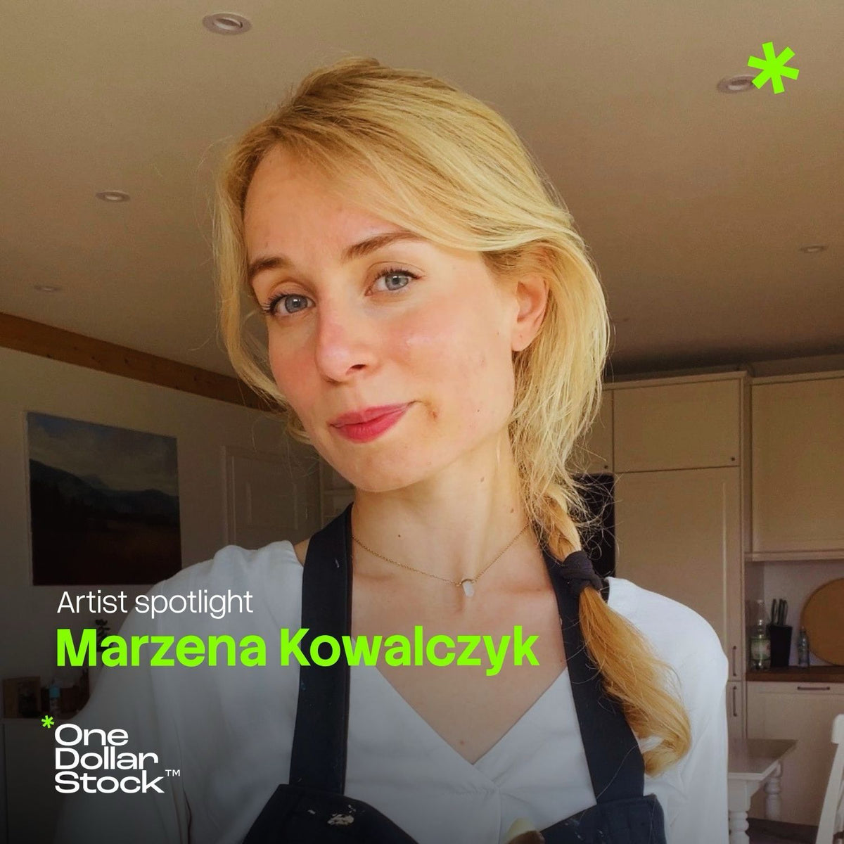
Between Classical Painting and Digital Art: An Interview with Marzena Kowalczyk
Marzena Kowalczyk creates paintings, illustrations, and sketches in which nature meets emotion, stillness, and storytelling. She works both traditionally, on paper and canvas, and digitally using a drawing tablet. In this Artist Spotlight interview for OneDollarStock, she discusses her creative process, artistic mistakes, inspiration, traditional painting, digital tools, and why an image can sometimes communicate more than a realistic photograph. At OneDollarStock, we often talk about images in the context of design, content creation, digital products, graphics, presets, templates, and creative tools. But behind every strong image, whether it is created on canvas, paper, a drawing tablet, or a computer screen, there is something far more important than the tool itself: a way of seeing. That is why we invited Marzena Kowalczyk, an artist working between traditional painting and digital illustration, to join us for a conversation. Her work offers an opportunity to discuss nature, emotions, sketches, mistakes, creative blocks, and what contemporary digital creators can learn from classical painting. We did not want this to be a rigid interview about an “artistic career.” Instead, we wanted an honest conversation about how an image is created, what happens before the finished work appears, and why choosing the wrong color can sometimes hurt more than receiving a simple “nice” comment. 1. Your work moves between nature, emotion, and storytelling. What usually comes first: an image in your mind, a specific place, or a feeling you cannot yet name? It is always a feeling triggered by a particular view or memory. It is as though I live, collect experiences, observe, and then, at some point, the dots suddenly connect. The image that emerges is my attempt to transfer that feeling. I do everything I can to reflect it as faithfully as possible, using every available means. 2. Can a painting be more truthful than a photograph, even when it depicts something less realistically? The question is: what does “truthful” mean? To me, a painting is more of a carrier of feelings than a precise, realistic representation of reality. It is more subjective and personal than a photograph. Everyone sees differently. Perhaps it is not exactly about comparing how different people see the world. It is more about sending a signal: “This is how I experience it. Perhaps you do too?” It can also be about awakening someone’s ability to feel, because it is possible to look without really seeing. Sometimes I can pass the same tree one hundred times, only to notice something special about it on the one hundred and first. I can then paint it and emphasize that quality so that someone else can notice it more easily. I can do that through color, composition, or any number of other artistic devices. I can paint a meadow, but not simply to show what a meadow looks like. I want the viewer to look at the painting and feel, “This is exactly how I feel when I am standing in a meadow.” That is essentially why I paint nature. Someone may not have the opportunity or energy to go for a walk in the forest, but looking at a painting is easy. Perhaps it will remind them of how they felt the last time they were in the forest and encourage them to take that walk. 3. Drawing tablet or paper: which one forgives mistakes more easily, and which one makes it clear that there is no room for error? A drawing tablet obviously forgives more mistakes. When I draw on paper, I often miss the undo function. Not everything can be erased, and sometimes you have to start over even though parts of the previous version were very successful. There is no such problem on a drawing tablet. A risky color? Create a new layer and keep going. Then there is the magical undo button, and the paper does not get damaged. However, the feeling of painting on paper cannot be replaced. Perhaps the risk that the work can easily be damaged by one careless movement makes the creative process even more intense. That is why I combine both methods. I use a tablet to plan the sketch because I can modify it easily and design the composition. I then continue on paper or canvas, allowing myself to move into the unknown. At this point, that process works best for me. 4. What do you think people creating digital projects can learn from classical painting? Digital painting offers slightly different possibilities. The visual effect of painting with real, thick paint that smells of linseed oil is different from painting with a digital brush in Procreate. The fundamental principles of creating an image remain the same: composition, color, light, anatomy, and so on. I think people who work exclusively in digital media can learn from the texture of traditional paint or the accidental way watercolor spreads across paper. At the same time, I sometimes work entirely digitally, and it is simply a different medium. Just as oil paint produces a different result from watercolor, digital painting has its own distinct qualities. 5. What is the most difficult thing for you to paint: light, nature, the human figure, stillness, or emotions? The most difficult moment is when I desperately wanted to communicate something, worked on it for a long time, and then felt disappointed by the result because I could not see what I had wanted to express. At that point, I do not know whether I should continue trusting the process or whether a light will eventually appear at the end of the tunnel. It can happen with anything: light, nature, the human figure, stillness, or emotions. You only discover it during the process. 6. What do you do when a painting goes in a completely different direction from the one you intended? Do you fight it, let it go, paint over it, or pretend that was the plan? It is different every time. I think it depends on how important the message I wanted to communicate was to me. Sometimes I accept what I have created. When the client is satisfied too, that can occasionally be enough. I do not pretend it was the plan, because the artistic process never goes entirely according to plan. When the final result is certain and predictable, it is no longer an artistic process. Sometimes, however, I obsessively start again because I can sense beneath the surface that it will eventually work. I try not to repaint the same piece indefinitely because, after several revisions, a painting can begin to look tired. It is difficult to know when to tell yourself to stop. As the saying goes, “A painting is never finished, only abandoned.” 7. If your sketches could speak, would they be more likely to say “finish me” or “leave me alone”? I think they constantly say, “Finish me. Work on me for just a little longer. Give me a few more lines.” However, I am usually not satisfied with the result when I listen to them. My sketches are better and lighter when I abandon them at a certain point. Of course, I have plenty of unfinished works and ideas that I have started. Their time will eventually come. 8. What do you do when you lack inspiration for an extended period? Do you actively search for it, wait for it, or simply sit down and work anyway? I do not really experience a lack of inspiration. I return from every walk with at least two ideas for a painting. I choose very carefully which ideas deserve an investment of my time. I usually make a quick sketch or write the idea down. When I still like it after some time has passed, I know it is worth developing. It is also important not to leave it waiting for too long because I may forget the feeling that accompanied it. I take photographs, but they do not capture that feeling. I have to rely on my notes and memory. I also separate the creative role from the practical work of execution. The concepts already exist and appear spontaneously. But I always sit down to work in the morning and continue until a designated time. There is no magical spark involved. I sit down whether I am tired, excited, sad, or happy. When my working hours end, I put down my brushes and return to everyday life, my home, and my family. It is very useful to walk away from the easel while still feeling that you want to do a little more. 9. What is the biggest lie about working as an artist that people still like to repeat? There are many of them. People often say, “Do what you love, and you will never work a day in your life.” What nonsense. You have to work extremely hard to make a living from what you love. Another misconception is that talent is something you are simply born with. Of course, some people have certain predispositions that help them observe closely or stay focused on one pursuit for years. Autism can be one example. But that is what talent really is: practicing one thing for years. It is more than passion. It can become an obsession, although hopefully within reasonably healthy boundaries. 10. What hurts an artist more: a blank page, a poorly chosen color, or someone commenting “nice”? The comment “nice” does not hurt me at all. I appreciate that someone made an effort and expressed their approval of my work in the best way they could. As for a blank page, even my desk is covered in drawings. I do not remember ever sitting in front of an empty page for very long. I always doodle something. It is not necessarily good, and what hurts much more is wasting yet another sheet of paper. A poorly chosen color, however, can ruin a painting. It is slightly less of a problem when the work is created on a tablet. 11. If you had to paint a deadline, what would it look like? It would look like a wall, a dam, or a solid barrier with a door in it. A deadline determines how far my creative process is allowed to run wild. I do not treat deadlines as something inherently negative. In fact, I need to establish certain boundaries so that I do not remain stuck on one thing for too long. Otherwise, it is easy to begin moving in circles without producing better results. A reasonable deadline allows me to close the open tabs in my mind and open the door to the next project. 12. What is the most absurd thing that has ever inspired one of your drawings or paintings? I do not know whether anything can truly be considered absurd when it comes to inspiration. A dream, a mess, bones found along the way, gold left over from a previous painting, a client’s fantasy, a deer, a tree, or bare feet in the snow. The last one was supposed to be healthy, although not when you have Raynaud’s syndrome. What Digital Creators Can Learn from Traditional Painting One simple but important thought remains after speaking with Marzena: tools change, but the way we see remains essential. A drawing tablet, paper, a brush, a screen, a photograph, a sketch, and a finished illustration are simply different routes toward the same destination: an image capable of making someone feel something. This is particularly important for digital creators. In a world of rapidly produced graphics, ready-made templates, and images generated in seconds, it is easy to forget that strong composition, color, light, and emotion still require attention and awareness. Classical painting does not have to be the opposite of digital creativity. It can be one of its most valuable foundations. About Marzena Kowalczyk Marzena Kowalczyk is an artist and illustrator who works both digitally and traditionally. Her work combines nature, emotion, storytelling, and a painterly way of seeing. She creates using a drawing tablet, paper, and canvas, exploring the boundary between classical techniques and contemporary visual tools. You can follow Marzena Kowalczyk’s work on Instagram at @byvisenna. OneDollarStock Artist Spotlight This interview is the first installment in a series of OneDollarStock conversations with creators who represent different approaches to working with images. We are interested not only in finished results, but also in the processes, decisions, mistakes, inspirations, and experiences that make an image stay in someone’s mind. We believe that classical painting, illustration, digital design, photography, presets, templates, and other forms of visual creativity share the same foundation: learning how to see. Conversations with artists such as Marzena are therefore a natural part of building the creative community around OneDollarStock.

How to Avoid Generic AI-Looking Visuals in Brand and Marketing Content
Generic AI-looking visuals make brands harder to recognize. This guide explains how to avoid them using curated stock images, mockups, textures, overlays, presets and a clear visual direction -- so your marketing content feels intentional, not interchangeable.
What Is a Visual Asset Stack? A Practical Guide for Small Creative Teams
A practical guide for small businesses, agencies, marketers and creators who need faster websites, campaigns, social content and client work without managing scattered creative subscriptions. Learn what a visual asset stack is, what it includes, and how to build one that actually works.
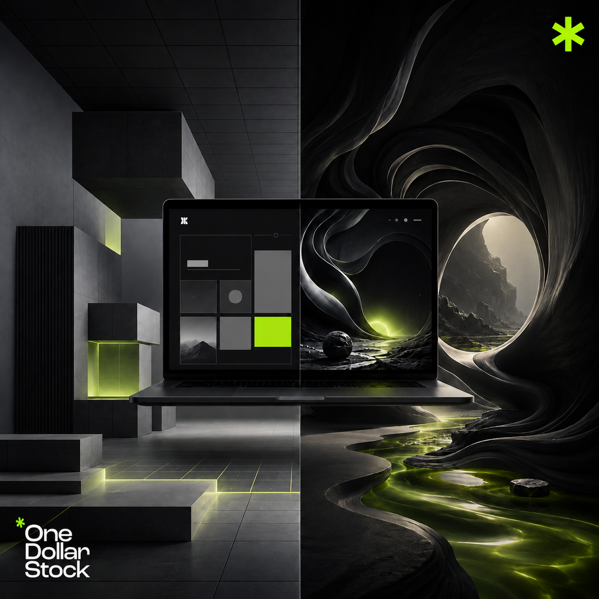
What Is a Framer Template and Who Should Use One?
A Framer template is a ready-made website design built for Framer. Instead of starting with a blank page, you begin with a pre-designed layout that already includes sections, spacing, typography, interactions, and page structure. For freelancers, founders, agencies, creators, and small businesses, a Framer template can make launching a website much faster. You can customize it with your own copy, images, colors, product visuals, and brand assets instead of building everything from zero. What is a Framer template? A Framer template is a reusable website layout created inside Framer. It can include pages, sections, components, animations, responsive layouts, buttons, forms, navigation, pricing blocks, FAQ sections, blog layouts, and landing page structures. In plain English, it is a website starting point. You take the template, edit the content, adjust the style, replace the images, connect your links, and publish a page that fits your brand or offer. A Framer template can be used for: Startup landing pages Portfolio websites Agency websites Creator pages Product launch pages SaaS landing pages Personal brand websites Waitlist pages Digital product pages Small business websites Why use a Framer template? Building a website from scratch takes time. You need to plan the layout, design every section, create responsive versions, choose typography, set spacing, build interactions, and make the page feel polished. A Framer template reduces that workload by giving you a ready-made design system that you can adapt to your project. This is useful when you need to launch quickly, test a new offer, build a clean landing page, create a portfolio, ship an MVP website, or present a product or service more professionally. A good template does not replace strategy. You still need clear messaging, a strong offer, and relevant visuals. But it can speed up the design and production process significantly. Who should use a Framer template? Framer templates are useful for anyone who needs a good-looking website or landing page without building every detail manually. They are especially helpful for small teams and solo operators who need to move quickly. Founders Founders can use Framer templates to launch startup websites, waitlist pages, SaaS landing pages, MVP pages, and product launch pages faster. This is useful for testing demand, collecting emails, explaining a product, or preparing for launch. Freelancers Freelancers can use Framer templates for portfolio websites, service pages, personal brand sites, and client landing pages. A template gives them a repeatable structure for presenting services, testimonials, case studies, pricing, and contact information. Agencies Agencies can use Framer templates to speed up client work, campaign pages, pitch concepts, and internal landing pages. They are useful for faster prototypes, layout testing, and polished first drafts before a more custom final version. Creators Creators can use Framer templates to build personal websites, link-in-bio alternatives, course pages, digital product stores, newsletter landing pages, and media kits. A template gives them a clean base they can customize around their content, audience, and offers. Small businesses Small businesses can use Framer templates for service websites, local business pages, booking pages, product pages, and simple brand websites. With the right template and visual assets, a small business can create a polished website faster. What makes a good Framer template? A good Framer template should not only look nice. It should support a real website goal. The layout should help visitors understand the offer, trust the brand, and take action. Look for a Framer template with: A clear hero section Strong CTA placement Good responsive design Readable typography Clean spacing Useful sections for the offer Easy customization Room for product screenshots or mockups Sections for social proof, features, pricing, or contact A style that fits your brand direction The best template is not always the most visually complex one. Often, the best choice is the template that makes your message clearer and your launch easier. Framer templates for landing pages and product launches One of the most common uses for Framer templates is landing page creation. A strong landing page needs a clear headline, value proposition, supporting visuals, benefits, features, proof, and a strong CTA. Framer landing page templates work well for SaaS products, digital products, agency services, newsletter signups, course launches, app launches, productized services, and lead generation campaigns. If you sell digital products, a Framer template can also help you create a more polished sales page. This applies to ebooks, templates, presets, LUTs, courses, design assets, Notion systems, and other downloadable products. A strong digital product page may include: A clear hero section Product mockups What is included Who it is for Benefits and use cases Preview images Testimonials or proof Strong CTA buttons A template provides the layout. Your copy, offer, mockups, product visuals, and creative assets make the page specific and easier to understand. How to customize a Framer template A template should never be used without customization. If you only replace the logo and leave everything else generic, the website may look like many other sites using the same layout. To make a Framer template feel more specific, customize: The headline and copy CTA buttons Brand colors Typography Hero visuals Product screenshots Mockups Section order Icons and graphics Photos, textures, and overlays The goal is to keep the strong structure of the template while making the visual system fit your brand. What to avoid when using a Framer template Framer templates can speed up website creation, but they still need thoughtful editing. A template can look weak if it is used without adapting it to the business. Avoid these mistakes: Keeping generic placeholder copy Using random stock photos that do not match the brand Leaving sections that do not support the offer Using too many animation effects Choosing a template only because it looks trendy Forgetting mobile responsiveness Using mockups that do not match the actual product Publishing without a clear CTA The template should support the message. It should not distract from it. When a Framer template is a good choice A Framer template is a good choice when speed, quality, and flexibility matter. It is especially useful when you need a polished page but do not want to build every section from scratch. Use a Framer template when you are launching a new brand, testing a startup idea, creating a SaaS landing page, building a freelancer portfolio, creating a campaign page for a client, promoting a digital product, building a creator website, creating a waitlist page, or refreshing a small business website. If you need a highly complex web app or custom backend system, a simple website template may not be enough. But for marketing pages, launch pages, portfolios, and small business sites, Framer templates can be a practical solution. Framer templates as part of a launch asset system A Framer template works best when it is supported by the right visual assets. A website launch often needs more than page structure. It needs product presentation, campaign graphics, brand visuals, and content assets. A practical launch asset system can include: Framer templates for the website or landing page structure Stock photos for hero sections, blog visuals, and campaign imagery Mockups for product, app, website, or digital download presentation Lightroom presets for consistent photo editing LUTs for launch videos and social content Textures and overlays for visual depth Social media graphics for launch promotion Creative bundles for building a complete visual direction This is where OneDollarStock becomes useful. You can start with Framer templates on OneDollarStock, then add stock photos, mockups, textures, and creative bundles to make the site feel more branded and complete. Final takeaway A Framer template is a ready-made website design that helps you launch faster without building every page from scratch. It is useful for founders, freelancers, agencies, creators, and small businesses that need clean landing pages, portfolios, product pages, or campaign sites. The strongest results come when a Framer template is customized with clear copy, strong visuals, and relevant brand assets. OneDollarStock can support that workflow by offering Framer templates and the visual assets needed to turn a basic template into a more polished, branded launch experience. Before you decide, keep this in mind What is a Framer template? A Framer template is a ready-made website design built for Framer. It gives you pre-designed pages, sections, layouts, and components that you can customize for your own brand, product, or business. Who should use a Framer template? Framer templates are useful for founders, freelancers, agencies, creators, and small businesses that need to launch websites, landing pages, portfolios, product pages, or campaign pages quickly. Are Framer templates good for startups? Yes. Framer templates can help startups launch SaaS pages, MVP websites, waitlist pages, and product landing pages faster without designing everything from zero. Can agencies use Framer templates for clients? Yes. Agencies can use Framer templates to speed up prototypes, campaign pages, landing pages, and early website concepts. The template should still be customized to match the client's brand and offer. Do I still need brand assets with a Framer template? Yes. A template gives you structure, but brand assets make the page feel specific. Stock photos, mockups, textures, overlays, presets, LUTs, and creative bundles can help turn a template into a complete brand launch system. Where can I find Framer templates? You can browse Framer templates on OneDollarStock and combine them with other launch assets such as stock photos, mockups, textures, overlays, and creative bundles.
Best Mockups for Digital Product Launches
Digital products are often hard to sell with words alone. A template, ebook, preset pack, course, app, or SaaS product may be valuable, but if the customer cannot quickly understand what they are getting, the offer feels weaker. This is where mockups help. A good mockup shows a digital product in context. It turns a flat file, screen, PDF, or download into something more tangible, visual, and easier to understand. For founders, creators, designers, marketers, and small businesses, mockups can increase perceived value, improve product presentation, and make a launch page feel more polished without needing a full custom photoshoot. Why mockups matter for digital product launches When someone buys a digital product, they cannot hold it in their hands. They need to understand what the product is, how it looks, how it works, and why it is useful. Mockups help bridge that gap by showing the product inside a realistic or styled environment, such as a laptop screen, phone screen, tablet, ebook cover, course dashboard, app interface, packaging-style preview, or website layout. Good mockups can help with: Making the offer easier to understand Increasing perceived value Making landing pages look more polished Creating better product images for social media Showing what the customer gets after purchase Improving ads, email graphics, and sales pages Creating a more professional launch campaign The goal is not to make a digital product look physical. The goal is to present it clearly, attractively, and in the right context. 1. Device mockups for apps and SaaS products Device mockups are one of the best choices for app launches and SaaS landing pages. They show the product interface inside a laptop, desktop monitor, tablet, or phone screen. They work well for SaaS dashboards, mobile apps, web apps, AI tools, productivity software, marketing platforms, finance tools, and creator tools. For SaaS products, a clean laptop or desktop mockup usually works best in the hero section. Phone mockups are better for mobile apps, social-first products, or responsive interface previews. The interface should stay readable and the mockup should not overpower the product. 2. Ebook and PDF mockups Ebook and PDF mockups are useful for digital guides, workbooks, recipe books, reports, checklists, lead magnets, and educational downloads. A flat PDF cover can look too simple on its own. Placing it into an ebook mockup, tablet mockup, or stacked-page preview can make the product feel more complete and valuable. Good ebook mockups can show: The cover design Selected inside pages A workbook or checklist format A digital guide on a tablet A bundle of multiple PDF resources This is especially useful for educational digital products, where customers want to know whether the material looks clear, organized, and worth paying for. 3. Template mockups Templates need strong visual presentation because the product itself is visual. Whether you are selling Canva templates, Notion templates, Framer templates, social media templates, website templates, pitch deck templates, or email templates, the mockup should show the design in use. Template mockups work best when they show multiple screens, pages, or formats together. This helps customers understand that they are buying a reusable system, not one isolated file. Useful template mockup ideas include: Website pages displayed on a desktop screen Mobile and desktop versions shown together Social media post templates arranged as a grid Pitch deck slides displayed in perspective Email designs shown inside a laptop screen Framer website templates shown as full landing page previews 4. Course mockups Online courses often include videos, modules, worksheets, slides, templates, and private resources. A course mockup should show the learning experience, not only the course title. Strong course mockups can include: A course dashboard on a laptop Video lesson previews Module cards or lesson lists Workbook pages Slide deck previews Bonus resources displayed as a bundle This helps the offer feel more structured. For educational products, clarity matters: the mockup should make the course feel organized, practical, and easy to follow. 5. Preset and LUT pack mockups Lightroom presets and LUTs are visual products, so they need before-and-after presentation. Customers want to see the effect clearly before they buy. For preset packs, useful mockups include: Before-and-after photo grids Lightroom-style editing previews Mobile photo editing scenes Multiple image examples using the same preset pack Styled product cover graphics For LUT packs, useful mockups include: Video frame before-and-after previews Cinematic color grading examples Timeline or editing software-inspired visuals Launch graphics showing multiple LUT looks Social video preview frames The mistake is showing only a file icon or generic cover. Presets and LUTs sell through visual transformation, so the result needs to be visible. 6. Creative bundle mockups Creative bundles often include multiple asset types, such as stock photos, mockups, textures, overlays, templates, presets, LUTs, or social media graphics. A good bundle mockup should make the collection feel organized and valuable. Instead of showing one image, it should show the range of what is included. Creative bundle mockups can include: A grid of included assets Stacked product cards Folder-style previews Multiple device screens Before-and-after examples Social media and website use cases 7. Website mockups for landing pages and themes Website templates, landing page kits, and themes need mockups that show the structure of the page. A customer wants to know what the template actually looks like, how sections are arranged, and whether the layout fits their business. Useful website mockups include: Full-page landing page previews Desktop screen mockups Mobile responsive previews Multiple page previews shown together Hero, features, pricing, and CTA section previews For website templates, the mockup should not only look stylish. It should make the structure clear. 8. Social media product mockups Digital product launches usually need social content. Mockups can help turn one product into many promotional visuals for Instagram, LinkedIn, Pinterest, Facebook, TikTok covers, and email graphics. Social media mockups work well for launch announcement posts, carousel covers, product feature posts, story graphics, ad creatives, countdown posts, and bundle reveal graphics. The best social mockups are simple and readable. They should show the product quickly, leave space for a headline, and match the brand's colors and layout style. How to choose the right mockup style The best mockup depends on the product, audience, and brand style. A premium business course should not use the same mockup style as a colorful creator template pack. A serious finance SaaS product should not look like a playful lifestyle ebook. Choose mockups based on: The type of product you are selling The platform where the product is used The visual style of the brand The level of realism you need The channel where the mockup will appear The amount of detail the customer needs to see Clean device mockups work well for SaaS and apps. Ebook mockups work well for PDFs and guides. Grid previews work well for templates and bundles. Before-and-after mockups work well for presets and LUTs. Where to use mockups during a product launch A strong mockup should not be used only once. It can support the full launch campaign across multiple channels. Use mockups in: Landing page hero sections Product image galleries Feature sections Pricing sections Email launch campaigns Social media posts Paid ads Sales decks Affiliate materials Checkout pages Using one consistent product presentation style across the website, ads, emails, and social media makes the launch feel more intentional. Common mockup mistakes to avoid Mockups can improve a launch, but only if they are used carefully. Poor mockup choices can make a digital product look less credible. Avoid these mistakes: Using mockups that do not match the actual product Showing too many devices or screens at once Using unrealistic scenes that distract from the offer Making the product preview too small to read Mixing too many different mockup styles in one launch Using low-resolution screenshots inside high-quality mockups Using mockups that imply physical delivery when the product is digital only The mockup should clarify the product, not confuse the buyer. How OneDollarStock helps with digital product launches OneDollarStock can help creators, founders, agencies, and small businesses build stronger digital product launches with practical creative assets. You can use mockups on OneDollarStock to present ebooks, templates, apps, SaaS dashboards, courses, presets, LUTs, websites, and digital downloads in a more polished way. You can also combine mockups with website templates to build landing pages faster, or use creative bundles to create a more complete launch system with related visuals, backgrounds, templates, and campaign assets. This matters because digital product launches rarely need only one image. A strong launch may need hero visuals, product previews, social graphics, email images, ad creatives, and sales page assets. Building those from one connected asset library helps the campaign feel more consistent. Final takeaway The best mockups for digital product launches are the ones that make the offer easier to understand. Device mockups work well for apps and SaaS products. Ebook mockups work well for PDFs and guides. Template mockups help show reusable design systems. Course mockups make educational products feel more structured. Bundle mockups help show the full value of a larger asset collection. Good mockups increase perceived value because they show the product in context. They help customers see what they are getting, how it works, and why it is useful. For digital product creators, startups, agencies, and small businesses, OneDollarStock can work as a practical source for mockups, website templates, and creative bundles that support a more polished and consistent launch. Good to know before you pick a mockup What are the best mockups for digital products? The best mockups depend on the product type. Device mockups work well for apps and SaaS products, ebook mockups work well for PDFs and guides, template mockups work well for design products, and bundle mockups work well for larger creative asset collections. Why should I use mockups for a digital product launch? Mockups help show the product in context. They make the offer easier to understand, increase perceived value, and help the launch page, ads, emails, and social media graphics look more professional. Do mockups increase perceived value? Yes. A mockup can make a digital product feel more complete and polished by showing how it looks in use. This helps customers understand the product faster and makes the offer feel more tangible. What mockups are best for SaaS products? Clean laptop, desktop, tablet, and phone mockups usually work best for SaaS products. They help show dashboards, app screens, product workflows, and interface previews in a clear and credible way. Can I use mockups with website templates? Yes. Mockups and website templates work well together. A website template gives the landing page structure, while mockups help present the product, app, ebook, course, or digital download inside that structure. Where can I find mockups for digital product launches? You can find mockups, website templates, and creative bundles on OneDollarStock to build a more complete visual system for digital product launches.

How to Keep Brand Visuals Consistent Across Website, Ads and Social Media
Brand visuals often become inconsistent when different channels are created separately. The website has one style, ads use another style, and social media looks like it belongs to a different brand. This is common for small brands, agencies, and marketing teams that need to publish quickly without one clear visual system. The solution is not always a full rebrand. In many cases, the brand simply needs a better creative asset workflow. When your stock photos, presets, LUTs, colors, mockups, textures, and templates follow the same direction, your website, ads, and social media start to feel connected. Consistency makes a brand easier to recognize. It also makes campaigns look more professional, even when the team is small and the content is produced quickly. Why brand visuals become inconsistent Visual inconsistency usually happens when every asset is created in isolation. A designer picks website images from one source. A marketer creates ads with different stock photos. A social media manager uses another template style. Video content gets edited with a different color tone. Over time, the brand starts to look fragmented. Common signs of inconsistent visuals include: Website photos that do not match social media posts Ads that use different colors from the main brand palette Videos that feel colder or warmer than the photo content Mockups with different device styles or backgrounds Social graphics that change layout every week Random textures, overlays, or effects used without a system Campaign visuals that look good individually but do not feel connected This creates friction for the audience. People may still understand the message, but the brand feels less intentional and less memorable. Start with one clear visual direction Before choosing assets, define how the brand should feel. This does not need to be complicated. A small team can start with a few simple words. For example, the brand could feel: Clean, minimal, and modern Warm, human, and approachable Bold, colorful, and energetic Premium, editorial, and refined Dark, cinematic, and high contrast Technical, structured, and precise Soft, natural, and lifestyle-focused This direction should guide every visual decision. If the brand is clean and minimal, the photos, mockups, templates, and textures should support that. If the brand is warm and human, the editing style, people photography, and social graphics should feel natural and approachable. Without this first decision, even high-quality assets can look random. Choose similar stock photos across channels Stock photos are often the first place where visual consistency breaks. A website may use bright lifestyle photos, while ads use dark corporate photos, and social media uses colorful creator images. Each photo may be fine on its own, but together they create a messy brand impression. To keep stock photos consistent, choose images with similar: Lighting Color temperature Contrast level Composition style Background type People, objects, or environments Level of realism or polish The goal is not to use the same image everywhere. The goal is to make different images feel like they belong to the same world. Use presets and LUTs to control color style Even if your photos are similar, they may still have different color tones. Some may be too warm, some too cold, some too contrasty, and some too flat. Lightroom presets help create a repeatable editing style for photos. A preset can help align brightness, contrast, highlights, shadows, saturation, color temperature, grain, texture, and overall mood. This is useful for website images, product photos, blog graphics, campaign visuals, and social media posts. Video should follow the same visual direction. LUTs help create a consistent color grade for reels, TikToks, YouTube Shorts, product demos, launch videos, and paid video ads. If your photos use a warm, soft, editorial look, your videos should not feel cold and flat. If your website feels clean and minimal, your video color grading should not be overly dramatic. Presets and LUTs help keep photo and video content inside the same visual system. Keep your color palette controlled Color consistency is one of the easiest ways to make a brand look more professional. A brand does not need many colors. It needs the right colors used repeatedly. A simple visual system can include: One main brand color One secondary color One accent color Neutral background colors Consistent text colors Consistent button colors Use these colors across the website, ads, email graphics, social media posts, and landing pages. Avoid changing button colors, headline colors, and background styles randomly from one campaign to another. The same rule applies to photo and video editing. If the brand palette is soft and neutral, avoid extremely saturated images. If the brand is bold and high contrast, avoid visuals that feel too muted unless the contrast is intentional. Use mockups with one visual style Mockups are useful for showing websites, apps, digital products, packaging, templates, and campaign materials. But inconsistent mockups can make the brand feel messy. To keep mockups consistent, choose similar: Device types Angles Backgrounds Lighting Shadow style Level of realism Color treatment When mockups follow the same style, the product feels more recognizable across website sections, ads, and social posts. Use textures, overlays, and templates consistently Textures and overlays can add depth to brand visuals. They can make simple graphics feel more designed and less flat, but they should be used with restraint. Useful texture and overlay styles include soft grain, paper texture, light leaks, dust effects, gradient overlays, shadow overlays, subtle noise, and film-inspired effects. Choose one or two styles and repeat them across channels. Templates help control layout consistency. They define where headlines go, how images are placed, how much spacing is used, where CTAs appear, and how sections are organized. This matters across every channel: Website templates keep landing pages visually structured Social media templates keep posts recognizable Ad templates help maintain campaign consistency Email templates keep newsletters aligned with the brand Presentation templates make sales materials feel connected For websites and landing pages, Framer templates can help small brands and agencies move faster while keeping a clean layout structure. Build one visual asset library The best way to keep visuals consistent is to stop treating every channel as a separate project. Instead, build one visual asset library that supports the whole brand. A practical brand asset library can include: Approved stock photos Lightroom presets for photo editing LUTs for video color grading Mockups for product presentation Textures and overlays Website templates Social media templates Ad creative layouts Brand colors and typography rules Reusable campaign graphics This library should not be a random folder of downloaded files. It should be organized by real use case: website, ads, social media, email, video, product visuals, and sales materials. OneDollarStock can work as a practical starting point for this kind of system because it includes multiple types of creative assets in one place. A team can combine stock photos, presets, LUTs, mockups, textures, overlays, and templates instead of sourcing each asset separately and hoping they match later. How to keep the website, ads, and social media aligned Each channel has a different job, but the visual language should stay connected. Website Your website should define the main visual direction. Use consistent hero images, feature visuals, mockups, background textures, colors, and CTA styles. The website usually becomes the central reference point for the rest of the brand. Ads Ads can be more direct and attention-grabbing, but they should still use the same photo style, colors, mockups, and editing direction. A person who clicks an ad should feel that the landing page belongs to the same campaign. Social media Social media can be more flexible, but it should not feel disconnected. Use recurring templates, similar crops, consistent color grading, and repeated visual motifs. This helps people recognize the brand in the feed. The key is controlled variation. Each channel can adapt the system, but it should not invent a new one every time. Example workflow for a consistent campaign Here is a simple workflow a small brand or agency can use: Define the campaign mood: decide whether the visuals should feel clean, warm, bold, premium, technical, or lifestyle-focused. Select matching stock photos: choose images with similar lighting, color, composition, and subject matter. Apply presets: edit photos with a consistent Lightroom preset style. Apply LUTs to video: color grade reels, ads, and demos so they match the photo direction. Choose mockups: present products, apps, websites, or digital files in a consistent mockup style. Add textures or overlays: use subtle effects to create depth and brand atmosphere. Use templates: place assets into consistent website, ad, and social media layouts. Review everything together: compare the website, ads, and posts side by side before publishing. What to avoid Visual consistency does not mean making every asset identical. The brand still needs variety, but that variety should happen inside a clear system. Avoid these mistakes: Choosing random stock photos for each channel Using unrelated presets and LUTs Changing the color palette from campaign to campaign Mixing too many mockup styles Using textures only because they look trendy Creating every social post from a blank page Letting ads look disconnected from the landing page Using templates without adapting them to the brand How OneDollarStock supports one visual system OneDollarStock can help small brands, agencies, and marketers build one connected visual system for websites, ads, and social media. Instead of using stock photos alone, teams can combine them with other creative assets: Stock photos for website sections, ads, blog visuals, and social content Lightroom presets for consistent photo editing LUTs for consistent video color grading Mockups for product, app, website, and campaign presentation Textures and photo overlays for visual depth and atmosphere Framer templates for faster landing page and website production This is useful because most brand visuals are not built from one asset type. A strong campaign may need photos, edited color styles, video grading, mockups, layout templates, and background textures. When those assets are selected together, the final brand presence feels much more consistent. Final takeaway Consistent brand visuals do not happen by accident. They come from repeated visual decisions: similar photos, controlled colors, matching presets, aligned LUTs, consistent mockups, subtle textures, and reusable templates. For small brands, agencies, and marketers, the most practical solution is to build one visual asset library and use it across the website, ads, and social media. OneDollarStock can support that workflow by giving teams access to stock photos, Lightroom presets, LUTs, mockups, textures, overlays, and Framer templates in one creative asset system. When your visuals come from one clear system, your brand becomes easier to recognize, easier to manage, and more professional across every channel. Things worth knowing before you build your visual system How do I keep brand visuals consistent? Keep brand visuals consistent by using similar stock photos, a controlled color palette, matching Lightroom presets, aligned LUTs for video, consistent mockups, repeated textures, and reusable templates across all channels. Why do my website, ads, and social media look different? This usually happens when each channel is created separately without one shared visual system. Different photos, colors, templates, mockups, and editing styles can make the brand feel disconnected. Can stock photos be part of a consistent brand system? Yes. Stock photos can work well when they are selected with a consistent aesthetic and edited with similar color grading or presets. They should match the brand's tone, audience, and campaign style. Should my photos and videos have the same style? They should feel visually connected. Photos and videos do not need to be identical, but they should share a similar mood, color direction, contrast level, and brand tone. How can OneDollarStock help with visual consistency? OneDollarStock can help by providing stock photos, Lightroom presets, LUTs, mockups, textures, overlays, and Framer templates that can be combined into one visual system for websites, ads, and social media.

How to Make Stock Photos Look Less Generic
Stock photos can make a website, campaign, or landing page look polished quickly. They can also make a brand look cheap, generic, and forgettable if they are used without a clear visual system. The problem is usually not stock photography itself. The problem is using stock photos as isolated images instead of treating them as part of the brand's full creative direction. A strong stock photo can become much more effective when it is cropped well, color graded consistently, paired with textures or overlays, used inside mockups, and matched to the rest of the brand's visual assets. For startups, small businesses, creators, and marketing teams, the goal is not to hide that a photo is from a stock library. The goal is to make the image feel intentional, specific, and connected to the brand. Why stock photos often look generic Stock photos usually look generic when they are too polished, too staged, too obvious, or too disconnected from the message. A random smiling team photo on a SaaS landing page, a fake handshake on a service website, or a flat laptop image used without styling can immediately weaken the page. Generic stock photo use often happens when brands choose images based only on the subject. They search for "business meeting," "startup," "marketing," or "teamwork" and pick the first image that looks clean. That approach creates visuals that technically match the topic but do not match the brand. Better stock photo use starts with a more specific question: what should this brand feel like? 1. Choose a consistent aesthetic first Before choosing stock photos, define the visual mood of the brand or campaign. If the photos do not share a consistent aesthetic, the final design will look random no matter how high quality the images are. A brand aesthetic can be: Clean and minimal Warm and human Bold and high contrast Premium and editorial Soft and lifestyle-focused Dark, cinematic, and modern Bright, colorful, and creator-focused Technical, structured, and SaaS-oriented Once the aesthetic is clear, choose photos that match it. Do not mix cold corporate office images with warm lifestyle photography unless the contrast is intentional. Do not combine soft natural light with harsh neon visuals unless the brand system supports that mix. This is where OneDollarStock can be useful as a visual asset base. Instead of downloading one random photo at a time, teams can build a focused collection of stock photos, textures, overlays, presets, mockups, and templates that all support the same direction. 2. Avoid the most obvious stock photo clichés Some stock photo categories are overused because they are easy to understand. The issue is that users have seen them too many times. These images can make a new brand feel outdated before the visitor even reads the copy. Common clichés to avoid include: Fake handshakes Overly staged boardroom meetings People pointing at transparent screens Random smiling office workers with no real context Generic laptop-on-desk images with no personality Unrealistic customer support headset photos Abstract technology images that say nothing specific Photos that look disconnected from the product or audience This does not mean you can never use business, workspace, or technology photos. It means the image needs to feel more specific. A quiet founder working late, a realistic team reviewing a dashboard, a close-up of a creative process, or a well-composed desk scene can work better than a generic office group smiling at a camera. 3. Crop photos instead of using them as-is Cropping is one of the easiest ways to make stock photos feel less generic. Many stock photos are designed to be flexible, which means the original image may feel too broad or obvious. A better crop can make the same image feel more editorial and brand-specific. Use cropping to: Create negative space for text Remove distracting background details Focus on hands, devices, products, materials, or textures Make the image feel more abstract or atmospheric Create stronger alignment with website sections or ad formats Turn one image into several different campaign visuals For example, instead of using a full office photo, crop into the laptop, hands, notebook, or screen area. Instead of showing a full person, crop the image into a more subtle lifestyle detail. This can make the visual feel more custom, even when the source is a stock photo. 4. Use overlays and textures with restraint Overlays and textures can help stock photos feel more connected to the brand. A subtle gradient overlay, shadow overlay, grain layer, light leak, paper texture, or color wash can make different images feel like they belong to the same campaign. They work well for website hero sections, landing page backgrounds, social media graphics, YouTube thumbnails, email headers, ad creatives, product launch graphics, and editorial blog visuals. The key is restraint. Overlays should support the image, not cover it completely. Textures should also match the brand tone. A luxury brand may use soft paper grain or subtle shadows. A creator brand may use bolder film grain or colorful textures. A SaaS brand may use clean gradients, soft noise, or minimal abstract backgrounds. 5. Use color grading, presets, and LUTs for consistency Color is one of the biggest reasons stock photos look disconnected. If one image is warm, another is cold, another is high contrast, and another is muted, the page immediately feels inconsistent. Decide whether the campaign should feel warm or cool, bright or moody, soft or high contrast, natural or stylized, clean or cinematic. Then apply similar color treatment across all selected visuals. Lightroom presets help turn color consistency into a repeatable workflow. Instead of manually editing every stock photo from zero, a team can apply the same preset family across images and make smaller adjustments where needed. If your campaign includes video, LUTs should follow the same visual direction. They help create a consistent color grade across launch videos, reels, product demos, founder videos, YouTube content, and paid ads. The mistake is applying presets or LUTs too aggressively. A good edit should improve consistency without making every image or video look overprocessed. 6. Use mockups and templates to create context Mockups are a strong way to make stock photos feel connected to a real product or campaign. Instead of using a plain image alone, you can place screenshots, designs, digital products, app screens, packaging, posters, or website previews into a mockup scene. This works well for SaaS landing pages, digital product launches, brand presentations, portfolio pages, ad creatives, social media posts, sales decks, and email campaigns. Templates help stock photos work harder. A strong website or social media template gives structure to the visual system: spacing, hierarchy, typography, image placement, CTA flow, and content rhythm. For example, a Framer template can provide a landing page structure, while stock photos, mockups, textures, and overlays create the visual direction. This is faster than designing every section from scratch and usually more consistent than placing random photos into a blank layout. 7. Match photos to the page structure Stock photos should serve the layout. A good image for a hero section may not work in a feature section. A strong social post image may not work as a testimonial background. Choosing images by placement helps avoid generic design. For a website or landing page, think in sections: Hero section: clean, spacious, high-impact image with room for text Feature section: specific image that supports the product or service benefit About section: more human, warm, or process-oriented image Testimonial section: subtle trust-building visual, not fake customer portraits CTA section: simple background or visual that does not compete with the button Blog section: editorial images that support the topic and visual system When each photo has a clear job, the website looks more intentional. When photos are added only to fill empty space, the design starts to feel cheap. 8. Keep visual consistency across channels A stock photo should not only look good on one page. It should fit the larger brand system across the website, social media, ads, email campaigns, pitch decks, and sales materials. Consistency does not mean every image must look identical. It means the viewer should feel that the visuals belong to the same brand. You can create that feeling through repeated choices: Similar color grading Consistent cropping style Recurring textures or overlays Similar lighting and composition Matching mockup styles Consistent use of templates Clear connection to brand colors and typography This is what makes stock photos look less generic. The image becomes part of a system instead of standing alone. Example workflow: from generic stock photo to branded visual Here is a simple workflow for improving a stock photo before using it in a campaign: Choose the right image: select a photo that matches the audience, product, and brand tone. Crop with intention: remove unnecessary details and create space for copy or layout elements. Apply color grading: adjust warmth, contrast, saturation, shadows, and highlights to match the brand. Add texture or overlay: use subtle grain, gradient, light, or shadow treatment to create depth. Place it into a template: use consistent typography, spacing, and CTA placement. Check it against other assets: make sure it fits the rest of the website, social posts, ads, or sales materials. This process turns a basic stock image into a usable brand asset. How OneDollarStock helps make stock photos less generic OneDollarStock is useful because it is not only a place to find stock photos. It can work as a broader creative asset library for building a full visual system. Instead of using stock photos in isolation, brands can combine them with: Photo overlays for atmosphere and visual effects Textures for depth and background treatments Lightroom presets for consistent photo editing LUTs for matching video color grading Mockups for product and campaign presentation Framer templates for faster landing page production Social media graphics for consistent campaign rollout This matters because the strongest brand visuals usually come from combinations. A stock photo becomes more useful when it is edited with a preset, cropped for a layout, paired with a texture, placed into a template, or used alongside a mockup. For startups, small businesses, creators, agencies, and marketing teams, this can reduce blank-page work and help create a more consistent brand presence across multiple channels. Final takeaway Stock photos look generic when they are used randomly. They look more premium when they are part of a clear visual system. To make stock photos look less generic, choose a consistent aesthetic, avoid obvious clichés, crop intentionally, use overlays and textures, apply color grading, work with Lightroom presets and LUTs, use mockups and templates, and keep the same visual direction across the full campaign. OneDollarStock can help by giving teams access to stock photos and the supporting assets needed to make them feel more branded: overlays, textures, presets, LUTs, mockups, templates, and campaign-ready visual elements. The result is not just a better photo. It is a stronger, more consistent brand system. Things worth knowing before you start Why do stock photos look generic? Stock photos look generic when they are chosen randomly, used without editing, or disconnected from the brand's visual style. Common clichés like fake handshakes, staged office scenes, and unrelated business images can also make a page feel cheap. How can I make stock photos look more branded? You can make stock photos look more branded by choosing a consistent aesthetic, cropping intentionally, applying color grading, using Lightroom presets, adding overlays or textures, and placing images inside consistent website or social media templates. Should I edit stock photos before using them? Yes. Light editing usually helps. Adjusting crop, contrast, color temperature, saturation, shadows, highlights, and texture can make a stock photo fit the brand better. Can overlays and textures improve stock photos? Yes. Subtle overlays and textures can add depth, atmosphere, and consistency. They are especially useful for hero sections, campaign graphics, social media posts, thumbnails, and landing page backgrounds. Are Lightroom presets useful for stock photos? Yes. Lightroom presets help create a repeatable photo style, especially when a brand uses images from different sources. They can make stock photos feel more consistent across websites, ads, social media, and sales materials. How does OneDollarStock help with stock photo design? OneDollarStock helps by offering stock photos together with supporting creative assets such as overlays, textures, Lightroom presets, LUTs, mockups, Framer templates, and social media graphics. This makes it easier to build a full visual system instead of using photos in isolation.
Lightroom Presets vs LUTs: What Is the Difference?
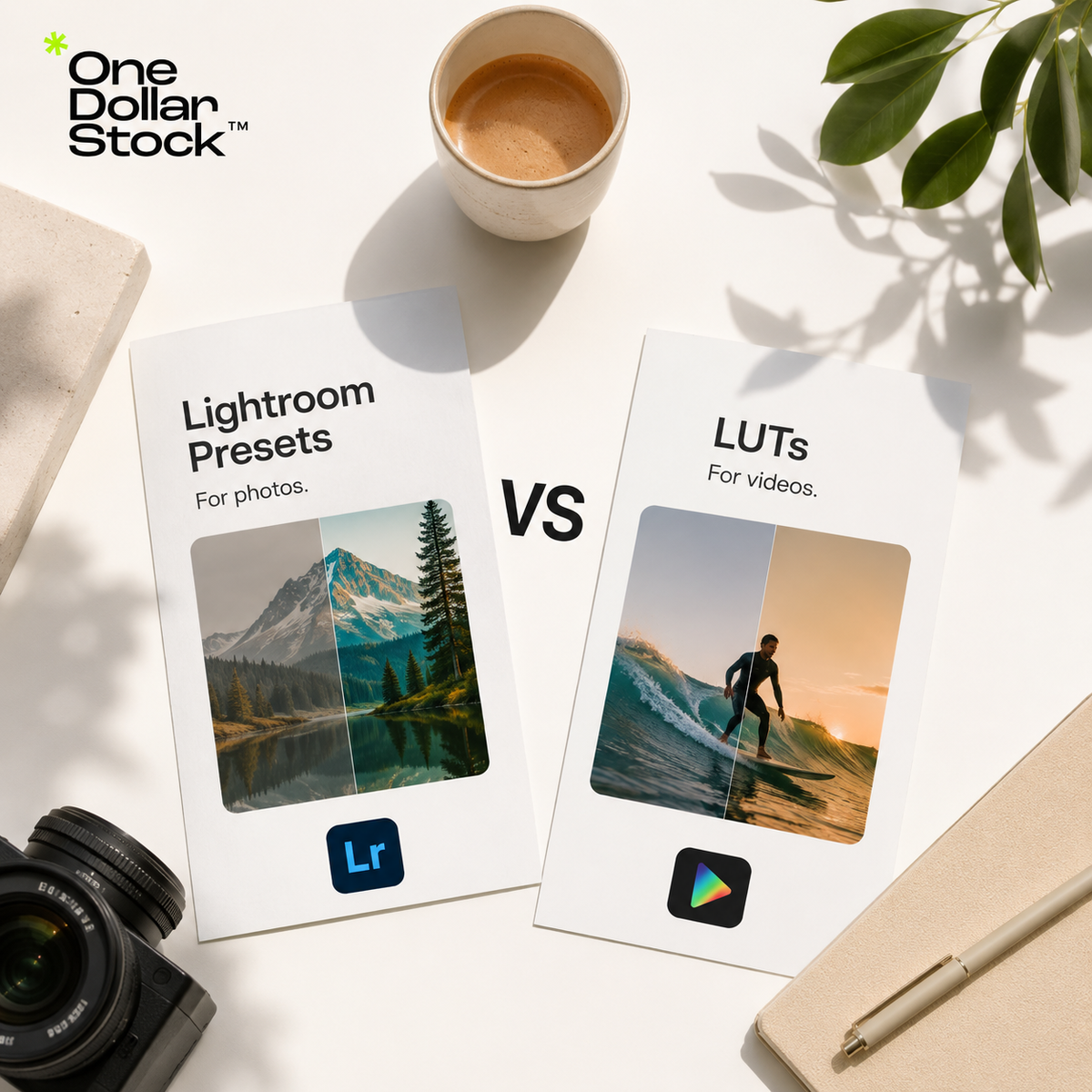
If you are trying to create a consistent visual style for your brand, you will probably see two common terms: Lightroom presets and LUTs. They sound similar because both are used to change the look of images, colors, contrast, shadows, highlights, and overall mood. But they are not the same thing. Lightroom presets are mainly for editing photos, while LUTs are mainly for color grading videos. If your brand uses both photos and videos, you may need both. This guide explains the difference in plain English so you can choose the right tool for your workflow. What is a Lightroom preset? A Lightroom preset is a saved group of photo editing settings. When you apply a preset to a photo in Adobe Lightroom, it can instantly adjust color, brightness, contrast, shadows, highlights, saturation, tone curve, grain, sharpness, and other photo editing controls. In simple terms, a preset is like a reusable photo editing recipe. Instead of adjusting every photo from zero, you can apply a preset and quickly create a more consistent look. Lightroom presets are useful for: Brand photography Product photos Website images Instagram posts Blog images Portraits Lifestyle photos Campaign visuals Stock photo editing If your main problem is that your photos look inconsistent, Lightroom presets are usually the right starting point. What is a LUT? A LUT, short for Look-Up Table, is a color grading file used to change the color and tone of video footage. LUTs are commonly used in video editing software to create a specific look, such as cinematic, warm, clean, moody, high contrast, soft, vintage, or commercial. In simple terms, a LUT is like a reusable color style for video. It does not usually control as many detailed editing settings as a Lightroom preset. It mainly transforms color and tone. LUTs are useful for: Brand videos Reels TikToks YouTube videos Product demos Launch videos Ads Founder videos Client case study videos Short-form social content If your main problem is that your videos look flat, mismatched, or off-brand, LUTs are usually the better tool. Lightroom presets vs LUTs: the simple difference Feature Lightroom Presets LUTs Main use Photo editing Video color grading Best for Photos, stock images, portraits, product shots, lifestyle images Video clips, reels, ads, YouTube content, product demos Used in Adobe Lightroom Video editing software What they adjust Color, exposure, contrast, shadows, highlights, grain, tone, and more Mainly color and tone Best goal Consistent photo style Consistent video style Brand use case Website images, social photos, product photos, blog graphics Launch videos, social videos, ads, content clips The easiest way to decide is to start with the content format. For photos, use Lightroom presets. For videos, use LUTs. For a brand that uses both, use both together. When should you use Lightroom presets? Use Lightroom presets when you need your photos to look more consistent. This is especially useful if your brand uses images from different sources, such as original photography, stock photos, founder photos, product images, and lifestyle content. Lightroom presets are a good choice when you want to: Create a consistent photo style Edit stock photos so they feel less generic Make website images match your brand tone Prepare social media photos faster Build a repeatable visual workflow Give product or lifestyle photos a more polished look You can explore Lightroom presets on OneDollarStock if you need ready-made photo styles for brand content, websites, social media, and campaigns. When should you use LUTs? Use LUTs when you are working with video and want your footage to have a consistent color style. This matters because many brands publish video across Instagram, TikTok, YouTube, ads, product pages, and landing pages. LUTs are a good choice when you want to: Color grade videos faster Create a consistent video style Make social videos look more polished Match video content with your brand mood Improve launch videos, ads, and reels Build a repeatable video editing workflow You can browse LUTs on OneDollarStock if you need color grading looks for video content, launch campaigns, short-form clips, and brand videos. Can presets and LUTs be used interchangeably? Lightroom presets are designed mainly for photos inside Lightroom. They are not the standard tool for video color grading. If you want to edit video, LUTs are usually the better option because they are made for video workflows and can be used in many editing tools. LUTs can sometimes be used on still images depending on the software, but they are mainly built for video color grading. For most photo workflows, Lightroom presets are easier and more practical because they give more detailed control over photo editing. If you want your videos to match your photo style, choose LUTs that share a similar mood with your Lightroom presets. Why brands often need both Most modern brands do not use only one type of content. A small business may need website photos, product images, Instagram posts, short-form videos, YouTube content, ad creatives, and email graphics. Presets help your photos look consistent. LUTs help your videos look consistent. When both tools follow a similar visual direction, your brand feels more connected across channels. For example, a brand could use: A warm Lightroom preset for website and social photos A matching warm LUT for reels and ads Similar contrast and saturation across both photo and video The same overall mood across landing pages, campaigns, and content This does not mean every asset needs to look identical. It means the viewer should feel that all the visuals belong to the same brand. How to choose between presets and LUTs If you are not sure what you need, start with your content format. If you mostly edit photos: choose Lightroom presets. If you mostly edit videos: choose LUTs. If you use both photos and videos: use both, but choose styles that visually match. If you run a brand or agency: build a small preset and LUT system so all content feels more consistent. The wrong approach is to choose random presets and random LUTs that do not match each other. That can make a brand feel messy. The better approach is to choose a visual direction first, then select photo and video tools that support it. Examples of matching presets and LUTs by brand style Clean SaaS brand Use Lightroom presets with bright whites, controlled contrast, natural skin tones, and minimal color shifts. Pair them with LUTs that keep video clean, sharp, and professional. Warm lifestyle brand Use presets with warm tones, soft highlights, gentle contrast, and natural shadows. Pair them with warm LUTs for reels, product videos, and social campaigns. Premium editorial brand Use presets with deeper contrast, refined colors, and a more polished finish. Pair them with cinematic LUTs that make video content feel elevated but not overprocessed. Creator or social-first brand Use presets with bold color, clear contrast, and strong visual personality. Pair them with LUTs that make short-form video feel energetic and recognizable. Common mistakes to avoid Presets and LUTs are useful, but they are not magic. They still need good source material and careful adjustment. Avoid these mistakes: Using presets or LUTs that do not match your brand Applying the same look too heavily to every image or clip Mixing too many unrelated styles Ignoring lighting differences between photos or videos Expecting one preset or LUT to fix every file perfectly Using a cinematic LUT on content that should feel clean and natural Using a warm preset when your brand needs a cooler technical look The best results usually come from using a preset or LUT as a starting point, then making small adjustments for each image or clip. How OneDollarStock helps build a consistent visual style OneDollarStock can help creators, startups, agencies, and small businesses build a more consistent visual system by combining different types of creative assets in one workflow. For photos, you can use Lightroom presets to create a repeatable editing style across stock photos, product images, website visuals, and social content. For videos, you can use LUTs to bring a similar color direction to reels, ads, product demos, YouTube videos, and launch clips. Together, presets and LUTs help your brand avoid the common problem of mismatched visuals. Instead of every photo and video feeling separate, your content starts to feel like part of one brand system. Final takeaway Lightroom presets and LUTs both help shape visual style, but they are used for different workflows. Lightroom presets are mainly for photos. LUTs are mainly for videos. If you only edit photos, start with Lightroom presets. If you only edit videos, start with LUTs. If your brand uses both photos and videos, use both tools together to create a more consistent visual identity. For brands that want a faster workflow, OneDollarStock offers Lightroom presets and LUTs that can help create a more polished and connected style across websites, social media, ads, launch campaigns, and content. Before you choose, here is what to keep in mind What is the main difference between Lightroom presets and LUTs? Lightroom presets are mainly used for editing photos in Adobe Lightroom. LUTs are mainly used for color grading videos in video editing software. Presets usually control more photo editing settings, while LUTs mainly change color and tone. Do I need Lightroom presets or LUTs? If you edit photos, you probably need Lightroom presets. If you edit videos, you probably need LUTs. If your brand uses both photos and videos, using both can help you keep a consistent style across different types of content. Can I use Lightroom presets for brand photos? Yes. Lightroom presets are useful for brand photos, product images, lifestyle content, website visuals, social media posts, and stock photos. They help create a repeatable look across your photo content. Can I use LUTs for social media videos? Yes. LUTs are useful for reels, TikToks, YouTube Shorts, ads, product demos, launch videos, and other short-form content. They help make video color more consistent and polished. Should my presets and LUTs match? Yes, if you want a consistent brand style. They do not need to be identical, but they should share a similar mood, color direction, contrast level, and overall feel. Where can I find Lightroom presets and LUTs? You can find ready-made Lightroom presets and LUTs on OneDollarStock for photo editing, video color grading, and consistent brand content creation.

What are Best Stock Photos for SaaS Landing Pages?
A strong SaaS landing page needs more than clean copy and a good product screenshot. The right stock photos can make the page feel modern, trustworthy, and easier to understand. They are especially useful when a company does not yet have custom brand photography or a large library of original visuals. The key is choosing photos that support the message instead of distracting from it. SaaS websites usually need visuals that feel simple, credible, and current. They should work naturally in hero sections, feature blocks, testimonial areas, CTA sections, blog graphics, and sales pages. Why stock photos matter for SaaS landing pages SaaS products are often abstract. A visitor may not understand the value of the software from text alone. Good visuals help create context around the product: who uses it, what kind of workflow it supports, and what type of business it is built for. Stock photos can help SaaS brands communicate speed, collaboration, clarity, productivity, trust, creativity, or technical sophistication. When used well, they make the page feel more human without overwhelming the product message. A useful SaaS landing page asset library should include both product visuals and supporting lifestyle or workplace imagery. Product screenshots show the interface, while stock photos help create the right mood and context around the offer. What kind of stock photos work best for SaaS? The best stock photos for SaaS landing pages are usually clean, modern, simple, and believable. They should feel like they belong inside a digital product experience, not like random corporate filler. Look for photos that have: Clean compositions with enough negative space for text Modern work environments, devices, and team settings Natural lighting and realistic colors People using laptops, phones, tablets, dashboards, or digital tools Simple backgrounds that do not compete with the copy A visual tone that matches the product category Authentic-looking scenes instead of staged corporate clichés A SaaS landing page usually does not need overly dramatic photography. It needs visuals that make the product feel useful, credible, and easy to adopt. 1. Hero section photos The hero section is the first major visual impression of the landing page. The stock photo used here should support the main value proposition immediately. For SaaS hero sections, the best images are simple and spacious. They should leave room for a headline, subheadline, CTA button, product screenshot, or interface mockup. Busy images with too many faces, objects, or colors can make the hero section harder to read. Good SaaS hero photo ideas include: A clean desk setup with a laptop and soft lighting A founder or professional using software in a modern workspace A small team collaborating around a screen A close-up of hands working on a laptop or tablet An abstract technology background with enough negative space A modern office scene that feels calm and focused The image should match the product's positioning. A finance SaaS may need a more serious and premium look. A creator tool may need something lighter and more expressive. A B2B operations platform may need clean, structured, professional imagery. 2. Feature section photos Feature sections explain what the product does. In many SaaS pages, product screenshots or UI cards are the main feature visuals. However, stock photos can still support these sections when they show the use case behind the software. For example, a project management tool can use photos of teams planning work. A CRM can use sales or customer support imagery. A design tool can use creative workspaces. A productivity app can use simple focused-work scenes. Feature photos should not feel decorative. They should make the feature easier to understand. If a photo does not connect to the feature, it is probably not the right image. 3. Testimonial and social proof photos Testimonial sections work better when they feel credible. Stock photos can support this area, but they need to be used carefully. Overly polished headshots or obviously fake corporate portraits can reduce trust. If the page uses real testimonials, real customer photos are usually better. If those are not available, use neutral supporting imagery instead of pretending a stock model is a real customer. For example, you can use workplace scenes, team images, or industry-relevant visuals around the testimonial block rather than fake profile photos. For SaaS social proof sections, consider images that show: Teams using digital tools Customer support or sales workflows Founders reviewing dashboards Professionals collaborating remotely Clean office environments connected to the product category The goal is to create trust without making unsupported claims. 4. CTA section photos A call-to-action section needs visual clarity. The image should guide the visitor toward the next step, not distract from it. For SaaS CTA sections, simple images usually work best. A clean product-related workspace, a soft gradient background, an abstract visual, or a focused device image can all work. Avoid photos with too much detail behind the CTA button. Useful CTA image types include: Minimal laptop scenes Clean abstract backgrounds Simple office or desk photography Soft technology-inspired visuals Calm team collaboration scenes The CTA section should feel like a natural conclusion to the page. The stock photo should reinforce confidence and reduce friction. 5. Blog and content photos SaaS brands often publish blog posts, guides, comparison pages, case studies, and educational content. Stock photos are useful here because they help create a consistent editorial system. For blog content, choose images that fit the topic without being too literal. A post about productivity can use focused-work photography. A post about analytics can use dashboards, data, or clean business visuals. A post about remote teams can use modern collaboration imagery. When the same visual style is used across blog images, landing pages, email graphics, and social media posts, the SaaS brand starts to feel more intentional. What SaaS stock photos should avoid Bad stock photos can make a SaaS landing page feel generic. This is a common problem in B2B software design. A photo may be technically high quality but still feel wrong for the brand. Avoid: Fake-looking handshakes Overly staged boardroom scenes Random smiling office workers with no connection to the product Photos with outdated laptops, phones, or office interiors Images that are too busy for landing page layouts Visuals that look like generic enterprise software from ten years ago Photos that do not match the actual customer or use case The best SaaS imagery feels current, calm, and specific enough to support the product story. How to choose photos by SaaS category Different SaaS products need different visual styles. A single stock photo style will not work for every product. For productivity SaaS Use clean workspaces, focused laptop scenes, calendars, notebooks, planning boards, and minimal office environments. The visual tone should feel organized and efficient. For AI SaaS Use modern technology visuals, abstract digital backgrounds, clean interfaces, workstations, and subtle futuristic imagery. Avoid cliché robot photos unless the brand is intentionally playful. For finance SaaS Use premium, structured, trustworthy imagery. Clean desks, data dashboards, business professionals, and subtle financial visuals work better than exaggerated money graphics. For marketing SaaS Use creative team scenes, content planning, analytics dashboards, social media workflows, and campaign-related visuals. The tone can be more energetic but should still feel professional. For HR or team management SaaS Use people-focused images, collaboration scenes, hiring visuals, team meetings, and remote work setups. The photos should feel human and credible, not overly staged. How stock photos and Framer templates work together Stock photos are only one part of a SaaS landing page. Layout matters too. A strong landing page needs a clear hierarchy: hero section, problem statement, product value, feature blocks, social proof, pricing or plan information, and CTA. This is where Framer templates can speed up the process. A founder or designer can start with a clean SaaS landing page structure, then customize it with relevant stock photos, product screenshots, mockups, copy, and brand colors. The template provides the structure, while the stock photos help create the visual tone. This combination is especially useful for early-stage startups, MVP launches, productized services, and small teams building marketing pages without a large design department. How to build a SaaS landing page asset kit Instead of downloading random images, build a small visual system for the page. A practical SaaS landing page asset kit could include: One hero section image with strong negative space Three to five feature-support images One or two team or workflow images for trust sections One clean CTA background image Several blog or resource images for related content Product mockups or screenshots for the main offer A Framer template for the landing page structure This gives the brand enough visual material to launch the page, create social posts, build email graphics, and support a short campaign around the product. If you want a faster starting point, creative bundles on OneDollarStock can help you build a focused visual kit in one step. Why OneDollarStock is useful for SaaS landing pages OneDollarStock can work as a practical asset base for SaaS founders, designers, and marketers who need landing page visuals quickly. Teams can build a focused collection of stock photos that match the product's tone and page structure. SaaS landing pages often need more than photos. A complete launch workflow may include stock photos for hero and content sections, Framer templates for the website structure, mockups for product presentation, textures for backgrounds, and social graphics for campaign promotion. For early-stage SaaS teams, this can reduce blank-page work and help the brand launch with a more consistent visual direction. Final takeaway The best stock photos for SaaS landing pages are simple, modern, credible, and connected to the product's use case. They should support the page structure, not compete with it. Use clean hero images, relevant feature visuals, believable trust-section photography, simple CTA backgrounds, and consistent blog imagery. When paired with a strong Framer template, the right stock photos can help a SaaS brand launch faster and look more polished from the first version of the website. If you are building a SaaS landing page, OneDollarStock can help you create a flexible visual base with stock photos and Framer templates that support a faster, more consistent launch. Practical answers before you start building What are the best stock photos for SaaS landing pages? The best stock photos for SaaS landing pages are clean, modern, simple, and credible. They usually show workspaces, digital tools, teams, laptops, dashboards, collaboration, or abstract technology visuals that support the product message. Should SaaS landing pages use people photos? Yes, people photos can work well when they feel natural and relevant. They are useful for showing users, teams, collaboration, customer support, or workflow context. Avoid fake-looking corporate photos that feel disconnected from the product. Can stock photos be used in a SaaS hero section? Yes. Stock photos can work in SaaS hero sections when they have enough negative space, match the brand tone, and support the main value proposition. Simple laptop, workspace, team, or abstract technology images often work well. Are Framer templates useful for SaaS landing pages? Yes. Framer templates can help SaaS teams build landing pages faster by providing a ready-made structure for hero sections, features, testimonials, pricing, and CTAs. Stock photos can then be added to create the right visual style. How can OneDollarStock help SaaS founders and marketers? OneDollarStock can help SaaS teams find stock photos, Framer templates, mockups, textures, and other creative assets for building landing pages, launch campaigns, social media graphics, and marketing content more quickly.
What Should Be Included in a Brand Launch Kit?
A brand launch kit should include the practical visual assets a new business needs to publish its first website, social media posts, launch emails, product visuals, ads, and sales materials. For a startup, small business, creator, or agency, the right kit creates a faster, cleaner, and more consistent brand presence from day one. What is a brand launch kit? A brand launch kit is a collection of reusable creative assets prepared before a brand goes public. It supports the first website, social media campaign, product announcement, pitch deck, email launch, ad campaign, and sales content. A useful launch kit is more than a logo folder. It should include the visual materials a brand will actually use during launch week, such as stock photos, mockups, website visuals, social media graphics, presets, LUTs, templates, textures, overlays, product visuals, and sales assets. Brand launch kit checklist A strong brand launch kit should be organized around real marketing use cases. A practical starter kit can include: 10 to 20 stock photos for the website, blog, ads, and social media 3 to 5 website hero images or section backgrounds 3 to 5 product, website, app, packaging, or digital product mockups 1 landing page or website template for the first launch page 10 to 15 social media graphics for launch week 3 to 5 ad creative layouts for paid campaigns 1 consistent Lightroom preset direction for brand photography 1 LUT style for launch videos and short-form content 5 to 10 textures, overlays, or background effects 1 small pitch, proposal, or sales visual pack The exact number of assets depends on the brand, but the goal is simple: make the launch easier to execute without making the visual system feel random. Core assets to include in a brand launch kit The table below shows the most useful asset types and where they fit inside a real launch workflow. Asset type Main use case Example Stock photos Website, blog, ads, newsletters, and social media Hero images, section backgrounds, campaign visuals Mockups Product, website, app, packaging, and offer presentation App screen mockup, ebook mockup, website preview Lightroom presets Consistent photo editing Warm editorial, clean minimal, cinematic, or premium look LUTs Launch videos and short-form content Reels, TikToks, YouTube Shorts, product demos Website templates Faster landing page or website creation Framer landing page, startup homepage, product page Textures and overlays Visual depth and brand atmosphere Grain, paper texture, light leaks, shadows, gradients Social media graphics Launch announcement and campaign content Countdown posts, feature graphics, story templates Sales assets Pitching, proposals, and early customer communication Deck visuals, PDF covers, one-pagers, media kit graphics 1. Stock photos for website, ads, and content Stock photos are one of the most flexible parts of a brand launch kit. They can be used in website hero sections, landing pages, blog posts, newsletters, social media graphics, paid ads, and presentation slides. The key is to choose photos that match the brand direction. A wellness brand may need calm, natural, and soft imagery. A tech startup may need clean workspaces, abstract digital visuals, or product-focused compositions. A creative agency may need bolder editorial images with stronger contrast and personality. For a launch kit, avoid collecting random images. Build a focused photo set around tone, subject matter, color, lighting, and intended use. 2. Mockups for products, websites, apps, and offers Mockups help make an offer easier to understand. Instead of showing a flat design file, a brand can present a product, website, app, packaging, ebook, course, template, or digital download in a realistic context. For a brand launch, mockups are useful across website hero sections, product launch graphics, social media posts, pitch decks, email campaigns, ads, and sales pages. A good mockup can quickly make a new brand look more polished, especially when the business does not yet have a large library of original product photography. 3. Presets and LUTs for consistent photo and video style Launch content often comes from several sources: stock photos, founder photos, product shots, behind-the-scenes content, reels, demos, and ads. Without a shared editing direction, those assets can feel disconnected. Lightroom presets help create a consistent photo style. They can make a brand feel warmer, cleaner, more editorial, more cinematic, or more premium depending on the chosen direction. LUTs do the same job for video. They help apply a consistent color grade to launch trailers, reels, TikToks, YouTube Shorts, product demos, founder videos, and paid ads. For small businesses and startups, presets and LUTs are useful because they help non-designers create content faster while staying closer to the brand's visual identity. 4. Website templates for faster launch pages A new brand usually needs a website or landing page quickly. Framer templates can speed up that process by giving the team a strong starting structure for sections, spacing, layouts, calls to action, and responsive design. A website template does not replace strategy or copywriting, but it can reduce blank-page work. For founders, marketers, and small teams, this can make the difference between delaying a launch and publishing a clean first version. 5. Textures and overlays for visual depth Textures and overlays are useful when a brand needs more character. They can add grain, paper texture, light leaks, shadows, dust, gradients, atmospheric effects, or subtle visual depth to simple designs. These assets are helpful for social media graphics, posters, thumbnails, hero images, product visuals, and campaign backgrounds. Used carefully, they can make a brand feel less generic without requiring complex custom design work. 6. Social media graphics and campaign templates A launch usually needs more than one announcement post. A strong brand launch kit should include reusable social media graphics for different stages of the campaign. Useful social media assets may include: Launch announcement posts Founder story graphics Product feature posts Before-and-after visuals Carousel templates Story graphics Ad creative layouts Quote or testimonial graphics Countdown graphics Promotional banners These templates help the brand stay active during launch week without redesigning every post from zero. 7. Product, offer, and sales visuals Every launch kit should include visuals that clearly explain what the brand sells. This may include product images, service graphics, pricing section visuals, feature cards, comparison graphics, before-and-after images, process diagrams, or simple offer breakdowns. For digital products, mockups are often essential. For service businesses, branded graphics can help explain the process, packages, deliverables, and benefits. A brand launch is not only public-facing. Startups and small businesses may also need pitch deck visuals, proposal graphics, media kit images, PDF covers, one-pagers, and presentation backgrounds for investors, partners, clients, affiliates, press, or early customers. Example brand launch kits by business type Different brands need different launch assets. Here are a few practical examples. SaaS startup launch kit Clean stock photos for website sections and blog posts App screen mockups for the homepage and ads A Framer landing page template for the first product page Social media graphics for feature announcements Pitch deck visuals and one-pager graphics Wellness brand launch kit Soft lifestyle stock photos with natural lighting Lightroom presets for warm and consistent photography Textures for calm backgrounds and social graphics Story templates, quote graphics, and launch announcement posts Product or packaging mockups for the website and ads Digital product launch kit Ebook, course, template, or download mockups Website hero graphics and sales page visuals Promotional banners for email and social media Ad creative layouts for launch campaigns Presentation visuals for webinars or product demos Creative agency launch kit Bold editorial stock photos Portfolio and website mockups Textures, overlays, and background effects Proposal graphics and pitch deck visuals Social media templates for case studies and service posts How to organize a brand launch kit The best launch kits are organized by real use case, not only by file type. A simple structure could look like this: Website assets: hero images, section backgrounds, icons, product mockups, and landing page templates Social media assets: post templates, story graphics, launch banners, and campaign visuals Photo editing: Lightroom presets for consistent images Video editing: LUTs for short-form and launch video content Product visuals: mockups, screenshots, packaging visuals, and offer graphics Design effects: textures, overlays, gradients, and background elements Sales materials: deck visuals, PDF covers, proposal graphics, and one-pagers This structure makes the kit easier to use during a real launch, when speed matters and teams do not have time to search through messy folders. What to avoid in a brand launch kit A launch kit should make the brand more consistent, not more chaotic. Avoid collecting random assets that do not match the brand's direction. Common mistakes include: Using too many different photo styles Mixing unrelated colors, textures, and visual effects Choosing mockups that do not match the real product Using templates that look good but do not support the message Applying presets or LUTs too heavily Downloading assets without organizing them Using the same stock photo everywhere Building a kit around file volume instead of real launch needs The goal is not to collect as many files as possible. The goal is to build a practical visual system that supports the brand's first campaigns. How OneDollarStock can support a faster brand launch OneDollarStock can work as a flexible asset base for startups, small businesses, creators, agencies, and marketing teams preparing a brand launch. Instead of sourcing every visual from different places, a team can build a launch-ready collection from one library of digital creative assets. A practical launch kit from OneDollarStock can include stock photos for website and content, mockups for product presentation, Lightroom presets for photo consistency, LUTs for video color grading, Framer templates for faster page creation, and textures and overlays for campaign visuals. If you want to build a launch kit faster, browse the Bundles collection to find ready-made asset sets for websites, campaigns, social media, and brand visuals. Final takeaway A strong brand launch kit should include more than a logo, color palette, and typography system. It should include the practical visual materials a brand needs to actually launch: stock photos, mockups, Lightroom presets, LUTs, website templates, textures, overlays, product visuals, social media graphics, and sales assets. For a new brand, startup, creator, agency, or small business, this kind of kit creates speed, consistency, and flexibility. OneDollarStock can serve as a practical starting point for building that visual system and launching with a more polished, connected brand presence. Common questions about building a brand launch kit What is included in a brand launch kit? A brand launch kit can include logos, colors, typography, stock photos, mockups, Lightroom presets, LUTs, website templates, textures, overlays, social media graphics, product visuals, campaign templates, and sales materials. Why do startups need a brand launch kit? Startups need a brand launch kit because it helps them create websites, social media posts, ads, pitch decks, launch emails, and product visuals faster while keeping the brand more consistent. Are stock photos enough for a brand launch? Stock photos are useful, but they are not enough on their own. A stronger launch kit also includes mockups, website templates, presets, LUTs, textures, overlays, social media graphics, and offer visuals. How many assets should be in a brand launch kit? A small brand launch kit may include 30 to 60 practical assets, including photos, mockups, templates, social graphics, presets, LUTs, textures, overlays, and sales visuals. The best number depends on the launch plan and channels. How do mockups help with a brand launch? Mockups help show products, websites, apps, digital downloads, packaging, or brand materials in a realistic context. They make launch visuals easier to understand and more polished. Can OneDollarStock be used for a brand launch kit? Yes. OneDollarStock offers stock photos, mockups, Lightroom presets, LUTs, Framer templates, textures, overlays, and other creative assets that support a fast and consistent brand launch.
What Are Creative Assets and Why Do Brands Need Them?
Creative assets are the visual and design files a brand uses to create marketing materials faster and more consistently. They include stock photos, mockups, Lightroom presets, LUTs, textures, overlays, Framer templates, website layouts, campaign graphics, and reusable design elements. For small brands, creators, startups, and agencies, creative assets reduce the need to start every project from a blank page. A well-organized creative asset library helps teams build websites, ads, social media posts, launch materials, presentations, and sales content with a clearer visual style and a faster workflow. What are creative assets? Creative assets are reusable files that support visual communication. They can be finished designs, editable templates, raw visual materials, campaign graphics, or production tools. Examples include stock photos for websites and ads, mockups for presenting products, Lightroom presets for consistent photo editing, LUTs for video color grading, textures for backgrounds, photo overlays for visual effects, and Framer templates for websites. The key point is simple: creative assets are building blocks. They help a brand create more visual output without rebuilding every image, layout, or effect manually. Why creative assets matter Small brands, creators, startups, marketers, and agencies usually work with limited time and budget. They need to publish content, test offers, build landing pages, create ads, update social channels, and prepare sales materials. Without a clear asset system, every task takes longer. A designer searches for images from scratch. A marketer rebuilds similar ad layouts. A founder prepares a sales deck without consistent visuals. A creator edits each photo or video manually. Creative assets solve part of this problem. One stock photo can support a blog image, landing page section, ad creative, and social post. One mockup can make a digital product easier to understand. One preset can help keep campaign photography feel connected. This matters because modern marketing is visual and repetitive. Brands do not need one perfect graphic. They need a repeatable system for creating many strong assets quickly. Creative assets are not just stock photos Many people hear creative assets and think only about stock photos. Stock photos are useful, but they are only one part of a practical brand asset library. A stronger library can include: Stock photos for websites, ads, blogs, and social media Mockups for products, apps, digital downloads, packaging, and branding Lightroom presets for consistent photo editing LUTs for video color grading Textures for backgrounds, posters, thumbnails, and campaign graphics Photo overlays for effects such as light leaks, grain, dust, shadows, or atmosphere Framer templates for faster website production Social media templates for posts, stories, carousels, and promotions Campaign assets such as banners, CTA sections, launch graphics, and product visuals The best asset libraries combine several of these file types and organize them around campaigns or use cases rather than random downloads. Creative bundles are a practical way to start because they help you work from a focused set of matching assets. How a creative asset workflow works A creative asset workflow should be organized around real marketing needs, not random downloads. Start by listing the formats your brand creates most often: landing pages, Instagram posts, ads, newsletters, blog graphics, sales decks, product pages, or campaign visuals. Then group assets by use case, such as website visuals, product mockups, ad creatives, social templates, textures, overlays, presets, and LUTs. Next, choose a consistent visual direction. Your brand may be clean, warm, bold, editorial, premium, playful, or practical. The assets should support that direction instead of creating a disconnected look. Finally, reuse assets across channels. A mockup can appear on a landing page, in an email campaign, on social media, and in a sales deck. A texture can become a recurring background style. A preset can make campaign photography feel connected. The goal is not to collect as many files as possible. The goal is to build a practical system that helps you create better marketing materials faster. When to use creative assets Creative assets are useful whenever a brand needs to create visual content with speed and consistency. Use them when building landing pages, testing Meta ads, preparing social content, designing a product launch kit, creating website hero sections, making sales decks, showing digital products in mockups, editing photos or videos, or producing campaign graphics for multiple channels. For agencies, creative assets improve delivery. Instead of starting every client project from zero, the team can use strong visual building blocks and spend more time on strategy, messaging, layout, and conversion. For startups, they help create launch materials before there is a full internal design team. For creators, they make content production more consistent. How one asset library speeds up production A well-organized asset library creates leverage because the same files can support websites, ads, social media, email campaigns, and sales materials. For websites, stock photos support hero sections, blog visuals, landing pages, and category pages. Framer templates help move from idea to page structure faster. Textures can create visual contrast in sections that would otherwise feel flat. For ads, mockups make offers easier to understand. Overlays and textures help create stronger visual variations without redesigning every ad from scratch. For social media, presets keep photos consistent and templates keep layouts recognizable across posts and stories. The benefit is not only speed. It is consistency. When your visuals come from a clear asset system, your brand starts to feel more intentional across channels. What to avoid Creative assets only help if they are selected carefully. Poor choices can make a brand look generic, inconsistent, or disconnected from its offer. Avoid using stock photos that do not match your brand tone. Avoid mixing too many styles in one campaign. Avoid downloading files without organizing them. Avoid applying presets or LUTs too strongly. Avoid choosing templates only because they look good. A template should support the message, not distract from it. A creative asset should make the offer clearer. If it looks polished but does not help the audience understand the brand, product, or campaign, it is not the right asset. How OneDollarStock can help OneDollarStock offers digital creative assets built for real marketing workflows. The catalog covers stock photos, mockups, Lightroom presets, LUTs, photo overlays, textures, Framer templates, and creative bundles. A practical starting point is to build a small creative bundle for one campaign: website visuals, a product mockup, a background texture, and one consistent editing style. This gives you a focused system instead of a folder full of disconnected files. Start with one campaign and build from there. Browse OneDollarStock collections to create a flexible asset library for websites, ads, social media, and sales content. Final takeaway Creative assets help brands create faster, more consistent, and more professional-looking marketing materials. A useful asset library goes beyond stock photos. It includes mockups, presets, LUTs, textures, overlays, templates, and campaign-ready elements organized around real workflows. For small brands, creators, startups, and agencies, the advantage is practical: less blank-page work, faster production, easier content repurposing, and more consistent visuals across every channel. Before you use creative assets, keep this in mind What are creative assets in marketing? Creative assets in marketing are reusable visual and design files used to create campaigns, websites, social media content, ads, and sales materials. They can include stock photos, mockups, templates, textures, overlays, presets, LUTs, graphics, and product visuals. Are creative assets the same as brand assets? They overlap, but they are not identical. Brand assets usually refer to core identity files such as logos, colors, typography, and brand guidelines. Creative assets are broader because they include practical files used to produce marketing content. Why do small brands need creative assets? Small brands often have limited time, budget, and design capacity. A useful creative asset library helps them create websites, ads, social posts, newsletters, launch materials, and sales content without starting every project from scratch. What should be included in a creative asset library? A practical creative asset library can include stock photos, product mockups, social media templates, website templates, Lightroom presets, LUTs, textures, overlays, campaign graphics, and presentation visuals. The best library is organized around real use cases. Can creative assets make a brand look generic? Yes, if they are chosen randomly or used without a clear visual direction. Creative assets should match the brand's tone, audience, and message. Good selection and organization matter more than collecting a large number of files.

How to Create Social Media Ads Using Stock Images
Creating social media ads with stock images is not about placing a random image behind a headline. A good ad needs a clear goal, a visual hook, readable copy, the right format, enough space for branding, and a layout that still works on a small mobile screen. Stock images can make that process much faster because you do not need a full photoshoot for every campaign. But the image has to do a specific job. It should stop the scroll, support the offer, create the right emotion, and leave enough room for a short message. This guide shows how to create social media ads using stock images, step by step. The workflow works for Meta ads, Instagram ads, LinkedIn ads, Pinterest graphics, campaign banners, story ads, carousel ads, and simple promotional visuals for small brands, ecommerce stores, agencies, creators, and founders. Start with the campaign goal, not the image The first step is to define what the ad is supposed to do. Many weak social media ads start with a nice image and then try to force a message into it. A stronger workflow starts with the campaign goal and chooses the image after that. An awareness ad needs a different image than a discount ad. A lead generation ad needs a different structure than a product launch. A local service ad needs a different level of trust than a bold founder-style campaign. The image, headline, and call to action should all support the same goal. Practical rule: every social media ad should answer one question before you design anything: what should the viewer understand or do after seeing this creative? Build the ad around one message A social media ad usually has only a few seconds to make sense. That means one visual idea, one main message, and one action. If the ad tries to explain too much, the viewer will keep scrolling. Before opening a design tool, write the message in one sentence. For example: “Get 40% off commercial design assets,” “Launch your landing page faster,” “Book your first consultation,” or “Upgrade your product visuals before the next campaign.” If the sentence is not clear, the design will not fix it. safe zone Campaign Hook Make the benefit visible fast. Use the image to create emotion, then let the headline explain the offer in one short idea. CTA area A simple ad structure Think of the ad as three layers. The image creates the first reaction. The headline explains the promise. The call to action tells the viewer what to do next. The best stock image is not always the most beautiful one. It is the one that gives the ad enough emotion, contrast, space, and context to make the message easy to understand. Step-by-step workflow for creating social media ads The workflow below keeps the process practical. It helps you move from campaign idea to finished creative without overdesigning the ad or relying on a generic image that does not support the offer. Define the offer Write the exact thing you are promoting: a product, service, discount, bundle, free trial, newsletter, event, lead magnet, launch, or seasonal campaign. The offer decides the emotional direction of the image. Choose the ad format Decide whether the ad will be square, vertical, horizontal, story format, carousel, or a simple feed image. Format matters because it changes the crop, text placement, and amount of visual space available. Pick an image with a clear visual role Use the image as a hook. People-centered images can create trust, product-style images can show value, lifestyle images can show desire, and abstract images can create a clean background for stronger copy. Add one short headline The headline should explain the benefit quickly. Avoid long copy on the image. A good ad headline usually works as a short promise, direct offer, pain point, or result. Design for mobile readability Most social ads are viewed on phones. Keep the headline large, avoid weak contrast, leave safe space near the edges, and check whether the creative is still readable at small size. Export several variations Do not rely on one creative. Make several versions with different images, headlines, crops, and CTA treatments. Small changes can make a large difference in ad performance. Choose the right format for the platform The same stock image can work differently depending on the format. A wide image may be strong for a website banner but weak for a story ad. A close-up image may work well in a square feed post but feel too tight in a vertical crop. Before editing the image, decide where the ad will run. This prevents last-minute cropping problems and keeps the design from feeling squeezed. 1:1 Square feed ads Good for simple offers, product messages, brand awareness, and posts that need to work across several platforms with minimal layout changes. 4:5 Tall feed ads Useful when you want more vertical screen space without going full story format. Strong for Meta and Instagram feed placements. 9:16 Story ads Best for full-screen mobile creatives. Use images with strong vertical composition and keep key text away from interface areas. Use the stock image as the hook The image should create the first reason to stop. For some ads, that means a person looking natural and relatable. For others, it means a bold product scene, a strong background, a premium texture, a food image, a workspace, a travel mood, or a clean abstract visual. If the ad needs human trust, start with people images that feel natural and relevant to the offer. If the ad promotes an app, template, ebook, course, or digital product, use mockups for brand presentation to make the offer more tangible. A stock image should not be decoration. It should make the offer easier to understand. If the viewer could remove the image and the ad would mean the same thing, the visual is probably too generic. Write copy that fits the image Good social ad copy is usually shorter than people expect. The image does the emotional work. The headline explains the offer. The caption or ad text can add context. Trying to put everything inside the image usually makes the creative harder to read. Headline Use one short promise or direct offer. Example: “Launch cleaner ads faster” or “Upgrade your campaign visuals.” Support line Add one extra detail only if it improves clarity. Example: “Ready-to-use images, mockups and creative assets.” CTA Use a clear action. Example: “Browse assets,” “Start designing,” “Get the bundle,” or “Download the visuals.” Design the ad for speed, not decoration Social media ads are not posters. People see them quickly, often while walking, waiting, scrolling, or switching between apps. The design should make the idea obvious fast. Use strong contrast between text and image. Place copy where the image has enough empty space. Avoid covering faces, products, hands, important objects, or emotional details. If the image is too busy, add a soft gradient or use a cleaner crop. For campaign sets, it can help to use creative asset bundles so the images feel visually related. This is useful when a brand needs multiple ads for the same offer, season, product launch, or paid campaign. Create variations before judging the ad One ad creative is rarely enough. A better workflow is to create several variations from the same campaign idea. This gives you more material to test and helps you avoid making design decisions based only on personal taste. Five useful ad variations Use the same offer, then change one main element at a time. This makes it easier to understand what actually improves the creative. A Lifestyle image with benefit-focused headline. B Product mockup with direct offer. C Close-up crop with short pain point. D Abstract background with bold typography. E Seasonal image with time-sensitive CTA. Check the license before publishing Before using any stock image in a paid ad, campaign banner, email, landing page, or social media creative, check the license. This is especially important when the ad is commercial, when the creative will run at scale, or when the image becomes part of a product, template, merchandise, or client campaign. On OneDollarStock, usage depends on the license type and intended use case. Review the license page before publishing commercial campaigns, especially if the ad will be used for client work, ecommerce, paid media, or larger brand distribution. Run a quick quality check before export The last step is to check the ad as a viewer would see it, not as a designer editing it at full size. Zoom out. Preview it on a phone. Check whether the message is still clear in a feed. If the creative needs five seconds of explanation, simplify it. Pre-export checklist The ad has one clear goal. The image supports the offer. The headline is readable on mobile. The CTA is short and specific. The image is not too busy behind the text. The crop works in the chosen format. The brand colors are visible but not excessive. The file size is suitable for the platform. The license matches the commercial use case. There are at least three creative variations. A practical workflow for your next ad campaign To create stronger social media ads with stock images, start with the campaign goal, choose the format, select an image with a clear role, write one short message, design for mobile readability, and export several variations. That process is more reliable than choosing a nice image and hoping the ad works. The best stock image for an ad is not simply the most attractive image. It is the image that helps the viewer understand the offer faster. When the visual hook, headline, layout, CTA, and license all support the same campaign goal, the ad has a much better chance of working in a real feed.
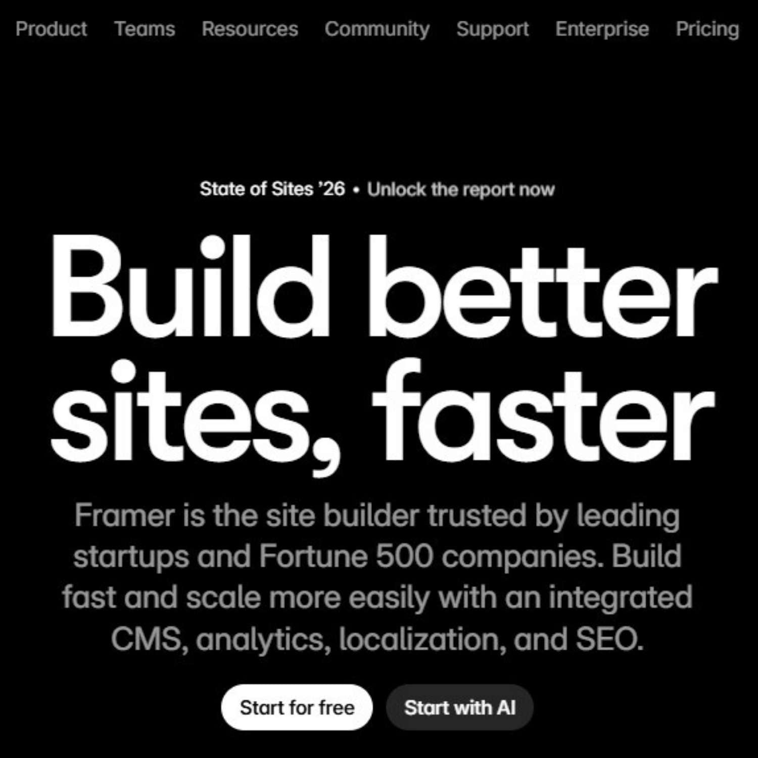
What Is Framer? A Beginner’s Guide to Building Websites With Templates
Framer is a website builder for people who want to design and publish modern websites without starting from a blank codebase. It is especially popular with designers, founders, marketers, startups, agencies, and creators who need a polished website quickly but still want control over layout, motion, content, and visual direction. The easiest way to understand Framer is this: it feels closer to a visual design tool than a traditional website admin panel. You work on a canvas, arrange sections, edit text, adjust responsive layouts, connect CMS content, set SEO metadata, and publish the site from the same environment. For beginners, the fastest way to start is usually with a template. A good Framer template already gives you page structure, spacing, typography, sections, responsive behavior, and visual hierarchy. Your job is to replace the content, adapt the brand, check the mobile version, set the SEO details, and publish. What is Framer? Framer is a no-code website builder and design platform used to create websites, landing pages, portfolios, startup pages, product sites, marketing pages, and content-driven web projects. Instead of writing every layout in code, you build visually and publish the finished page as a live website. It is not only a static design tool. Framer includes website-specific features such as hosting, responsive breakpoints, CMS collections, SEO settings, page publishing, forms, components, animations, and collaboration. That makes it useful for people who want to move from idea to live website without separating design, development, and publishing into three different processes. Plain-English definition: Framer is a visual website-building platform that lets you design, customize, and publish professional websites without building the entire front end manually in code. A short history of Framer Framer was founded by Koen Bok and Jorn van Dijk in 2014. In its earlier years, it was known mainly as a prototyping tool for designers who wanted to create interactive, high-fidelity product experiences. Over time, the product shifted toward a broader goal: helping teams design and publish real websites, not only prototypes. That history matters because it explains Framer’s personality. It still feels design-first. The platform is built around visual control, motion, layout precision, and fast iteration. But it has evolved into a practical website platform for businesses, creators, and teams that need live web pages, not just mockups. 2014 Framer begins as a design and prototyping tool The early product focused on helping designers create interactive prototypes and explore more advanced product experiences. Later The platform moves closer to website creation Framer gradually expanded beyond prototyping into visual website building, publishing, CMS workflows, performance, and SEO. Now Framer is used as a full website platform Teams can design pages, manage content, collaborate, optimize for search, and launch sites from one visual workflow. How Framer works Framer works by combining a visual design canvas with web publishing features. You create pages and sections visually, but the final result is a real website that can be published, indexed, shared, and updated. For a beginner, the workflow feels simple: choose a starting point, edit the design, replace the content, check responsiveness, configure SEO, and publish. For more advanced teams, Framer can also support CMS-driven pages, reusable components, localization, analytics, A/B testing, and more complex site structures. Visual canvas You build the website visually by placing sections, text, images, buttons, navigation, forms, and layout elements on a canvas. This makes Framer feel familiar to designers who are used to visual tools. Responsive layout You adjust how the page behaves on desktop, tablet, and mobile. This is important because a beautiful desktop design can still fail if the mobile version is not checked carefully. CMS and content Framer can use CMS collections for repeated content such as blog posts, case studies, resources, directories, updates, or landing page variations. Publishing and SEO Framer includes publishing, hosting, page settings, metadata, URLs, social previews, sitemap support, and other website essentials that matter after the design is finished. What are Framer templates? Framer templates are pre-built website projects that you can open, duplicate, customize, and publish. They can include complete pages, reusable sections, components, typography styles, color systems, CMS structures, navigation, and responsive layouts. This is why templates are useful for beginners. Instead of figuring out every section from scratch, you start with a working website structure. You can then replace the copy, images, colors, logo, links, sections, and SEO settings until the template becomes your own website. You may hear people say they “install” a Framer template. In practice, the workflow is closer to opening, duplicating, or remixing a ready-made project into your Framer workspace. Once it is in your account, you edit it like a normal Framer site. Template mindset A Framer template is not just decoration. It is a pre-built website system: layout, hierarchy, spacing, sections, responsive behavior, and visual direction. Choose a template that matches the type of website you need. Open or duplicate the template into your Framer workspace. Replace the placeholder copy with real messaging. Swap images, mockups, icons, and brand assets. Adjust colors, typography, spacing, and sections. Check desktop and mobile layouts before publishing. How to use a Framer template step by step The right template can save days of structural work. The wrong template can create more work than starting clean. Before choosing one, look at the purpose of the website. A SaaS landing page, personal portfolio, agency site, restaurant page, newsletter landing page, and product launch site all need different content structures. If you are looking for ready-made starting points, browse the Framer templates collection on OneDollarStock. Choose the template by website goal first, not only by visual style. 1 Choose the website type Start with the goal: landing page, portfolio, agency website, SaaS page, startup site, product page, local business website, or personal brand. 2 Open the template in Framer Use the template as a working project. Keep the structure that helps the page flow, then remove sections that do not support your message. 3 Replace the copy first Before changing every color and image, add your real headline, subheadline, offer, benefits, proof, pricing, contact details, and calls to action. 4 Update the visual system Replace stock visuals, product screenshots, mockups, background images, icons, and color accents so the template fits your brand. 5 Check mobile behavior Review spacing, text size, button visibility, navigation, image crops, and section order on smaller screens before publishing. 6 Set SEO and publish Add a clear page title, meta description, URL slug, Open Graph image, headings, alt text, and index settings before launching the site. What to change first after opening a template Many beginners start by changing colors, animations, and decorative details. That is usually the wrong order. A website succeeds or fails because of message clarity, offer structure, visual hierarchy, trust, and mobile usability. Decoration comes later. Start by replacing the core content. If the headline, offer, benefits, CTA, proof, and images are still generic, the website will feel generic even if the design is beautiful. Template customization checklist Replace the homepage headline. Rewrite the subheadline. Update all button labels. Remove sections you do not need. Add real product or service images. Check every mobile breakpoint. Update navigation links. Set page titles and meta descriptions. Add alt text to key images. Replace placeholder testimonials. Check contact forms and links. Preview the social sharing image. When Framer is a good choice Framer is a strong choice when the website needs to look polished, launch quickly, and stay easy to update. It is especially useful when the team cares about design quality but does not want a long development cycle for every landing page or marketing update. It works well for startup websites, SaaS landing pages, portfolios, agency websites, creator pages, event pages, product announcements, waitlists, lead generation pages, and marketing sites that need fast iteration. Good fit Landing pages and startup websites. Portfolio and personal brand sites. Agency, studio, and service websites. Product launches and waitlists. Marketing pages that need frequent updates. Sites where design quality matters a lot. May need another setup Complex ecommerce with advanced inventory logic. Large custom web apps with user dashboards. Deep backend workflows and custom databases. Advanced membership platforms. Projects requiring highly specific server-side logic. Websites where the main product is a complex application. How Framer compares to building from scratch Building from scratch gives maximum technical control, but it also takes more time, planning, development resources, QA, and maintenance. Framer is built for a different type of project: websites where speed, visual quality, and iteration matter more than building every piece manually. A custom-coded site may be the better option for a complex application. A Framer site may be the better option for a brand website, launch page, content site, portfolio, or campaign page that needs to go live quickly and still look professional. The practical question is not “Is Framer better than code?” The better question is: “What kind of website are we building, and how much custom logic does it really need?” How Framer templates help beginners move faster Beginners often struggle with the same problem: they know they need a website, but they do not know what the structure should be. A template solves that by giving them a working page architecture. The sections are already there. The rhythm is already there. The spacing and hierarchy are already planned. That does not mean the template should stay untouched. A good template is a starting system. It should be edited, trimmed, rewritten, and visually adjusted. The goal is not to hide the fact that you used a template. The goal is to use the template as a professional foundation, then make the content specific enough that the website feels real. If you already understand the basics and want a more tactical build process, read the existing guide on how to create a website in 1 hour using OneDollarStock. It focuses more on assembling a fast website workflow with templates and creative assets. Common mistakes beginners make in Framer Framer makes it easier to build a website, but it does not automatically make the website good. The most common mistakes are not technical. They are usually content, hierarchy, and decision-making problems. Choosing a template only because it looks impressive A dramatic template may look great in preview but fail for your actual content. Choose a template that fits the website’s purpose, not just your first reaction to the design. Keeping too many sections Templates often include more sections than you need. Remove anything that does not support the message. A shorter, clearer website is usually stronger than a long page filled with weak content. Ignoring mobile layout A website can look excellent on desktop and still feel broken on mobile. Check spacing, image crops, sticky elements, navigation, buttons, and text sizes before publishing. Publishing without SEO basics Before launching, set the page title, meta description, URL handle, headings, alt text, social preview image, and index settings. These details are easy to skip but important for search and sharing. How OneDollarStock fits into a Framer workflow A Framer template gives you the website structure. OneDollarStock can support the visual layer around it: templates, images, mockups, textures, presets, LUTs, and other creative assets that help the site feel finished faster. This is useful because many template-based sites fail at the same stage. The layout is good, but the visuals stay generic. Replacing placeholder assets with stronger images, product mockups, textures, and brand-specific visuals can make the site feel more credible immediately. If you are comparing template options, the existing guide to Framer templates for fast, modern websites goes deeper into how templates save time, how to choose better ones, and what to check before using them for a real project. The practical takeaway for beginners Framer is best understood as a design-first website platform. It helps you move from visual idea to live website without forcing every beginner through a full development workflow. That makes it useful for founders, creators, designers, marketers, and small teams that need a professional web presence quickly. Templates make that process even easier. They give you structure before you have a perfect plan. Start with the right template, replace the content with real messaging, adjust the visual system, check mobile layouts, set SEO details, and publish only when the site feels specific to your project. The result should not feel like a template. It should feel like a focused website built from a strong foundation.

