

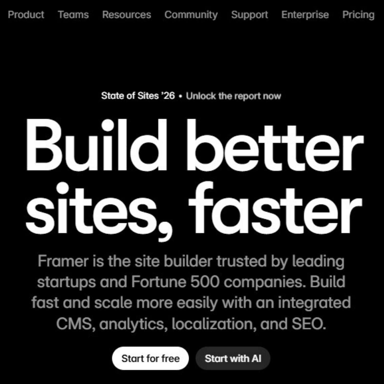
What Is Framer? A Beginner’s Guide to Building Websites With Templates
Framer is a website builder for people who want to design and publish modern websites without starting from a blank codebase. It is especially popular with designers, founders, marketers, startups, agencies, and creators who need a polished website quickly but still want control over layout, motion, content, and visual direction. The easiest way to understand Framer is this: it feels closer to a visual design tool than a traditional website admin panel. You work on a canvas, arrange sections, edit text, adjust responsive layouts, connect CMS content, set SEO metadata, and publish the site from the same environment. For beginners, the fastest way to start is usually with a template. A good Framer template already gives you page structure, spacing, typography, sections, responsive behavior, and visual hierarchy. Your job is to replace the content, adapt the brand, check the mobile version, set the SEO details, and publish. What is Framer? Framer is a no-code website builder and design platform used to create websites, landing pages, portfolios, startup pages, product sites, marketing pages, and content-driven web projects. Instead of writing every layout in code, you build visually and publish the finished page as a live website. It is not only a static design tool. Framer includes website-specific features such as hosting, responsive breakpoints, CMS collections, SEO settings, page publishing, forms, components, animations, and collaboration. That makes it useful for people who want to move from idea to live website without separating design, development, and publishing into three different processes. Plain-English definition: Framer is a visual website-building platform that lets you design, customize, and publish professional websites without building the entire front end manually in code. A short history of Framer Framer was founded by Koen Bok and Jorn van Dijk in 2014. In its earlier years, it was known mainly as a prototyping tool for designers who wanted to create interactive, high-fidelity product experiences. Over time, the product shifted toward a broader goal: helping teams design and publish real websites, not only prototypes. That history matters because it explains Framer’s personality. It still feels design-first. The platform is built around visual control, motion, layout precision, and fast iteration. But it has evolved into a practical website platform for businesses, creators, and teams that need live web pages, not just mockups. 2014 Framer begins as a design and prototyping tool The early product focused on helping designers create interactive prototypes and explore more advanced product experiences. Later The platform moves closer to website creation Framer gradually expanded beyond prototyping into visual website building, publishing, CMS workflows, performance, and SEO. Now Framer is used as a full website platform Teams can design pages, manage content, collaborate, optimize for search, and launch sites from one visual workflow. How Framer works Framer works by combining a visual design canvas with web publishing features. You create pages and sections visually, but the final result is a real website that can be published, indexed, shared, and updated. For a beginner, the workflow feels simple: choose a starting point, edit the design, replace the content, check responsiveness, configure SEO, and publish. For more advanced teams, Framer can also support CMS-driven pages, reusable components, localization, analytics, A/B testing, and more complex site structures. Visual canvas You build the website visually by placing sections, text, images, buttons, navigation, forms, and layout elements on a canvas. This makes Framer feel familiar to designers who are used to visual tools. Responsive layout You adjust how the page behaves on desktop, tablet, and mobile. This is important because a beautiful desktop design can still fail if the mobile version is not checked carefully. CMS and content Framer can use CMS collections for repeated content such as blog posts, case studies, resources, directories, updates, or landing page variations. Publishing and SEO Framer includes publishing, hosting, page settings, metadata, URLs, social previews, sitemap support, and other website essentials that matter after the design is finished. What are Framer templates? Framer templates are pre-built website projects that you can open, duplicate, customize, and publish. They can include complete pages, reusable sections, components, typography styles, color systems, CMS structures, navigation, and responsive layouts. This is why templates are useful for beginners. Instead of figuring out every section from scratch, you start with a working website structure. You can then replace the copy, images, colors, logo, links, sections, and SEO settings until the template becomes your own website. You may hear people say they “install” a Framer template. In practice, the workflow is closer to opening, duplicating, or remixing a ready-made project into your Framer workspace. Once it is in your account, you edit it like a normal Framer site. Template mindset A Framer template is not just decoration. It is a pre-built website system: layout, hierarchy, spacing, sections, responsive behavior, and visual direction. Choose a template that matches the type of website you need. Open or duplicate the template into your Framer workspace. Replace the placeholder copy with real messaging. Swap images, mockups, icons, and brand assets. Adjust colors, typography, spacing, and sections. Check desktop and mobile layouts before publishing. How to use a Framer template step by step The right template can save days of structural work. The wrong template can create more work than starting clean. Before choosing one, look at the purpose of the website. A SaaS landing page, personal portfolio, agency site, restaurant page, newsletter landing page, and product launch site all need different content structures. If you are looking for ready-made starting points, browse the Framer templates collection on OneDollarStock. Choose the template by website goal first, not only by visual style. 1 Choose the website type Start with the goal: landing page, portfolio, agency website, SaaS page, startup site, product page, local business website, or personal brand. 2 Open the template in Framer Use the template as a working project. Keep the structure that helps the page flow, then remove sections that do not support your message. 3 Replace the copy first Before changing every color and image, add your real headline, subheadline, offer, benefits, proof, pricing, contact details, and calls to action. 4 Update the visual system Replace stock visuals, product screenshots, mockups, background images, icons, and color accents so the template fits your brand. 5 Check mobile behavior Review spacing, text size, button visibility, navigation, image crops, and section order on smaller screens before publishing. 6 Set SEO and publish Add a clear page title, meta description, URL slug, Open Graph image, headings, alt text, and index settings before launching the site. What to change first after opening a template Many beginners start by changing colors, animations, and decorative details. That is usually the wrong order. A website succeeds or fails because of message clarity, offer structure, visual hierarchy, trust, and mobile usability. Decoration comes later. Start by replacing the core content. If the headline, offer, benefits, CTA, proof, and images are still generic, the website will feel generic even if the design is beautiful. Template customization checklist Replace the homepage headline. Rewrite the subheadline. Update all button labels. Remove sections you do not need. Add real product or service images. Check every mobile breakpoint. Update navigation links. Set page titles and meta descriptions. Add alt text to key images. Replace placeholder testimonials. Check contact forms and links. Preview the social sharing image. When Framer is a good choice Framer is a strong choice when the website needs to look polished, launch quickly, and stay easy to update. It is especially useful when the team cares about design quality but does not want a long development cycle for every landing page or marketing update. It works well for startup websites, SaaS landing pages, portfolios, agency websites, creator pages, event pages, product announcements, waitlists, lead generation pages, and marketing sites that need fast iteration. Good fit Landing pages and startup websites. Portfolio and personal brand sites. Agency, studio, and service websites. Product launches and waitlists. Marketing pages that need frequent updates. Sites where design quality matters a lot. May need another setup Complex ecommerce with advanced inventory logic. Large custom web apps with user dashboards. Deep backend workflows and custom databases. Advanced membership platforms. Projects requiring highly specific server-side logic. Websites where the main product is a complex application. How Framer compares to building from scratch Building from scratch gives maximum technical control, but it also takes more time, planning, development resources, QA, and maintenance. Framer is built for a different type of project: websites where speed, visual quality, and iteration matter more than building every piece manually. A custom-coded site may be the better option for a complex application. A Framer site may be the better option for a brand website, launch page, content site, portfolio, or campaign page that needs to go live quickly and still look professional. The practical question is not “Is Framer better than code?” The better question is: “What kind of website are we building, and how much custom logic does it really need?” How Framer templates help beginners move faster Beginners often struggle with the same problem: they know they need a website, but they do not know what the structure should be. A template solves that by giving them a working page architecture. The sections are already there. The rhythm is already there. The spacing and hierarchy are already planned. That does not mean the template should stay untouched. A good template is a starting system. It should be edited, trimmed, rewritten, and visually adjusted. The goal is not to hide the fact that you used a template. The goal is to use the template as a professional foundation, then make the content specific enough that the website feels real. If you already understand the basics and want a more tactical build process, read the existing guide on how to create a website in 1 hour using OneDollarStock. It focuses more on assembling a fast website workflow with templates and creative assets. Common mistakes beginners make in Framer Framer makes it easier to build a website, but it does not automatically make the website good. The most common mistakes are not technical. They are usually content, hierarchy, and decision-making problems. Choosing a template only because it looks impressive A dramatic template may look great in preview but fail for your actual content. Choose a template that fits the website’s purpose, not just your first reaction to the design. Keeping too many sections Templates often include more sections than you need. Remove anything that does not support the message. A shorter, clearer website is usually stronger than a long page filled with weak content. Ignoring mobile layout A website can look excellent on desktop and still feel broken on mobile. Check spacing, image crops, sticky elements, navigation, buttons, and text sizes before publishing. Publishing without SEO basics Before launching, set the page title, meta description, URL handle, headings, alt text, social preview image, and index settings. These details are easy to skip but important for search and sharing. How OneDollarStock fits into a Framer workflow A Framer template gives you the website structure. OneDollarStock can support the visual layer around it: templates, images, mockups, textures, presets, LUTs, and other creative assets that help the site feel finished faster. This is useful because many template-based sites fail at the same stage. The layout is good, but the visuals stay generic. Replacing placeholder assets with stronger images, product mockups, textures, and brand-specific visuals can make the site feel more credible immediately. If you are comparing template options, the existing guide to Framer templates for fast, modern websites goes deeper into how templates save time, how to choose better ones, and what to check before using them for a real project. The practical takeaway for beginners Framer is best understood as a design-first website platform. It helps you move from visual idea to live website without forcing every beginner through a full development workflow. That makes it useful for founders, creators, designers, marketers, and small teams that need a professional web presence quickly. Templates make that process even easier. They give you structure before you have a perfect plan. Start with the right template, replace the content with real messaging, adjust the visual system, check mobile layouts, set SEO details, and publish only when the site feels specific to your project. The result should not feel like a template. It should feel like a focused website built from a strong foundation.

How to Create a Website in 1 Hour Using OneDollarStock
How to Create a Website in 1 Hour Using OneDollarStock If you want to create a website in 1 hour using OneDollarStock, the good news is that it is completely realistic when you use the right creative assets in the right order. Most people waste time on design decisions, visual consistency, and hunting for files. The faster way is to build a clear workflow first, then use ready-to-go assets that help you move from blank page to polished site without getting stuck. This guide shows exactly how to create a website in 1 hour using OneDollarStock step by step. It is built for founders, marketers, creators, freelancers, agencies, and small businesses that need a site live fast. Instead of treating website creation like a giant design project, this article breaks it into focused stages you can actually complete. You will learn how to use website templates, stock images, mockups, textures, overlays, presets, and LUTs together so your final site looks sharper, feels more intentional, and takes a fraction of the time to build. Why Creating a Website in 1 Hour Is Possible With the Right Asset Workflow The main reason websites take too long is not coding. It is indecision. People lose hours picking fonts, searching for visuals, replacing bad images, redesigning sections, and trying to force random assets into one coherent look. When you create a website in 1 hour using OneDollarStock, you skip most of that chaos. You start with a strong visual system and use pre-made assets that already solve the hard parts. Instead of creating everything from scratch, you assemble a website with better speed and fewer weak points. This matters for businesses that need to launch quickly. A founder validating an idea, a freelancer building a portfolio, a restaurant updating its online presence, or an agency shipping a landing page for a client does not need more friction. They need a fast, repeatable process. Templates reduce layout time Images improve quality instantly Mockups make offers look more real Textures and overlays add brand depth Presets and LUTs create visual consistency That combination is what makes a one-hour website build possible. What You Need Before You Create a Website in 1 Hour Using OneDollarStock Before you open your website builder, get your inputs ready. This is where a lot of speed is won. If you go in without structure, the hour disappears fast. Prepare Your Website Goal Pick one goal only. Do not try to make the website do everything: collect leads, sell a product, show a portfolio, present a service, or launch a brand landing page. A focused site is easier to build and converts better. Prepare Your Core Copy You do not need perfect copy. You need enough to fill the key sections: a headline, a short subheadline, three core benefits, one call to action, and one trust element such as a testimonial, result, or guarantee. If you already have these ready, you save huge time during the build. Prepare Your Asset Direction Choose one visual direction before you begin. Clean and minimal, bold and energetic, premium and editorial, warm and human, or modern and tech-focused. This helps you choose the right OneDollarStock products faster and keeps the website from looking random. Step 1: Start With a Website Template to Save the Most Time If you want to create a website in 1 hour using OneDollarStock, starting from a blank page is the worst move. The fastest path is to begin with a ready-made Framer website template that already solves structure, hierarchy, spacing, and layout flow. A strong template gives you a homepage framework immediately. Instead of asking what goes where, you only need to replace content and visuals. That cuts decision fatigue fast. Salifact: Automation SaaS Website Framer Template → Founders launching an MVP, marketers building campaign pages, creators making personal websites, and agencies handling fast-turnaround client work all benefit from templates because they reduce the slowest part of web design: the beginning. The first rule of building fast is simple. Borrow structure. Customize meaning. A good website template should already give you a strong hero section, clear content blocks, call to action sections, responsive spacing, and a layout style that fits your niche. If your goal is speed, do not over-customize the structure. Focus on replacing assets and tightening the message. Step 2: Use Stock Images to Make the Website Look Professional Fast Once your layout is in place, the next biggest upgrade comes from visuals. Stock images are one of the fastest ways to make a website feel complete, credible, and usable. This is where OneDollarStock becomes especially useful because you can quickly build a site with visuals that look intentional instead of filler. When people say a website looks polished, they are often reacting to image quality, image fit, and visual consistency more than anything else. Use stock images that reflect your audience and use case. If the website is for a cafe, do not use sterile corporate laptop scenes. Relevance matters more than volume. Choose images that are visually aligned. Similar lighting, similar color mood, and similar composition will make the entire site feel more designed. Pick images with usable negative space, especially if you want to place headlines or interface elements on top. Strong website images should explain the offer visually, create emotional tone, add credibility, or support scannability. If an image does none of those, it is probably decoration, not a useful asset. Step 3: Use Mockups to Present Products, Offers, or Downloads Better One of the easiest ways to make a website look more valuable is to show your offer inside a mockup. Mockups help users understand what they are buying, what they are signing up for, or what they will receive. That makes them especially useful for digital products, service packages, presentations, courses, templates, and app concepts. Browse the full editable mockups collection to find the right format for your offer. Man Holding a Phone Mockup (editable, layered PSD file) → Mockups add context. Context increases trust. They make digital products feel tangible, improve hero sections, help product blocks look more complete, and can replace weaker screenshots. If you are building a site for an ebook, online service, creative pack, branding offer, or digital toolkit, mockups can carry a lot of visual weight. The hero section is a strong place to use a mockup because it creates a fast first impression. For service businesses, you can also use mockups to frame deliverables such as audit documents, strategy decks, social media plans, or onboarding materials. The man holding a tablet mockup works especially well for app presentations and digital service pages. Step 4: Use Presets and LUTs to Create a Consistent Visual Identity If you want your website to look cohesive in one hour, consistency matters more than perfection. This is where Lightroom presets and LUTs help. Instead of editing every image from scratch or accepting visual mismatch, you use presets for photos and LUTs for video stills or moving visuals to create a more unified style. This is especially useful when your site includes multiple images from different shoots, different creators, or different sources. Water Tones Presets (13 XMP files) → Presets let you batch-edit images so they share similar brightness, contrast, tone, warmth, mood, and color balance. Even small visual consistency makes a site feel more premium. If your brand direction is soft and editorial, a preset can reduce harshness and make your visuals feel aligned. If your brand is bold and modern, a different preset can increase contrast and punch. LUTs are useful when your website includes video banners, social proof clips, product reels, founder videos, or embedded campaign content. If those visuals all feel different, the site starts to look stitched together. LUTs help bring visual harmony to video elements. When users move across a site and the visual language feels stable, the whole brand feels more deliberate. Step 5: Use Overlays and Textures to Add Depth Without Slowing the Site Down A lot of fast websites look flat. They have structure, but no atmosphere. This is where overlays and website textures can make a big difference. Used carefully, they add visual depth, character, and uniqueness without forcing a full redesign. Subtly Textured Gold Textures (20 JPG files) → Textures work well in section backgrounds, banners, cards, separators, and brand moments. A subtle paper texture, grain texture, fabric texture, or organic surface can make a page feel warmer and less sterile. This works especially well for creative brands, editorial businesses, hospitality, beauty, food, fashion, and premium service sites. For natural, organic brand aesthetics, the spalted maple wood textures are a strong choice for section backgrounds and card elements. Overlays can be useful for hero images, call-to-action visuals, campaign pages, and promotional blocks. They add mood, movement, and emphasis. The important thing is moderation. If the overlay fights readability, remove it. Good depth supports clarity. Bad depth competes with it. Step 6: Build the Core Website Sections in the Right Order If you only have one hour, section order matters. Do not jump around randomly. Build the website from highest impact to lowest impact. Hero section Main offer or features section Social proof or trust section About or brand section Call to action section Footer This order works because it prioritizes what users actually need first. Most websites do not fail because the footer is weak. They fail because the message is unclear, the visuals are generic, and the first screen does not make the offer obvious. Your hero should answer three things quickly: what is this, who is it for, and what should I do next. Add one strong headline, one supporting line, one button, and one key visual. That visual can be a stock image, a mockup, or a styled product frame using overlays or textures. For the features section, keep it tight. Use three to four core benefits, not ten. Pair each feature with a relevant visual if possible. For the trust section, include testimonials, logos, before-and-after visuals, case snippets, star ratings, or outcomes. Even if the website is simple, trust elements help it feel finished. Step 7: Keep the Website Simple Enough to Finish in One Hour The fastest websites are not the ones with the most sections. They are the ones where every section has a job. If you are serious about creating a website in 1 hour using OneDollarStock, you need to avoid feature creep. Cut too many pages, fancy animations everywhere, overwritten copy, too many colors, too many image styles, and sections that repeat the same message. Keep the first version lean. A website that is live and clear beats a half-finished masterpiece every time. Usually one strong landing page or homepage is enough. If you move fast, you might also finish a contact page or simple product page. But the smartest approach is to launch one strong page first, then expand later. Speed comes from narrowing the scope. Best OneDollarStock Products to Use When You Create a Website Fast If your goal is building quickly, some product types have a bigger impact than others. Here is the smartest priority order for a one-hour website build. Framer Templates save the most time because they solve structure first. Images create immediate polish and relevance. Editable Mockups increase product clarity and perceived value. Textures add atmosphere and brand depth. Overlays enhance visuals when used lightly. Presets help unify photo content across the site. LUTs help unify video and motion-based content if your site uses them. This order helps because it focuses first on structure, then on image quality, then on visual refinement. Common Mistakes When You Try to Create a Website in 1 Hour Fast builds go wrong when people confuse speed with randomness. The goal is not to rush badly. The goal is to make fast decisions that still support a good result. Using too many asset styles is the most common trap. If your images feel editorial, your mockups feel corporate, your textures feel grungy, and your overlays feel futuristic, the site becomes visually confused. Use fewer styles and repeat them well. Writing too much copy also slows the build and often weakens the design. And choosing visuals before the message is backwards. Pick the main offer first, then choose assets that make the offer clearer. Do not try to reinvent the template either. Most of the time, your fastest win is replacing content inside a good structure, not redesigning every block. What to Avoid if You Want a Website That Looks Fast but Not Cheap There is a difference between efficient and unfinished. A website can be built quickly and still feel premium if you avoid a few common traps: low-resolution visuals, mixed color temperatures, an overcrowded hero section, generic filler photos, effects used just because they are available, and launching without checking spacing or mobile layout. Take five minutes at the end to review spacing, button clarity, and image consistency. That final check can make a fast site feel much more intentional. How to Create a Website in 1 Hour Using OneDollarStock: A Realistic 60-Minute Workflow Here is a practical one-hour build system you can actually follow. Minute 0 to 10: Pick the closest-fit template from the Framer Templates collection. Replace logo, colors, and main headline. Do not overthink it. Minute 10 to 20: Swap in stock images for the hero, about, and supporting sections. Keep them consistent. Minute 20 to 30: Place mockups from the editable mockups collection where users need more clarity around what they get. Minute 30 to 40: Shorten headlines, simplify benefit blocks, and make the main button clear. Minute 40 to 50: Add textures or overlays only where they improve the page. Keep it subtle. Minute 50 to 60: Check spacing, readability, button hierarchy, and overall consistency. Remove anything that feels extra. This timeline works because it forces focus. It is easier to create a website in 1 hour when each part of the build has a job and a time limit. Why This Workflow Works for Founders, Marketers, and Small Teams Most small teams do not have the luxury of waiting weeks for a polished website. They need fast launch systems. That is exactly why asset-based workflows are so practical. Instead of making every visual decision from zero, you use a library of strong parts and assemble a better result faster. Founders can test ideas faster. Marketers can launch campaigns faster. Creators can present themselves faster. Agencies can reduce delivery time without lowering quality. That is the real value of using OneDollarStock for web creation. The asset library approach is not about cutting corners. It is about removing unnecessary friction from the process. Conclusion: The Fastest Way to Create a Website in 1 Hour Using OneDollarStock If you want to create a website in 1 hour using OneDollarStock, the smartest move is to stop thinking of website creation as one huge task. Break it into a fast asset workflow. Start with a Framer template, add strong stock images, use mockups where clarity matters, unify visuals with presets or LUTs, and add textures or overlays only where they improve the page. This approach works because it matches how real businesses operate. You do not always need a custom design process from scratch. Sometimes you need a website that is clear, attractive, on-brand, and ready today. With the right asset system, that is not just possible. It is repeatable. The faster you can build without making the site look rushed, the more useful your workflow becomes. That is exactly where OneDollarStock fits in. Q&A: How to Create a Website in 1 Hour Using OneDollarStock Can I really create a website in 1 hour using OneDollarStock?Yes, if you start with a template, keep the scope small, and use ready-made assets in a clear order. A one-page website or landing page is the most realistic format for a one-hour build. What OneDollarStock products are most useful for website creation?Templates, stock images, and mockups have the biggest immediate impact. Textures, overlays, presets, and LUTs help refine the site and improve visual consistency. Should I use presets and LUTs for a website?Yes, especially if your site includes multiple images or videos from different sources. Presets help unify photos, while LUTs help unify video content and visual tone. What kind of website can I build in one hour?You can realistically build a homepage, landing page, simple portfolio, service site, or product page. The key is limiting the number of sections and pages. Do mockups help website conversion?They can. Mockups help users understand what they are getting, especially for digital products, service deliverables, downloadable files, and visual offers. How many visuals should I use on a fast website?Use only what supports the page. One strong hero visual, a few supporting images, and one or two clear product presentation visuals are often enough. What is the biggest mistake when building a website fast?The biggest mistake is adding too much. Too many sections, too many styles, and too many effects make the site slower to build and weaker to use. Who is this workflow best for?It is best for founders, creators, marketers, freelancers, small businesses, and agencies that need a polished website live quickly without a heavy production process.

