

How to Create Social Media Ads Using Stock Images
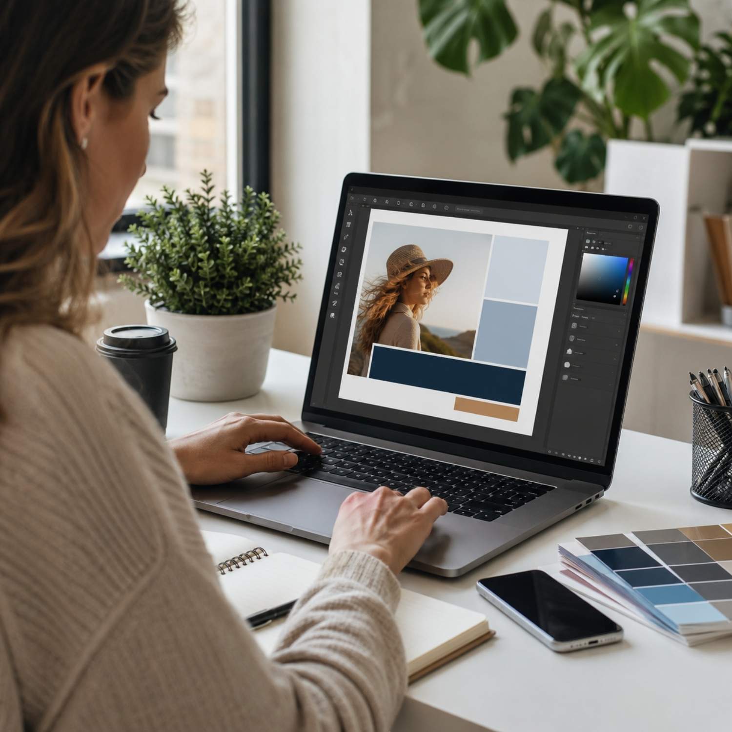
Creating social media ads with stock images is not about placing a random image behind a headline. A good ad needs a clear goal, a visual hook, readable copy, the right format, enough space for branding, and a layout that still works on a small mobile screen. Stock images can make that process much faster because you do not need a full photoshoot for every campaign. But the image has to do a specific job. It should stop the scroll, support the offer, create the right emotion, and leave enough room for a short message. This guide shows how to create social media ads using stock images, step by step. The workflow works for Meta ads, Instagram ads, LinkedIn ads, Pinterest graphics, campaign banners, story ads, carousel ads, and simple promotional visuals for small brands, ecommerce stores, agencies, creators, and founders. Start with the campaign goal, not the image The first step is to define what the ad is supposed to do. Many weak social media ads start with a nice image and then try to force a message into it. A stronger workflow starts with the campaign goal and chooses the image after that. An awareness ad needs a different image than a discount ad. A lead generation ad needs a different structure than a product launch. A local service ad needs a different level of trust than a bold founder-style campaign. The image, headline, and call to action should all support the same goal. Practical rule: every social media ad should answer one question before you design anything: what should the viewer understand or do after seeing this creative? Build the ad around one message A social media ad usually has only a few seconds to make sense. That means one visual idea, one main message, and one action. If the ad tries to explain too much, the viewer will keep scrolling. Before opening a design tool, write the message in one sentence. For example: “Get 40% off commercial design assets,” “Launch your landing page faster,” “Book your first consultation,” or “Upgrade your product visuals before the next campaign.” If the sentence is not clear, the design will not fix it. safe zone Campaign Hook Make the benefit visible fast. Use the image to create emotion, then let the headline explain the offer in one short idea. CTA area A simple ad structure Think of the ad as three layers. The image creates the first reaction. The headline explains the promise. The call to action tells the viewer what to do next. The best stock image is not always the most beautiful one. It is the one that gives the ad enough emotion, contrast, space, and context to make the message easy to understand. Step-by-step workflow for creating social media ads The workflow below keeps the process practical. It helps you move from campaign idea to finished creative without overdesigning the ad or relying on a generic image that does not support the offer. Define the offer Write the exact thing you are promoting: a product, service, discount, bundle, free trial, newsletter, event, lead magnet, launch, or seasonal campaign. The offer decides the emotional direction of the image. Choose the ad format Decide whether the ad will be square, vertical, horizontal, story format, carousel, or a simple feed image. Format matters because it changes the crop, text placement, and amount of visual space available. Pick an image with a clear visual role Use the image as a hook. People-centered images can create trust, product-style images can show value, lifestyle images can show desire, and abstract images can create a clean background for stronger copy. Add one short headline The headline should explain the benefit quickly. Avoid long copy on the image. A good ad headline usually works as a short promise, direct offer, pain point, or result. Design for mobile readability Most social ads are viewed on phones. Keep the headline large, avoid weak contrast, leave safe space near the edges, and check whether the creative is still readable at small size. Export several variations Do not rely on one creative. Make several versions with different images, headlines, crops, and CTA treatments. Small changes can make a large difference in ad performance. Choose the right format for the platform The same stock image can work differently depending on the format. A wide image may be strong for a website banner but weak for a story ad. A close-up image may work well in a square feed post but feel too tight in a vertical crop. Before editing the image, decide where the ad will run. This prevents last-minute cropping problems and keeps the design from feeling squeezed. 1:1 Square feed ads Good for simple offers, product messages, brand awareness, and posts that need to work across several platforms with minimal layout changes. 4:5 Tall feed ads Useful when you want more vertical screen space without going full story format. Strong for Meta and Instagram feed placements. 9:16 Story ads Best for full-screen mobile creatives. Use images with strong vertical composition and keep key text away from interface areas. Use the stock image as the hook The image should create the first reason to stop. For some ads, that means a person looking natural and relatable. For others, it means a bold product scene, a strong background, a premium texture, a food image, a workspace, a travel mood, or a clean abstract visual. If the ad needs human trust, start with people images that feel natural and relevant to the offer. If the ad promotes an app, template, ebook, course, or digital product, use mockups for brand presentation to make the offer more tangible. A stock image should not be decoration. It should make the offer easier to understand. If the viewer could remove the image and the ad would mean the same thing, the visual is probably too generic. Write copy that fits the image Good social ad copy is usually shorter than people expect. The image does the emotional work. The headline explains the offer. The caption or ad text can add context. Trying to put everything inside the image usually makes the creative harder to read. Headline Use one short promise or direct offer. Example: “Launch cleaner ads faster” or “Upgrade your campaign visuals.” Support line Add one extra detail only if it improves clarity. Example: “Ready-to-use images, mockups and creative assets.” CTA Use a clear action. Example: “Browse assets,” “Start designing,” “Get the bundle,” or “Download the visuals.” Design the ad for speed, not decoration Social media ads are not posters. People see them quickly, often while walking, waiting, scrolling, or switching between apps. The design should make the idea obvious fast. Use strong contrast between text and image. Place copy where the image has enough empty space. Avoid covering faces, products, hands, important objects, or emotional details. If the image is too busy, add a soft gradient or use a cleaner crop. For campaign sets, it can help to use creative asset bundles so the images feel visually related. This is useful when a brand needs multiple ads for the same offer, season, product launch, or paid campaign. Create variations before judging the ad One ad creative is rarely enough. A better workflow is to create several variations from the same campaign idea. This gives you more material to test and helps you avoid making design decisions based only on personal taste. Five useful ad variations Use the same offer, then change one main element at a time. This makes it easier to understand what actually improves the creative. A Lifestyle image with benefit-focused headline. B Product mockup with direct offer. C Close-up crop with short pain point. D Abstract background with bold typography. E Seasonal image with time-sensitive CTA. Check the license before publishing Before using any stock image in a paid ad, campaign banner, email, landing page, or social media creative, check the license. This is especially important when the ad is commercial, when the creative will run at scale, or when the image becomes part of a product, template, merchandise, or client campaign. On OneDollarStock, usage depends on the license type and intended use case. Review the license page before publishing commercial campaigns, especially if the ad will be used for client work, ecommerce, paid media, or larger brand distribution. Run a quick quality check before export The last step is to check the ad as a viewer would see it, not as a designer editing it at full size. Zoom out. Preview it on a phone. Check whether the message is still clear in a feed. If the creative needs five seconds of explanation, simplify it. Pre-export checklist The ad has one clear goal. The image supports the offer. The headline is readable on mobile. The CTA is short and specific. The image is not too busy behind the text. The crop works in the chosen format. The brand colors are visible but not excessive. The file size is suitable for the platform. The license matches the commercial use case. There are at least three creative variations. A practical workflow for your next ad campaign To create stronger social media ads with stock images, start with the campaign goal, choose the format, select an image with a clear role, write one short message, design for mobile readability, and export several variations. That process is more reliable than choosing a nice image and hoping the ad works. The best stock image for an ad is not simply the most attractive image. It is the image that helps the viewer understand the offer faster. When the visual hook, headline, layout, CTA, and license all support the same campaign goal, the ad has a much better chance of working in a real feed.
Stock Images for Marketing: How to Choose High-Converting Visuals That Actually Drive Results
Stock Images for Marketing: How to Choose High-Converting Visuals That Actually Drive Results If you are searching for stock images for marketing, you are probably trying to solve one real problem: how to create content faster without sacrificing quality or conversions. Modern marketing moves fast. Ads, landing pages, social media, email campaigns. Everything needs visuals, and not just any visuals. You need high quality stock images that feel intentional, relevant, and aligned with your brand. This guide breaks down exactly how to choose, use, and optimize stock images for marketing so they actually perform. Why Stock Images for Marketing Still Matter in 2025 There is a common myth that stock photos do not work anymore. That only happens when people use bad ones. High quality stock images are still one of the fastest ways to produce consistent visual content across channels. For ecommerce brands, agencies, and marketers under pressure, speed matters. Faster campaign launches Consistent visual identity Lower production costs Scalable content creation The difference is not whether you use stock images. It is how you choose them. What Makes High Quality Stock Images for Marketing Campaigns Not all stock photos are equal. The gap between generic and high-performing visuals is huge. 1. Realistic, Not Overproduced Images should feel natural. Overly staged photos kill trust instantly, especially in ads. 2. Clear Use Case Good marketing visuals are not abstract. They show context. Workspaces, products, people using something. Young Woman with Glasses and Bright Smile — Professional Stock Photos → 3. Composition That Leaves Space You need room for headlines, UI elements, or product overlays. Busy images are harder to use. A good example is our modern laptop on wooden desk — clean, open, and ready for text overlay. 4. Modern Aesthetic Outdated visuals signal outdated brands. Lighting, colors, and styling must feel current. Best Stock Image Ideas for Marketing Campaigns If you are stuck on what to use, these categories consistently perform across industries. Workspace and Productivity Scenes Perfect for SaaS, agencies, and service businesses. Clean desks, laptops, real working environments. Browse our modern laptop workspace, organized desk with vintage books, or the minimal podcast studio setup — all ready to use in your next campaign. Product Lifestyle Images Show products in use. Not isolated, but in context. This increases perceived value. Our wellness and sauna lifestyle photos and urban lifestyle street scenes are strong examples of this done right. Authentic Urban Lifestyle — Candid Couples, Families & Street Scenes (27 Images) → Minimal Background Visuals Ideal for ads and landing pages. They allow easy text overlay and faster design. Try our pastel chalks with sketchbook or the ultra-clean white tape on table surface for a distraction-free base. Emotional Close-Ups Faces, hands, small interactions. These work well in social media and storytelling formats. How to Use Stock Images for Marketing Campaigns That Convert Choosing the image is only step one. How you use it determines performance. Match the Image to the Funnel Stage Top of funnel: attention-grabbing, emotional visuals Middle: product or service context Bottom: trust-building, clarity-focused images Design Around the Image Do not just drop an image into a layout. Build the layout around it. Align colors, spacing, and typography. Use Consistent Visual Direction Random styles kill brand recognition. Pick a visual direction and stick to it. Test Variations Even small changes in visuals can impact CTR and conversions. Always test multiple options. How to Choose the Best Stock Images for Your Brand The right image is not just about quality. It is about fit. Align With Your Audience Your visuals should reflect your customer, not just look good. Match Your Offer If you sell premium products, your images must feel premium. If you sell fast solutions, they should feel dynamic. Think in Systems Do not choose images one by one. Build a visual system that can scale across campaigns. Common Mistakes When Using Stock Photos in Marketing Using overly generic images Mixing inconsistent styles Choosing images without space for design Ignoring brand alignment Not testing variations These mistakes reduce performance more than most people realize. What to Avoid When Choosing Stock Images Some images will hurt your brand more than help it. Fake-looking corporate scenes Outdated technology or environments Overly edited or unrealistic colors Visuals that do not match your product If it feels generic, your audience will feel it too. Stock Images for Ecommerce vs Social Media vs Ads Ecommerce Focus on product clarity and lifestyle context. Food brands, for example, benefit from rich, detailed shots like our gourmet steak photography pack or fresh vegetables and fruits lifestyle set. Gourmet Steak Stock Photos — Juicy Grilled Cuts & Elegant Plating (17 Images) → Social Media Prioritize attention and emotion. Candid, human moments perform best. Our professional portrait stock photos and cozy lifestyle scenes are built for scroll-stopping content. Paid Ads Clarity wins. The message should be obvious within seconds. Pair a clean background image with a strong headline and you are halfway there. Each channel requires a slightly different visual strategy. How Affordable Stock Images Improve Marketing Speed Speed is one of the biggest competitive advantages today. Affordable stock images allow you to: Launch campaigns faster Test more variations Reduce production bottlenecks Scale content output This is especially important for small teams and growing brands. Conclusion: How to Use Stock Images for Marketing That Actually Work Stock images for marketing are not about filling space. They are about communicating faster and more effectively. If you choose high quality stock images that match your audience, align with your brand, and support your message, they become a powerful tool for growth. The brands that win are not the ones with the biggest budgets. They are the ones that move faster and make better creative decisions. Q&A: Stock Images for Marketing What are the best stock images for marketing? Images that feel real, match your audience, and support your message clearly. Avoid generic visuals. Are stock images good for ads? Yes, if chosen correctly. High quality stock images can perform as well as custom content when aligned with the offer. Where can I use stock images in marketing? Landing pages, ads, social media, email campaigns, and websites. How do I make stock photos look unique? Use consistent editing, crop strategically, and design layouts around them. What makes a stock image convert better? Clarity, relevance, and emotional connection with the target audience. How many stock images should I test? At least 3 to 5 variations per campaign to find what performs best.

How to Create a Website in 1 Hour Using OneDollarStock
How to Create a Website in 1 Hour Using OneDollarStock If you want to create a website in 1 hour using OneDollarStock, the good news is that it is completely realistic when you use the right creative assets in the right order. Most people waste time on design decisions, visual consistency, and hunting for files. The faster way is to build a clear workflow first, then use ready-to-go assets that help you move from blank page to polished site without getting stuck. This guide shows exactly how to create a website in 1 hour using OneDollarStock step by step. It is built for founders, marketers, creators, freelancers, agencies, and small businesses that need a site live fast. Instead of treating website creation like a giant design project, this article breaks it into focused stages you can actually complete. You will learn how to use website templates, stock images, mockups, textures, overlays, presets, and LUTs together so your final site looks sharper, feels more intentional, and takes a fraction of the time to build. Why Creating a Website in 1 Hour Is Possible With the Right Asset Workflow The main reason websites take too long is not coding. It is indecision. People lose hours picking fonts, searching for visuals, replacing bad images, redesigning sections, and trying to force random assets into one coherent look. When you create a website in 1 hour using OneDollarStock, you skip most of that chaos. You start with a strong visual system and use pre-made assets that already solve the hard parts. Instead of creating everything from scratch, you assemble a website with better speed and fewer weak points. This matters for businesses that need to launch quickly. A founder validating an idea, a freelancer building a portfolio, a restaurant updating its online presence, or an agency shipping a landing page for a client does not need more friction. They need a fast, repeatable process. Templates reduce layout time Images improve quality instantly Mockups make offers look more real Textures and overlays add brand depth Presets and LUTs create visual consistency That combination is what makes a one-hour website build possible. What You Need Before You Create a Website in 1 Hour Using OneDollarStock Before you open your website builder, get your inputs ready. This is where a lot of speed is won. If you go in without structure, the hour disappears fast. Prepare Your Website Goal Pick one goal only. Do not try to make the website do everything: collect leads, sell a product, show a portfolio, present a service, or launch a brand landing page. A focused site is easier to build and converts better. Prepare Your Core Copy You do not need perfect copy. You need enough to fill the key sections: a headline, a short subheadline, three core benefits, one call to action, and one trust element such as a testimonial, result, or guarantee. If you already have these ready, you save huge time during the build. Prepare Your Asset Direction Choose one visual direction before you begin. Clean and minimal, bold and energetic, premium and editorial, warm and human, or modern and tech-focused. This helps you choose the right OneDollarStock products faster and keeps the website from looking random. Step 1: Start With a Website Template to Save the Most Time If you want to create a website in 1 hour using OneDollarStock, starting from a blank page is the worst move. The fastest path is to begin with a ready-made Framer website template that already solves structure, hierarchy, spacing, and layout flow. A strong template gives you a homepage framework immediately. Instead of asking what goes where, you only need to replace content and visuals. That cuts decision fatigue fast. Salifact: Automation SaaS Website Framer Template → Founders launching an MVP, marketers building campaign pages, creators making personal websites, and agencies handling fast-turnaround client work all benefit from templates because they reduce the slowest part of web design: the beginning. The first rule of building fast is simple. Borrow structure. Customize meaning. A good website template should already give you a strong hero section, clear content blocks, call to action sections, responsive spacing, and a layout style that fits your niche. If your goal is speed, do not over-customize the structure. Focus on replacing assets and tightening the message. Step 2: Use Stock Images to Make the Website Look Professional Fast Once your layout is in place, the next biggest upgrade comes from visuals. Stock images are one of the fastest ways to make a website feel complete, credible, and usable. This is where OneDollarStock becomes especially useful because you can quickly build a site with visuals that look intentional instead of filler. When people say a website looks polished, they are often reacting to image quality, image fit, and visual consistency more than anything else. Use stock images that reflect your audience and use case. If the website is for a cafe, do not use sterile corporate laptop scenes. Relevance matters more than volume. Choose images that are visually aligned. Similar lighting, similar color mood, and similar composition will make the entire site feel more designed. Pick images with usable negative space, especially if you want to place headlines or interface elements on top. Strong website images should explain the offer visually, create emotional tone, add credibility, or support scannability. If an image does none of those, it is probably decoration, not a useful asset. Step 3: Use Mockups to Present Products, Offers, or Downloads Better One of the easiest ways to make a website look more valuable is to show your offer inside a mockup. Mockups help users understand what they are buying, what they are signing up for, or what they will receive. That makes them especially useful for digital products, service packages, presentations, courses, templates, and app concepts. Browse the full editable mockups collection to find the right format for your offer. Man Holding a Phone Mockup (editable, layered PSD file) → Mockups add context. Context increases trust. They make digital products feel tangible, improve hero sections, help product blocks look more complete, and can replace weaker screenshots. If you are building a site for an ebook, online service, creative pack, branding offer, or digital toolkit, mockups can carry a lot of visual weight. The hero section is a strong place to use a mockup because it creates a fast first impression. For service businesses, you can also use mockups to frame deliverables such as audit documents, strategy decks, social media plans, or onboarding materials. The man holding a tablet mockup works especially well for app presentations and digital service pages. Step 4: Use Presets and LUTs to Create a Consistent Visual Identity If you want your website to look cohesive in one hour, consistency matters more than perfection. This is where Lightroom presets and LUTs help. Instead of editing every image from scratch or accepting visual mismatch, you use presets for photos and LUTs for video stills or moving visuals to create a more unified style. This is especially useful when your site includes multiple images from different shoots, different creators, or different sources. Water Tones Presets (13 XMP files) → Presets let you batch-edit images so they share similar brightness, contrast, tone, warmth, mood, and color balance. Even small visual consistency makes a site feel more premium. If your brand direction is soft and editorial, a preset can reduce harshness and make your visuals feel aligned. If your brand is bold and modern, a different preset can increase contrast and punch. LUTs are useful when your website includes video banners, social proof clips, product reels, founder videos, or embedded campaign content. If those visuals all feel different, the site starts to look stitched together. LUTs help bring visual harmony to video elements. When users move across a site and the visual language feels stable, the whole brand feels more deliberate. Step 5: Use Overlays and Textures to Add Depth Without Slowing the Site Down A lot of fast websites look flat. They have structure, but no atmosphere. This is where overlays and website textures can make a big difference. Used carefully, they add visual depth, character, and uniqueness without forcing a full redesign. Subtly Textured Gold Textures (20 JPG files) → Textures work well in section backgrounds, banners, cards, separators, and brand moments. A subtle paper texture, grain texture, fabric texture, or organic surface can make a page feel warmer and less sterile. This works especially well for creative brands, editorial businesses, hospitality, beauty, food, fashion, and premium service sites. For natural, organic brand aesthetics, the spalted maple wood textures are a strong choice for section backgrounds and card elements. Overlays can be useful for hero images, call-to-action visuals, campaign pages, and promotional blocks. They add mood, movement, and emphasis. The important thing is moderation. If the overlay fights readability, remove it. Good depth supports clarity. Bad depth competes with it. Step 6: Build the Core Website Sections in the Right Order If you only have one hour, section order matters. Do not jump around randomly. Build the website from highest impact to lowest impact. Hero section Main offer or features section Social proof or trust section About or brand section Call to action section Footer This order works because it prioritizes what users actually need first. Most websites do not fail because the footer is weak. They fail because the message is unclear, the visuals are generic, and the first screen does not make the offer obvious. Your hero should answer three things quickly: what is this, who is it for, and what should I do next. Add one strong headline, one supporting line, one button, and one key visual. That visual can be a stock image, a mockup, or a styled product frame using overlays or textures. For the features section, keep it tight. Use three to four core benefits, not ten. Pair each feature with a relevant visual if possible. For the trust section, include testimonials, logos, before-and-after visuals, case snippets, star ratings, or outcomes. Even if the website is simple, trust elements help it feel finished. Step 7: Keep the Website Simple Enough to Finish in One Hour The fastest websites are not the ones with the most sections. They are the ones where every section has a job. If you are serious about creating a website in 1 hour using OneDollarStock, you need to avoid feature creep. Cut too many pages, fancy animations everywhere, overwritten copy, too many colors, too many image styles, and sections that repeat the same message. Keep the first version lean. A website that is live and clear beats a half-finished masterpiece every time. Usually one strong landing page or homepage is enough. If you move fast, you might also finish a contact page or simple product page. But the smartest approach is to launch one strong page first, then expand later. Speed comes from narrowing the scope. Best OneDollarStock Products to Use When You Create a Website Fast If your goal is building quickly, some product types have a bigger impact than others. Here is the smartest priority order for a one-hour website build. Framer Templates save the most time because they solve structure first. Images create immediate polish and relevance. Editable Mockups increase product clarity and perceived value. Textures add atmosphere and brand depth. Overlays enhance visuals when used lightly. Presets help unify photo content across the site. LUTs help unify video and motion-based content if your site uses them. This order helps because it focuses first on structure, then on image quality, then on visual refinement. Common Mistakes When You Try to Create a Website in 1 Hour Fast builds go wrong when people confuse speed with randomness. The goal is not to rush badly. The goal is to make fast decisions that still support a good result. Using too many asset styles is the most common trap. If your images feel editorial, your mockups feel corporate, your textures feel grungy, and your overlays feel futuristic, the site becomes visually confused. Use fewer styles and repeat them well. Writing too much copy also slows the build and often weakens the design. And choosing visuals before the message is backwards. Pick the main offer first, then choose assets that make the offer clearer. Do not try to reinvent the template either. Most of the time, your fastest win is replacing content inside a good structure, not redesigning every block. What to Avoid if You Want a Website That Looks Fast but Not Cheap There is a difference between efficient and unfinished. A website can be built quickly and still feel premium if you avoid a few common traps: low-resolution visuals, mixed color temperatures, an overcrowded hero section, generic filler photos, effects used just because they are available, and launching without checking spacing or mobile layout. Take five minutes at the end to review spacing, button clarity, and image consistency. That final check can make a fast site feel much more intentional. How to Create a Website in 1 Hour Using OneDollarStock: A Realistic 60-Minute Workflow Here is a practical one-hour build system you can actually follow. Minute 0 to 10: Pick the closest-fit template from the Framer Templates collection. Replace logo, colors, and main headline. Do not overthink it. Minute 10 to 20: Swap in stock images for the hero, about, and supporting sections. Keep them consistent. Minute 20 to 30: Place mockups from the editable mockups collection where users need more clarity around what they get. Minute 30 to 40: Shorten headlines, simplify benefit blocks, and make the main button clear. Minute 40 to 50: Add textures or overlays only where they improve the page. Keep it subtle. Minute 50 to 60: Check spacing, readability, button hierarchy, and overall consistency. Remove anything that feels extra. This timeline works because it forces focus. It is easier to create a website in 1 hour when each part of the build has a job and a time limit. Why This Workflow Works for Founders, Marketers, and Small Teams Most small teams do not have the luxury of waiting weeks for a polished website. They need fast launch systems. That is exactly why asset-based workflows are so practical. Instead of making every visual decision from zero, you use a library of strong parts and assemble a better result faster. Founders can test ideas faster. Marketers can launch campaigns faster. Creators can present themselves faster. Agencies can reduce delivery time without lowering quality. That is the real value of using OneDollarStock for web creation. The asset library approach is not about cutting corners. It is about removing unnecessary friction from the process. Conclusion: The Fastest Way to Create a Website in 1 Hour Using OneDollarStock If you want to create a website in 1 hour using OneDollarStock, the smartest move is to stop thinking of website creation as one huge task. Break it into a fast asset workflow. Start with a Framer template, add strong stock images, use mockups where clarity matters, unify visuals with presets or LUTs, and add textures or overlays only where they improve the page. This approach works because it matches how real businesses operate. You do not always need a custom design process from scratch. Sometimes you need a website that is clear, attractive, on-brand, and ready today. With the right asset system, that is not just possible. It is repeatable. The faster you can build without making the site look rushed, the more useful your workflow becomes. That is exactly where OneDollarStock fits in. Q&A: How to Create a Website in 1 Hour Using OneDollarStock Can I really create a website in 1 hour using OneDollarStock?Yes, if you start with a template, keep the scope small, and use ready-made assets in a clear order. A one-page website or landing page is the most realistic format for a one-hour build. What OneDollarStock products are most useful for website creation?Templates, stock images, and mockups have the biggest immediate impact. Textures, overlays, presets, and LUTs help refine the site and improve visual consistency. Should I use presets and LUTs for a website?Yes, especially if your site includes multiple images or videos from different sources. Presets help unify photos, while LUTs help unify video content and visual tone. What kind of website can I build in one hour?You can realistically build a homepage, landing page, simple portfolio, service site, or product page. The key is limiting the number of sections and pages. Do mockups help website conversion?They can. Mockups help users understand what they are getting, especially for digital products, service deliverables, downloadable files, and visual offers. How many visuals should I use on a fast website?Use only what supports the page. One strong hero visual, a few supporting images, and one or two clear product presentation visuals are often enough. What is the biggest mistake when building a website fast?The biggest mistake is adding too much. Too many sections, too many styles, and too many effects make the site slower to build and weaker to use. Who is this workflow best for?It is best for founders, creators, marketers, freelancers, small businesses, and agencies that need a polished website live quickly without a heavy production process.
The Anti-Photoshoot Playbook: When Stock Visuals Beat a Custom Shoot
A practical guide to building a flexible visual identity without expensive photoshoots. Learn when stock photography is the smarter, more scalable choice for your brand.
How to creatively use stock images in Reels and Shorts
Short-form videos like Instagram Reels and YouTube Shorts are one of the hottest content formats today. But to make your videos stand out, you need strong visuals - and premium stock images can help. In this article, we’ll explore creative ways to use stock images in your Reels and Shorts content. Why use stock images in Reels and Shorts? With fast-paced video formats, adding high-quality stock images helps: Break up video flow with visual accents Support storytelling elements Add mood and atmosphere Create engaging intros and transitions Boost professionalism and style Creative ideas for using stock images in Reels and Shorts 1. Scene setters Use AI stock images or curated stock images as visual scene setters at the start of your video. This draws viewers in and establishes a tone for what’s to come. 2. Transitions and visual breaks Break up your main footage with stock images: Use abstract or minimalist images for pacing Insert lifestyle shots to add variety Use thematic images tied to your content (e.g., food, travel, memes) 3. Visual storytelling Tell more with visuals. Insert stock images to: Show emotion through expressive people images Highlight key locations or objects Bring a narrative element to your video 4. CTA frames and branding Don’t forget your CTA! Use stock images to create eye-catching end frames that encourage: Following your profile Visiting a website Engaging with your brand Combine stock images with bold text and animation for maximum impact. 5. Product highlights If you’re showcasing products or services, use supporting premium stock images to: Reinforce lifestyle positioning Show aspirational imagery Build mood around your offering Tips for seamless integration For a polished look: Maintain consistent color grading across video and images Use subtle motion (zoom, pan) on static images Balance image duration to keep pacing dynamic Choose high-quality curated images from One Dollar Stock™ to avoid the stocky feel Elevate your Reels and Shorts Stock images are a powerful tool for enhancing your short-form videos. From creative storytelling to polished branding, premium stock images from One Dollar Stock™ help you create videos that grab attention and keep viewers coming back.

10 inspiring examples of using stock images
Stock images are more than just filler visuals - they can transform your designs, marketing, and storytelling when used creatively. In this article, we’ll share 10 inspiring examples of how brands, creators, and designers are using premium stock images to elevate their work. Why stock images matter High-quality stock images help you: Build emotional connections Enhance visual storytelling Support brand positioning Save time and resources on content creation Maintain a professional and polished look 10 inspiring ways to use stock images 1. Hero banners on landing pages Use bold, eye-catching stock images to create impactful landing page hero banners. Choose visuals that match your product or brand values to drive conversions. 2. Backgrounds for reels and stories Creators often use ai stock images or curated stock images as dynamic backgrounds for short-form video content - adding mood and style. 3. Podcast cover art Podcasters use premium stock images to design standout cover art that attracts listeners and conveys their show’s vibe. 4. E-book covers and layouts Authors and marketers enhance e-books with carefully selected stock images - from polished covers to mood-setting chapter visuals. 5. Brand storytelling on social media Brands use people stock images to create relatable, human-centric social media content that resonates emotionally with their audience. 6. Visual accents in explainer videos Incorporate stock images into explainer videos to illustrate concepts and maintain viewer engagement. Add humor and personality with thematic images like memes or food and drinks. 7. Moodboards for client presentations Designers build compelling moodboards using curated stock images - helping clients visualize aesthetic directions for projects. 8. Email marketing visuals Enhance newsletters and email campaigns with thematic stock images that support your messaging and grab attention in crowded inboxes. 9. YouTube thumbnails Boost YouTube video click-through rates with professional, on-brand thumbnails created using premium stock images combined with custom text and graphics. 10. Branded merch designs Merchants and creators leverage stock images (with appropriate licenses) to design products such as posters, apparel, and mugs - adding visual impact and storytelling elements to merch. Inspire your next project These examples show just how versatile and powerful stock images can be when used thoughtfully. Whether you’re a designer, creator, or marketer, premium stock images from One Dollar Stock™ can help you bring your ideas to life.

How to build a consistent visual branding on Instagram with stock images
Instagram is a visual-first platform and your profile’s visual branding can make or break your presence. A cohesive aesthetic helps you attract followers, communicate your brand’s personality, and stand out in a crowded feed. In this article, we’ll show you how to use premium stock images to build a consistent visual branding on Instagram. Why visual consistency matters Brands and creators with a strong, cohesive visual style tend to: Attract more engaged followers Build stronger brand recognition Increase content shareability Drive higher conversion rates from social traffic Stock images when used strategically can help you maintain a unified look and feel across your Instagram profile. How to define your visual style Before selecting stock images, define your brand’s visual identity: Choose a consistent color palette Decide on preferred photo styles (light and airy, dark and moody, vintage, minimalist, etc.) Establish your brand tone (playful, professional, elegant, bold) Tip: Create a visual moodboard using curated stock images to guide your content choices. Choosing the right stock images When selecting stock images for Instagram: Favor images that align with your color palette and tone Mix people-focused images with lifestyle and flat-lay shots Use AI stock images or abstract images to create visual variety without breaking consistency Avoid cliché or overly "stocky" images opt for authentic, curated visuals How to maintain consistency across posts To keep your Instagram grid visually cohesive: Edit all images using the same presets or filters Stick to a limited set of image sources - such as One Dollar Stock™ curated collections Plan your feed in advance using tools like Later or Planoly Maintain balance between different types of images (people, objects, backgrounds) Tips for specific Instagram content types Feed posts For your main feed, choose stock images that reinforce your brand identity and evoke the desired emotional response from your audience. Stories Use AI stock images or abstract visuals as story backgrounds or to add texture to interactive content. Reels and video covers Enhance your video covers with premium stock images combined with branded typography and graphics. Conclusion - create an Instagram that stands out A consistent visual brand on Instagram helps you connect with your audience and strengthen your identity. With the right premium stock images from One Dollar Stock™, you can build an Instagram presence that looks professional, cohesive, and uniquely yours - without breaking your content budget.

How designers using Framer / Webflow can quickly build moodboards and concepts with One Dollar Stock™
When building websites with modern tools like Framer or Webflow, visual design concepts matter just as much as technical implementation. A strong moodboard helps you set the creative direction, inspire your client, and speed up the design process. In this article, we’ll show how you can quickly build moodboards and concepts using premium stock images from One Dollar Stock™. Why moodboards are essential in web design Before diving into prototyping or development, a moodboard helps you: Align on visual tone and style with the client Experiment with colors, imagery, and typography Communicate abstract ideas visually Reduce revisions later in the project That’s why many web designers consider moodboards an indispensable part of their process. Why use stock images for moodboards? Creating a moodboard from scratch is time-consuming. Using AI stock images and curated stock images allows you to quickly: Source diverse visual elements Test multiple creative directions Find niche imagery not available in client assets Stay on-brand while exploring new styles How to build a moodboard with One Dollar Stock™ 1. Define your creative direction Start by determining: Color palette(s) Visual tone (light, dark, muted, vibrant) Image style (photorealistic, abstract, minimal, maximalist) 2. Source relevant stock images Browse collections on One Dollar Stock™: For bold, modern design → abstract stock images For human-centered brands → people stock images For lifestyle-oriented brands → food and drinks, travel and landscapes For tech startups → AI-generated visuals 3. Assemble the moodboard Use tools like Figma, Canva, or Framer canvas to arrange your images: Mix stock images with color swatches and typography samples Include both large hero-style images and supporting textures Test multiple variants and layouts quickly Example moodboard flow for Webflow / Framer Hero image concept (one strong, engaging visual) Typography pairing ideas Background textures or abstract overlays People imagery to set emotional tone Accent visuals (product shots, lifestyle imagery) Tip: Keep the number of images balanced — too many can dilute the concept. Design smarter with stock images Using premium stock images from One Dollar Stock™ in your Framer or Webflow workflow helps you save time, impress clients, and explore creative directions faster. Instead of endlessly searching for assets, you can focus on what matters — building beautiful, effective websites.
How to quickly create professional podcast covers with stock images
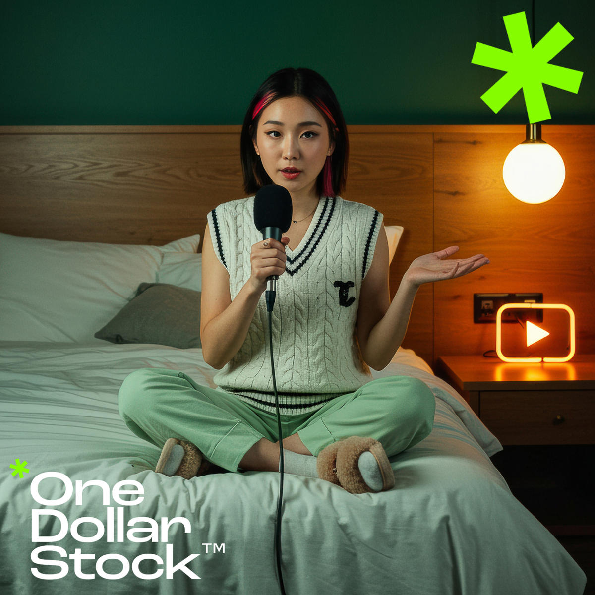
Your podcast cover is the first thing potential listeners see, it’s your show’s visual handshake. A well-designed cover can attract new listeners, convey your brand personality, and build recognition across platforms. In this article, we’ll show you how to quickly create professional podcast covers using premium stock images from One Dollar Stock™. Why your podcast cover matters A podcast cover influences: Whether users click "play" when browsing How your show is perceived (professional, fun, niche, premium, etc.) Brand consistency across podcast platforms and social media Stock images help you create stunning visuals even if you don’t have the budget for a custom photoshoot. Elements of a great podcast cover According to platform guidelines and best practices, a good podcast cover should: Have a clear focal point Include legible text (especially on mobile) Feature high-contrast design for visibility in small sizes Convey the tone of your podcast at a glance How to choose the right stock images Start by defining your show’s personality and niche. Then browse premium stock images to find visuals that match: For business, tech, or education podcasts → abstract stock images, AI-generated visuals For lifestyle, wellness, or personal growth podcasts → people-focused images, travel and landscapes For entertainment or comedy podcasts → bold, colorful images or quirky funny memes Tip: Use curated stock images to ensure visual quality and avoid generic-looking designs. Designing your podcast cover Follow these simple steps: Choose your core background image from One Dollar Stock™ Add your podcast name in a bold, easy-to-read font Layer additional elements (icons, textures) if needed Test readability at small sizes (platform thumbnails) Use tools like Canva, Photoshop, or Figma to quickly assemble your design, no advanced design skills required. Tips for standing out Stick to one focal image + text, avoid visual clutter Ensure color contrast between text and background Consider adding a subtle frame or border to help your cover pop in podcast directories Use high-resolution stock images to ensure your design looks sharp on all devices Create covers that attract listeners With the right premium stock images from One Dollar Stock™, you can create professional podcast covers that elevate your show’s visual identity without spending days on design or breaking your budget.

How to build high-converting landing pages with stock images
A great landing page does more than look good it drives action. But too often, poorly chosen visuals dilute your message or fail to connect with your audience. In this article, we’ll show you how to use premium stock images from One Dollar Stock™ to build landing pages that convert visitors into leads and customers. Why visuals matter on landing pages Landing pages have one primary goal: conversion. The right visuals can: Build trust and credibility Support and enhance your value proposition Guide users’ attention toward the CTA Reinforce emotional connections with your audience But mismatched or low-quality images can do the opposite confuse, distract, or erode trust. How to choose stock images for high-converting landing pages Start by clearly defining your target audience and conversion goal. Then browse premium stock images that match the tone and expectations of your ideal visitor: For professional services → clean, confident people stock images For e-commerce → lifestyle imagery that showcases product use cases For tech startups → abstract stock images and AI-generated visuals that convey innovation For travel or experiences → travel and landscapes Where to use stock images on your landing page 1. Hero section Your hero image is your landing page’s first impression. Use a bold, relevant visual that: Supports your headline Evokes the desired emotion Directs attention toward your primary CTA 2. Feature sections Break up text-heavy sections with complementary stock images that illustrate key features or benefits. Use consistent visual style and tone across these sections. 3. Testimonials and social proof Add authenticity by pairing testimonials with people stock images that represent your target audience, helping visitors visualize themselves as happy customers. 4. CTA banners Reinforce your call-to-action by using background images that subtly support the message without overpowering the CTA text. Best practices for stock images on landing pages Optimize images for fast loading times (use compressed formats) Maintain visual consistency across all images on the page Test images for performance different visuals can impact conversion rates Avoid cliché or generic stock imagery use curated stock images to ensure authenticity and quality Examples of effective landing page visuals Minimalist abstract images behind CTAs Warm, human people imagery in hero sections Atmospheric travel photography for experience-based offers Modern AI visuals to convey innovation Drive more conversions with better visuals Thoughtfully selected stock images can dramatically improve your landing page performance. With premium stock images from One Dollar Stock™, you can elevate your designs, connect with your audience, and guide more visitors toward action all without blowing your budget.
How to select stock images for e-books, lead magnets, and online courses
Strong visuals can elevate any digital product whether it’s an e-book, a lead magnet, or an online course. The right stock images help communicate your message, enhance your brand, and create a more engaging experience for your audience. In this article, we’ll show you how to select the perfect premium stock images from One Dollar Stock™ to enhance your digital products. Why visuals matter in digital products Effective use of images in digital products can: Increase perceived value and professionalism Break up long text sections and improve readability Reinforce brand identity and tone Support visual learning and retention Drive engagement and completion rates for courses With premium stock images, you can achieve all this without investing in expensive custom photography. How to choose stock images for e-books When selecting images for e-books: Align visuals with your brand’s tone and style Use abstract stock images for chapter openers and backgrounds Feature people images when telling human-centered stories Enhance diagrams and infographics with subtle visual accents Use high-resolution images to maintain quality in print versions (if applicable) How to select stock images for lead magnets Lead magnets such as checklists, guides, and templates should look polished and professional. Great stock images can: Draw attention to CTA sections Make covers more visually appealing Support key messages and positioning Help differentiate your lead magnet from others in your niche For strong impact: Use bold, simple abstract images for backgrounds Incorporate AI stock images for modern, tech-savvy audiences Add human elements with people stock images that reflect your ideal customer profile Choosing stock images for online courses In online courses, visuals can drive learner engagement: Use AI stock images to illustrate concepts and ideas Include people-focused images to create emotional resonance and relatability Break up content with food and drinks or travel images to add visual variety Reinforce key points with visual metaphors or conceptual imagery Tips for using stock images effectively in digital products Maintain visual consistency across all images in the product Optimize images for fast loading (especially for online courses) Use images to support not overwhelm your content Stay aligned with your brand’s color palette and style guidelines Source images from curated collections to avoid cliché or overused visuals Elevate your digital products with better visuals Stock images can transform e-books, lead magnets, and online courses from bland to brilliant. With premium stock images from One Dollar Stock™, you can add depth, professionalism, and emotional impact to your digital products all while keeping production fast and affordable.
Why One Dollar Stock™ is a better choice than free stock sites?
Free stock photo sites can seem tempting when you’re trying to save money. But in reality, using free images often comes with hidden costs - poor quality, legal risks, and lack of uniqueness. In this article, we’ll show why choosing premium stock images from One Dollar Stock™ is a smarter investment for creators, designers, and businesses alike. 1. Quality you can count on Free stock sites are often flooded with: Low-quality or outdated images Inconsistent styles and aesthetics Overused visuals that appear on countless other websites At One Dollar Stock™, every image is carefully curated to ensure: High resolution and professional composition Consistency across collections for building brand identity Fresh, modern visual styles that stand out 2. Clear and safe licensing Many free stock sites offer unclear or inconsistent licensing terms. Some require attribution, others restrict commercial use, and many expose you to potential copyright claims. At One Dollar Stock™, we offer clear licenses designed for creators: No attribution required Commercial use allowed (with proper license) Peace of mind every image is vetted for safe use 3. Affordable access to premium images With free stock sites, you get what you pay for which is often not enough for professional projects. Premium stock agencies can cost hundreds of dollars per image or subscription. One Dollar Stock™ bridges the gap: From just $1 per image → a fraction of premium stock prices Access AI stock images, abstract images, people stock images, and more No subscription required, buy only what you need 4. Unique content for a competitive edge Free stock images are often overused, making your brand look generic. At One Dollar Stock™ you can access: Curated collections with unique, trending visuals New AI-generated stock images created specifically for modern visual needs Less likelihood of finding your visuals duplicated on competitor sites 5. Designed for creators, by creators One Dollar Stock™ was built for creators, designers, and businesses who value: High-quality visuals Transparent licensing Fast, affordable access Whether you’re designing a website, building a brand, launching a campaign, or creating social media content, we provide the images you need to succeed. Stop settling for free, go premium for less Free stock sites have their place, but when quality, uniqueness, and peace of mind matter - One Dollar Stock™ is the better choice. Explore premium stock images starting from just $1 and level up your creative projects today.
10 types of stock images that always sell well
Not all stock images perform equally well. If you want to create content that stands out or if you’re a creator choosing images for your products - knowing what sells is key. In this article, we’ll share 10 types of premium stock images that consistently sell well on One Dollar Stock™ and across the industry. 1. Authentic people photography People stock images remain one of the top-selling categories. Brands and designers seek images that: Feel authentic and relatable Represent diverse backgrounds and demographics Convey real emotions and connections Tip: opt for natural, candid imagery over staged or posed stock photos. 2. Lifestyle and wellness Lifestyle visuals consistently drive sales, especially for: Fitness brands Beauty and wellness products Self-care and mental health content Browse our curated staff picks for high-converting lifestyle imagery. 3. Food and drinks Food and drinks stock images are essential for: Restaurants and food blogs Recipe books and cooking channels Social media content for lifestyle brands Fresh, vibrant imagery sells best in this category. 4. Business and work There’s constant demand for stock images that depict modern work and business settings: Remote work and digital nomad visuals Diverse workplace imagery Technology and innovation scenes Enhance business content with abstract stock images and AI visuals. 5. Travel and adventure Travel and landscapes images are ideal for: Travel brands and bloggers Online courses and experience marketing Social media storytelling High-quality travel images help evoke emotion and aspiration. 6. Abstract and backgrounds Abstract stock images and textured backgrounds are highly versatile: Website hero sections Social media posts Infographics and presentations This content sells well across industries. 7. AI-generated conceptual visuals Demand for AI stock images is growing rapidly: Tech companies and startups use them for future-focused content Creative agencies incorporate them into modern design concepts Social media managers love their unique look These images often command premium attention. 8. Holidays and seasonal content Holiday-themed stock images always drive sales: Christmas and New Year visuals Valentine’s Day, Halloween, Easter, etc. Seasonal lifestyle and decor imagery Plan ahead - early buyers lock in their seasonal content early! 9. Health and medical Healthcare stock images perform well across niches: Medical websites Wellness brands Educational content Look for images that feel warm and reassuring. 10. Social media templates and flatlays Flatlay stock images and template-style visuals sell well because they are: Easy to customize Useful for Instagram feeds Popular in e-commerce product marketing Explore premium stock images that fit this aesthetic to stay ahead of the trend. Stock up on what sells Whether you’re building a library for your creative business or choosing images for your next campaign, focusing on top-selling categories can drive better results. Explore premium stock images on One Dollar Stock™ and stock up on what works.

How to legally use stock images - a simple guide to licenses
Using stock images can elevate your designs and marketing, but only if you use them correctly. Confusion about licenses is one of the top reasons creators accidentally misuse stock images. In this simple guide, we’ll explain how to legally use premium stock images from One Dollar Stock™, so you can create with confidence. Why licensing matters Every stock image comes with a license that defines how you can legally use it. Ignoring license terms can result in: Legal liability (including fines or lawsuits) Brand reputation damage Content takedown requests or DMCA claims That’s why it’s essential to understand what your license allows and what it doesn’t. Types of licenses at One Dollar Stock™ We designed our licensing options to be clear and creator-friendly: Personal License → for personal, non-commercial use Commercial License → for business use, marketing, website, advertising (but not products for resale) Creator Commerce License → for using images in physical and digital products for resale (merch, e-books, templates, etc.) Corporate License → for larger organizations (50+ employees) with extended usage rights Common legal mistakes to avoid Here are some of the most frequent licensing mistakes and how to avoid them: 1. Using a Personal License for business projects Personal Licenses don’t cover: Commercial websites Social media for businesses Advertising campaigns For any business use, choose a Commercial License or higher. 2. Selling products without the right license Only the Creator Commerce License allows you to use stock images on products for resale, such as: Print-on-demand merchandise Posters and prints Templates and e-books sold online Using a Commercial License for these cases is not allowed, always upgrade to Creator Commerce when selling products. 3. Reselling the image itself No license allows you to: Resell the image as a stand-alone product Include it in another stock library or pack Claim copyright over the original image Stock images should always be used as part of a larger project or creative work, not sold on their own. How to stay safe with stock images Follow these best practices: Always read the license terms (ours are written in plain English) Choose the license that matches your intended use Keep proof of your purchase/license in case of future questions If in doubt - ask! We’re happy to clarify any usage questions Why One Dollar Stock™ is a safe choice At One Dollar Stock™, we built our platform to eliminate licensing confusion: Simple license options tailored to creators and businesses Clear explanations - no legal jargon All images vetted for safe use - no “gray area” content That means you can focus on creating without worrying about legal risks. Create with confidence Understanding stock image licenses is the key to using them legally and effectively. With the right license from One Dollar Stock™, you can bring your creative vision to life and sleep easy knowing you’re covered. Ready to create? Explore premium stock images - starting from just $1.
Stock images for podcasters and video creators
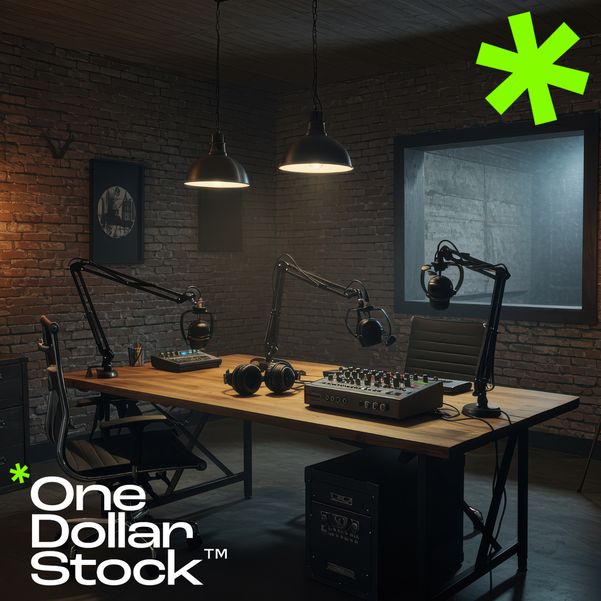
If you’re a podcaster or video creator, your visuals matter just as much as your voice. Strong images help you attract new listeners and viewers, promote your content across platforms, and build a cohesive brand. In this article, we’ll show you how to use premium stock images from One Dollar Stock™ to elevate your podcast and video content. Why podcasters and video creators need great stock images Even if your content is audio-first or video-heavy, visual presentation drives engagement: Podcast cover art is critical for discovery on directories Thumbnails drive video click-through rates on platforms like YouTube Social media promotions rely on standout images Visual consistency helps build brand recognition Top use cases for stock images in podcasting and video 1. Podcast cover art Your cover image is your podcast’s visual identity. Use premium stock images to: Establish tone and style Attract your ideal audience Stand out in crowded podcast directories 2. Video thumbnails On YouTube and other video platforms, thumbnails are everything. High-converting thumbnails often feature: Compelling faces and emotions Bold backgrounds Contrasting text overlays Mix people images with abstract backgrounds to create eye-catching video covers. 3. Social media promotions Promote your podcast or videos on Instagram, Facebook, LinkedIn, and TikTok with curated visuals: Quote graphics featuring AI stock images Episode announcements with engaging visuals Behind-the-scenes posts using lifestyle people stock images 4. Branded backgrounds for video intros and outros Use abstract stock images and subtle textures as backgrounds for: Video intro sequences Outro screens with CTAs Lower-thirds and overlay elements Best practices for using stock images in audio and video content Maintain visual consistency across images used on covers, thumbnails, and social media Choose images that reinforce your brand identity and message Always check that your license covers intended use Test different images to see which drive the highest engagement and clicks Why use One Dollar Stock™? At One Dollar Stock™, we make it easy for podcasters and video creators to find: Affordable premium stock images (from just $1) Curated visuals with consistent quality AI-generated images perfect for modern, trend-driven content Clear licenses that cover your promotional and commercial needs Level up your audio and video brand Don’t let poor visuals hold back great content. With premium stock images from One Dollar Stock™, you can build a visual presence that matches your audio or video brand and helps you attract more listeners, viewers, and fans.

How to build a personal brand with stock images
In the digital world, your personal brand is often defined visually, before you say a word. Whether you’re a creator, entrepreneur, consultant, or influencer, consistent, well-chosen visuals can strengthen your personal brand and build trust with your audience. In this article, we’ll show how to use premium stock images from One Dollar Stock™ to craft a personal brand that stands out. Why visuals are essential for personal branding First impressions online are often visual: Website visitors form opinions in seconds based on imagery Social media feeds are dominated by visuals Consistent visuals build brand recognition and trust By using premium stock images strategically, you can: Enhance the professionalism of your personal brand Communicate your personality and values visually Maintain a consistent look across all channels Key areas where visual branding matters 1. Website and blog Your website is your home base. Use people stock images to humanize your site and abstract images for stylish backgrounds and accents. Tips: Choose a consistent color palette Use images that match your tone (professional, approachable, creative, etc.) Keep image styles consistent across pages 2. Social media On social platforms, visuals are your brand. Use premium stock images to: Create branded quote graphics Design stylish post templates Enhance Reels and Stories with AI visuals and abstract backgrounds Visual consistency builds brand recognition and helps you stand out in the feed. 3. Content marketing Visuals can elevate: Blog posts Lead magnets (guides, e-books) Newsletter designs Use AI stock images and people images to add personality and emotion to your content. 4. Personal brand merch and products Launching merch or digital products? The Creator Commerce License lets you use One Dollar Stock™ images legally in products for sale like: Branded apparel and prints E-books and templates Digital courses and downloads How to choose the right stock images for your personal brand Ask yourself: What 3 words describe my personal brand? (e.g. bold, minimalist, warm) What emotions do I want my visuals to evoke? Who is my ideal audience - and what visuals will resonate with them? Then browse: People stock images for connection and authenticity Abstract images for style and modernity AI stock images for uniqueness and visual edge Build a visual brand that connects Your personal brand deserves visuals that inspire trust, reflect your personality, and connect with your audience. With premium stock images from One Dollar Stock™, you can build a distinctive personal brand - affordably and legally.

