

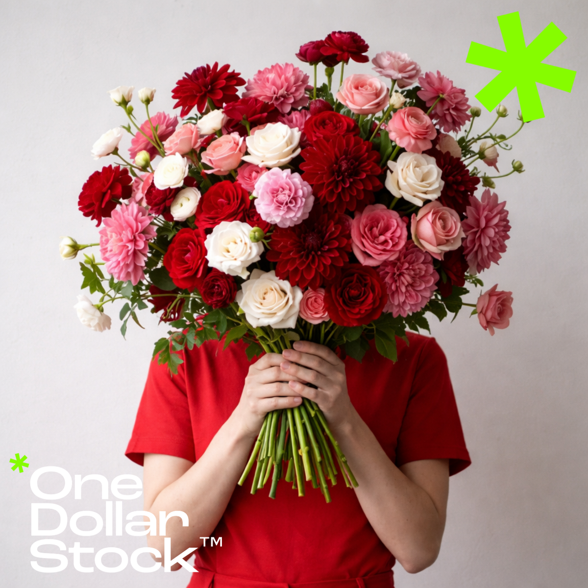
How Florists Can Make Their Brand Look Premium Without a Big Budget
How Florists Can Make Their Brand Look Premium Without a Big Budget If you run a small flower shop, you already know that the product sells itself in person. The moment a customer walks in and sees a well-arranged dahlia bouquet or smells fresh lavender, the sale is halfway done. The problem is getting them through the door, or to your website, or to follow you on Instagram, before they ever experience that. That first impression is entirely visual, and it is made in under three seconds. For most independent florists, that window is being lost to competitors with bigger marketing budgets and more polished feeds. The good news is that premium brand perception is not about budget. It is about consistency, color, and the right imagery. This guide breaks down exactly how a small florist can build a high-end visual identity without an agency, a photographer on retainer, or a design team. Why Visual Branding Matters More for Florists Than Almost Any Other Business Flowers are a visual product sold in a visual medium. Instagram, Pinterest, Google Business photos, and your website header are all doing the same job: convincing a potential customer that your arrangements are worth the price. A blurry phone photo of a bouquet on a cluttered counter communicates something very specific about your brand, and it is not "premium." Conversely, a clean, well-lit macro shot of a pink dahlia petal communicates craft, care, and attention to detail, even if the arrangement itself costs the same. The visual gap between a florist that looks established and one that looks amateur is rarely about the flowers. It is almost always about the photography and the consistency of the brand palette across every touchpoint. How to Build a Consistent Color Palette for Your Flower Shop Brand Color consistency is the single fastest way to make a small brand look intentional and professional. Pick two to three core colors that reflect your shop's personality, whether that is soft blush and sage for a romantic wedding florist, or deep burgundy and forest green for a moody, editorial aesthetic. Apply those colors to your Instagram grid backgrounds, your website banners, your packaging tissue paper, and your promotional graphics. When every visual element shares the same palette, the brand starts to feel cohesive even if the individual assets are simple. You do not need a designer to do this. You need discipline and a reference image you can pull colors from. A detailed purple-toned floral images can serve as your palette anchor, giving you exact hex codes to match across Canva, your website theme, and your printed materials. Using Professional Floral Stock Photos to Elevate Your Instagram and Website Not every post needs to be an original photo you took yourself. Professional florists and lifestyle brands have used licensed stock photography for years to fill content gaps, maintain visual quality between shoots, and create seasonal campaigns without a photographer on call. For a small flower shop, having access to a library of high-quality floral images can be the difference between a sparse, inconsistent Instagram grid and one that looks like it belongs to a boutique studio. The key is choosing images that match your brand palette and feel, not just any flower photo. Browse nature stock photos for seasonal campaigns, for example, to find images that work perfectly for a spring campaign post, a website seasonal banner, or a Valentine's Day email header, without requiring a photoshoot. Seasonal Campaigns That Make a Small Florist Look Like a Big Brand The florist calendar is built around seasons and occasions: Valentine's Day, Mother's Day, spring weddings, summer garden parties, autumn arrangements, and Christmas wreaths. Each of these is a content and sales opportunity, but only if you show up with visuals that match the moment. A premium-looking seasonal campaign does not require a full photoshoot. It requires three things: a strong hero image that fits the season, a consistent color treatment applied across your posts and stories, and copy that speaks directly to the buyer's intent. For wedding season specifically, pink floral stock photos can anchor an entire campaign across Instagram, your website, and printed flyers. The image does the heavy lifting. Your job is to keep the palette and messaging consistent around it. How Lightroom Presets Help Florists Create a Consistent Photo Aesthetic One of the fastest ways to make your own flower photos look more professional is to apply a consistent editing style across every image you post. Lightroom presets let you do this in one click. Instead of spending twenty minutes adjusting each photo, you apply a preset that matches your brand's warmth, saturation, and tone, and every image instantly feels like it belongs to the same visual world. For florists, the right preset can make a phone photo of a bouquet look editorial. Warm, slightly desaturated tones work well for romantic and rustic aesthetics. Cooler, high-contrast edits suit modern and minimalist shops. Analog film presets are particularly effective for florists going for a timeless, slightly faded look that photographs well on both Instagram and print materials. What a Premium Florist Instagram Feed Actually Looks Like A premium Instagram feed for a florist is not about posting every day. It is about posting with intention. Each image should feel like it belongs next to the one before it. That means consistent editing, consistent framing (close-up macro shots mix well with wider arrangement shots), and a color story that runs through the grid. Avoid mixing warm-toned photos with cool-toned ones in the same row. Avoid posting low-light phone photos next to bright studio shots. The contrast breaks the visual rhythm and signals inconsistency to the viewer. Use your stock images to fill gaps between original content, and use your presets to unify the editing across both. A florist with 800 followers and a visually coherent feed will convert more profile visitors into customers than one with 8,000 followers and a chaotic grid. Perceived quality drives purchasing decisions in this category more than almost any other metric. The Cheapest Investment a Small Florist Can Make in Their Brand If you had to pick one thing to invest in first, it would be a small library of high-quality floral stock images and a set of Lightroom presets that match your brand palette. Together, these two assets give you the raw material to build every campaign, every seasonal post, every website banner, and every promotional graphic for the next twelve months, without a photographer, without a designer, and without an agency retainer. The cost is a fraction of a single photoshoot. The output is a brand that looks like it has been professionally managed from day one. For independent florists competing against larger chains and well-funded boutiques, that visual credibility is not a luxury. It is the baseline for being taken seriously in a market where the first impression is always visual and almost always made on a screen.

