

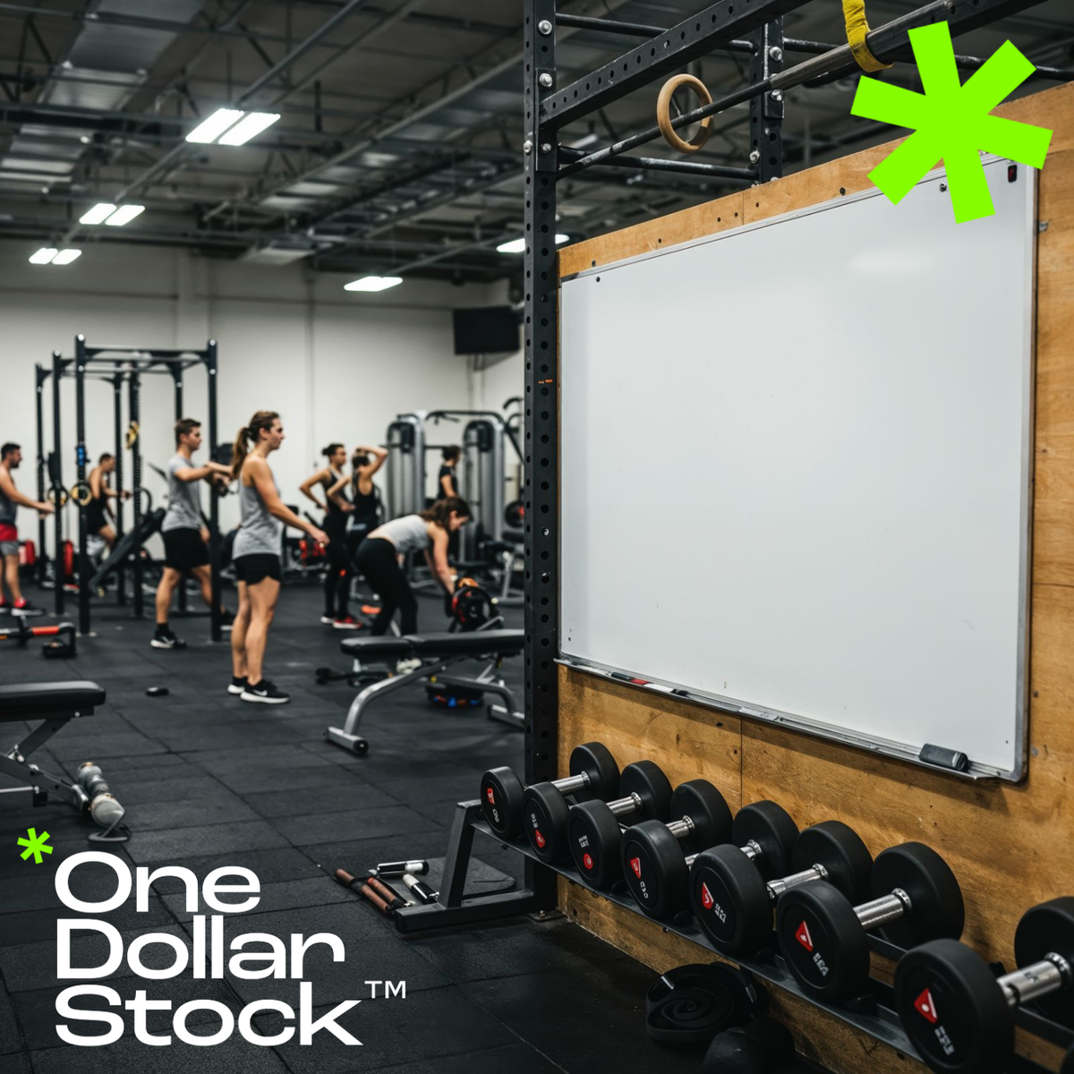
Top Visual Mistakes Small Gyms Make on Social Media (And How to Fix Them)
Top Visual Mistakes Small Gyms Make on Social Media (And How to Fix Them) If your gym's Instagram looks like it was put together in five minutes between classes, you are not alone. Most independent gyms and boutique fitness studios struggle with the same problem: the training is excellent, but the social media presence looks cheap, inconsistent, or completely forgettable. And in a market where potential members scroll past dozens of fitness brands every day, looking generic is the same as being invisible. This article breaks down the most common visual mistakes small gyms make on social media, and shows exactly how better fitness imagery and consistent branding can turn a low-performing profile into one that actually attracts premium members. Mistake 1: Using Low-Quality Gym Photos That Kill Your Brand Credibility Blurry action shots taken on an old phone, harsh fluorescent lighting, cluttered backgrounds with equipment piled in the corner. These are the images that make a gym look like a budget operation even when the actual facility is solid. The problem is not the gym itself. It is the visual representation of it. Premium members, the ones who will pay for personal training packages, annual memberships, and specialty classes, make snap judgments based on what they see online. A dark, grainy photo of someone doing a squat does not communicate quality. It communicates that nobody cared enough to do it right. Investing in professional-grade modern gym interior photography is one of the fastest ways to reposition how your brand is perceived before a single word is read. Mistake 2: Inconsistent Visual Style Across Every Post One post is bright and airy. The next is dark and moody. The one after that uses a completely different font and color palette. This kind of visual inconsistency is one of the most damaging things a small gym can do on social media, because it signals that there is no brand identity behind the business. Consistency is what makes a profile feel like a brand rather than a random collection of posts. That means committing to a color palette, a tone, a style of photography, and sticking to it. Applying a consistent Lightroom preset to every image is one of the simplest ways to achieve this. A set like Strong Color Grading Presets can unify the look of your entire feed in minutes, giving every photo the same punchy, high-contrast finish that reads as intentional and professional. Mistake 3: Only Posting Equipment and Empty Spaces A photo of a barbell rack is not a reason to join a gym. People join gyms because of how they imagine themselves feeling inside them. The most effective fitness social media content puts people at the center: real training moments, raw effort, and the kind of energy that makes someone think they want to feel that way too. Small gyms often default to equipment shots because they feel safe and easy. But they rarely convert. What converts is showing the experience in motion. An athlete pushing hard through a sprint, a member mid-rep with full focus, a coach cueing someone through a tough set. That is the content that stops the scroll. Mistake 4: Ignoring the Visual Language of Your Target Member A gym targeting 35-to-50-year-old professionals who want structured strength training should not be posting the same kind of content as a CrossFit box targeting competitive athletes in their twenties. The visual language, the color palette, the type of movement shown, the mood of the photography, all of it needs to match the lifestyle and aspirations of the specific person you are trying to reach. A boutique studio that offers yoga, pilates, or mindful movement needs imagery that feels calm, intentional, and premium, not aggressive or high-intensity. Generic fitness imagery that could belong to any gym in any city does not speak to anyone in particular. Niche-specific visuals create an immediate sense of recognition. When the right person sees your content and thinks that looks like me, you have done your job. Mistake 5: Promotional Posts That Look Like Flyers from 2009 Membership offers, class schedules, and seasonal promotions are necessary content for any gym. But the way most small gyms design these posts is a problem. Bright yellow backgrounds, clip art icons, five different fonts, and a wall of text crammed into a square image. These posts look like they were made in a word processor and they perform accordingly. Promotional content for a fitness brand should feel as premium as the brand itself. Clean layouts, strong typography, high-quality background imagery, and a consistent color system make the difference between a post that gets ignored and one that gets saved and shared. The visual energy of a focused athlete cycling intensely on a bright orange bike used as a background immediately raises the perceived value of whatever offer you are running. Mistake 6: Never Showing the People Behind the Gym Independent gyms have one major advantage over big-box chains: personality. The coaches, the community, the culture. But most small gyms never show any of it on social media. Every post is a workout tip or a stock-looking image with no human connection. Showing real people, whether that is your coaching staff, your members with their permission, or behind-the-scenes moments from class, builds the kind of trust that no promotional post can manufacture. Pair that authentic content with polished supporting visuals from a professional fitness image library and you get the best of both worlds: real and refined. How to Fix Your Gym's Social Media Visuals Without a Big Budget The good news is that fixing these mistakes does not require hiring a full-time photographer or a creative agency. It requires three things: a consistent visual style, a library of high-quality fitness images you can actually use, and a basic understanding of what your target member responds to. A well-curated stock library built specifically for fitness and wellness content gives you the raw material to post consistently, look professional, and stay on brand without scrambling for content every week. Pair that with a set of Lightroom presets to keep your color grading consistent, and you have a repeatable visual system that scales with your gym as it grows. The gyms that win on social media are not always the ones with the best equipment or the most square footage. They are the ones that look like they belong in the premium tier, even before a potential member walks through the door. Build a Gym Brand That Looks as Good as Your Training Social media is the first impression most potential members will ever have of your gym. If that impression is inconsistent, low-quality, or visually forgettable, you are losing members before they ever contact you. The fix is not complicated, but it does require intention. Start by auditing your last 30 posts. Count how many use consistent colors, how many feature people in action, and how many look like they belong to the same brand. Then close the gaps with better source material, a defined visual style, and fitness photography that actually reflects the quality of what you offer. Your social media should be the best advertisement your gym has. Right now, for most small gyms, it is the biggest missed opportunity.
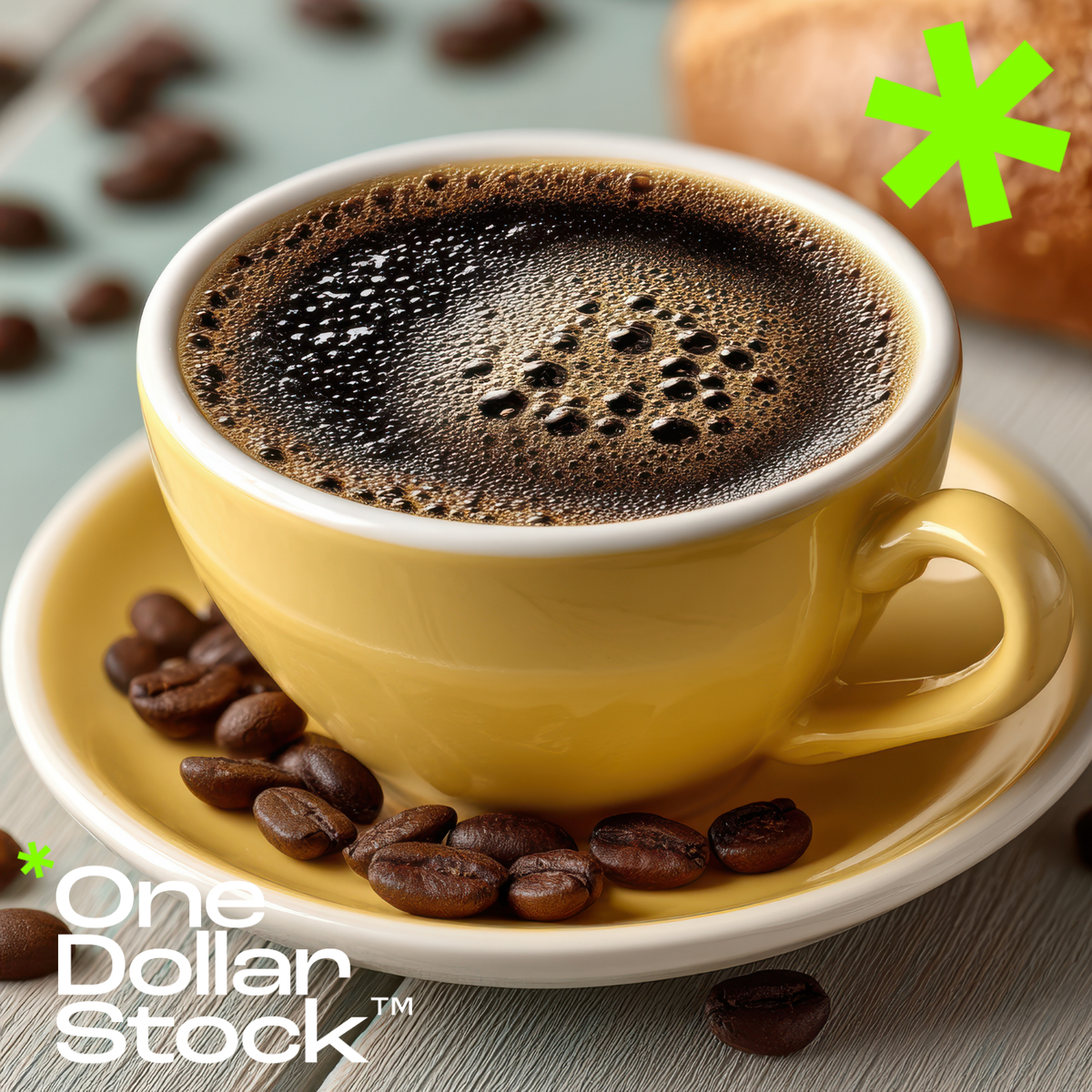
Best Visual Branding Tips for Independent Cafes and Coffee Shops
Best Visual Branding Tips for Independent Cafes and Coffee Shops If you run an independent cafe or coffee shop, you already know the product is not the problem. The espresso is dialed in, the pastries are fresh, and the regulars keep coming back. What holds most small coffee shops back from growing their audience, attracting new customers, and competing with bigger chains is not the coffee. It is the visual brand. The good news is that you do not need a costly rebrand or a full-time designer to fix it. With the right stock photos, Lightroom presets, and ready-to-use creative assets, an independent cafe can look polished, premium, and genuinely Instagram-worthy in a matter of hours. Why Visual Branding Matters More Than Ever for Independent Coffee Shops Customers decide whether to visit a cafe based on what they see online before they ever walk through the door. Your Google Business photos, your Instagram grid, your seasonal drink promotions, and even your digital menu all communicate something about your brand. If those visuals look inconsistent, low-quality, or generic, potential customers will scroll past and choose the place that looks more put-together. For independent coffee shops competing against well-funded chains with in-house creative teams, visual consistency is one of the most powerful and affordable advantages available. Start With a Consistent Color Palette and Cafe Aesthetic Before you post another photo or update your menu board, define your visual identity. Most successful independent cafes anchor their brand around two or three core colors and a consistent mood. Think warm neutrals and terracotta for a cozy neighborhood feel, or clean whites and muted greens for a minimalist specialty coffee vibe. Once you have that palette, every photo you post, every story you share, and every promotional graphic you create should feel like it belongs to the same world. This is where high-quality stock photography becomes a practical tool rather than a shortcut. Choosing images that already match your color story saves hours of editing and keeps your feed looking intentional. Use Professional Cafe Stock Photos to Fill Content Gaps Not every cafe has the budget for a monthly photo shoot, and not every owner has time to style and shoot content between the morning rush and closing. This is exactly where a well-curated library of cafe and coffee lifestyle stock photos pays for itself. The key is choosing images that feel specific and editorial rather than generic and staged. A photo of a barista carefully pouring steamed milk into a fresh latte, shot in warm ambient light, tells a story. A flat, overlit stock photo of a coffee cup on a white background does not. When you browse the OneDollarStock photo library, look for images that match the actual mood of your space, not just the subject matter. Lightroom Presets for Coffee Shop Photography: Edit Faster, Look More Premium Even the best smartphone photo looks flat without a consistent edit. Lightroom presets are one of the fastest ways to give your cafe photography a signature look without spending hours in post-production. For coffee shops, the most effective presets tend to lean warm and moody, with lifted shadows, rich browns, and a slight fade that makes drinks and interiors look inviting rather than clinical. If your cafe has a darker, more atmospheric interior, a set of dark interior presets can make your space look intentional and editorial rather than just dimly lit. The Moody Urban Food Presets from OneDollarStock are a strong starting point for cafes that want a consistent, high-end look across food and drink photography. How to Make Your Seasonal Drink Promotions Look More Professional Seasonal menus are one of the highest-engagement content opportunities a coffee shop has all year. A pumpkin spice latte launch in September, a lavender cold brew for summer, or a holiday spiced mocha in December can drive real foot traffic if the visual promotion looks good enough to share. The mistake most independent cafes make is creating these promotions at the last minute with whatever photos they have on hand. A better approach is to build a small library of seasonal cafe imagery and lifestyle shots in advance, then pair them with a consistent editing style so every seasonal campaign feels like a deliberate brand moment rather than a rushed post. Pairing strong imagery with the Dark Interior Presets can give autumn and winter drink promotions a rich, atmospheric quality that performs well on Instagram and in email campaigns. Barista and Behind-the-Counter Content That Builds Brand Trust Customers connect with people, not just products. Behind-the-counter content, showing your baristas at work, the care that goes into each drink, and the craft behind your espresso program, builds the kind of brand trust that no amount of logo design can replicate. If you do not have enough of your own behind-the-scenes photography, supplementing with high-quality barista stock photos that match your cafe's aesthetic is a practical and cost-effective solution. The goal is to make your content feel human and specific, not polished to the point of feeling corporate. Make Your Coffee Shop Instagram-Worthy Without Redesigning Your Space You do not need to renovate your cafe to make it more photogenic. Small, deliberate changes to how you style your counter, your window seating, or your seasonal display can make a significant difference in how your space photographs. Natural light is your best asset. A clean, uncluttered surface with one or two well-chosen props, a ceramic cup, a small plant, a handwritten card, will photograph better than a busy counter full of equipment. When you combine thoughtful in-house styling with a consistent editing preset and a curated selection of lifestyle stock photos to fill your content calendar, your Instagram grid starts to look like a brand rather than a random collection of phone snapshots. Build a Repeatable Visual System for Your Cafe Marketing The cafes that consistently look great online are not necessarily the ones with the biggest budgets. They are the ones with a system. That means a defined color palette, a go-to editing preset, a small library of on-brand stock photos for content gaps, and a simple template for promotional graphics. Once that system is in place, creating content for a new seasonal drink, a weekend event, or a loyalty program promotion takes minutes instead of hours. For independent coffee shop owners who are already managing everything from ordering to staffing, that kind of efficiency is not a luxury. It is a competitive advantage. Visual Branding Assets for Coffee Shops: Where to Start If you are starting from scratch or refreshing your cafe's visual identity, the most practical first step is to build a small, curated asset library. That means a set of Lightroom presets that match your cafe's mood, a collection of high-quality coffee and cafe lifestyle stock photos that align with your color palette, and a handful of versatile lifestyle images you can use across Instagram, your website, and email. OneDollarStock offers a pay-once, use-forever model with no subscription required, which makes it a genuinely practical option for independent cafe owners who need professional-quality assets without ongoing costs. Browse the full creative asset library to find coffee shop photography, food and drink presets, and lifestyle images that fit your brand. Final Thoughts: Premium Coffee Shop Branding Is Within Reach Independent cafes have something the big chains can never fully replicate: personality, community, and a genuine story. The goal of visual branding is not to make your cafe look like a chain. It is to make sure that personality comes through clearly and consistently everywhere a potential customer encounters your brand, from your Instagram grid to your seasonal menu launch to the photo on your Google listing. With the right stock photos, a consistent editing style, and a small library of on-brand creative assets, you can close the visual gap between your cafe and the competition without a costly rebrand or a full-time creative team. Start with one preset pack, one curated photo collection, and one consistent color story. The rest follows from there.
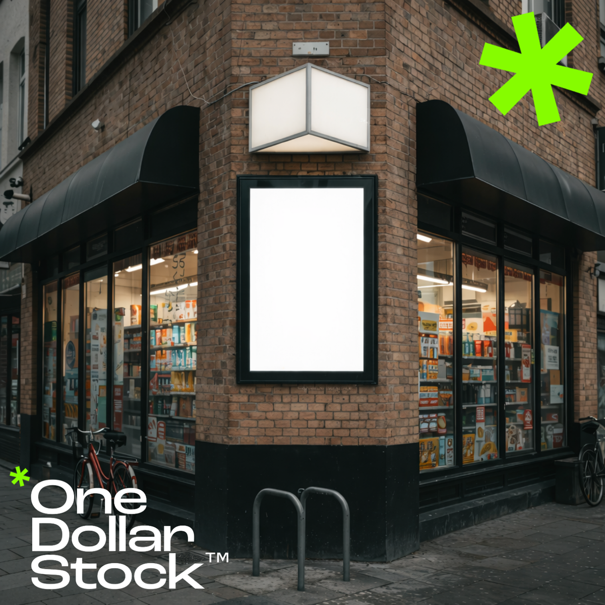
How to Run a Corner Shop and Survive: Family Stores vs. Corporate Giants
A practical guide for independent corner shop owners on how to survive and thrive when supermarket chains move into the neighborhood - covering local brand identity, stock strategy, customer experience, and digital presence.

