


How to Avoid Generic AI-Looking Visuals in Brand and Marketing Content
Generic AI-looking visuals make brands harder to recognize. This guide explains how to avoid them using curated stock images, mockups, textures, overlays, presets and a clear visual direction -- so your marketing content feels intentional, not interchangeable.
What Is a Visual Asset Stack? A Practical Guide for Small Creative Teams
A practical guide for small businesses, agencies, marketers and creators who need faster websites, campaigns, social content and client work without managing scattered creative subscriptions. Learn what a visual asset stack is, what it includes, and how to build one that actually works.
What Are Creative Assets and Why Do Brands Need Them?
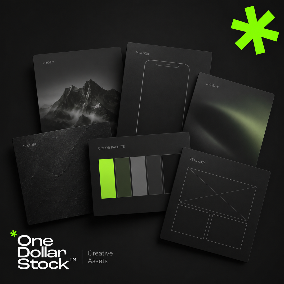
Creative assets are the visual and design files a brand uses to create marketing materials faster and more consistently. They include stock photos, mockups, Lightroom presets, LUTs, textures, overlays, Framer templates, website layouts, campaign graphics, and reusable design elements. For small brands, creators, startups, and agencies, creative assets reduce the need to start every project from a blank page. A well-organized creative asset library helps teams build websites, ads, social media posts, launch materials, presentations, and sales content with a clearer visual style and a faster workflow. What are creative assets? Creative assets are reusable files that support visual communication. They can be finished designs, editable templates, raw visual materials, campaign graphics, or production tools. Examples include stock photos for websites and ads, mockups for presenting products, Lightroom presets for consistent photo editing, LUTs for video color grading, textures for backgrounds, photo overlays for visual effects, and Framer templates for websites. The key point is simple: creative assets are building blocks. They help a brand create more visual output without rebuilding every image, layout, or effect manually. Why creative assets matter Small brands, creators, startups, marketers, and agencies usually work with limited time and budget. They need to publish content, test offers, build landing pages, create ads, update social channels, and prepare sales materials. Without a clear asset system, every task takes longer. A designer searches for images from scratch. A marketer rebuilds similar ad layouts. A founder prepares a sales deck without consistent visuals. A creator edits each photo or video manually. Creative assets solve part of this problem. One stock photo can support a blog image, landing page section, ad creative, and social post. One mockup can make a digital product easier to understand. One preset can help keep campaign photography feel connected. This matters because modern marketing is visual and repetitive. Brands do not need one perfect graphic. They need a repeatable system for creating many strong assets quickly. Creative assets are not just stock photos Many people hear creative assets and think only about stock photos. Stock photos are useful, but they are only one part of a practical brand asset library. A stronger library can include: Stock photos for websites, ads, blogs, and social media Mockups for products, apps, digital downloads, packaging, and branding Lightroom presets for consistent photo editing LUTs for video color grading Textures for backgrounds, posters, thumbnails, and campaign graphics Photo overlays for effects such as light leaks, grain, dust, shadows, or atmosphere Framer templates for faster website production Social media templates for posts, stories, carousels, and promotions Campaign assets such as banners, CTA sections, launch graphics, and product visuals The best asset libraries combine several of these file types and organize them around campaigns or use cases rather than random downloads. Creative bundles are a practical way to start because they help you work from a focused set of matching assets. How a creative asset workflow works A creative asset workflow should be organized around real marketing needs, not random downloads. Start by listing the formats your brand creates most often: landing pages, Instagram posts, ads, newsletters, blog graphics, sales decks, product pages, or campaign visuals. Then group assets by use case, such as website visuals, product mockups, ad creatives, social templates, textures, overlays, presets, and LUTs. Next, choose a consistent visual direction. Your brand may be clean, warm, bold, editorial, premium, playful, or practical. The assets should support that direction instead of creating a disconnected look. Finally, reuse assets across channels. A mockup can appear on a landing page, in an email campaign, on social media, and in a sales deck. A texture can become a recurring background style. A preset can make campaign photography feel connected. The goal is not to collect as many files as possible. The goal is to build a practical system that helps you create better marketing materials faster. When to use creative assets Creative assets are useful whenever a brand needs to create visual content with speed and consistency. Use them when building landing pages, testing Meta ads, preparing social content, designing a product launch kit, creating website hero sections, making sales decks, showing digital products in mockups, editing photos or videos, or producing campaign graphics for multiple channels. For agencies, creative assets improve delivery. Instead of starting every client project from zero, the team can use strong visual building blocks and spend more time on strategy, messaging, layout, and conversion. For startups, they help create launch materials before there is a full internal design team. For creators, they make content production more consistent. How one asset library speeds up production A well-organized asset library creates leverage because the same files can support websites, ads, social media, email campaigns, and sales materials. For websites, stock photos support hero sections, blog visuals, landing pages, and category pages. Framer templates help move from idea to page structure faster. Textures can create visual contrast in sections that would otherwise feel flat. For ads, mockups make offers easier to understand. Overlays and textures help create stronger visual variations without redesigning every ad from scratch. For social media, presets keep photos consistent and templates keep layouts recognizable across posts and stories. The benefit is not only speed. It is consistency. When your visuals come from a clear asset system, your brand starts to feel more intentional across channels. What to avoid Creative assets only help if they are selected carefully. Poor choices can make a brand look generic, inconsistent, or disconnected from its offer. Avoid using stock photos that do not match your brand tone. Avoid mixing too many styles in one campaign. Avoid downloading files without organizing them. Avoid applying presets or LUTs too strongly. Avoid choosing templates only because they look good. A template should support the message, not distract from it. A creative asset should make the offer clearer. If it looks polished but does not help the audience understand the brand, product, or campaign, it is not the right asset. How OneDollarStock can help OneDollarStock offers digital creative assets built for real marketing workflows. The catalog covers stock photos, mockups, Lightroom presets, LUTs, photo overlays, textures, Framer templates, and creative bundles. A practical starting point is to build a small creative bundle for one campaign: website visuals, a product mockup, a background texture, and one consistent editing style. This gives you a focused system instead of a folder full of disconnected files. Start with one campaign and build from there. Browse OneDollarStock collections to create a flexible asset library for websites, ads, social media, and sales content. Final takeaway Creative assets help brands create faster, more consistent, and more professional-looking marketing materials. A useful asset library goes beyond stock photos. It includes mockups, presets, LUTs, textures, overlays, templates, and campaign-ready elements organized around real workflows. For small brands, creators, startups, and agencies, the advantage is practical: less blank-page work, faster production, easier content repurposing, and more consistent visuals across every channel. Before you use creative assets, keep this in mind What are creative assets in marketing? Creative assets in marketing are reusable visual and design files used to create campaigns, websites, social media content, ads, and sales materials. They can include stock photos, mockups, templates, textures, overlays, presets, LUTs, graphics, and product visuals. Are creative assets the same as brand assets? They overlap, but they are not identical. Brand assets usually refer to core identity files such as logos, colors, typography, and brand guidelines. Creative assets are broader because they include practical files used to produce marketing content. Why do small brands need creative assets? Small brands often have limited time, budget, and design capacity. A useful creative asset library helps them create websites, ads, social posts, newsletters, launch materials, and sales content without starting every project from scratch. What should be included in a creative asset library? A practical creative asset library can include stock photos, product mockups, social media templates, website templates, Lightroom presets, LUTs, textures, overlays, campaign graphics, and presentation visuals. The best library is organized around real use cases. Can creative assets make a brand look generic? Yes, if they are chosen randomly or used without a clear visual direction. Creative assets should match the brand's tone, audience, and message. Good selection and organization matter more than collecting a large number of files.
LUTs vs Presets: What’s the Difference?
Creative asset bundles are one of the fastest ways to build better visual projects without starting from zero every time. Instead of searching for one image, one texture, one mockup, one overlay, one preset, or one background separately, a bundle gives you a ready-made collection of assets that already belong to the same creative direction. For designers, marketers, founders, ecommerce teams, agencies, and content creators, this can save hours of repetitive work. A good creative asset bundle helps you move from idea to execution faster, especially when you need visuals for websites, social media posts, ad campaigns, product pages, pitch decks, client presentations, thumbnails, digital products, or brand concepts. The real value of a bundle is not only the number of files inside. The value is speed, consistency, flexibility, and the ability to build a complete visual system from one source. A strong creative bundle should feel like a useful toolkit, not a random folder of files. The best bundles give you assets that can work together across multiple formats, channels, and campaign needs. What is a creative asset bundle? A creative asset bundle is a collection of digital files grouped around a specific use case, style, product type, theme, or workflow. It can include images, graphics, mockups, textures, overlays, LUTs, presets, templates, backgrounds, patterns, and other ready-to-use files for visual projects. Some bundles are narrow and specific, such as a pack of product mockups for ecommerce packaging. Others are broader, such as a large visual bundle with images, textures, overlays, and design assets for social media or branding. The best choice depends on what you need to create. A bundle is especially useful when you need visual consistency. Instead of combining unrelated files from many different sources, you can work from a curated set of assets that share a similar mood, quality level, color direction, or creative purpose. Why creative asset bundles save time The biggest hidden cost in creative work is not always the price of the asset. It is the time spent searching, comparing, downloading, testing, rejecting, resizing, adapting, and trying to make unrelated visuals work together. Bundles reduce that friction. They give you a larger creative starting point, which means you can test more directions, build more variations, and complete projects faster without interrupting the workflow every few minutes to look for another file. 1 Less searching, more building Instead of opening multiple marketplaces and searching for every visual separately, you start with a ready collection. This is useful when you need to produce many assets quickly, such as ad variations, social posts, landing page visuals, or product presentation materials. 2 More consistent visual direction A bundle can help your project feel more coherent. When images, textures, mockups, overlays, and templates share a similar style, the final result looks more intentional and less patched together. 3 Faster creative testing Bundles are useful when you want to compare styles quickly. You can test several backgrounds, mockups, textures, or image directions before deciding which look fits the campaign, product, or brand. 4 Better value per project When one bundle can support a website, social posts, ads, email graphics, thumbnails, product pages, and presentations, the cost per final creative output becomes much lower. What can be included in a creative asset bundle? Creative bundles can be built around different asset types. Some are focused on photography, others on mockups for product and brand presentation, design elements, editing tools, or website templates. The strongest bundles are usually organized around a practical outcome: build a campaign, present a product, create a brand look, edit a photo set, design a landing page, or produce content faster. Asset type What it helps with Common use cases Images Visual storytelling, website sections, campaigns, editorial content, and social posts. Landing pages, blog covers, ads, moodboards, presentations, thumbnails. Graphics Decorative visuals, digital compositions, backgrounds, and creative layouts. Post designs, banners, digital products, brand visuals, campaign graphics. Mockups Showing designs in realistic product, branding, packaging, apparel, or device contexts. Portfolios, client presentations, ecommerce previews, branding concepts. Textures Adding depth, material detail, atmosphere, and tactile visual quality. Posters, packaging, backgrounds, web sections, editorial layouts. Overlays Adding light leaks, film effects, dust, grain, shadows, frames, or atmospheric details. Photo edits, social visuals, music covers, thumbnails, campaign images. LUTs and presets Creating a consistent color style across videos and photos. Reels, YouTube videos, product clips, photo sets, social media feeds. Website templates Speeding up web design and layout production. Landing pages, portfolios, startup pages, product pages, service websites. Bundles vs single assets: which one is better? Single assets are useful when you know exactly what you need. A single image, mockup, texture, or preset can solve a specific problem quickly. But bundles are usually better when you are building a full project, testing multiple directions, or creating content across many channels. Single assets are best when the need is precise Use a single asset when you need one clear file: one hero image, one product mockup, one background texture, one social media visual, or one preset style. This keeps the workflow simple and direct. Use bundles when the project has many outputs. If you need a landing page, ads, social posts, thumbnails, email graphics, and presentation visuals, a bundle gives you more material to build a connected system. The choice is not only about price. It is about workflow. If you are creating one visual, a single asset may be enough. If you are creating a campaign or brand system, a bundle usually gives you more creative freedom. Who should use creative asset bundles? Creative asset bundles are useful for anyone who regularly produces visual work. They are especially valuable when time, consistency, and output volume matter. Designers Use bundles to speed up layouts, test visual directions, build client concepts, create presentations, and prepare portfolio-ready mockups. Marketing teams Use bundles to create campaign variations, ad visuals, social content, email graphics, landing page sections, and promotional materials faster. Founders Use bundles when building early-stage websites, pitch decks, product pages, launch materials, and brand assets without hiring a full creative team. Agencies Use bundles to produce more concepts, move faster in client work, and keep campaign materials visually aligned across multiple deliverables. Ecommerce teams Use bundles for product presentations, mockups, seasonal campaigns, social media ads, email visuals, and storefront graphics. Creators Use bundles to create thumbnails, reels, posts, covers, digital products, editing styles, and branded visual content more efficiently. How to choose a good creative asset bundle Not every bundle is worth downloading. A large file count does not automatically mean better value. A good bundle should be usable, organized, visually consistent, and relevant to the kind of work you actually produce. Before choosing a bundle, look at the asset quality, file types, licensing, variety, preview images, and how many real projects the bundle can support. The best bundles are practical enough for immediate use but flexible enough to support different creative directions. A practical bundle checklist Check the use case. Is the bundle for branding, social media, websites, product presentation, photo editing, video editing, or general creative work? Review the file types. Make sure the files match your tools and workflow, such as JPG, PNG, PSD, XMP, CUBE, HTML, or template files. Look for visual consistency. The assets should feel like they can belong to the same project or campaign. Check commercial usability. If you plan to use the assets in business or client work, make sure the license supports your intended use. Think beyond one project. A strong bundle should be useful across multiple formats, not only one isolated design. Best use cases for creative asset bundles Bundles work best when you need more than one finished visual. They are ideal for projects where the same visual style needs to appear across several placements. Website launches A website launch rarely needs only one image. It may need hero visuals, section backgrounds, product previews, blog graphics, icons, mockups, social sharing images, and presentation visuals. A bundle can help keep those assets aligned. Social media campaigns Social campaigns need volume. A bundle can support multiple post variations, stories, reels covers, carousels, promotional graphics, and seasonal content without forcing the team to search from scratch every time. Brand presentations Pitch decks, client presentations, and brand proposals benefit from visual consistency. A bundle can help create a polished presentation with connected imagery, mockups, textures, and backgrounds. Ecommerce product launches Ecommerce teams often need product images, lifestyle visuals, banners, ads, packaging mockups, and storefront graphics. Bundles can speed up the launch process and make the visual system feel more complete. Creator workflows Creators need repeatable visual systems for thumbnails, reels, posts, covers, templates, and product previews. Bundles make it easier to publish consistently without redesigning every asset from zero. How creative bundles support brand consistency Brand consistency does not mean every visual should look identical. It means that the images, graphics, colors, textures, editing styles, and layouts should feel connected. This is where bundles become useful. A curated bundle can give your project a shared visual language. For example, a brand campaign might use warm lifestyle images, high-quality texture assets, clean mockups, and subtle overlays. A tech startup might use minimal backgrounds, product mockups, clean website templates, and a restrained visual palette. A creator might combine presets, overlays, and cover images to keep content recognizable across platforms. The more places your brand appears, the more useful this becomes. Websites, ads, emails, social posts, thumbnails, pitch decks, and product pages should not feel like they were made by six unrelated teams. Where OneDollarStock fits into this workflow OneDollarStock is built for creators, founders, marketers, agencies, designers, and ecommerce teams that need practical visual assets for real projects. Instead of only working with single stock images, you can build a broader creative workflow using images, graphics, mockups, textures, overlays, LUTs, presets, bundles, and website templates. That makes bundles especially useful. They help you build campaigns, visual systems, product presentations, web sections, social media content, and client materials faster. You can start with creative asset bundles, then expand into related categories such as mockups, textures, LUTs, and presets when the project needs more specific assets. Useful OneDollarStock collections for bundle-based workflows Start with the asset category that matches your current project, then combine related assets when you need a larger visual system. Browse creative asset bundles Browse mockups for product and brand presentation Browse textures for backgrounds and design depth Browse LUTs for video color grading Browse presets for photo editing Final takeaway: bundles are not just cheaper files, they are faster workflows Creative asset bundles are useful because they reduce friction. They help you search less, test faster, create more variations, and keep your visual work more consistent across different formats. Single assets are still useful when you need one specific file. But when you are building a campaign, a brand system, a launch, a social content set, a product presentation, or a complete website, bundles usually give you a stronger starting point. The best bundle is not the one with the biggest number of files. It is the one that helps you finish better creative work faster.

How to Build a Complete Brand Launch Kit with Stock Photos, Presets, LUTs, Textures and Website Templates
How to Build a Complete Brand Launch Kit Using Creative Assets from OneDollarStock A brand launch kit is the single most important creative investment you can make before going to market. It is not a logo file and a color palette. A real brand launch kit is a complete visual asset system: stock photos, a color grading style for photos and video, background textures, design overlays, and a website template that ties everything together. Without it, your launch looks fragmented. With it, a solo founder or a two-person startup can produce content that looks like it came from a funded creative team. This guide shows you exactly how to build a complete brand launch kit using commercial creative assets from OneDollarStock, a marketplace offering stock photos, Lightroom presets, color LUTs, textures, and Framer website templates under a pay-once commercial license. Every asset category covered here maps directly to a real production need at launch. What Should a Brand Launch Kit Include? Most founders underestimate how many visual asset types a brand launch actually requires. A complete brand launch kit covers every surface where your brand will appear in the first 90 days after launch. Hero stock photography: Images for your homepage, social profiles, email headers, and paid ads. Lightroom presets: A consistent color grade applied to every still photo your brand publishes. Color LUTs: The video equivalent of presets, applied in Premiere Pro, DaVinci Resolve, or Final Cut Pro to keep your reels, ads, and brand videos visually consistent with your photography. Textures and overlays: Background layers and design accents used in social media graphics, email headers, and landing page sections. A website template: A professionally designed, customizable web presence you can launch in hours, not weeks. Brand guidelines document: A simple internal reference that tells your team which assets to use, where, and how. OneDollarStock covers all five asset categories in one place. Browse the full Lightroom presets collection, the LUTs collection, the textures collection, and the Framer templates collection to start building your kit. Step 1: Define Your Visual Identity Before You Download Anything Before selecting any asset, answer three questions: What emotion should your brand trigger? What color temperature fits your positioning? Who is your primary visual audience? A wellness brand targeting women in their 30s needs warm, natural tones and clean editorial photography. A SaaS startup targeting B2B buyers needs sharp, modern visuals with a cool or neutral palette. A streetwear label needs gritty textures and high-contrast color grading. A personal brand built around coaching or consulting needs approachable, confident portraiture. Your answers determine which stock photos, presets, LUTs, and textures you select. Skipping this step is the single most common reason brand launch kits end up looking inconsistent three weeks after launch. Step 2: Build Your Stock Photo Library for Brand Launch Stock photography is the backbone of any brand launch kit. It sets the human tone of your brand and gives you immediate content for your homepage, social profiles, email headers, and ad creatives. The key is selecting images that share a consistent light direction, color temperature, and compositional style so they feel like they belong to the same visual world. For brands built around people, lifestyle, or beauty, editorial portrait photography works best. For product-focused brands, you need clean, styled imagery that puts the product in context without competing with it. The Elegant Woman in Black Blouse with Earrings Portrait Stock Photo is a strong example of editorial-grade imagery that works across beauty, fashion, lifestyle, and premium product brands. The neutral background, sharp focus, and confident subject make it versatile enough for homepage heroes, Instagram grids, and email headers without modification. For brands with a warmer, more approachable tone, the Joyful Young Woman Smiling Outdoors with Nature Background delivers natural light and authentic energy that performs well in wellness, coaching, and consumer lifestyle categories. What to Look for in Brand Launch Photography Consistent light direction and color temperature across all selected images Neutral or brand-aligned backgrounds that do not compete with overlays or text Subjects and compositions that leave room for copy placement Commercial licensing that explicitly covers social media, paid ads, and web use Step 3: Lock In Your Color Grade with Lightroom Presets for Branding Color grading is what separates a random collection of images from a recognizable brand aesthetic. A single Lightroom preset applied consistently across all your still photography creates the visual signature that makes your brand instantly identifiable in a feed, an inbox, or a search result. Presets work in Lightroom Classic, Lightroom CC, and Lightroom Mobile. They are applied in seconds and can be batch-processed across an entire photo library, which means you can grade 50 brand images in the same time it takes to edit one manually. The Earth Tones Presets (15 XMP files) are built for brands that want a warm, grounded, organic aesthetic. They work especially well for wellness, food, beauty, and lifestyle brands where natural warmth signals authenticity and trust. Fifteen variations give you enough range to match different lighting conditions without breaking your visual consistency. If your brand leans toward a cleaner, editorial warmth without retro grain, the Vintage Warm No Grain Presets (15 XMP files) give you a polished, timeless look that works across portrait, product, and lifestyle photography. This is a strong choice for personal brands, coaches, and service businesses that want to look premium without looking cold. Step 4: Add LUTs for Brand Video Consistency If your brand produces any video content at all, including Instagram Reels, YouTube videos, TikToks, or paid video ads, you need a LUT. A LUT (Look Up Table) is the video equivalent of a Lightroom preset. It applies a color grade to your footage in Premiere Pro, DaVinci Resolve, or Final Cut Pro in a single click. Without a LUT, your video content will never match your photo content. That mismatch is one of the most common reasons brand feeds look inconsistent even when the photography is strong. For a complete brand launch kit, your preset and your LUT should share the same color temperature and tonal direction. The Dark Portraits LUT pack (20 LUTs) is ideal for premium, high-contrast brands in fashion, beauty, and luxury. Twenty variations give you enough range to find the exact tone that fits your visual direction without locking you into a single look across every video format. For brands with a more vibrant, urban, or street-culture identity, the Cinematic Colorful Streets LUT pack (6 LUTs) delivers punchy, saturated tones that make content pop on mobile screens and social feeds. This pack works particularly well for consumer brands, streetwear labels, and lifestyle products targeting younger audiences. Step 5: Use Textures to Make Your Brand Visuals Feel Premium Textures are one of the most underused tools in brand design. They add tactile depth to flat digital assets, making backgrounds, overlays, and design elements feel more intentional and premium. In a brand launch kit, textures are used as background layers in social media templates, as overlay elements on hero images, and as design accents in email headers and landing page sections. The right texture reinforces your brand's material world. A luxury brand uses gold or marble. A craft brand uses wood or raw paper. A tech brand uses brushed metal or concrete. Choosing the wrong texture, or using too many, is one of the fastest ways to make a brand look inconsistent. The Subtly Textured Gold Textures (20 JPG files) are a strong choice for luxury, beauty, and premium consumer brands. The subtle metallic quality adds richness without overwhelming the design, making them ideal for email headers, product announcement graphics, and social story backgrounds. For brands with a raw, artisan, or craft identity, the Burned Wood Textures (16 JPG files) bring an organic, handcrafted quality to digital design. They work particularly well for food, spirits, outdoor, and maker brands that want to signal authenticity through their visual materials. Step 6: Launch Your Website with a Framer Website Template Your website is the single most important brand touchpoint at launch. It is where every ad, every social post, and every email ultimately sends traffic. A poorly designed or generic website undermines every other asset in your launch kit, regardless of how strong your photography and color grading are. Framer website templates give you a professionally designed, fully customizable web presence that you can launch in hours rather than weeks. They are built for speed, visual quality, and conversion, which is exactly what a brand launch requires. Replace the placeholder images with your brand photography, apply your color palette, and you have a launch-ready website that looks like it cost ten times more to build. The Ignitex Digital Agency Framer Template is built for agencies, studios, and service brands that need a sharp, modern web presence with strong visual hierarchy. The layout is designed to showcase work, communicate positioning, and convert visitors into leads from the first scroll. For SaaS products, tech startups, and digital-first brands, the Elixhub SaaS and Startup Framer Template provides a clean, conversion-focused structure with sections for features, pricing, testimonials, and CTAs. It is the kind of website launch kit that makes a pre-launch page look like a funded product from day one. Common Mistakes When Building a Brand Launch Kit Most brand launch kits fail not because of bad assets, but because of poor selection and inconsistent application. These are the most common mistakes to avoid. Mixing color temperatures: Combining warm-toned photos with cool-toned presets creates visual dissonance that makes your brand look unpolished, even if each individual asset is high quality. Choosing too many textures: One or two textures used consistently is a brand system. Five different textures used randomly is visual noise. Skipping video color grading: If your brand produces any video content, launching without a LUT means your video and photo content will never visually match. Using a website template without replacing placeholder images: A Framer template is a starting point, not a finished product. Populate it with your actual brand photography before launch. Treating the launch kit as a one-time project: Your visual system should evolve with your brand. Build it with assets that are flexible enough to grow across new campaigns and channels. Skipping the brand guidelines document: Without a simple internal reference, team members and freelancers will make inconsistent choices that erode your visual identity over time. How to Organize Your Brand Launch Kit for a Team If you are working with a team, a freelancer, or an agency, your brand launch kit needs to be organized and documented so that anyone can use it correctly without asking you for guidance every time. Create a shared folder with clearly labeled subfolders: Photography, Presets, LUTs, Textures, Templates, and Brand Guidelines. Inside the Brand Guidelines document, specify which preset to use for still photography, which LUT to use for video, which textures are approved for which use cases, and which Framer template sections are locked versus editable. This structure turns a collection of assets into a repeatable production system. That is the real goal of a brand launch kit: not just to look good at launch, but to make it easy to produce consistent content for the next 12 months without starting from scratch every time. Build Your Complete Brand Launch Kit with Affordable Creative Assets A brand launch kit built on commercial-grade creative assets is one of the highest-leverage investments a founder or marketer can make before going to market. It compresses weeks of creative production into a single, organized system that your entire team can execute from, consistently, across every channel. OneDollarStock provides stock photos, Lightroom presets, color LUTs, textures, and Framer website templates under a pay-once commercial license. You build the kit once and use every asset indefinitely across campaigns, channels, and markets. No subscriptions. No per-use fees. No licensing surprises. Start with your hero photography, lock in your color grade with a matching preset and LUT, add one or two textures that reinforce your brand tone, and deploy your web presence with a Framer template built for your category. That is a complete, affordable brand launch kit, and it is ready to produce content from day one. Browse the full range of Framer website templates and Lightroom presets at OneDollarStock to start assembling your visual identity kit today. Frequently Asked Questions About Brand Launch Kits What is a brand launch kit? A brand launch kit is a curated collection of visual assets that defines how your brand looks and feels across every touchpoint at launch. It typically includes stock photography, a color grading style for photos and video, background textures, design overlays, and a website template. The goal is to give your team a complete, consistent visual system they can use immediately without building assets from scratch. How much does it cost to build a brand launch kit? The cost varies widely depending on whether you use custom photography, hire a designer, or use ready-made commercial assets. Using a marketplace like OneDollarStock, you can assemble a complete brand launch kit, including stock photos, presets, LUTs, textures, and a Framer website template, for a fraction of what a custom creative production would cost. All assets are sold under a pay-once commercial license with no recurring fees. Do I need both Lightroom presets and LUTs for a brand launch kit? If your brand produces both photo and video content, yes. Lightroom presets apply your color grade to still photography. LUTs apply the same visual direction to video footage in tools like Premiere Pro, DaVinci Resolve, and Final Cut Pro. Using both ensures your photos and videos share the same aesthetic, which is essential for a consistent brand identity across social media, ads, and your website. What Framer template should I use for a brand launch? The right Framer template depends on your brand category. Agencies and service brands benefit from portfolio-style layouts with strong visual hierarchy. SaaS products and startups need conversion-focused structures with feature sections, pricing tables, and clear CTAs. Personal brands and coaches need clean, approachable layouts that put the person front and center. OneDollarStock offers Framer templates across all of these categories. Can I use OneDollarStock assets for commercial projects? Yes. All assets available on OneDollarStock are sold under a commercial license, which means you can use them in client work, paid advertising, social media, websites, and marketing materials. Always review the specific license terms for each asset before use to confirm the scope of permitted use cases.
How to Use LUTs for Better Video Color Grading Without Slowing Down Your Edit
How to Use LUTs for Better Video Color Grading Without Slowing Down Your Edit If you spend more time color grading than actually editing, LUTs are the fix you have been looking for. A good LUT can transform flat, lifeless footage into something cinematic, consistent, and on-brand in a matter of seconds. For creators, marketers, and brand teams producing reels, ads, YouTube videos, and product content at scale, LUTs are not a shortcut. They are a workflow essential. This guide covers everything you need to know about video color grading with LUTs: what they are, how to apply them correctly, how to dial in the intensity, and how to avoid the mistakes that make footage look over-processed or inconsistent. What Are LUTs and Why Do They Matter for Video Color Grading LUT stands for Look-Up Table. In practical terms, it is a preset color transformation that maps the original color values in your footage to a new set of values. Think of it as a color filter with mathematical precision. Unlike a basic Instagram filter, a LUT is designed to work with professional video formats and can be applied across editing software including Premiere Pro, DaVinci Resolve, Final Cut Pro, and CapCut. For video editors working on tight deadlines, LUTs eliminate the need to build a color grade from scratch on every clip. For brands and marketers, they create visual consistency across every piece of content, whether it is a 15-second reel or a 10-minute YouTube video. Best LUTs for Video Editing: Cinematic, Moody, and Brand-Ready Styles Not all LUTs are created equal. The best LUTs for video editing are ones that complement your footage type, match your brand aesthetic, and hold up across different lighting conditions. Here are the styles that perform best for common content formats: Cinematic LUTs for YouTube videos, short films, and brand documentaries. These add depth, contrast, and a film-like quality that elevates production value instantly. The Cinema (20 LUTs) pack is a strong starting point for editors who want range and flexibility. Moody and dark LUTs for fashion, lifestyle, and editorial content. Deep shadows and desaturated tones work well for premium brands. The Dark Portraits (20 LUTs) pack covers this range with precision. Street and urban LUTs for social content, travel reels, and product ads shot outdoors. The Cinematic Streets (8 LUTs) pack delivers gritty, high-contrast looks that perform well on Instagram and TikTok. Warm and natural LUTs for food, interiors, and lifestyle brands. These keep skin tones accurate while adding warmth and richness to the overall image. Black and white LUTs for editorial, portrait, and artistic content. The BW Portraits Blue (2 LUTs) pack adds a cool, tonal quality that works well for fashion and personal branding. How to Apply LUTs in Premiere Pro, DaVinci Resolve, and Final Cut Pro Applying a LUT is straightforward once you know where to find the setting in your editing software. Here is a quick breakdown for the three most common platforms: Adobe Premiere Pro Go to the Lumetri Color panel, open the Basic Correction tab, and click the Input LUT dropdown. Select Browse and navigate to your downloaded .cube file. The LUT will apply immediately to the selected clip. From there, use the Intensity slider or the HSL Secondary controls to fine-tune the look. DaVinci Resolve In the Color page, right-click on a node and select LUTs. Browse to your .cube file and apply it. DaVinci gives you the most control for adjusting LUT intensity using node opacity or by adding a correction node after the LUT node. Final Cut Pro Go to the Effects Browser, find the Custom LUT effect under Color, and drag it onto your clip. In the inspector, click Choose Custom LUT and select your file. You can adjust the Mix slider to control how strongly the LUT affects the footage. How to Lower LUT Intensity for a More Natural, Polished Result One of the most common mistakes editors make is applying a LUT at full strength and calling it done. Most LUTs are designed to be used at 60 to 80 percent intensity, not 100 percent. At full strength, they can crush shadows, blow out highlights, or shift skin tones in ways that look unnatural on screen. Here is how to dial it in correctly: Apply the LUT at 100 percent first so you can see the full effect. Reduce the intensity or opacity to around 70 percent as a starting point. Check skin tones, shadow detail, and highlight recovery. Make small exposure and white balance corrections before applying the LUT, not after. Use a second adjustment layer or node to add any final contrast or saturation tweaks on top of the LUT. How to Use LUTs for Brand Consistency Across Reels, Ads, and YouTube Visual consistency is one of the most underrated advantages of using LUTs in a content workflow. When every video your brand publishes shares the same color treatment, it builds recognition. Viewers start to associate that look with your brand before they even see your logo. To build a consistent visual identity with LUTs, pick one or two LUTs that match your brand palette and stick with them across all content formats. Apply them as a base layer and adjust per clip rather than switching LUTs from video to video. If you shoot in log or flat profiles, apply a technical LUT first to restore a normal image, then layer your creative LUT on top. For brands producing product videos, the Film PRO View (2 LUTs) pack offers a clean, professional film look that works across indoor and outdoor product footage without overpowering the subject. Common LUT Mistakes That Make Footage Look Over-Processed Even experienced editors fall into these traps. Avoiding them will immediately improve the quality of your color grades: Applying a LUT to poorly exposed footage. LUTs cannot fix bad exposure. Always correct brightness and white balance before applying any LUT. Using the wrong LUT for the footage type. A LUT designed for log footage applied to a standard color profile will look washed out or broken. Match the LUT to your camera profile. Stacking multiple LUTs without adjustment. Layering two or three LUTs without reducing intensity creates an over-saturated, unnatural result. Use one LUT and adjust it. Ignoring skin tones. Always check how the LUT affects skin tones, especially in portrait or talking-head content. Use HSL or qualifier tools to protect skin if needed. Applying the same LUT to every project regardless of mood. A dark, moody LUT does not belong on a bright, cheerful product ad. Match the LUT to the emotional tone of the content. What to Look for When Buying LUTs for Video Color Grading Not every LUT pack is worth your money. Here is what separates a quality LUT from a generic one: Compatibility with .cube format for cross-platform use Multiple variations within a pack so you can choose the right intensity level Designed for a specific mood or use case, not a catch-all pack Works across different camera profiles and lighting conditions Comes from a source that understands real editing workflows At OneDollarStock, every LUT pack is built for practical use in real content workflows. You pay once and use the assets across every project, with no subscription and no licensing headaches. Browse the full LUT collection to find packs matched to your content style. LUTs for Reels and Short-Form Video: What Works on Social Short-form video on Instagram Reels, TikTok, and YouTube Shorts has its own color grading logic. Screens are small, playback is fast, and contrast and saturation need to punch harder to hold attention. LUTs that work well for long-form YouTube content can look flat or dull on mobile. For reels and short-form content, lean toward LUTs with stronger contrast, slightly elevated saturation, and clear tonal separation between highlights and shadows. The Cinematic Colorful Streets (6 LUTs) pack is a strong choice for urban and lifestyle reels that need to stand out in a fast-moving feed. Conclusion: Faster Color Grading Starts With the Right LUTs Video color grading does not have to be a time sink. With the right LUTs, a clear application process, and a consistent approach to intensity and correction, you can build a polished, on-brand look across every video you produce without rebuilding your grade from scratch each time. Whether you are editing product ads, YouTube content, brand reels, or client videos, LUTs give you a repeatable, professional starting point that saves time and raises the quality of your output. Find the LUT packs that match your style at OneDollarStock and start building a visual identity that is consistent, cinematic, and yours.

How to Create a Website in 1 Hour Using OneDollarStock
How to Create a Website in 1 Hour Using OneDollarStock If you want to create a website in 1 hour using OneDollarStock, the good news is that it is completely realistic when you use the right creative assets in the right order. Most people waste time on design decisions, visual consistency, and hunting for files. The faster way is to build a clear workflow first, then use ready-to-go assets that help you move from blank page to polished site without getting stuck. This guide shows exactly how to create a website in 1 hour using OneDollarStock step by step. It is built for founders, marketers, creators, freelancers, agencies, and small businesses that need a site live fast. Instead of treating website creation like a giant design project, this article breaks it into focused stages you can actually complete. You will learn how to use website templates, stock images, mockups, textures, overlays, presets, and LUTs together so your final site looks sharper, feels more intentional, and takes a fraction of the time to build. Why Creating a Website in 1 Hour Is Possible With the Right Asset Workflow The main reason websites take too long is not coding. It is indecision. People lose hours picking fonts, searching for visuals, replacing bad images, redesigning sections, and trying to force random assets into one coherent look. When you create a website in 1 hour using OneDollarStock, you skip most of that chaos. You start with a strong visual system and use pre-made assets that already solve the hard parts. Instead of creating everything from scratch, you assemble a website with better speed and fewer weak points. This matters for businesses that need to launch quickly. A founder validating an idea, a freelancer building a portfolio, a restaurant updating its online presence, or an agency shipping a landing page for a client does not need more friction. They need a fast, repeatable process. Templates reduce layout time Images improve quality instantly Mockups make offers look more real Textures and overlays add brand depth Presets and LUTs create visual consistency That combination is what makes a one-hour website build possible. What You Need Before You Create a Website in 1 Hour Using OneDollarStock Before you open your website builder, get your inputs ready. This is where a lot of speed is won. If you go in without structure, the hour disappears fast. Prepare Your Website Goal Pick one goal only. Do not try to make the website do everything: collect leads, sell a product, show a portfolio, present a service, or launch a brand landing page. A focused site is easier to build and converts better. Prepare Your Core Copy You do not need perfect copy. You need enough to fill the key sections: a headline, a short subheadline, three core benefits, one call to action, and one trust element such as a testimonial, result, or guarantee. If you already have these ready, you save huge time during the build. Prepare Your Asset Direction Choose one visual direction before you begin. Clean and minimal, bold and energetic, premium and editorial, warm and human, or modern and tech-focused. This helps you choose the right OneDollarStock products faster and keeps the website from looking random. Step 1: Start With a Website Template to Save the Most Time If you want to create a website in 1 hour using OneDollarStock, starting from a blank page is the worst move. The fastest path is to begin with a ready-made Framer website template that already solves structure, hierarchy, spacing, and layout flow. A strong template gives you a homepage framework immediately. Instead of asking what goes where, you only need to replace content and visuals. That cuts decision fatigue fast. Salifact: Automation SaaS Website Framer Template → Founders launching an MVP, marketers building campaign pages, creators making personal websites, and agencies handling fast-turnaround client work all benefit from templates because they reduce the slowest part of web design: the beginning. The first rule of building fast is simple. Borrow structure. Customize meaning. A good website template should already give you a strong hero section, clear content blocks, call to action sections, responsive spacing, and a layout style that fits your niche. If your goal is speed, do not over-customize the structure. Focus on replacing assets and tightening the message. Step 2: Use Stock Images to Make the Website Look Professional Fast Once your layout is in place, the next biggest upgrade comes from visuals. Stock images are one of the fastest ways to make a website feel complete, credible, and usable. This is where OneDollarStock becomes especially useful because you can quickly build a site with visuals that look intentional instead of filler. When people say a website looks polished, they are often reacting to image quality, image fit, and visual consistency more than anything else. Use stock images that reflect your audience and use case. If the website is for a cafe, do not use sterile corporate laptop scenes. Relevance matters more than volume. Choose images that are visually aligned. Similar lighting, similar color mood, and similar composition will make the entire site feel more designed. Pick images with usable negative space, especially if you want to place headlines or interface elements on top. Strong website images should explain the offer visually, create emotional tone, add credibility, or support scannability. If an image does none of those, it is probably decoration, not a useful asset. Step 3: Use Mockups to Present Products, Offers, or Downloads Better One of the easiest ways to make a website look more valuable is to show your offer inside a mockup. Mockups help users understand what they are buying, what they are signing up for, or what they will receive. That makes them especially useful for digital products, service packages, presentations, courses, templates, and app concepts. Browse the full editable mockups collection to find the right format for your offer. Man Holding a Phone Mockup (editable, layered PSD file) → Mockups add context. Context increases trust. They make digital products feel tangible, improve hero sections, help product blocks look more complete, and can replace weaker screenshots. If you are building a site for an ebook, online service, creative pack, branding offer, or digital toolkit, mockups can carry a lot of visual weight. The hero section is a strong place to use a mockup because it creates a fast first impression. For service businesses, you can also use mockups to frame deliverables such as audit documents, strategy decks, social media plans, or onboarding materials. The man holding a tablet mockup works especially well for app presentations and digital service pages. Step 4: Use Presets and LUTs to Create a Consistent Visual Identity If you want your website to look cohesive in one hour, consistency matters more than perfection. This is where Lightroom presets and LUTs help. Instead of editing every image from scratch or accepting visual mismatch, you use presets for photos and LUTs for video stills or moving visuals to create a more unified style. This is especially useful when your site includes multiple images from different shoots, different creators, or different sources. Water Tones Presets (13 XMP files) → Presets let you batch-edit images so they share similar brightness, contrast, tone, warmth, mood, and color balance. Even small visual consistency makes a site feel more premium. If your brand direction is soft and editorial, a preset can reduce harshness and make your visuals feel aligned. If your brand is bold and modern, a different preset can increase contrast and punch. LUTs are useful when your website includes video banners, social proof clips, product reels, founder videos, or embedded campaign content. If those visuals all feel different, the site starts to look stitched together. LUTs help bring visual harmony to video elements. When users move across a site and the visual language feels stable, the whole brand feels more deliberate. Step 5: Use Overlays and Textures to Add Depth Without Slowing the Site Down A lot of fast websites look flat. They have structure, but no atmosphere. This is where overlays and website textures can make a big difference. Used carefully, they add visual depth, character, and uniqueness without forcing a full redesign. Subtly Textured Gold Textures (20 JPG files) → Textures work well in section backgrounds, banners, cards, separators, and brand moments. A subtle paper texture, grain texture, fabric texture, or organic surface can make a page feel warmer and less sterile. This works especially well for creative brands, editorial businesses, hospitality, beauty, food, fashion, and premium service sites. For natural, organic brand aesthetics, the spalted maple wood textures are a strong choice for section backgrounds and card elements. Overlays can be useful for hero images, call-to-action visuals, campaign pages, and promotional blocks. They add mood, movement, and emphasis. The important thing is moderation. If the overlay fights readability, remove it. Good depth supports clarity. Bad depth competes with it. Step 6: Build the Core Website Sections in the Right Order If you only have one hour, section order matters. Do not jump around randomly. Build the website from highest impact to lowest impact. Hero section Main offer or features section Social proof or trust section About or brand section Call to action section Footer This order works because it prioritizes what users actually need first. Most websites do not fail because the footer is weak. They fail because the message is unclear, the visuals are generic, and the first screen does not make the offer obvious. Your hero should answer three things quickly: what is this, who is it for, and what should I do next. Add one strong headline, one supporting line, one button, and one key visual. That visual can be a stock image, a mockup, or a styled product frame using overlays or textures. For the features section, keep it tight. Use three to four core benefits, not ten. Pair each feature with a relevant visual if possible. For the trust section, include testimonials, logos, before-and-after visuals, case snippets, star ratings, or outcomes. Even if the website is simple, trust elements help it feel finished. Step 7: Keep the Website Simple Enough to Finish in One Hour The fastest websites are not the ones with the most sections. They are the ones where every section has a job. If you are serious about creating a website in 1 hour using OneDollarStock, you need to avoid feature creep. Cut too many pages, fancy animations everywhere, overwritten copy, too many colors, too many image styles, and sections that repeat the same message. Keep the first version lean. A website that is live and clear beats a half-finished masterpiece every time. Usually one strong landing page or homepage is enough. If you move fast, you might also finish a contact page or simple product page. But the smartest approach is to launch one strong page first, then expand later. Speed comes from narrowing the scope. Best OneDollarStock Products to Use When You Create a Website Fast If your goal is building quickly, some product types have a bigger impact than others. Here is the smartest priority order for a one-hour website build. Framer Templates save the most time because they solve structure first. Images create immediate polish and relevance. Editable Mockups increase product clarity and perceived value. Textures add atmosphere and brand depth. Overlays enhance visuals when used lightly. Presets help unify photo content across the site. LUTs help unify video and motion-based content if your site uses them. This order helps because it focuses first on structure, then on image quality, then on visual refinement. Common Mistakes When You Try to Create a Website in 1 Hour Fast builds go wrong when people confuse speed with randomness. The goal is not to rush badly. The goal is to make fast decisions that still support a good result. Using too many asset styles is the most common trap. If your images feel editorial, your mockups feel corporate, your textures feel grungy, and your overlays feel futuristic, the site becomes visually confused. Use fewer styles and repeat them well. Writing too much copy also slows the build and often weakens the design. And choosing visuals before the message is backwards. Pick the main offer first, then choose assets that make the offer clearer. Do not try to reinvent the template either. Most of the time, your fastest win is replacing content inside a good structure, not redesigning every block. What to Avoid if You Want a Website That Looks Fast but Not Cheap There is a difference between efficient and unfinished. A website can be built quickly and still feel premium if you avoid a few common traps: low-resolution visuals, mixed color temperatures, an overcrowded hero section, generic filler photos, effects used just because they are available, and launching without checking spacing or mobile layout. Take five minutes at the end to review spacing, button clarity, and image consistency. That final check can make a fast site feel much more intentional. How to Create a Website in 1 Hour Using OneDollarStock: A Realistic 60-Minute Workflow Here is a practical one-hour build system you can actually follow. Minute 0 to 10: Pick the closest-fit template from the Framer Templates collection. Replace logo, colors, and main headline. Do not overthink it. Minute 10 to 20: Swap in stock images for the hero, about, and supporting sections. Keep them consistent. Minute 20 to 30: Place mockups from the editable mockups collection where users need more clarity around what they get. Minute 30 to 40: Shorten headlines, simplify benefit blocks, and make the main button clear. Minute 40 to 50: Add textures or overlays only where they improve the page. Keep it subtle. Minute 50 to 60: Check spacing, readability, button hierarchy, and overall consistency. Remove anything that feels extra. This timeline works because it forces focus. It is easier to create a website in 1 hour when each part of the build has a job and a time limit. Why This Workflow Works for Founders, Marketers, and Small Teams Most small teams do not have the luxury of waiting weeks for a polished website. They need fast launch systems. That is exactly why asset-based workflows are so practical. Instead of making every visual decision from zero, you use a library of strong parts and assemble a better result faster. Founders can test ideas faster. Marketers can launch campaigns faster. Creators can present themselves faster. Agencies can reduce delivery time without lowering quality. That is the real value of using OneDollarStock for web creation. The asset library approach is not about cutting corners. It is about removing unnecessary friction from the process. Conclusion: The Fastest Way to Create a Website in 1 Hour Using OneDollarStock If you want to create a website in 1 hour using OneDollarStock, the smartest move is to stop thinking of website creation as one huge task. Break it into a fast asset workflow. Start with a Framer template, add strong stock images, use mockups where clarity matters, unify visuals with presets or LUTs, and add textures or overlays only where they improve the page. This approach works because it matches how real businesses operate. You do not always need a custom design process from scratch. Sometimes you need a website that is clear, attractive, on-brand, and ready today. With the right asset system, that is not just possible. It is repeatable. The faster you can build without making the site look rushed, the more useful your workflow becomes. That is exactly where OneDollarStock fits in. Q&A: How to Create a Website in 1 Hour Using OneDollarStock Can I really create a website in 1 hour using OneDollarStock?Yes, if you start with a template, keep the scope small, and use ready-made assets in a clear order. A one-page website or landing page is the most realistic format for a one-hour build. What OneDollarStock products are most useful for website creation?Templates, stock images, and mockups have the biggest immediate impact. Textures, overlays, presets, and LUTs help refine the site and improve visual consistency. Should I use presets and LUTs for a website?Yes, especially if your site includes multiple images or videos from different sources. Presets help unify photos, while LUTs help unify video content and visual tone. What kind of website can I build in one hour?You can realistically build a homepage, landing page, simple portfolio, service site, or product page. The key is limiting the number of sections and pages. Do mockups help website conversion?They can. Mockups help users understand what they are getting, especially for digital products, service deliverables, downloadable files, and visual offers. How many visuals should I use on a fast website?Use only what supports the page. One strong hero visual, a few supporting images, and one or two clear product presentation visuals are often enough. What is the biggest mistake when building a website fast?The biggest mistake is adding too much. Too many sections, too many styles, and too many effects make the site slower to build and weaker to use. Who is this workflow best for?It is best for founders, creators, marketers, freelancers, small businesses, and agencies that need a polished website live quickly without a heavy production process.

Visual Branding Strategy: Why Your Business Needs a Scalable Content System in 2026
Why modern brands win by thinking in assets, presets, LUTs, and scalable design infrastructure.

OneDollarStock Just Redefined Affordable Creative Tools: Stock, Presets & LUTs
OneDollarStock has repositioned as a complete visual ecosystem. Affordable stock photos, XMP Lightroom presets, and CUBE format LUTs for video editing, unified under one platform at accessible pricing.

