

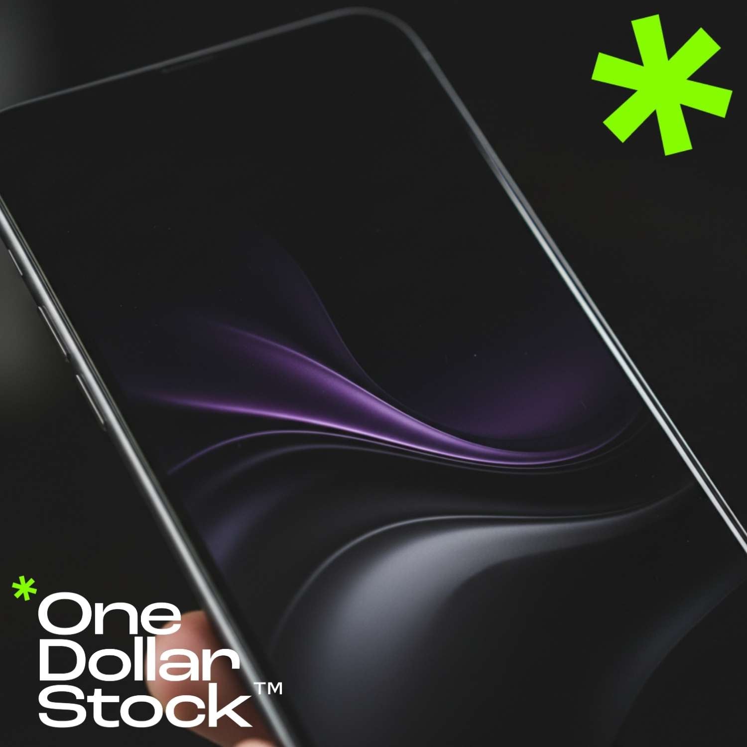
Dark Phone Wallpapers: Why They Work Better on OLED Screens
Dark phone wallpapers are popular for a simple reason: they make modern screens feel calmer, cleaner, and easier to use. On iPhone and Android, a dark background can reduce visual noise, support dark mode, make icons stand out, and create a more polished lock screen without making the phone feel overloaded. They are especially effective on OLED screens, where deep blacks, charcoal gradients, low-light photography, and muted abstract backgrounds can look rich without pushing too much brightness into the interface. But a good dark wallpaper is not just a black image. It still needs detail, contrast, composition, and enough structure to feel intentional. This guide explains why dark phone wallpapers work so well, how they behave on OLED screens, which styles are easiest to use daily, and how to choose a background that stays readable behind icons, widgets, notifications, and lock screen elements. Why dark phone wallpapers work so well A phone screen is not an empty frame. It is an interface. Every wallpaper has to sit behind app icons, widgets, folders, notification cards, the clock, search bars, and status indicators. Dark phone wallpapers often work better because they let those interface elements stay visually dominant. Bright wallpapers can look impressive in a preview, but they can also compete with app labels and widgets. A high-contrast beach photo, white interior, colorful street scene, or very bright landscape may make the screen feel busy after a few hours. Dark wallpapers usually create a quieter base. This is why dark backgrounds are common in productivity setups, premium app screenshots, dark mode interfaces, and minimalist home screens. They give the screen a clean foundation without making the phone look empty. Simple rule: a dark wallpaper should make your screen easier to read, not just darker. If icons, widgets, and lock screen text become harder to see, the image is not working. Why dark wallpapers are a natural fit for OLED screens OLED displays handle black and very dark areas differently from traditional backlit screens. Instead of lighting the whole screen from behind, each pixel can be controlled individually. This is one reason why deep blacks can look especially clean on many modern phones with OLED displays. For wallpapers, this creates a specific visual advantage. Dark backgrounds can feel deeper, smoother, and less aggressive than bright full-screen images. A black, graphite, navy, deep green, or dark brown wallpaper can blend naturally with dark mode and make the interface feel more unified. That does not mean every OLED wallpaper should be pure black. In many cases, subtle detail works better. A very dark gradient, a soft fabric texture, a low-light landscape, a shadowed architectural detail, or an abstract black-and-gray composition can look more refined than a flat black background. Dark wallpaper styles that work best on phones The best dark phone wallpaper depends on how you use your screen. A lock screen can handle a stronger image because there are fewer icons. A home screen usually needs more restraint because app icons and widgets sit on top of the background all day. Dark gradients Soft black, graphite, navy, green, or purple gradients are easy to use because they create depth without adding too much visual noise. Low-light photos Night streets, moody interiors, dark landscapes, shadows, and soft lighting can make the lock screen feel cinematic and personal. Abstract textures Dark glass, liquid shapes, grain, stone, fabric, metal, and blurred forms can add atmosphere while keeping the screen readable. Black wallpapers Black phone wallpapers are the simplest option. They are clean, minimal, and highly compatible with dark mode. A pure black background can make icons and widgets feel sharp, especially if you use a simple app layout. The downside is that pure black can sometimes feel too empty. If you want a more premium result, choose black wallpapers with very subtle texture, shadow, grain, reflection, or gradient. The difference is small, but it can make the screen feel designed rather than blank. Dark abstract wallpapers Dark abstract wallpapers are one of the safest choices for daily use. They do not depend on a specific subject, so they usually crop well across different screen sizes. They can also create a strong visual mood without interfering with icons. Soft abstract forms, dark color fields, smoky gradients, macro textures, glass effects, and blurred light can all work well. If you want more visual variation, explore abstract visuals and look for images with low visual noise and enough empty space. Dark nature wallpapers Dark nature wallpapers create a calmer screen without looking too technical. Forest shadows, mountains at dusk, dark water, mist, night skies, stones, leaves, and quiet landscapes can make the phone feel more grounded. They work best when the scene is not too detailed. A dark forest with too many branches can become visually messy behind icons. A simple horizon, soft fog, low-light water, or dark botanical close-up is usually easier to use. Dark luxury and editorial wallpapers Dark editorial wallpapers can make the phone feel more premium. These can include black marble, leather texture, architecture, studio lighting, minimal product-style compositions, shadowed interiors, or old money-inspired visual details. This style works well for people who want their phone to feel polished rather than decorative. The key is restraint. One strong texture, one refined object, or one controlled light source is usually enough. How to choose a dark wallpaper for your lock screen The lock screen is the best place for a more expressive dark wallpaper. There are fewer app icons, so the image can have a stronger focal point. Still, the clock, date, notifications, and widgets need space. When choosing a dark lock screen wallpaper, look at the top third of the image first. If the clock sits over a busy face, object, text, bright reflection, or detailed pattern, the composition may not work. A clean upper area usually performs better. Strong lock screen options include dark landscapes with open sky, shadowed architecture, low-light portraits without busy backgrounds, abstract gradients, black marble, night roads, cinematic interiors, and minimal dark textures. How to choose a dark wallpaper for your home screen The home screen is more demanding than the lock screen because it has more interface elements. App icons, folders, widgets, and labels need a calm background. A dark home screen wallpaper should support readability first and mood second. The safest choices are dark gradients, soft textures, low-contrast abstract images, blurred backgrounds, and simple dark surfaces. If the wallpaper has a subject, keep it away from the most crowded icon areas. If your home screen has many widgets, avoid detailed images. Widgets already add blocks, text, numbers, weather data, calendars, and controls. A busy wallpaper behind them makes the entire screen harder to scan. Screen setup Best dark wallpaper type Why it works Minimal home screen Black gradient, charcoal texture, dark abstract image Supports icons without making the screen feel empty or harsh. Widget-heavy layout Low-contrast background with large quiet areas Keeps widgets readable and avoids visual clutter behind cards. Dark mode interface Deep black, graphite, navy, dark green, or muted brown Creates consistency between wallpaper, apps, settings, and system UI. Expressive lock screen Low-light landscape, dark editorial photo, cinematic background Adds personality while leaving space for the clock and notifications. Color choices that make dark wallpapers easier to use Dark does not always mean black. Many of the best dark phone wallpapers use controlled color rather than total darkness. Deep navy, forest green, graphite gray, dark brown, burgundy, purple-black, and muted blue can all feel premium while still supporting readability. The most important factor is contrast. If the wallpaper has bright highlights directly behind white app labels, the labels may disappear. If the wallpaper is dark but visually noisy, icons may still become hard to read. A useful dark wallpaper needs contrast in the right places, not everywhere. For everyday use, choose darker backgrounds with soft transitions. Hard patterns, bright edges, high-detail photos, and sharp reflections are better for lock screens than home screens. Common mistakes with dark phone wallpapers Dark wallpapers are easy to get wrong because they look good in a clean preview. The real test happens when your phone interface appears over the image. A wallpaper can be dark and still be distracting. Using an image that is too flat A plain black wallpaper is clean, but it can feel empty. If that is the goal, it works. If you want something more polished, choose a dark image with subtle grain, shadow, gradient, or texture. Choosing too much contrast Bright neon details, sharp light streaks, and strong reflections can look impressive, but they often fight app icons and widgets. Keep strong highlights away from the busiest areas of your screen. Ignoring the crop Dark images can lose their subject quickly when cropped. If the main detail is near the edge, your phone may cut it off. Vertical compositions are usually safer for mobile backgrounds. Using text-based wallpapers Text on wallpapers often clashes with the phone interface. It can sit behind the clock, become partly hidden by icons, or compete with notifications. If you want a clean daily setup, avoid wallpapers with large words or slogans. Quick checklist for dark phone wallpapers The wallpaper stays readable behind app icons and widgets. The top area leaves enough room for the lock screen clock. The image has subtle depth, not just random darkness. Bright details do not sit behind important interface elements. The image crops well on a vertical phone screen. The color palette works with dark mode and your app icons. How to match dark wallpapers with iPhone and Android iPhone and Android handle wallpapers differently, but the practical rules are similar. You need a strong vertical crop, good readability, and enough calm space for interface elements. Dark wallpapers for iPhone On iPhone, the lock screen clock and widgets make the upper part of the image especially important. If you want a dark wallpaper for iPhone, choose images with a quieter top area and stronger visual detail toward the middle or lower part of the frame. Dark gradients, low-light landscapes, abstract images, and clean editorial photos often work well. If you use multiple focus modes, consider using different dark wallpapers for different contexts: one calm background for work, one more expressive image for personal use, and one very minimal option for night mode. Dark wallpapers for Android Android users often have more control over launchers, icon packs, widgets, and grid layouts. This makes dark wallpapers especially flexible. A dark background can support custom icon themes, monochrome layouts, and widget-heavy screens without making the interface look crowded. If you use a custom launcher, match the wallpaper to your icon style. Minimal icons work well with soft black gradients. Colorful icons need a quieter background. Large widgets need negative space and low contrast behind the widget area. How to build a consistent dark screen style A dark wallpaper works best when it feels connected to the rest of your phone setup. That does not mean everything has to be black. It means the wallpaper, icons, widgets, and app layout should feel like one visual system. 1 Pick a base tone Start with black, graphite, navy, dark green, brown, or purple-black as the dominant background tone. 2 Control contrast Keep bright details away from app labels, widgets, and clock areas so the interface remains easy to read. 3 Match your icons Use a wallpaper that supports your icon style instead of competing with it for attention. 4 Test daily use Keep the wallpaper for a full day and check whether it still feels calm, readable, and visually useful. If you are comparing wallpaper quality, size, and cropping before choosing a dark background, the guide to 4K phone wallpaper size and resolution explains the technical side in more detail. Where to find better dark phone wallpapers Good dark wallpapers are not only about mood. They need clean composition, strong resolution, subtle detail, and enough negative space for everyday use. Random downloads often look fine in preview but become messy once they sit behind icons and widgets. On OneDollarStock, you can browse 4K phone wallpapers for mobile screens and use them as lock screens, home screen backgrounds, design references, moodboard material, or visual assets for creative projects. The best dark wallpaper is often one that does more than look dark: it creates a screen that feels easier to use. Conclusions Dark phone wallpapers work because they respect the way people actually use their phones. They reduce visual noise, support dark mode, improve readability, and make OLED screens feel deeper and more refined. The strongest dark wallpapers are not always the blackest ones. They are the ones with the right balance of darkness, detail, contrast, and composition. Choose a background that works with your screen, not against it, and your phone will feel cleaner every time you unlock it.

