


How to Avoid Generic AI-Looking Visuals in Brand and Marketing Content
Generic AI-looking visuals make brands harder to recognize. This guide explains how to avoid them using curated stock images, mockups, textures, overlays, presets and a clear visual direction -- so your marketing content feels intentional, not interchangeable.

How to Build a Complete Brand Launch Kit with Stock Photos, Presets, LUTs, Textures and Website Templates
How to Build a Complete Brand Launch Kit Using Creative Assets from OneDollarStock A brand launch kit is the single most important creative investment you can make before going to market. It is not a logo file and a color palette. A real brand launch kit is a complete visual asset system: stock photos, a color grading style for photos and video, background textures, design overlays, and a website template that ties everything together. Without it, your launch looks fragmented. With it, a solo founder or a two-person startup can produce content that looks like it came from a funded creative team. This guide shows you exactly how to build a complete brand launch kit using commercial creative assets from OneDollarStock, a marketplace offering stock photos, Lightroom presets, color LUTs, textures, and Framer website templates under a pay-once commercial license. Every asset category covered here maps directly to a real production need at launch. What Should a Brand Launch Kit Include? Most founders underestimate how many visual asset types a brand launch actually requires. A complete brand launch kit covers every surface where your brand will appear in the first 90 days after launch. Hero stock photography: Images for your homepage, social profiles, email headers, and paid ads. Lightroom presets: A consistent color grade applied to every still photo your brand publishes. Color LUTs: The video equivalent of presets, applied in Premiere Pro, DaVinci Resolve, or Final Cut Pro to keep your reels, ads, and brand videos visually consistent with your photography. Textures and overlays: Background layers and design accents used in social media graphics, email headers, and landing page sections. A website template: A professionally designed, customizable web presence you can launch in hours, not weeks. Brand guidelines document: A simple internal reference that tells your team which assets to use, where, and how. OneDollarStock covers all five asset categories in one place. Browse the full Lightroom presets collection, the LUTs collection, the textures collection, and the Framer templates collection to start building your kit. Step 1: Define Your Visual Identity Before You Download Anything Before selecting any asset, answer three questions: What emotion should your brand trigger? What color temperature fits your positioning? Who is your primary visual audience? A wellness brand targeting women in their 30s needs warm, natural tones and clean editorial photography. A SaaS startup targeting B2B buyers needs sharp, modern visuals with a cool or neutral palette. A streetwear label needs gritty textures and high-contrast color grading. A personal brand built around coaching or consulting needs approachable, confident portraiture. Your answers determine which stock photos, presets, LUTs, and textures you select. Skipping this step is the single most common reason brand launch kits end up looking inconsistent three weeks after launch. Step 2: Build Your Stock Photo Library for Brand Launch Stock photography is the backbone of any brand launch kit. It sets the human tone of your brand and gives you immediate content for your homepage, social profiles, email headers, and ad creatives. The key is selecting images that share a consistent light direction, color temperature, and compositional style so they feel like they belong to the same visual world. For brands built around people, lifestyle, or beauty, editorial portrait photography works best. For product-focused brands, you need clean, styled imagery that puts the product in context without competing with it. The Elegant Woman in Black Blouse with Earrings Portrait Stock Photo is a strong example of editorial-grade imagery that works across beauty, fashion, lifestyle, and premium product brands. The neutral background, sharp focus, and confident subject make it versatile enough for homepage heroes, Instagram grids, and email headers without modification. For brands with a warmer, more approachable tone, the Joyful Young Woman Smiling Outdoors with Nature Background delivers natural light and authentic energy that performs well in wellness, coaching, and consumer lifestyle categories. What to Look for in Brand Launch Photography Consistent light direction and color temperature across all selected images Neutral or brand-aligned backgrounds that do not compete with overlays or text Subjects and compositions that leave room for copy placement Commercial licensing that explicitly covers social media, paid ads, and web use Step 3: Lock In Your Color Grade with Lightroom Presets for Branding Color grading is what separates a random collection of images from a recognizable brand aesthetic. A single Lightroom preset applied consistently across all your still photography creates the visual signature that makes your brand instantly identifiable in a feed, an inbox, or a search result. Presets work in Lightroom Classic, Lightroom CC, and Lightroom Mobile. They are applied in seconds and can be batch-processed across an entire photo library, which means you can grade 50 brand images in the same time it takes to edit one manually. The Earth Tones Presets (15 XMP files) are built for brands that want a warm, grounded, organic aesthetic. They work especially well for wellness, food, beauty, and lifestyle brands where natural warmth signals authenticity and trust. Fifteen variations give you enough range to match different lighting conditions without breaking your visual consistency. If your brand leans toward a cleaner, editorial warmth without retro grain, the Vintage Warm No Grain Presets (15 XMP files) give you a polished, timeless look that works across portrait, product, and lifestyle photography. This is a strong choice for personal brands, coaches, and service businesses that want to look premium without looking cold. Step 4: Add LUTs for Brand Video Consistency If your brand produces any video content at all, including Instagram Reels, YouTube videos, TikToks, or paid video ads, you need a LUT. A LUT (Look Up Table) is the video equivalent of a Lightroom preset. It applies a color grade to your footage in Premiere Pro, DaVinci Resolve, or Final Cut Pro in a single click. Without a LUT, your video content will never match your photo content. That mismatch is one of the most common reasons brand feeds look inconsistent even when the photography is strong. For a complete brand launch kit, your preset and your LUT should share the same color temperature and tonal direction. The Dark Portraits LUT pack (20 LUTs) is ideal for premium, high-contrast brands in fashion, beauty, and luxury. Twenty variations give you enough range to find the exact tone that fits your visual direction without locking you into a single look across every video format. For brands with a more vibrant, urban, or street-culture identity, the Cinematic Colorful Streets LUT pack (6 LUTs) delivers punchy, saturated tones that make content pop on mobile screens and social feeds. This pack works particularly well for consumer brands, streetwear labels, and lifestyle products targeting younger audiences. Step 5: Use Textures to Make Your Brand Visuals Feel Premium Textures are one of the most underused tools in brand design. They add tactile depth to flat digital assets, making backgrounds, overlays, and design elements feel more intentional and premium. In a brand launch kit, textures are used as background layers in social media templates, as overlay elements on hero images, and as design accents in email headers and landing page sections. The right texture reinforces your brand's material world. A luxury brand uses gold or marble. A craft brand uses wood or raw paper. A tech brand uses brushed metal or concrete. Choosing the wrong texture, or using too many, is one of the fastest ways to make a brand look inconsistent. The Subtly Textured Gold Textures (20 JPG files) are a strong choice for luxury, beauty, and premium consumer brands. The subtle metallic quality adds richness without overwhelming the design, making them ideal for email headers, product announcement graphics, and social story backgrounds. For brands with a raw, artisan, or craft identity, the Burned Wood Textures (16 JPG files) bring an organic, handcrafted quality to digital design. They work particularly well for food, spirits, outdoor, and maker brands that want to signal authenticity through their visual materials. Step 6: Launch Your Website with a Framer Website Template Your website is the single most important brand touchpoint at launch. It is where every ad, every social post, and every email ultimately sends traffic. A poorly designed or generic website undermines every other asset in your launch kit, regardless of how strong your photography and color grading are. Framer website templates give you a professionally designed, fully customizable web presence that you can launch in hours rather than weeks. They are built for speed, visual quality, and conversion, which is exactly what a brand launch requires. Replace the placeholder images with your brand photography, apply your color palette, and you have a launch-ready website that looks like it cost ten times more to build. The Ignitex Digital Agency Framer Template is built for agencies, studios, and service brands that need a sharp, modern web presence with strong visual hierarchy. The layout is designed to showcase work, communicate positioning, and convert visitors into leads from the first scroll. For SaaS products, tech startups, and digital-first brands, the Elixhub SaaS and Startup Framer Template provides a clean, conversion-focused structure with sections for features, pricing, testimonials, and CTAs. It is the kind of website launch kit that makes a pre-launch page look like a funded product from day one. Common Mistakes When Building a Brand Launch Kit Most brand launch kits fail not because of bad assets, but because of poor selection and inconsistent application. These are the most common mistakes to avoid. Mixing color temperatures: Combining warm-toned photos with cool-toned presets creates visual dissonance that makes your brand look unpolished, even if each individual asset is high quality. Choosing too many textures: One or two textures used consistently is a brand system. Five different textures used randomly is visual noise. Skipping video color grading: If your brand produces any video content, launching without a LUT means your video and photo content will never visually match. Using a website template without replacing placeholder images: A Framer template is a starting point, not a finished product. Populate it with your actual brand photography before launch. Treating the launch kit as a one-time project: Your visual system should evolve with your brand. Build it with assets that are flexible enough to grow across new campaigns and channels. Skipping the brand guidelines document: Without a simple internal reference, team members and freelancers will make inconsistent choices that erode your visual identity over time. How to Organize Your Brand Launch Kit for a Team If you are working with a team, a freelancer, or an agency, your brand launch kit needs to be organized and documented so that anyone can use it correctly without asking you for guidance every time. Create a shared folder with clearly labeled subfolders: Photography, Presets, LUTs, Textures, Templates, and Brand Guidelines. Inside the Brand Guidelines document, specify which preset to use for still photography, which LUT to use for video, which textures are approved for which use cases, and which Framer template sections are locked versus editable. This structure turns a collection of assets into a repeatable production system. That is the real goal of a brand launch kit: not just to look good at launch, but to make it easy to produce consistent content for the next 12 months without starting from scratch every time. Build Your Complete Brand Launch Kit with Affordable Creative Assets A brand launch kit built on commercial-grade creative assets is one of the highest-leverage investments a founder or marketer can make before going to market. It compresses weeks of creative production into a single, organized system that your entire team can execute from, consistently, across every channel. OneDollarStock provides stock photos, Lightroom presets, color LUTs, textures, and Framer website templates under a pay-once commercial license. You build the kit once and use every asset indefinitely across campaigns, channels, and markets. No subscriptions. No per-use fees. No licensing surprises. Start with your hero photography, lock in your color grade with a matching preset and LUT, add one or two textures that reinforce your brand tone, and deploy your web presence with a Framer template built for your category. That is a complete, affordable brand launch kit, and it is ready to produce content from day one. Browse the full range of Framer website templates and Lightroom presets at OneDollarStock to start assembling your visual identity kit today. Frequently Asked Questions About Brand Launch Kits What is a brand launch kit? A brand launch kit is a curated collection of visual assets that defines how your brand looks and feels across every touchpoint at launch. It typically includes stock photography, a color grading style for photos and video, background textures, design overlays, and a website template. The goal is to give your team a complete, consistent visual system they can use immediately without building assets from scratch. How much does it cost to build a brand launch kit? The cost varies widely depending on whether you use custom photography, hire a designer, or use ready-made commercial assets. Using a marketplace like OneDollarStock, you can assemble a complete brand launch kit, including stock photos, presets, LUTs, textures, and a Framer website template, for a fraction of what a custom creative production would cost. All assets are sold under a pay-once commercial license with no recurring fees. Do I need both Lightroom presets and LUTs for a brand launch kit? If your brand produces both photo and video content, yes. Lightroom presets apply your color grade to still photography. LUTs apply the same visual direction to video footage in tools like Premiere Pro, DaVinci Resolve, and Final Cut Pro. Using both ensures your photos and videos share the same aesthetic, which is essential for a consistent brand identity across social media, ads, and your website. What Framer template should I use for a brand launch? The right Framer template depends on your brand category. Agencies and service brands benefit from portfolio-style layouts with strong visual hierarchy. SaaS products and startups need conversion-focused structures with feature sections, pricing tables, and clear CTAs. Personal brands and coaches need clean, approachable layouts that put the person front and center. OneDollarStock offers Framer templates across all of these categories. Can I use OneDollarStock assets for commercial projects? Yes. All assets available on OneDollarStock are sold under a commercial license, which means you can use them in client work, paid advertising, social media, websites, and marketing materials. Always review the specific license terms for each asset before use to confirm the scope of permitted use cases.
How Yoga Studios Can Attract the Right Clients, Not Just More Clients
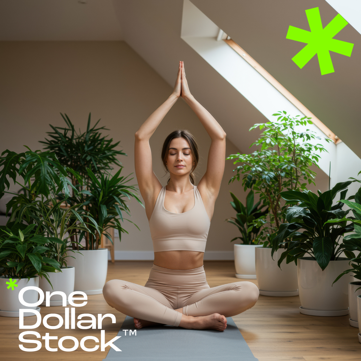
How Yoga Studios Can Attract the Right Clients, Not Just More Clients Most yoga studios do not have a visibility problem. They have a clarity problem. The class schedule is posted, the Instagram is active, the intro offer is live, and still the room fills with people who drop off after two weeks. The issue is rarely the product. It is almost always the positioning. When a studio tries to speak to everyone, it ends up resonating with no one, and the clients who would have stayed for years never feel like they found their place. This article is for studio owners and wellness brand managers who want to stop chasing volume and start building a community of clients who actually belong there. That shift starts with how you define your audience, how you communicate your identity, and how every visual touchpoint, from your website to your seasonal campaign, reflects a consistent and intentional world. Define Your Ideal Yoga Client Before You Market to Anyone The most effective yoga studio marketing starts with a decision, not a campaign. Before you write a single caption or design a single flyer, you need to answer one question honestly: who is this studio actually for? Not in a demographic sense, but in a psychographic one. Are you building a space for burned-out professionals who need stillness? For active women in their 30s who want a physical challenge alongside their mindfulness practice? For people recovering from injury who need a therapeutic, slow-paced environment? Each of those audiences has different search behavior, different visual expectations, and different reasons to stay. A studio that positions itself around nervous system regulation and deep rest will attract a completely different client than one that leads with power flow and athletic progression, even if both offer the same class types. The positioning is the product, at least from the outside. Once you have named your ideal client clearly, every marketing decision becomes easier. You know which platforms to prioritize, which language to use, which visuals feel right, and which offers will convert. Vague positioning produces vague results. Specific positioning builds loyalty. Yoga Studio Branding That Communicates Calm, Not Just Classes Wellness clients are not buying a workout. They are buying a feeling, a lifestyle signal, and a sense of belonging to something that reflects their values. That means your brand identity needs to do more than list your schedule and your pricing. It needs to communicate an atmosphere before anyone walks through the door. Visual consistency is one of the most underused tools in yoga studio marketing. Studios that invest in a coherent visual language, consistent color palettes, intentional photography, and a recognizable aesthetic across all channels, build trust faster and retain clients longer. When someone sees your Instagram post, your email header, and your website hero image and they all feel like the same world, that coherence signals professionalism and intentionality. It tells the client that the experience inside the studio will match the promise outside it. For studios that do not have the budget for regular professional photo shoots, a well-curated library of wellness stock photography can fill the gap without sacrificing quality. The key is choosing images that feel specific and editorial rather than generic and staged. A photo of a woman in a sunlit room with plants reads very differently than a clipart-style yoga pose on a white background. The former builds a world. The latter just fills space. Wellness Lifestyle Positioning: Selling a Way of Life, Not a Drop-In Class Studios that grow sustainably are not selling individual classes. They are selling a lifestyle identity that their clients want to be part of. This is the difference between a transactional business and a community-driven one. When your marketing consistently reflects a coherent way of life, whether that is slow mornings, intentional movement, seasonal rhythms, or urban calm, clients begin to see your studio as part of their identity, not just their weekly schedule. This kind of positioning shows up in the language you use, the stories you tell, and the visuals you choose. A retreat announcement that features a woman relaxing in a wooden sauna with a forest view during a wellness retreat communicates something very specific about the experience you are offering. It is not just a weekend away. It is a particular kind of restoration, in a particular kind of environment, for a particular kind of person. That specificity is what makes someone feel seen and want to book. Seasonal Yoga Campaigns That Attract High-Retention Clients One of the most reliable ways to attract the right clients, rather than just more clients, is to build your marketing calendar around seasonal themes that resonate with your target audience's emotional state. People's relationship with their body and their wellness practice shifts throughout the year. January brings resolution energy. Spring brings renewal. Late summer brings a desire to slow down before the year accelerates again. Autumn is a natural moment for introspection and grounding. Studios that align their campaigns with these rhythms speak directly to where their ideal client already is emotionally. A September campaign built around the theme of returning to stillness, supported by warm, earthy visuals and language about grounding and transition, will resonate far more deeply with a mindfulness-oriented audience than a generic back-to-class promotion. The message meets the moment. For studios building seasonal content, visual consistency across the campaign matters as much as the copy. Using a cohesive set of images with a unified color grade, such as warm earth tones or soft neutrals, ties the campaign together visually and makes it feel intentional rather than assembled. Earth Tones Presets are a practical tool for studios editing their own photography, allowing a small team to maintain a consistent, premium look across every piece of content without a dedicated creative director. How to Use Visual Storytelling to Build a Yoga Community Online The studios that build the strongest online communities are not the ones posting the most. They are the ones posting with the most intention. Every image, caption, and story should reinforce the same core identity: who this space is for, what it feels like to be there, and why it matters. Visual storytelling for yoga studios works best when it moves between three registers. The first is aspirational, showing the experience at its most beautiful and evocative, a group yoga class in a modern desert retreat, a quiet morning practice in a light-filled room. The second is relatable, showing the real, human side of the practice, the effort, the community, the small moments of progress. The third is educational, offering genuine value through tips, sequences, or insights that position the studio as a trusted guide. When studios do not have access to original photography for every post, a curated library of high-quality wellness stock images can maintain the visual standard without requiring a shoot for every campaign. The important thing is to choose images that feel specific to your world, not generic to the category. A woman practicing yoga at home in gentle morning light tells a story about a particular kind of client and a particular kind of practice. That specificity is what makes the content feel real rather than promotional. Stop Competing on Price and Start Competing on Identity The most common mistake yoga studios make when growth slows is dropping their prices. A lower intro offer might bring in more first-timers, but it rarely brings in the right ones. Price-sensitive clients are the hardest to retain and the least likely to become community members. The studios that thrive long-term are the ones that make their identity so clear and so compelling that the right clients feel they have no real alternative. That kind of positioning is built over time through consistent communication, intentional visuals, and a brand voice that never wavers. It is reinforced every time someone lands on your website, opens your email, or sees your content in their feed. When all of those touchpoints feel coherent and specific, the right client recognizes themselves in what you are offering. That recognition is worth far more than a discounted first month. The Right Clients Are Already Looking for You Yoga studio growth does not require a bigger audience. It requires a clearer signal. The clients who will stay for years, refer their friends, and become the core of your community are already searching for what you offer. The question is whether your brand is specific enough, consistent enough, and visually compelling enough for them to recognize you when they find you. Start with your positioning. Name your ideal client precisely. Build a visual identity that communicates your world before anyone reads a single word. Align your seasonal campaigns with the emotional rhythms of your audience. And make sure every image you use, whether original or sourced from a premium wellness stock library, reflects the specific atmosphere you are building. That is how you stop filling seats and start building a studio that people genuinely belong to.
The Internet Is Visual First - Your Business Still Isn't
Why modern brands win by thinking in assets, presets, LUTs, and scalable design infrastructure.

If Your Startup Closed Tomorrow, Would Anyone Miss It?
A deep dive into brand memorability and how strong visual language builds emotional recognition. Discover why consistency, distinctive visuals, and emotional connection determine whether your startup becomes forgettable or unforgettable.
Stop Designing From Scratch: The Anti-Hustle Guide for Creators
A contrarian take on why serious brands build asset systems instead of constantly reinventing visuals. Learn how professional creators use presets, templates, and reusable assets to work smarter, maintain consistency, and reclaim their time.

Why Your Instagram Feed Feels "Off" (It's Not the Algorithm)
An exploration of visual inconsistency, brand identity drift, and how structured creative libraries fix content chaos.

Your Brand Looks Cheap (And You Don't Even Know It)
A breakdown of the subtle visual mistakes that silently destroy perceived value - and how upgrading your creative assets instantly changes pricing power.

How to build a personal brand with stock images
In the digital world, your personal brand is often defined visually, before you say a word. Whether you’re a creator, entrepreneur, consultant, or influencer, consistent, well-chosen visuals can strengthen your personal brand and build trust with your audience. In this article, we’ll show how to use premium stock images from One Dollar Stock™ to craft a personal brand that stands out. Why visuals are essential for personal branding First impressions online are often visual: Website visitors form opinions in seconds based on imagery Social media feeds are dominated by visuals Consistent visuals build brand recognition and trust By using premium stock images strategically, you can: Enhance the professionalism of your personal brand Communicate your personality and values visually Maintain a consistent look across all channels Key areas where visual branding matters 1. Website and blog Your website is your home base. Use people stock images to humanize your site and abstract images for stylish backgrounds and accents. Tips: Choose a consistent color palette Use images that match your tone (professional, approachable, creative, etc.) Keep image styles consistent across pages 2. Social media On social platforms, visuals are your brand. Use premium stock images to: Create branded quote graphics Design stylish post templates Enhance Reels and Stories with AI visuals and abstract backgrounds Visual consistency builds brand recognition and helps you stand out in the feed. 3. Content marketing Visuals can elevate: Blog posts Lead magnets (guides, e-books) Newsletter designs Use AI stock images and people images to add personality and emotion to your content. 4. Personal brand merch and products Launching merch or digital products? The Creator Commerce License lets you use One Dollar Stock™ images legally in products for sale like: Branded apparel and prints E-books and templates Digital courses and downloads How to choose the right stock images for your personal brand Ask yourself: What 3 words describe my personal brand? (e.g. bold, minimalist, warm) What emotions do I want my visuals to evoke? Who is my ideal audience - and what visuals will resonate with them? Then browse: People stock images for connection and authenticity Abstract images for style and modernity AI stock images for uniqueness and visual edge Build a visual brand that connects Your personal brand deserves visuals that inspire trust, reflect your personality, and connect with your audience. With premium stock images from One Dollar Stock™, you can build a distinctive personal brand - affordably and legally.

